/Assets/base/Close.svg)
 ]
]
/Assets/arrow-facing-left--black-01.svg)
/Assets/base/Navigation%20Icons/TAYA.svg)
/Assets/base/Navigation%20Icons/navigation%20arrow%20-%20facing%20right-01.svg)
/Assets/base/Navigation%20Icons/Sales.svg)
/Assets/base/Navigation%20Icons/Web%20design.svg)
/Assets/base/Navigation%20Icons/HubSpot.svg)
/Assets/Icon%20Library/AI%20Mastery.svg)
/Assets/Icon%20Library/Gear%20icon.svg)
/Assets/Icon%20Library/Learning%20Center%20Laptop.svg)
/Assets/Icon%20Library/Click.svg)
/Assets/Icon%20Library/Link.svg)
/Assets/navigation-global--close-symbol-black-01-1.svg)
/Assets/navigation-global--close-symbol-black-01.svg)

/Assets/Icon%20Library/x%20corp.svg)
/Assets/base/Learning%20Center%20Resource%20Category%20Icons/Facebook_Messenger_logo_black.svg)
/Assets/Icon%20Library/whatsapp%20logo.svg)
/Assets/Icon%20Library/Email.svg)

What is the website grid?
The website grid is a visual structure used to organize components of a webpage's design such as typography, images, video, and other elements.
A grid is a visual structure used for organizing the visual elements and typography of a design. Traditionally, a grid structure is used to evenly divide the design space into a series of vertical columns. This helps ensure the design has consistent spacing, proper alignment, and appropriate visual hierarchy, which are all important when considering the legibility of a design.
The grid, explained
The purpose and structure of the grid is different in print design and other mediums than in web design, so we’ll focus on its implementation for web design and development in this article.
In web design, the vertical grid is more important and easily identifiable than the horizontal grid. This is due to the nature of web design and the concept that page height is greatly dependent on the length of the content. So, although horizontal alignment is involved in many aspects of web design, the vertical grid lines (i.e. columns) are what create the foundation for a grid structure.
A familiar comparison to the grid would be something like the columns in a newspaper or magazine.
Most websites are built responsively (meaning the design will adapt or scale based on the device and screen size) and, as a result, the grid's outer columns may span from the left edge of the screen all the way to the right or the grid may be confined to the center of the screen with a specific maximum width.
Most website grid structures use a 12-column grid, although there is no specific requirement for the number of columns. A website grid also has consistent spacing between each column, known as gutters, and spacing outside of the grid, known as margins.
Alignment and content type
A webpage built on a grid structure means most of the content or imagery that you see on that page is going to be anchored, in some way, to the left and right edges of one or more columns.
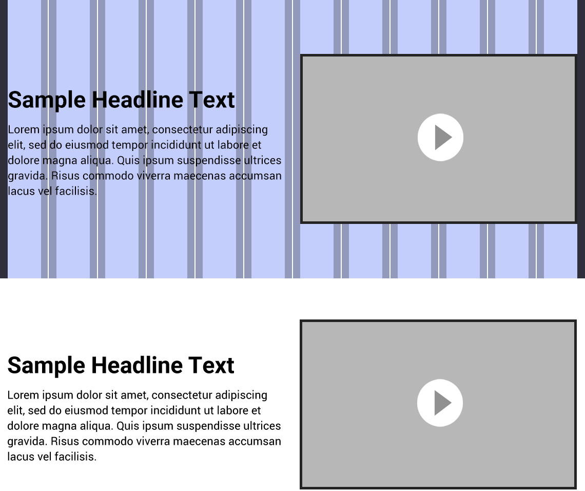
For example, a block of text content that covers the left half of the section of a page is an element which spans from the left edge of the first column to the right edge of the sixth column. This means the right half of the grid (columns 7 through 12) could be used for a related video or image.
However, the use of a bounding box (an invisible wrapper which contains the element) allows the text or imagery to be horizontally aligned (left, right, or center) within the available space. This means an element's bounding box may span a specific number of columns but the content within it may not necessarily cover the entire width of that space.
It's important to understand that text behaves differently within its bounding box than imagery and other media. This is because text will dynamically adapt to the available width so the number of lines is partially based on the user's screen size, whereas imagery will usually scale at a consistent aspect ratio.
Visual hierarchy
When considering the usage of a grid structure, it’s important to understand some of the basic design principles used in typography. These relate back to human psychology, and some of the more prominent ones are outlined in the Gestalt Principles, which is a set of laws describing how humans observe objects and patterns:
- Law of Proximity – an assortment of objects which are close together are perceived as forming a group
- Law of Similarity – an assortment of similar objects (in terms of shape, color, etc.) are perceived as forming a group
- Law of Closure – an unclosed or unfinished shape will be perceived as being whole if the mind is able to fill in the missing information
- Law of Symmetry – objects which are perceived as being equally arranged on or around a center point help the mind identify them as coherent objects
- Law of Continuity – the mind can distinguish between groups of objects even if some visual information is unknown, such as if they overlap
- Law of Figure/Ground – the mind will distinguish objects that appear to be in the foreground from the background
- Law of Common Fate – the mind will perceive objects that move in the same direction as a group, even if they are visually different
- Law of Past Experience – the mind is affected by past visual stimuli

Understanding fundamental concepts of typography is necessary for proper usage of the grid. However, it mostly comes down to one concept: Visual hierarchy.
Visual hierarchy is a term used to describe the order in which the parts of a design are interpreted. Visual hierarchy and the Gestalt Principles directly relate back to the grid structure because these determine how easy a design is to understand — in other words, how legible it is.
A grid helps ensure there is consistency in the design and helps ensure content is organized in a way that follows the Gestalt Principles. Text and imagery should be intentionally arranged in a way that causes humans to subconsciously group related content together, and visual hierarchy should be used to deliver the most important information first.
Following these principles results in content that is presented in an intuitive way which is easy for the user to understand and, therefore, a more effective design.
How developers use the grid
Web development, along with most forms of code or markup languages, is directly based on math and algebra. As a result, developers love the grid.
Not only does the grid ensure the aspects of a design are consistently spaced, it allows us to use a global foundation for creating webpages and templates rather than placing everything by hand. The benefit of this is not only consistency but efficiency as well.
The developer can configure the grid structure once, or as needed, to create the base structure on which the entire site will be built. This also helps with responsive design by allowing the designer and developer to more easily determine the behavior of elements by deciding how many columns they should span on certain device sizes and how they should be aligned within their bounding box.
Grid variations
The most common number of columns used for a website grid structure is 12. This number allows content to be arranged in any denomination of 12. Meaning, a 12-column grid can easily be used to create a 2-column, 3-column, 4-column, or 6-column layout.
Due to the amount of content that can effectively be displayed on a webpage, there is usually never a need to use more than 12 columns.
Breaking out of the grid
Although we always use some form of a grid structure, sometimes we need to break out of it. Abstraction or placing certain visual elements outside of the grid can actually help support your visual hierarchy by guiding the focus of the viewer towards a specific part of the page.
From a development standpoint, breaking the grid means you sometimes need to sacrifice the ability to use the global structure for that area of the design due to needing a custom layout.
From a design standpoint, frequently breaking out of the grid reduces its effectiveness and results in a design that’s less visually intuitive.
However, this is dependent on what aspects of the design aren’t following the grid structure. For example, a graphical element can effectively be placed outside of the grid to help guide the user’s eyes towards the grid or further down your design’s visual hierarchy.
Text content should usually be arranged within the grid to ensure it can be read easily at a glance while skimming the page.
What do marketers need to know about the grid?
The purpose of the grid, and design as a whole, is to deliver content in an effective way. When building a website on a CMS like HubSpot or WordPress, most of the grid structure may already be in place, but there is always some flexibility in the way the modules of a webpage template can used.
Marketers should pay close attention to the organization of content and the behavior of users to present this information in the most efficient way possible.
Free: Assessment
/Assets/Icon%20Library/Arrows/Grey%20Arrow%20-%20Prev.svg)
/Assets/Icon%20Library/Arrows/Grey%20Arrow%20-%20Next.svg)