/Assets/base/Navigation%20Icons/TAYA.svg)
/Assets/base/Navigation%20Icons/Sales.svg)
/Assets/base/Navigation%20Icons/Web%20design.svg)
/Assets/base/Navigation%20Icons/HubSpot.svg)
/Assets/Icon%20Library/AI%20Mastery.svg)
/Assets/Icon%20Library/Learning%20Center%20Laptop.svg)

Jan 19, 2021
/Assets/Icon%20Library/x%20corp.svg)
/Assets/Icon%20Library/whatsapp%20logo.svg)
/Assets/Icon%20Library/Email.svg)

What Is Parallax Scrolling?
Parallax scrolling is a special scrolling technique used in web design where background images throughout a web page move slower than foreground images, creating an illusion of depth on a two-dimensional site.
Traditional thinking in the field of web design held that your website should be designed in a way to minimize the need for the user to scroll and to keep the most important information "above the fold."
However, a lot has changed in recent years and if you think about it, we live in a scrolling culture.
Web users have become accustomed to scrolling down pages to get that absolute last piece of information. Google also prefers websites that have longer session durations, and one of the ways to accomplish this is to entice visitors to scroll by creating unique experiences.
Incorporating parallax scrolling also can help you accomplish a variety of goals such as:
- Immersing your visitors into unique experiences
- Drawing action to CTAs or forms
- Providing natural movement to otherwise inanimate images
When executed accurately, the application of this technique should be something the average user wouldn’t be distracted by or notice. It should help aid in any larger goals you want your website to accomplish, such as generating more higher qualified inbound leads.
But before we get too far let's take a step back and review what parallax scrolling is.
What is parallax scrolling?
Parallax scrolling is a special scrolling technique used in web design where background images throughout a web page move slower than foreground images, creating an illusion of depth on a two-dimensional site.
It is one of the most used design techniques in web design right now, but also something you probably don’t even realize you have already experienced.
 Parallax scrolling example from Squarespace
It is a simple motion that you are already accustomed to and it’s helped make many websites feel dynamic and interactive.
If you choose to use it, it's important to brainstorm how parallax could also affect the mobile experience. To increase site speed and not infringe too much on mobile usability, it's typically advised to either reduce parallax scrolling or remove it entirely.
Remember to think of all instances where you may want to use it first and how it needs to be adjusted for users across multiple devices.
How should parallax scrolling be used?
It’s also important to note that design aesthetics like parallax should be “nice to haves” and not core components of your website. Your website needs to be built first with your users in mind, and be specifically built to drive people through the top, middle, and bottom of the funnel areas of your website. Function should come before form and form should only enhance function.
Your website should be a valuable sales tool first and help get people to where they want to go and answer the questions they have. Once you establish this foundation, then you can begin to find interactive ways to help facilitate this, as opposed to thinking of design first, and strategy last.
Parallax Scrolling Website Examples
Here are some websites that have incorporated parallax scrolling in a way that makes sense and adds value:
- Anemoi Marine
- Dorm
- MarkUp
- Environmental Defence Fund (Impact Report)
- Unis Footwear
- Building the Future
- Cooper Perkins
- AlliancePlus
- Apollo
- WOTA
- Kontainer
- Hitachi
- Boynton Yards
- TEDxBethesda
- Canatal
- Laurent-Perrier
- La Phrase 5
- Scrollino®
- Letter
- McDonald's India
- CodeQ
- Cancer Research Foundation
- Konstantopoulos
- UBank
- Smith Institute
- NeaMedia
- Upper
- NooFlow
- Vanguard Prague
- Packwire
- WebFlow
31 websites that got parallax right
Because parallax scrolling can be utilized in a variety of ways, there’s no shortage of examples to inspire you.
It's easy to go overboard with parallax scrolling to the point where it feels like too much movement is taking place, but some websites execute it properly.
The following examples do just that, incorporating parallax scrolling in a way that makes sense and adds value. Some utilize the technique to the extreme, while others have employed it to add to the user experience without any potentially overwhelming effects.
1. Anemoi Marine
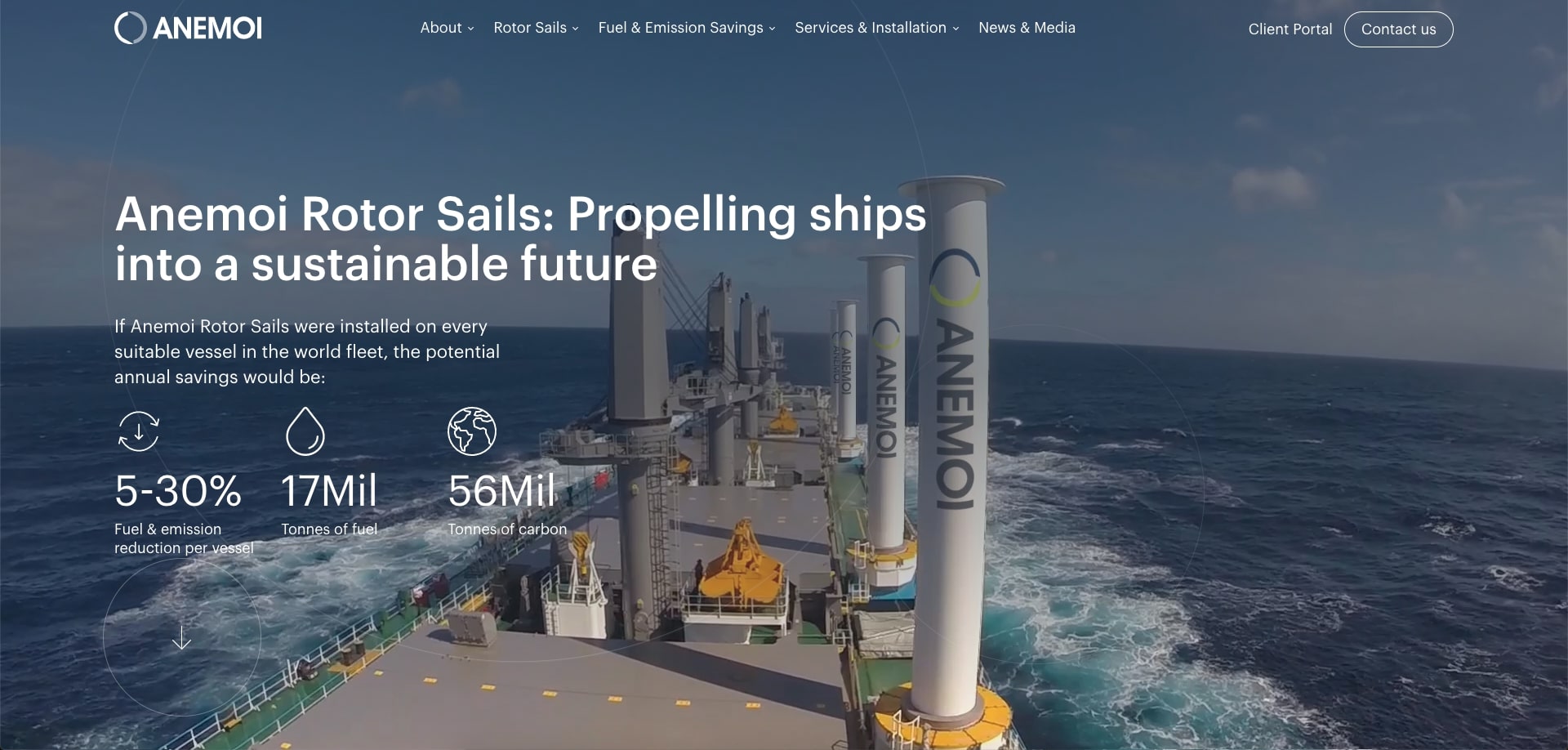
Anemoi Marine animates their rotor sail as you scroll down their homepage, creating a narrative experience to learn about the product's efficiency, size options, maneuverability, maintenance, etc.
This helps Aneimoi’s core customers better visualize how something of this caliber, which might normally be challenging to take real-life photos of, would behave and work.
2. Dorm
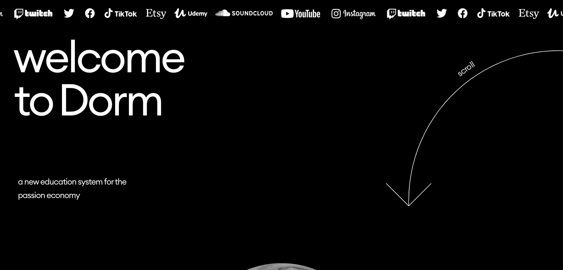
Dorm, an education platform, does an excellent job of using parallax to zoom in and out of certain imagery that aids its messaging. The initial animation of the moon image getting closer and closer as you scroll makes it as if you aren’t viewing a website at all. It creates a more surreal experience of entering the Dorm “universe.”
Alongside that, their parallax effects also work very well with showcasing the number of different teachers or topics their platform has to offer, giving the user a sense of their being many options to choose from.
3. MarkUp
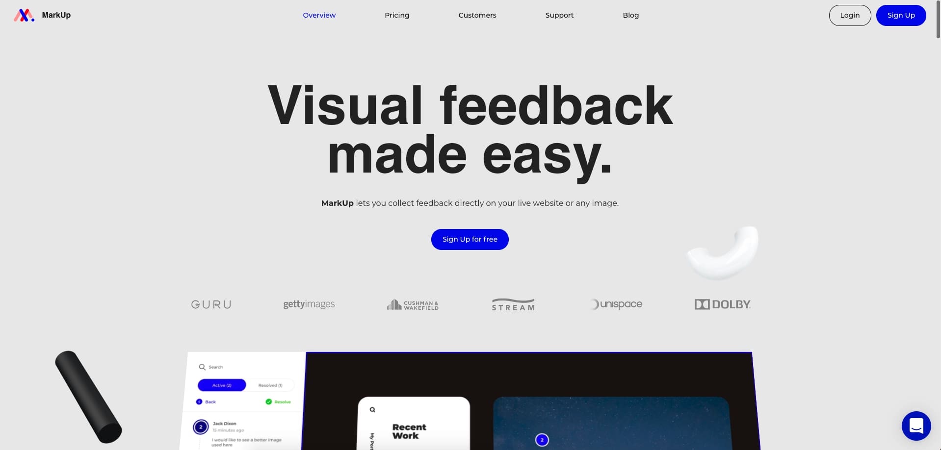
MarkUp is another company that uses parallax to scroll through different parts of their software. This works well because it guides your user's line of sight to important elements you wouldn’t want to be missed .
While the images are scrolling on the right side, the text on the left fades in and out as each new image comes into view. Below this text, they’ve made sure to leave their call-to-action to sign up. Using this layout, instead of a repeated left-right/right-left image and text layout makes the experience more visually interesting.
4. Environmental Defence Fund (Impact Report) (EDF)
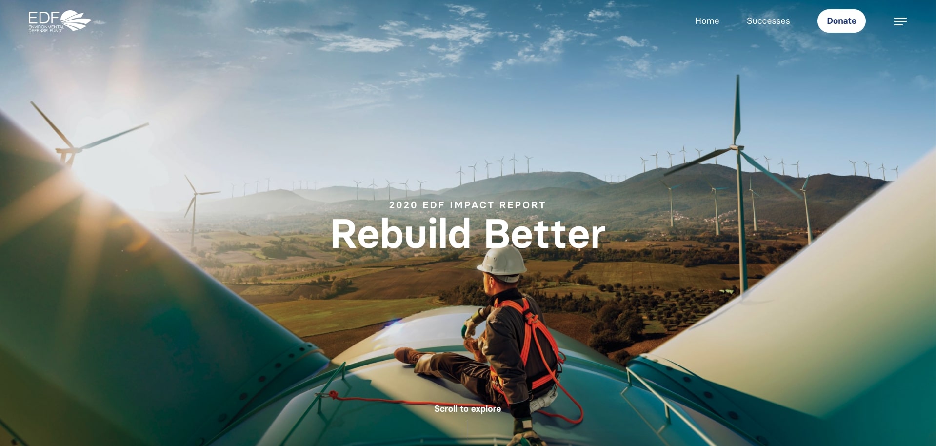
The EDF uses parallax scrolling heavily on their impact report to scroll through a variety of vivid imagery and text which correlate to different sections of the report. This makes digesting what can be dense information interesting and also easier to do.
This experience is carried through and sub-pages that are visited. Most of these pages have paragraphs of text that come in and out of view as you scroll through them, allowing you to only focus on what you need to.
5. Unis Footwear
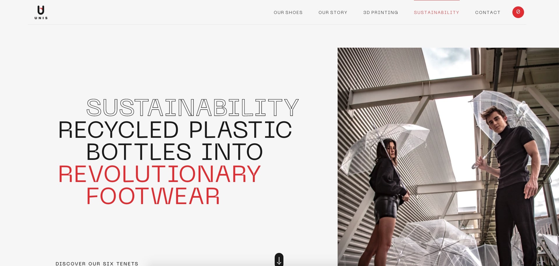
For Unis, I had to highlight their sustainability page, which describes the importance of eco-awareness with their footwear products.
The page is set up similar to a timeline, in which each sustainability tenant is contained in its section, yet, a line is drawn to the next as you scroll down the page. The pairs of images in each section move and overlap one another as you scroll by too.
6. Building the Future

Building the Future, a conference by Ativar, utilizes parallax to more dynamically display the conference information.
One creative instance of this is right below their hero section. Here, they vertically display their logo and place information about the conference's educational missions on either side of it as you scroll. Overall, it feels like a more engaging way to convey a text-heavy section. This use makes you want to keep scrolling through what typically would be pretty generic information.
7. Cooper Perkins

Cooper Perkins, an engineering design practice, shows a great example of how to pair simplicity and parallax scrolling.
On a couple of pages, they use large hero graphics which “reveal” the rest of the content underneath it as you begin scrolling.
In other cases, they use parallax on particular text areas, such as the statistics on their team page. As you scroll, their increased speed draws attention to them, but not in an overwhelming way.
8. AlliancePlus
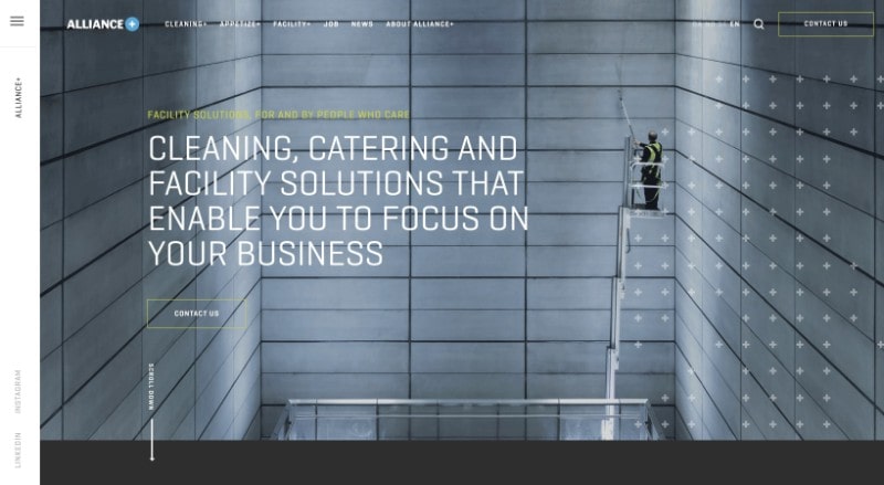
AlliancePlus serves as a great example of showcasing how non-stock photography paired with parallax scrolling can, in ways, create an immersive experience. In this instance, it paints a picture of their employees and clients.
It uses parallax scrolling to scroll particular images down the page which eventually stops in a section further down. It makes users want to continue following them to see where they will end up.
The way they use parallax scrolling on their jobs page in the “meet the employees” section draws the user’s attention to the positive affirmations from their workers, showing how they enjoy working there.
9. Apollo
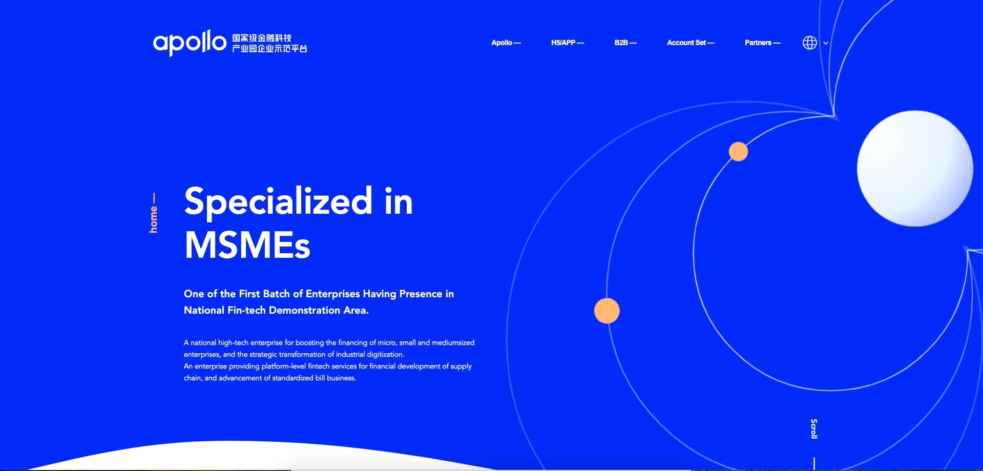
Apollo enhances the animations of their website by combining them with parallax to give the user a sense of control.
Decorative elements in each section move faster when you scroll, giving the website a sense of layered depth. These elements are also the only things that have parallax applied to them, so this acts as a very specific piece of branding on the website.
10. WOTA
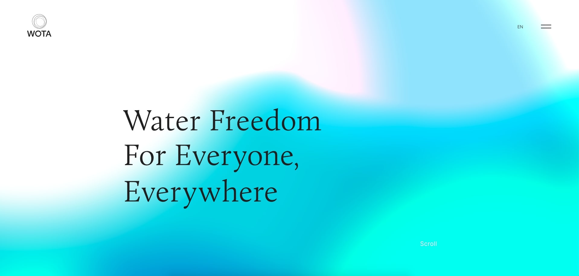
WOTA plays into the purpose of their company by incorporating water-like properties across the website. The most interesting use case is in their product section, where scrolling will distort the images in a way that makes them appear as if they’re swimming underwater.
Parallax effects like this that directly connect to your brand make the effect super intentional; it just seems like it should be used.
11. Kontainer
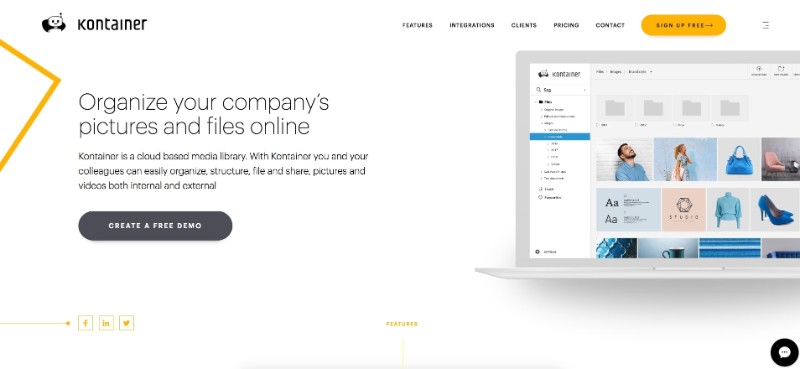
Kontainer uses parallax scrolling in a more subtle way to direct attention to the images of its software. You’ll notice the images in the half-and-half section will slowly move up faster than your scroll speed.
This helps make the half image, half text layout through the page more interactive and draw the user's eye.
12. Hitachi
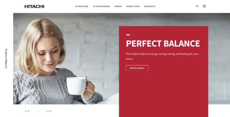
Hitachi, like Kontainer, also uses a subtle implementation of parallax to draw attention to important typography and smaller headers on their pages.
In this use case, much of the parallax is done in a section that has a button or action associated with it. So whenever a section or part of the website has that animation, it creates an assumption that that section might be clickable. This is useful in helping your users dive deeper into particular areas of your website.
13. Boynton Yards
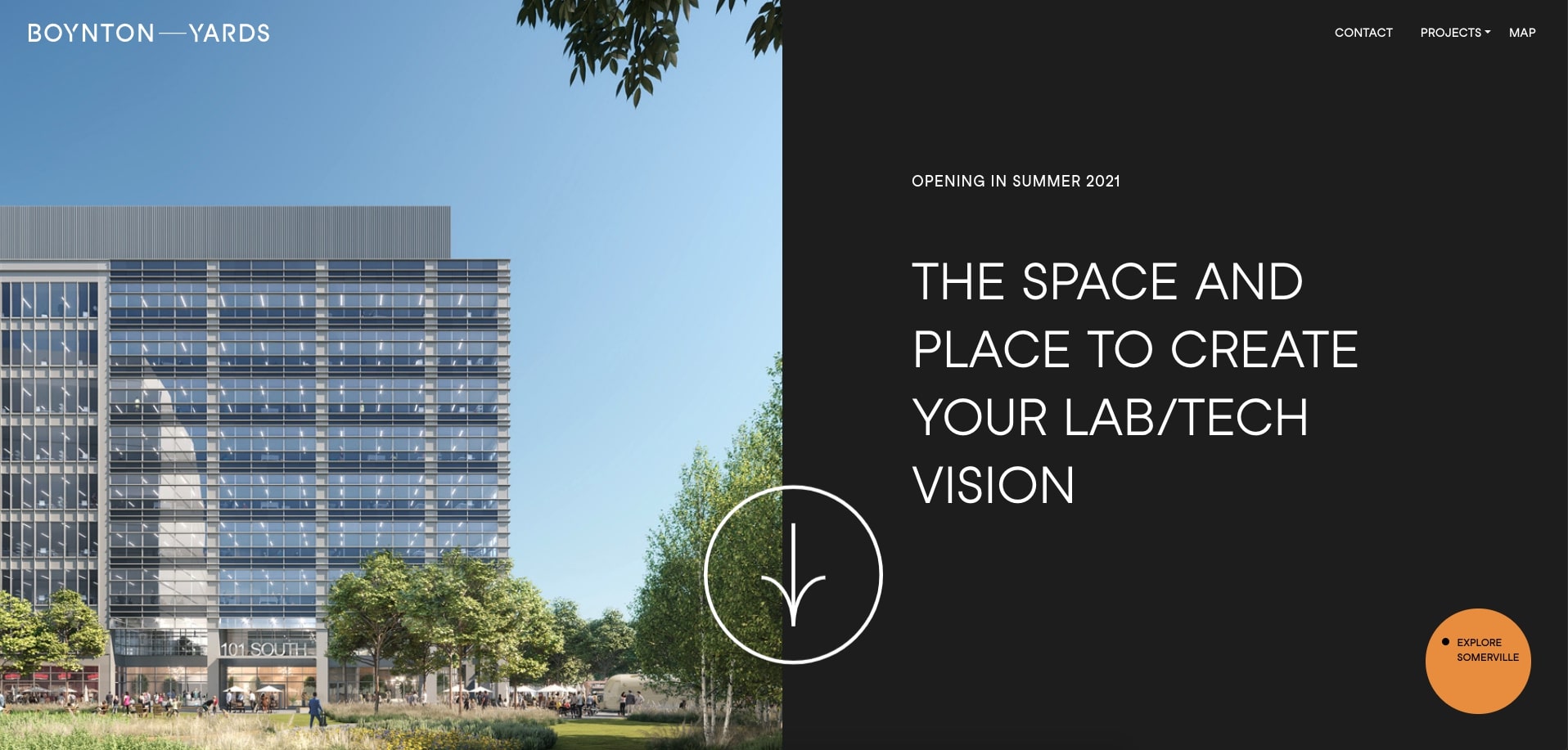
Like other examples, Boynton Yards' use of parallax gives a sense of depth to its images. The sections surrounding them reveal parts of the images as you scroll past.
In specific sections where there’s slow scrolling text with the addresses for the image above that increase or decrease speed and direction when you scroll up or down the page.
14. TEDxBethesda
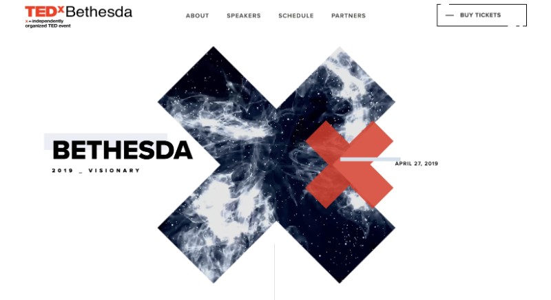
The landing page for TEDxBethesda 2019 plays with the theme of being the visionary and imagining things that are beyond the norm or “out there.”
To mold that theme, they placed the content and other images on the homepage atop of a dotted pattern that always stays present in the background as you scroll.
Even the logo and large “X” images and text in the hero section shifts in position slightly as you move your mouse around the screen.
15. Canatal
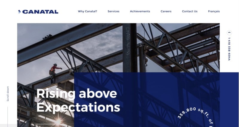
Canatal’s homepage is broken up into numbered sections that help explain some key components that differentiate the company.
As you scroll through the site, sections and images associated with them grow into view as you scroll. The gravitas of these sections also makes it feel like Canatal wants to celebrate the three areas they highlight.
16. Laurent-Perrier
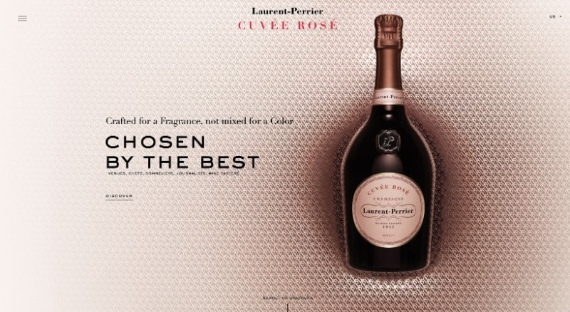
Nearly every single image and text area on Laurent-Perrier’s site has a very slight parallax effect applied to it.
With the sophisticated nature of the site, I find the delicate use of parallax scrolling reminiscent of the slight movement wine in a glass has when you hold it in your hand.
17. La Phrase 5
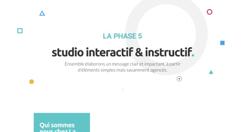
La Phrase 5’s site is composed primarily of smaller, more contained geometric shapes and circles with text and images within them.
Each of these sections moves at different speeds, overlapping one another in the process as you scroll. The style is reminiscent of ones you’ll see more commonly in print design and nicely sections off each aspect of the website.
18. Scrollino®
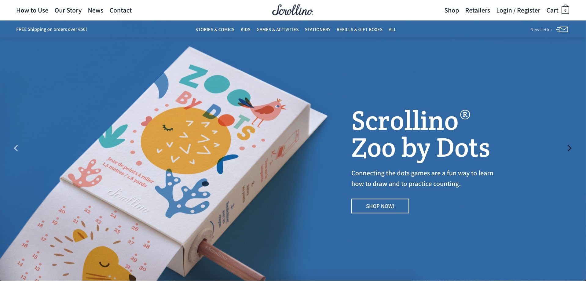
The Scrollino® is described as an “innovative device to read continuous printable editorial or book content.”
Although there are a few videos that show how the product can be used, Scrollino® uses parallax scrolling to animate images of the product. This makes it so users aren't forced to watch videos of the product. Instead, they are educated and delighted with the interaction once they scroll past the areas where the images are.
19. Letter
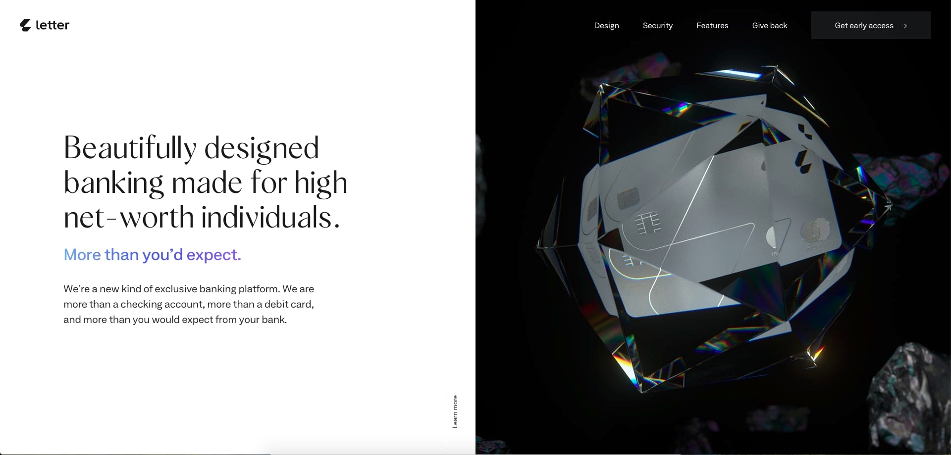
Letter blew me away with their scrolling video animation that occurs when you scroll to the section below the hero. The large credit card, encased in a diamond, bursts out when you scroll, which alone, creates a sense of awe for the user.
This same diamond-encased credit card returns in the “serious about security” section, where it centrally spins as you scroll through the section. These animations add to the luxurious feel of the card, which is especially important since it's advertised for “high net-worth individuals.”
20. McDonald's India
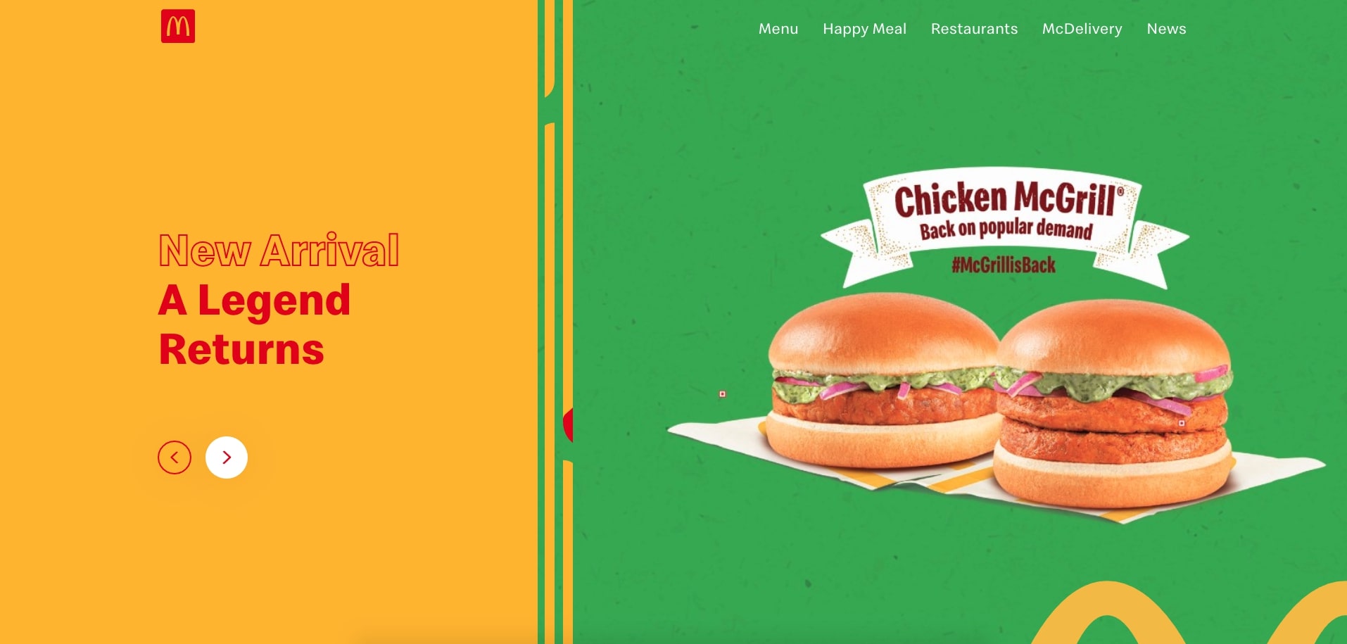
Mcdonald’s India uses parallax throughout each section of their homepage, usually to make the main text areas and features stand out.
I also like how they incorporated the sesame-seed pattern below many of their sections, which plays into these sections referencing the bun of their sandwiches.
21. CodeQ
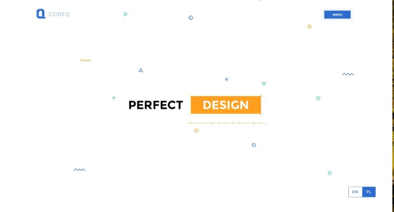
CodeQ, like others, really likes using parallax scrolling to position the images as if they are floating past the static content they are next too.
They also use parallax to create a sense of depth on their portfolio pages by revealing colored layers above and below the portfolio images that spread farther apart as you scroll. This also guides your eye to read the text associated with each project which includes the header that overlaps the images and the description which sits on the right-most side of each section.
22. Cancer Research Foundation
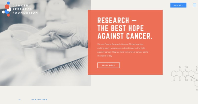
The Cancer Research Foundation has applied a very dynamic and colorful brand to their organization that coincides with the “bold” cures they want their scientists to explore.
To play into the scientific theme of the site, their design incorporates small sketches of research notes and molecule compounds that overlap content as you scroll through. These elements submerge the user further into the story they are trying to convey.
23. Konstantopoulos
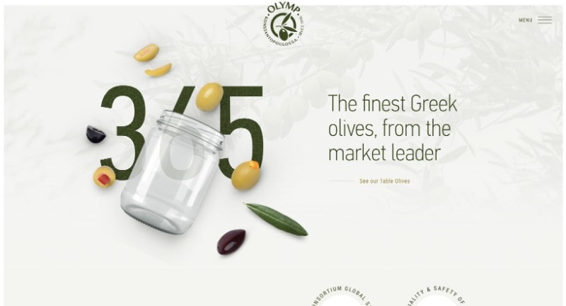
For an olive oil company, it's incredibly important to showcase the olives you use to create your products, and that's exactly what Konstantopoulos does. They’ve placed smaller images of olives, olive leaves, and olive pits delicately across the pages of their site.
My favorite use case is on the production history page. The page offers an interactive scrolling timeline describing the company's history, where those olive plant elements float by as you scroll from date to date thanks to parallax.
24. UBank
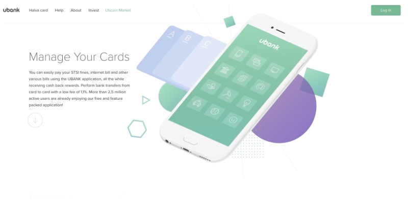
On their homepage, UBank uses parallax scrolling to show the various types of areas and features of their application.
These images of the application fade in and out as you scroll through each section and various subsections contained in each. A small line scrolls with you as you enter each section which helps denote which text area is associated with that image you see on the right-hand side of the page.
This interactivity acts as a high-level tour of everything the application has to offer, which helps the user better retain information about the app before they even use it.
25. Smith Institute

Smith Institute is a team of experts that bring insights and solutions to mathematical and engineering challenges. On their “about” page, they use parallax on the years of their timeline to highlight the milestones they’ve hit over time.
The slow scrolling years and icons in the background bring a bit more context to the points where they had the biggest achievements happen. They also draw a vertical line connecting to each year they pinpoint in the timeline which lets the user know they need to continue scrolling.
26. NeaMedia
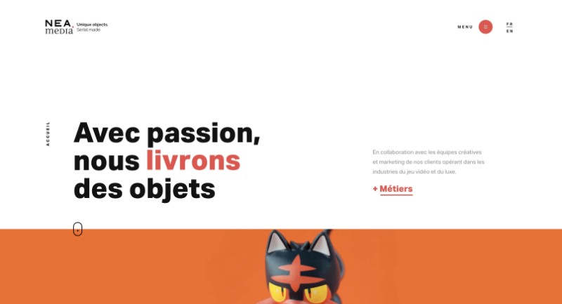
NeaMedia is a company that creates 3D sculptures and figurines, so it only makes sense for them to get up close and show their work and detail that goes into them.
To accompany that, NeaMedia uses parallax on all of their images to add emphasis and attention to the incredible work they do.
27. Upper
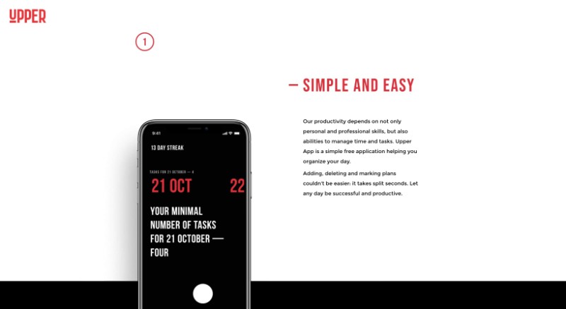
Upper is a simple productivity application that can be downloaded on your mobile device to help manage your work and motivate you to keep up with it.
Towards the middle of their features page, Upper uses parallax to show the various color display options you can use in the app with floating examples of different UI variants in the background. This lets users better understand the different options and possible experiences before they even download it.
28. NooFlow
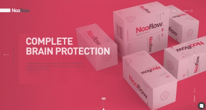
NooFlow, a health supplement company, truly believes their product is going to be the solution to amplifying your performance and knows its website needs to be able to represent that.
To achieve this, NooFlow parallaxes pictures of the product, ingredients, or pill depending on the page you are visiting. Again, this acts as a fantastic way to highlight the product and draw user eyes.
29. Vanguard Prague
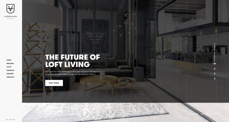
Vanguard Prague, an interior design company from the Czech Republic, has helped facilitate the luxury and forward-thinking design of loft living throughout the Prague area.
Their use of parallax scrolling highlights granite textures, text, and imagery allowing users to paint the picture of what type of product Vanguard might give them if they choose to hire them.
30. Packwire
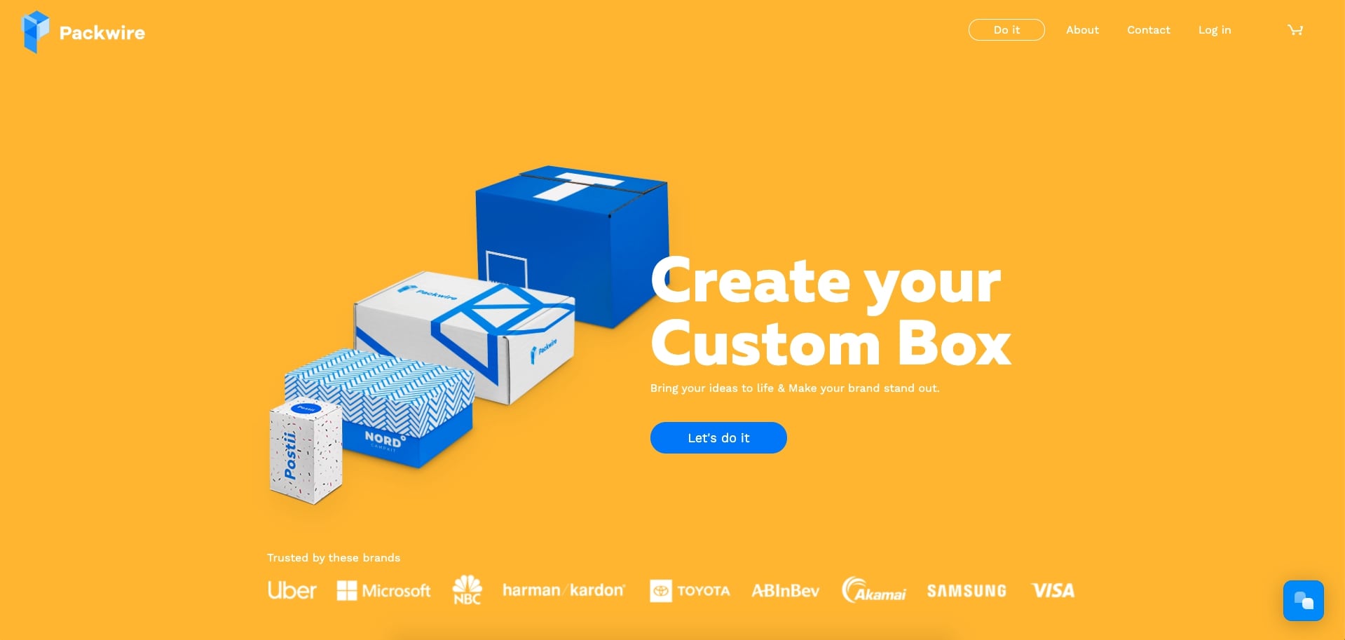
Packwire, a custom packaging company, has a variety of box sizes you can use to create the perfect option for your needs.
The homepage features a few of the options in the hero area. With parallax, these boxes animate and move into a more spread out position to reveal the box size's name and feature. They also each have a bright yellow ‘“customize it” button to get you started on selecting which box is best for your shipping needs.
31. WebFlow
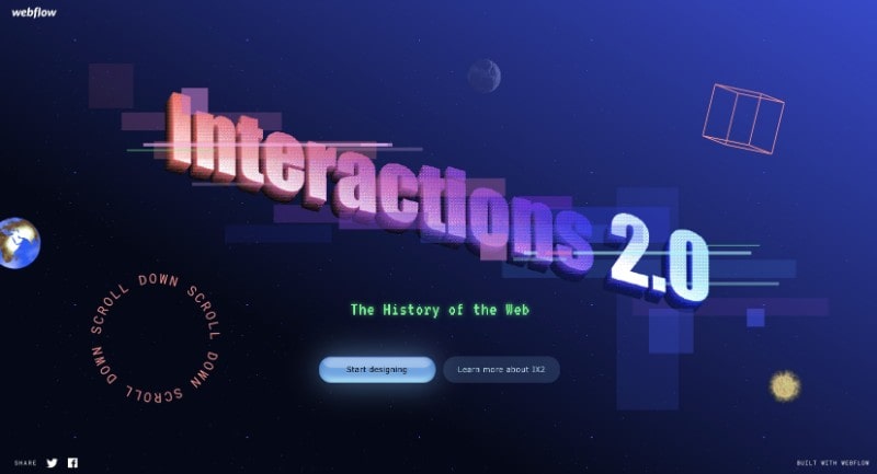
Have you ever wanted to go back in time and be reminded (or learn) what the web used to look like and how it has progressed? Look no further than CMS WebFlow's site.
They take you on a journey through the history of the web, scrolling through a variety of elements that transition into the modern-day design as you get closer to the bottom of the page.
Key takeaways
Parallax scrolling certainly offers a variety of advantages to the user experience and may even help better attain some of your website marketing metrics when executed properly — but this technique isn't for everyone.
Depending on your target audience, your users may find the effect too distracting or even annoying, so make sure to test its effect on a smaller scale and receive feedback before proceeding with any large-scale UI changes for this. And more than anything, make sure that it aids your messaging and conversion goals, not hurts them.
Free: Assessment
/Assets/Icon%20Library/Arrows/Grey%20Arrow%20-%20Prev.svg)
/Assets/Icon%20Library/Arrows/Grey%20Arrow%20-%20Next.svg)