/Assets/base/Navigation%20Icons/TAYA.svg)
/Assets/base/Navigation%20Icons/Sales.svg)
/Assets/base/Navigation%20Icons/Web%20design.svg)
/Assets/base/Navigation%20Icons/HubSpot.svg)
/Assets/Icon%20Library/AI%20Mastery.svg)
/Assets/Icon%20Library/Learning%20Center%20Laptop.svg)

Aug 2, 2019
/Assets/Icon%20Library/x%20corp.svg)
/Assets/Icon%20Library/whatsapp%20logo.svg)
/Assets/Icon%20Library/Email.svg)

Way back when, in my former years as a graphic design student, I had the opportunity to not only take a number of computer-based graphics classes but traditional art classes as well.
See, the thing is, you can’t go off applying concepts to elements in a design without a solid understanding of the core fundamentals of art and design. Most notably, color.
I learned about color theory in Painting I.
With my rolling, glass-top palette, oil pants, mineral oil, and a trusty palette knife, I learned everything I know about color by mixing the basics into what I needed.
We started color mixing with two simple rules, no mixing with white, no mixing with black, not until we learned to mix color with color.
The reason? Black and white effect the tint and shade of a color so dramatically, you’d likely end up with one big muted mess.
Even when you did perfect the proper restraint levels, it was always a dicey move, especially with black. Why? Black is simply that powerful.
Color can often speak louder than words. It’s the first thing you notice about a design, it evokes immediate emotion and sets the tone for all other supporting elements.
“People make a subconscious judgment about a . . . product within 90 seconds of initial viewing and . . . between 62% and 90% of that assessment is based on color alone.”
Being able to successfully understand and implement color in your marketing and design can change behavior. This is no more true than with, arguably, the strongest color there is - black.
But wait, is black even a color?
Valid question considering black isn’t even on the color wheel.
There are a couple of different philosophies on this. The first is scientific.
According to physics, black is not a color because it doesn’t have it’s on specific wavelength in terms of visible light.
Each color on the spectrum has its own specific wavelength, black does not have a wavelength because it is considered the absence of all light.

Image via ScieneStruck.
Ok fine, science has a point.
But, if you open up any box of crayons, you’ll see black, pink, and even macaroni and cheese, none of which have these wavelengths, but we still perceive them as and consider them “colors.”
Black as a neutral
We know from Ashleigh’s earlier article on the color red, that there are three primary color/emotional categories to consider when selecting colors for design: warm, cool, and neutral.
Black is a neutral color, which is often used to “stabilize” or subdue more vibrant colors that run the risk of being overpowering.
Because of these stabilizing properties, black can feel very powerful.
Black can be associated with being elegant, formal, slick, modern, or luxurious.

The WWF logo, for example, is formal with a refined elegance that will always remain modern.

The Nike swoosh’s action forward form is both slick and modern.

The logo for the New York Times is timeless and traditional.
Consumers can notice black being used on websites that sell high-end, luxury, or elite items.
The high contrast that black provides, allows certain page elements (like backgrounds) to recede, so that the user’s focus can remain on product photos without the overall layout seeming fussy or overdone.
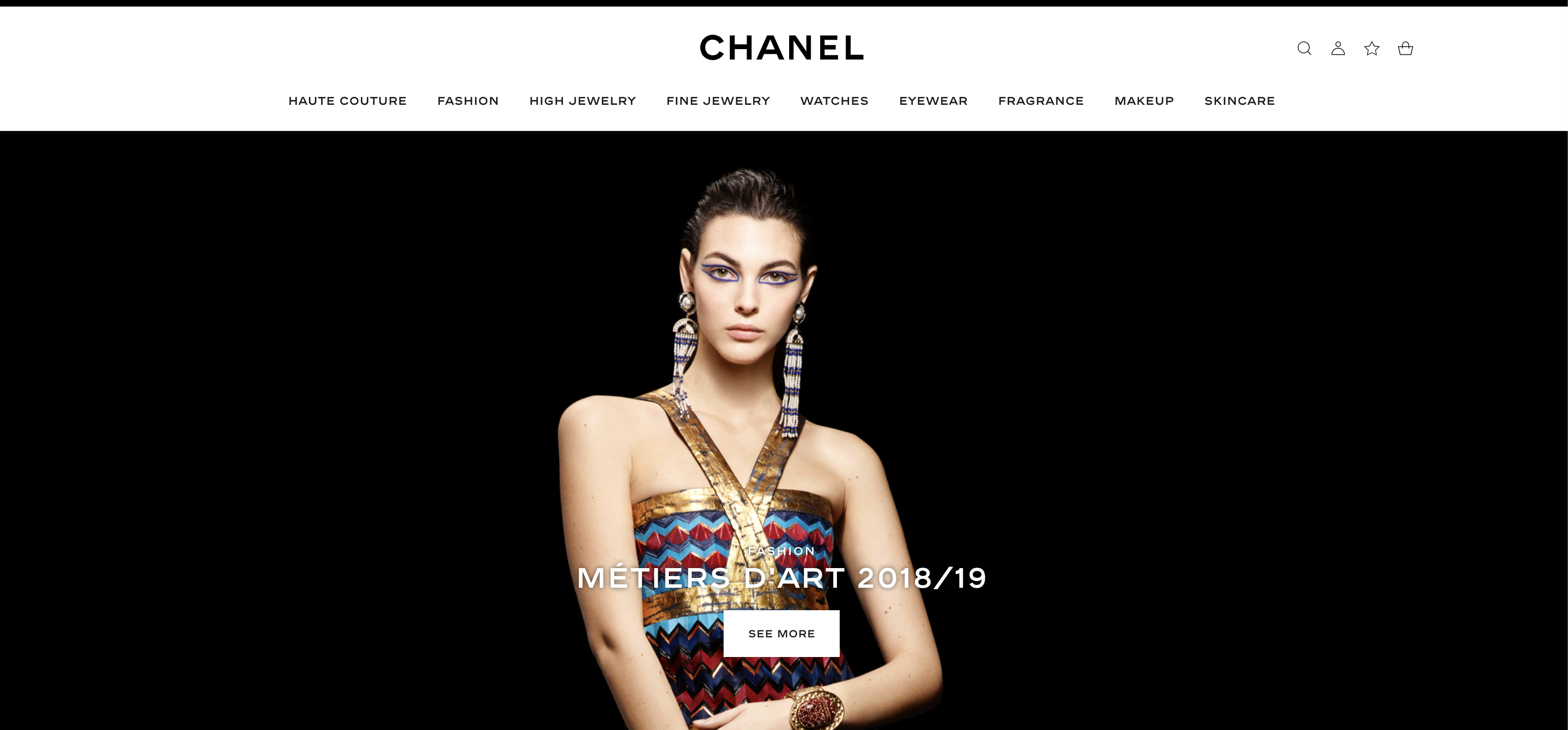
In the above example from Chanel, traditional website elements like the logo, navigation, and background fall away from focus so that the user concentrates on the vibrant product photo.
On the other hand, black has some very negative connotations. In North America, black is often associated with evil, death, or mystery.
Using black in support of additional elements can exude elegance, while too much black can be outright grim and uninviting.
So, how should you use black?
Successful Uses of Black in Marketing and Branding
Black is most regarded for its very functional design aesthetic. It’s often used in situations where high-contrast and legibility are the most important factors.
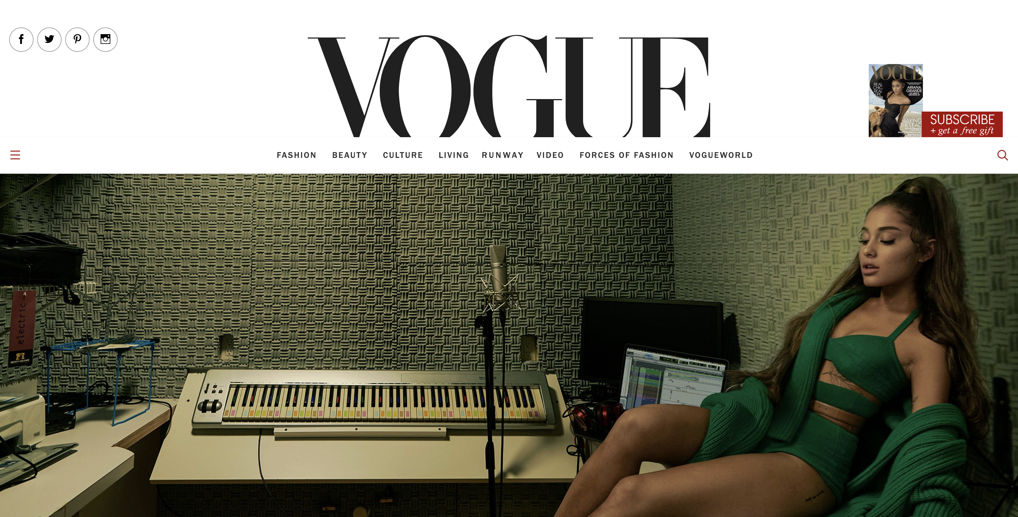
In this example from Vogue, we can see how these functional design principals translate from a traditional print publication where legibility is of utmost importance, to the web.
For instance, their logo is large, bold and takes center stage, similarly to its use on printed magazine covers. Their menu mimics the hierarchy of type in articles, serving as more of a headline as opposed to secondary body copy.
This is why most word processors default to black text on a white page and also why luxury brands keep their visual identities simple, yet extremely bold.
Unlike some more connotational colors like orange or red, black is versatile making it applicable to a variety of different industries.
Let’s take a look at how some brands have used black successfully in their marketing and branding.
Black in Logos
1. Tiffany & Co.: While Tiffany is more universally known for its “Tiffany Blue,” it also uses black in its logo to show simplicity and luxury. It’s also subtle, ready to fade into the background when up against their stunning jewelry. Black here promotes sophistication and refinement. 
2. Apple: The use of black in the Apple logo implies modernity, innovation, minimalism, and bold thinking.
These are all traits the modern consumer has come to rely on Apple products in their daily lives.

3. Gillette: Combined with such a strong typeface, Gillette’s use of black strikes the viewer as incredibly masculine. The color allows the brand to be viewed as indestructible, strong, and hardworking.
![]()
4. Chanel: Similar to the usage in the Tiffany logo, Chanel utilizes black as a pure neutral, serving as a way to enhance their products, showing that they are anything but basic. This logo is bold luxury, which is consistent with the brand’s values.
![]()
5. Playboy: The use of black in Playboy’s logo is extremely interesting. They are playing both sides of the emotional coin. On one hand, the brand is perceived as very high-end and glamorous while, at the same time, they are also incredibly mysterious.

Black in Websites
Just how the logos above have utilized black to convey emotion and qualities, the following websites have employed the color black to inspire action from their users.
1. Code and Theory: The use of black in the Code and Theory website sets a bold and modern tone. Since Code and Theory provide agency design services, these underlying tones speak to their aesthetic and the end-product the user can expect.
Black has been used here to create a stark contrast with the white text, the only other element on the page, completely commanding your attention.
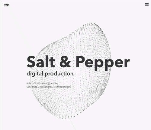
2. SNP: Similar to the example above, SNP utilizes black to set a bold and modern tone for their site and brand.
Since SNP specializes in digital production, using advanced programming languages to execute projects for their clients, the modern tone set by the color black is very much in line with their product and the services they deliver.
Combined with an interactive, animated element that provides the same stark contrast, your eye is drawn specifically to the text, beginning the user’s journey.
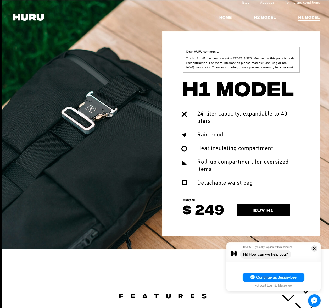
3. HURU: This example uses black in a very authoritative and traditionally “masculine” way. The color black combined with the bold, blocky typeface is extremely commanding, which mirrors the tone of the product pictured behind the high-contrast text box.
The tone of these elements not only mirrors the product, but it encapsulates the image their persona wants to identify with.
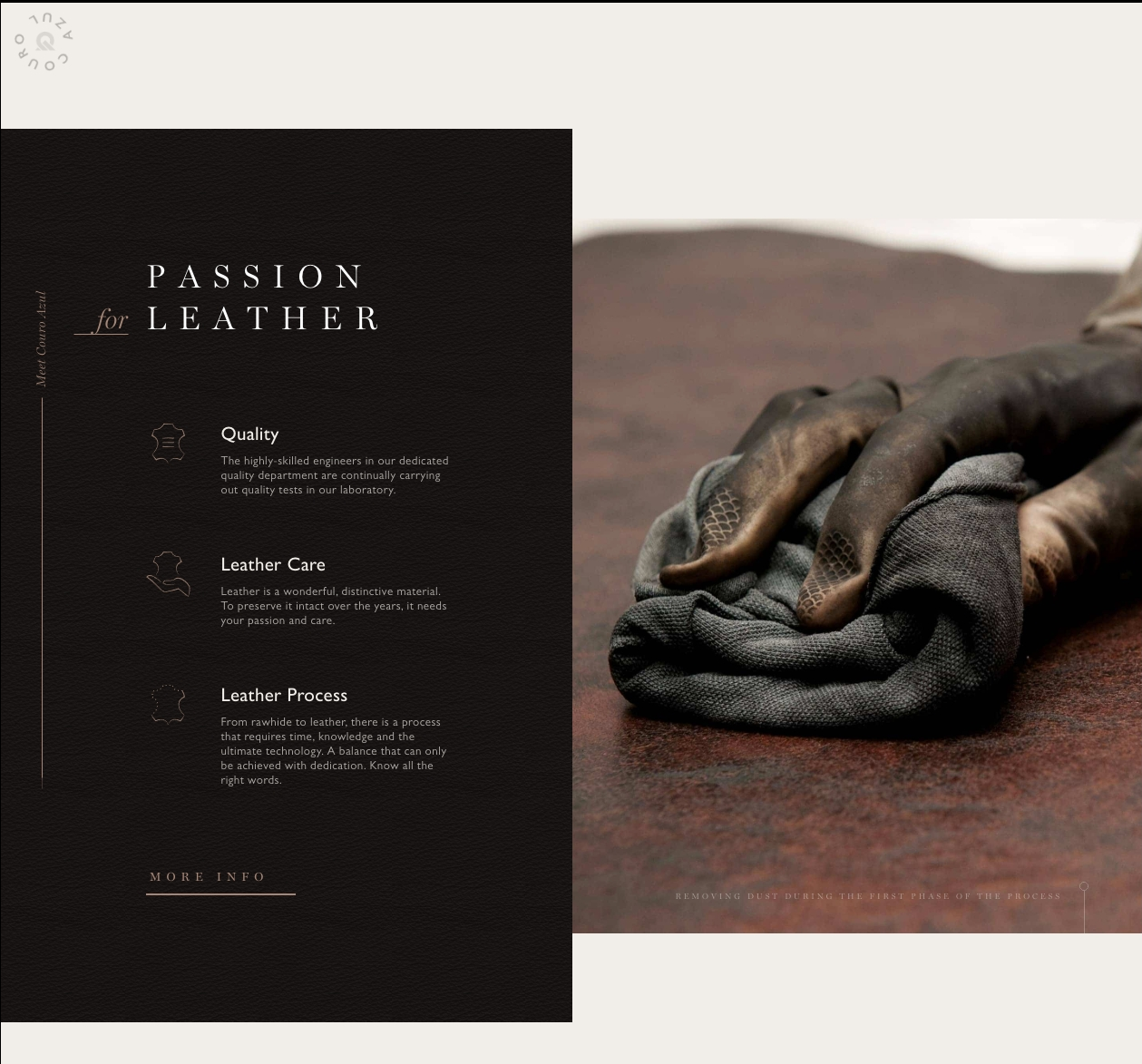
4. Couroazul: Very similar to the luxury brand logos mentioned earlier in the article, Couroazul utilizes black to exude affluence and a sense of exclusivity, which is important for a high-end leather company.
Combined with photography that also focuses on high contrasts, the color black serves as a grounding neutral for the elements on the page.
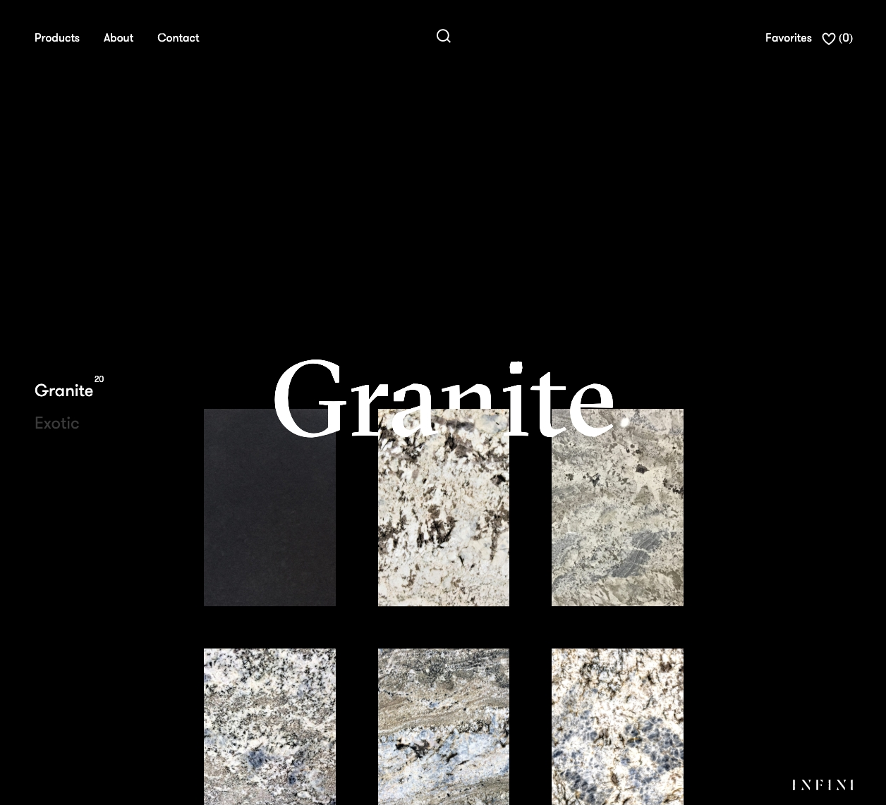
5. INFINI: This example relies on the color black to create a neutral background that puts their product front and center for the user.
Since this product will eventually be used in a user’s home, the neutral background allows the user to picture the product in their own space as opposed to an artificial space created by more intricate photography.
The use of black here as opposed to white pulls out smaller, more intricate details of their stone products and provides the user with an overall feeling of luxury, which they will want to translate into their own homes.
The Color Black & Conversion Rates
Color is arguably the most important element when constructing calls-to-action (CTAs).
CTAs exist to draw the user’s attention and convince them to perform a desired action. The best way to do this with color is to make sure you choose one that contrasts any other element on the page.
Black is an easy go-to color to accomplish this because of its ability to provide high-contrast with large majority of colors.
While it isn’t appropriate to use in every situation (you have to take corresponding page elements into consideration), it is a quick way to draw attention to a clickable action on a page.
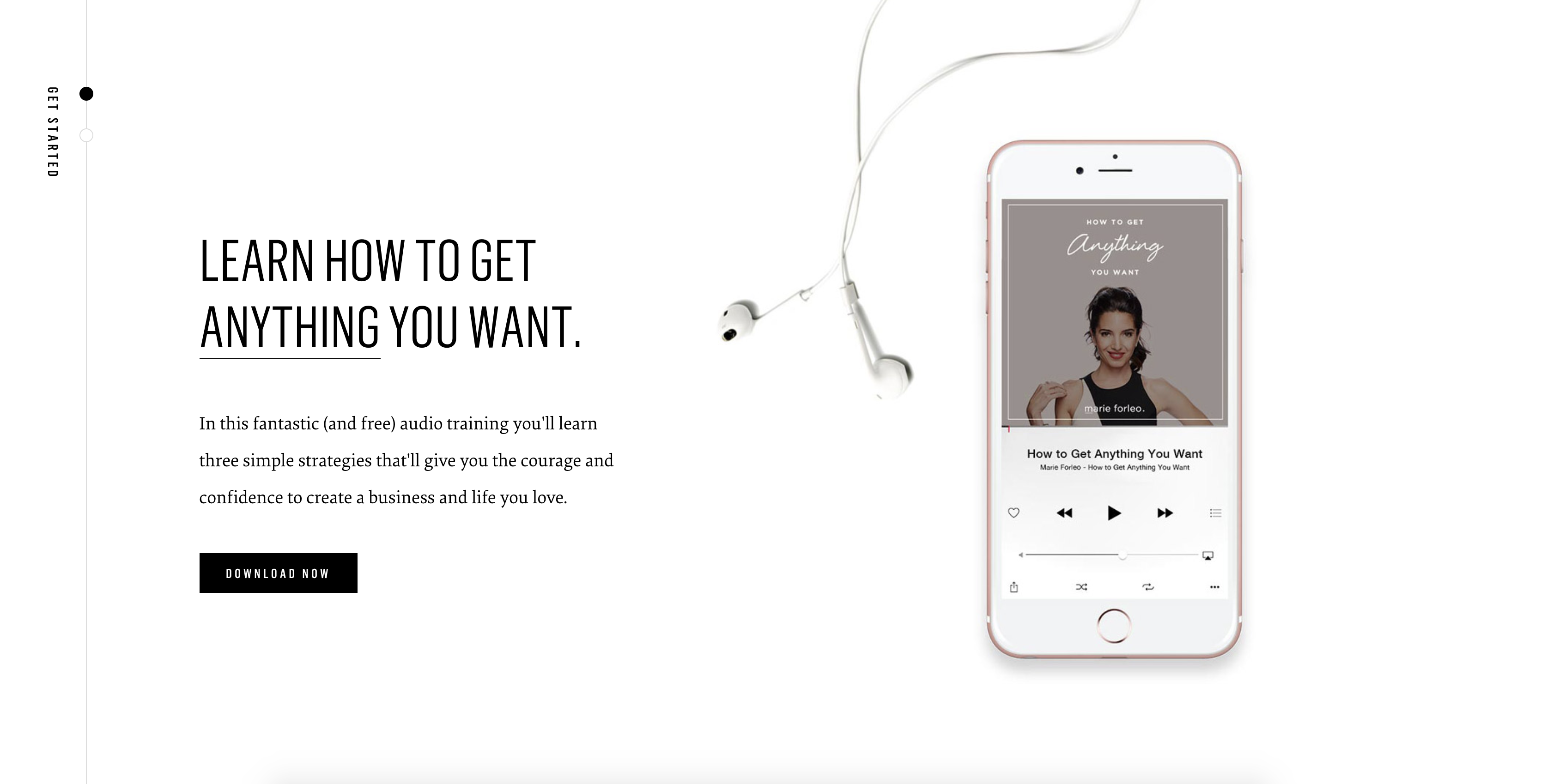
In this example, Marie Forleo has utilized a black in a CTA very effectively.
By choosing to use a black button, she stayed on brand and provided the highest level of contrast possible against all other elements on the page. The button has been provided with ample white space and the button text is equally as contrasting.
When to Avoid Using Black in Marketing & Branding
While we’ve highlighted some excellent examples of the most effective ways to use black in design, there are times when it simply isn’t appropriate.
1. In already dark design
Specifically dark backgrounds can reduce readability. Light text against a dark background can strain a user’s eyes, making for a less enjoyable user experience.
As always, accessibility concerns should also be taken into consideration.

In the example above, you can see how white text in a dark layout can go wrong.
The text is not large enough and there is far too much of it. Furthermore, there is not enough line-spacing to make the text completely legible.
If you are planning to utilize light text on a black background, provide plenty of white space and make sure your text size is appropriate given the font style (for example, thin text versus block text).
Furthermore, as we’ve discussed throughout this article, black is one of the most contrasting colors available to a designer. This contributes to its powerful, attention-grabbing nature.
When utilizing black in a design, be extremely intentional about its use. Applying the color to every element on a page will call attention to everything, and therefore nothing.
Reserve black for section backgrounds, important text, or bottom of the funnel calls-to-action, but do not utilize all of these elements in black in the same section. .
2. In particular industries
There are specific industries that often utilize black to communicate the raw emotion that the color often evokes, but others may want to be careful to completely avoid large doses of the color.
For example, black would be perceived with negative emotions in the wedding dress industry.
3. With particular audiences
Similar to use in particular industries, black may not be appropriate with particular audiences. Again, black is the color of mourning in many cultures. If not used strategically, this sentiment could be evoked with audiences that know of the color in that context.
Considerations when using black in your marketing & design
While black can be an asset to the emotion your brand wants to convey, you’ll want to be careful when utilizing the color in your designs.
Pairings
Be mindful of its pairings with other colors. While black can help enhance colors it’s paired with, sometimes that contrast can be too effective.
Take black and orange, for example, not only are you going to get some spooky Halloween vibes for many individuals, but when these two colors are paired together, they make the other brighter and more prominent.
 In this example, you’ll notice how black and orange elevate each other, making both colors much more commanding than they would be on their own.
This fight for the user’s attention could lead to ineffective design when you consider implementing them on CTAs.
Strategy
Think about how you’d like to use black.
Will it be a primary color in your design or simply an accent?
Depending on your usage you’ll want to take care in how you use other elements in the design. Notably, whitespace and typography will need to be treated much differently depending on your usage of black.
Competitors
Lastly, take notice of others in your industry.
How are they utilizing the color and what type of emotion does it evoke? If competitors aren’t using the color at all, is it conveying the appropriate emotional response from users?
Taking your competitor’s color usage into account can help determine how you may be perceived and if you’ll stand out.
Our brains prefer immediately recognizable brands, and color is a primary component of creating a brand identity. Depending on how you want to position yourself against direct competitors, you may want to deviate entirely, or conform to their color usage.
In the End, Use Black Responsibly.
In general, using the color black in design can greatly impact your efforts in gaining your user’s attention. You just want to be sure this impact is always as you intend and that it enhance your overall message.
So, go for it.
Go high contrast and use black, but make sure it’s appropriate for your application and your industry. Don’t forget to recognize how other elements in your design interact with the color and make the appropriate adjustments.
Black is an extremely powerful color, use it for good.
Free: Assessment
/Assets/Icon%20Library/Arrows/Grey%20Arrow%20-%20Prev.svg)
/Assets/Icon%20Library/Arrows/Grey%20Arrow%20-%20Next.svg)