/Assets/base/Navigation%20Icons/TAYA.svg)
/Assets/base/Navigation%20Icons/Sales.svg)
/Assets/base/Navigation%20Icons/Web%20design.svg)
/Assets/base/Navigation%20Icons/HubSpot.svg)
/Assets/Icon%20Library/AI%20Mastery.svg)
/Assets/Icon%20Library/Learning%20Center%20Laptop.svg)

Jul 3, 2019
/Assets/Icon%20Library/x%20corp.svg)
/Assets/Icon%20Library/whatsapp%20logo.svg)
/Assets/Icon%20Library/Email.svg)
![LuckyOrange Review: The Best Heat Map Tool in 2019 [IMPACT Toolbox]](https://www.impactplus.com/hs-fs/hubfs/blog-image-uploads/impact-toolbox-june-2019-0.jpg?length=1200&name=impact-toolbox-june-2019-0.jpg)
If there’s one thing marketers are spoiled with, it’s the sheer number of tools available to help us do our job better or more efficiently.
It’s both a blessing and a curse, as deciding on the right tool can be outright exhausting (part of the reason why I started this series).
However, when it comes to heat map tools (also called click maps), there are only a handful vying for best-in-class.
Today, I’m going to help you pick the best one for your website.
This article is part of our IMPACT Toolbox series.
With IMPACT Toolbox, we discuss all of the latest (and even underrated) marketing tools that you need to try. We make recommendations by category, helping you figure out what tool is best for your situation, and introduce you to tools you may not have heard of otherwise.
Have questions about a marketing tool, whether or not we’ve reviewed it?
Reach out to us and we’ll see how we can help.
Editor’s Note: The tools on this page and links therein may provide IMPACT with compensation for signups. This in no way affects IMPACT’s recommendation of the tools.
What Are Heat Maps?
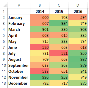
Heat maps are diagrams that use color/intensity to represent data values. This could be as simple as an Excel sheet with colored cells.
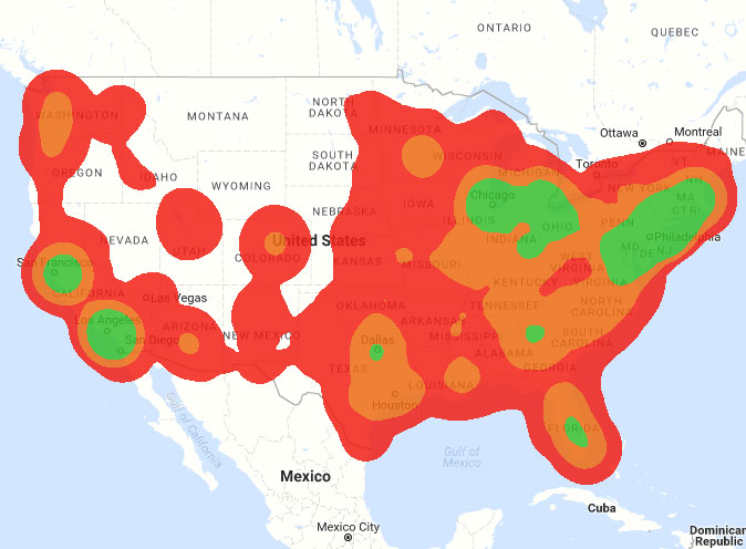
Or as complex as an overlay on an actual dynamic map.
Because of this, they make a large volume of data easier to understand.
Instead of looking through a table of numbers showing various locations, a heat map allows you to quickly discern where the highest concentrations of something are.
You’ve probably seen them before while checking out the weather. Different colors represent different categories or higher concentrations.
For the weather, that may different types of precipitation.
For websites, heat maps show which areas of your site get the most attention and/or clicks. And that data can help guide updates and changes to your website.
For a deeper dive, IMPACT’s Facebook Ads Guru Ali Parmalee discusses heat map analysis more in-depth.
What To Look For in a Heat Map Tool
While some of these criteria are similar across marketing tools, their importance varies based on the purpose of the tool.
For example, aesthetics is more important for tools you use on a regular basis or spend a lot of time using. You don’t want to be stuck looking at something that is confusing or ugly for extended periods of time.
Meanwhile, data reliability is always important.
Let’s look at all of these key factors as they pertain to heat maps.
Data Reliability
When it comes to heat maps, the most important criteria is the reliability of the data.
When making decisions based on attention and clicks on your website, you need to know that what shows up on a heat map is actually where users are interacting.
In the case of heat maps especially, if you attribute clicks and attention to the wrong parts of your site, you could completely upend what is actually working and what isn’t. You would essentially be doubling down on an unknown, and that would be detrimental.
You need to know that the data you are making decisions based on is reliable.
Ease of Use
If your tool is difficult to use, you’re probably not going to use it.
That means you’re wasting money and missing out on the insights you could be getting if you used a different one. Even if it’s the best rated tool, you need to use the best tool for you.
Admittedly, this criteria is a bit more subjective (although still valid). I think of the following when considering Ease of Use:
- Was I able to use this tool without digging into Help/FAQs/documentation or googling an answer?
- Was it intuitive to find what I was looking for? In other words, did I need to dig around in menus or change some strange setting to get it working as intended?
- If I couldn’t rely on a product and development background, would I be able to use this?
I lean heavily on the fact that I spend most of my time developing websites and the interactive interfaces behind them. So, I am consistently thinking about how to make web content easier to use and understand.
For a heat map tool, there are two main ways to show data that can greatly affect how easy it is to use.
Most tools use a screenshot, with the heat map data overlaid on it.
That’s helpful, but can be confusing if you have interactive or dynamic elements (navigations that expand/collapse, pop-ups, etc). It’s hard to differentiate those elements with a static screenshot.
A few tools use a dynamic heat map, which shows over an actual view of the web page. So as you interact, scroll, and change the width of the screen, the overlaid data changes with it.
In my experience, dynamic heat map tools also provide the most reliable data.
Aesthetics
On a related note, all other things equal, if you can’t stand looking at your heat map tool, you’re not going to use it. Function is still most important, but form can absolutely make a tool easier and better to use.
Analytics and Data Reporting
So the data is reliable, now how do you access it? It should be well-organized, and easy to browse and get insights.
Integrations
Does it play nicely with other tools and platforms? More importantly, the ones that you use? A strong integration can amplify the insights pulled from a tool, and particularly so in the case of heat map tools.
If you are stuck manually exporting and importing data, or comparing multiple browser tabs all the time, then chances are you will use one of those tools less (or quickly jump to an alternative that does integrate). Well-integrated tools will each use relevant data from the other to save you time and effort.
This can vary greatly depending on which tools you currently use and what will fit better into your workflow.
More integrations are generally better, although higher quality (more useful) integrations outweigh quantity of integrations.
When it comes to heat maps, a good CRM integration can close the gap on exactly what someone is doing on your website. This empowers you to have more effective conversations with your prospects, as you can see in greater detail what they clicked on and some of their hesitations in the recording.
Heat map CRM integrations also let you filter down your contacts and review how different segments are doing on your website, so you can focus your website revision efforts on things that would benefit a particular segment of your audience.
Additional Features
The goal of a heat map tool is to see where and how users are interacting with your website.
Other features that can supplement that include user recordings (viewing the site as an actual user), live chat with users on your site, form and polls data, and audience data (like Google Analytics, but based on the data your tool is gathering).
These additional features can help complete the picture of a heat map, giving you a more well-rounded picture of your visitors.
Let’s say someone clicked on a particular button after scrolling to a certain point on the page. Maybe they read the page once through then clicked on the button. Or maybe they were flipping between sections, trying to determine which button to click. Or they clicked one button, realized it was a mistake, and went back to click the other
A heat map alone doesn’t tell that whole story. But combining user recordings, live chat, page surveys, and other features can.
Pricing
Since most of these tools don’t break the bank, we considered bang-for-your-buck more than an absolute cost comparison.
Contenders for the Best Heat Map Tool
Now that you know what to look for in a heat map tool, which is right for you? We tested Hotjar, Lucky Orange, Crazy Egg, VWO, and Full Story.
Across all of our criteria, LuckyOrange is comparable or better than the other contenders for this category.
That’s why it is the heat map tool we use for IMPACT’s website and the tool we recommend to our clients.
It’s straightforward to use, inexpensive, and provides a lot of great data to learn about your audience and how they interact with your site.
Let’s look at each section a bit deeper.
Data Reliability
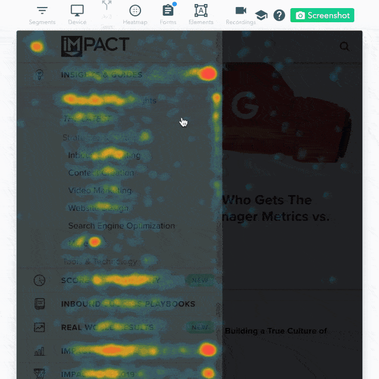
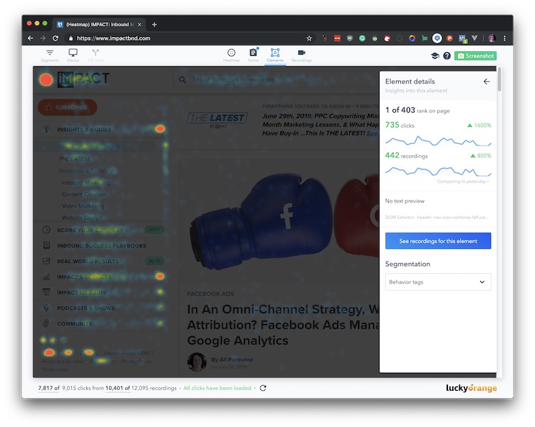 Heat map of IMPACT’s home page - most people interact with at least one part of our main navigation sidebar
“I’m most drawn to Lucky Orange because of their dynamic heat mapping tool. This is extremely useful for websites with elements users are interacting with (such as popups and sections that expand and collapse with content). Now I’m able to see how users behave within these elements, rather than guessing with a static heatmap.” - IMPACT’s Creative Lead and CRO Expert, Christine Austin
LuckyOrange has a number of tools, but the heat mapping tool takes the cake.
Many heat map tools (including others on our list), generate a static image with a heat map overlay.
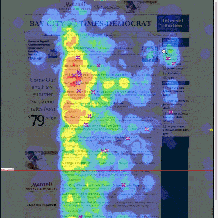
This is an example of a static heat map which overlays a screenshot of the website (attribution)
While still useful, that can get clouded if you have interactive/dynamic sections.
For example, if there are a high number of clicks about 40% of the way down the page, can you tell if those are actually for the page or because of your subscriber pop-up? With an image, there’s no good way to know.
Dynamic heat mapping makes the data LuckyOrange provides more reliable than a static image, because you can tell exactly how people are interacting with your site given what’s actually on their screen (and yours).
This is LuckyOrange’s heat map, which updates dynamically based on interactivity
Ease of Use
Setup is simple for all of these tools: add a snippet to your site, either within the code itself or within the designated area for your website platform.
Then you’ll start gathering data from your visitors.
Once installed, there’s some basic setup you can do under Settings, but you can probably leave the defaults until you have some time under your belt.
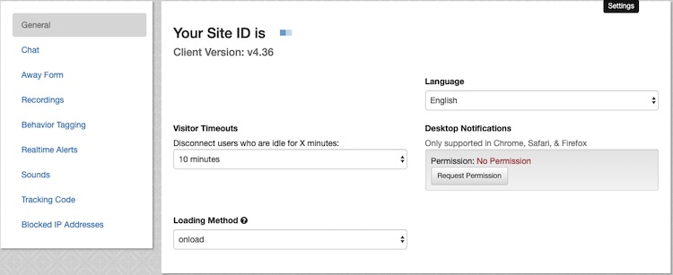
Things like “Visitor Timeouts,” which controls how long to wait to disconnect a user after they are idle (so you aren’t gathering lots of unimportant information) will vary based on your use case (ours is set to 10 minutes).
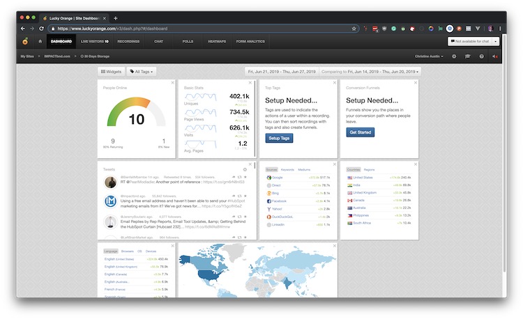
After setup, you can start interacting with LuckyOrange through the dashboard.
You’ll notice all of the features are accessible from the top menu bar, and then you can customize the dashboard with various widgets (we aren’t using all of them yet).
The first time you use the heat map, you’ll get a guided walkthrough. It’s only a few steps, and the interface is mostly self-explanatory.
Aesthetics
To be honest, the dashboard and menus look a little outdated, although they get the job done.
The textured background feels almost skeuomorphic, and the screen density is skewed (too cramped in part of the screen, very open in others) making the information difficult to digest.
And none of this might come up at all if it didn’t clash with the design of their heat maps interface.
The heat maps interface looks and feels excellent by comparison. You can tell where their design time is focused.
Everything has a light background, with a few areas of color to draw your attention without overloading you. The rounded corners are less jarring than the sharp edges of the dashboard menus, and there are clearer visual cues for where you are and what you are doing.
This is particularly important for this part of the tool, as a heat map can feel a bit overwhelming with so much data and interactivity going on.
The design across the board is good enough that it doesn’t take away from the toolset, although I am hopeful that the dashboard and other menus get a makeover to bring them up to par with the heat maps interface.
Analytics and Data Reporting
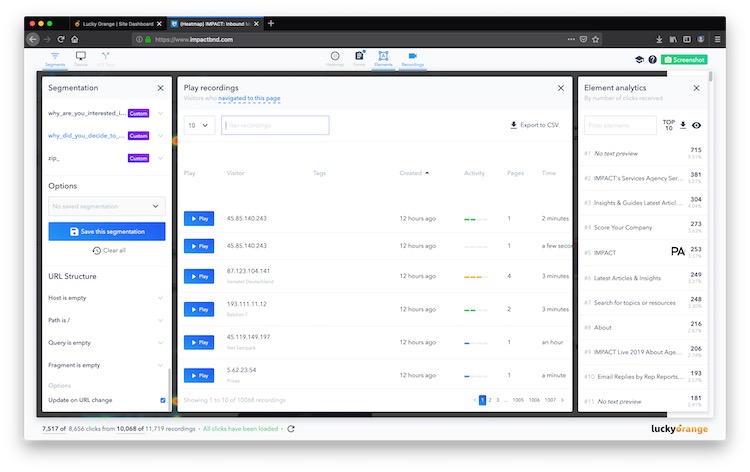
The main analytics tools available within LuckyOrange are for their heat maps and recordings.
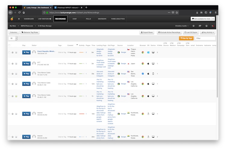
Recordings show you the actual view that your visitors had while they interacted with your website (adding that additional layer on top of the heat map aggregation).
Recordings are viewed individually in a spreadsheet-like interface, and you can filter and select users that visited certain pages, from specific locations, UTM parameters, and more.
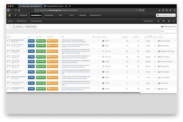
In addition to the high level view on your dashboard, the Live Visitors tab gives a snapshot of the data across all of the tools that is available per live visitor.
You can open a heat map by entering a URL into the Heatmaps tab, or clicking on the “Most Visited Pages” or “Recently Viewed Heatmaps” lists. This opens a new tab where you have access to the heat map interface shown above.
Heat maps are, by nature, aggregations of data per page, but again, you can also segment these as well.
Date range, behavior, source, custom fields, and URL structures are all available so you can see exactly how different groups of people are interacting.
LuckyOrange keeps unlimited heat maps and recordings over the last 30 days (you can increase that timeframe by contacting them and paying a bit more).
Integrations
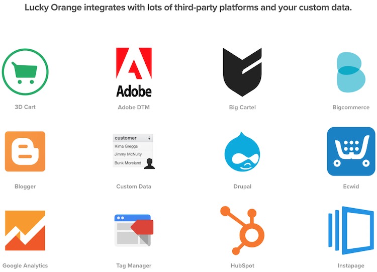
LuckyOrange integrates with many of the largest sales, marketing, and website platforms, including the killer one for us, HubSpot.
With this integration, you can view recordings, heat maps, and other conversion and account data on a HubSpot contact level.
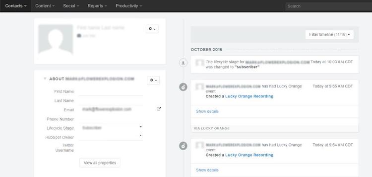
For instance, did someone schedule a call with your sales team? Check out their recording prior to the call to see exactly what they were looking at so you can provide them maximum value.
Find out where users dropped off in your conversion process and optimize your site to improve that conversion path.
Additional Features
Like most tools, LuckyOrange heat maps include clicks, moves and scroll maps.
But as mentioned earlier, in addition to heat maps, LuckyOrange provides some other great features like:
- Visitor Recordings
- Live Visitor interaction (live view and requests to chat)
- Live Chat functionality
- Polls
- Form Analytics
Combining all of these (especially if you’re using a sales and marketing platform integration) gives you an incredibly in-depth look into your website visitors and what they are doing on your website.
All of these pieces give you valuable information for improving your website’s performance and conversions. Do more of what is working (buttons and areas with the highest engagement). Fix the areas people are struggling with (scrolling back and forth unable to decide what to do).
Don’t be afraid to ask visitors with a poll or live chat to see what is good and what is bad about your site. The closer you can stay to your visitors, the more valuable content you will be able to provide them.
Pricing
After a seven-day free trial, LuckyOrange has one of the most affordable pricing models of all these tools.
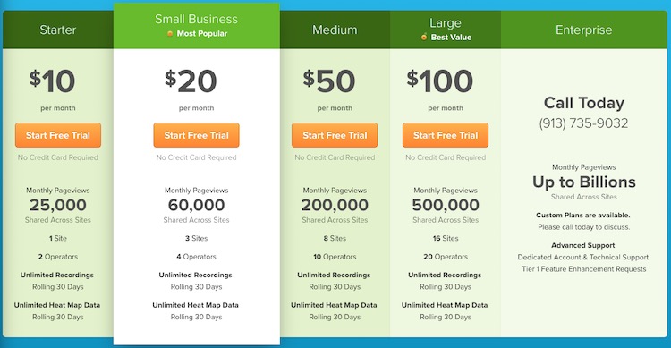
Starting at $10/month and increasing based on pageviews and sites/operators, no other platform provides so much for this pricing.
And if you’re getting hundreds of thousands of pageviews per month (or more), the pricing is very reasonable (up to 500,000 pageviews for $100/month).
If you need more, there are custom enterprise options available.
Where Can LuckyOrange Improve?
My only main complaint with LuckyOrange is the aesthetics mentioned above.
If the dashboard elements were on par with the heat maps interface, the design would be top-tier.
For me, that would include a simpler color palette, some breathing room between elements, and less visual noise. Sharp corners, shadows, and buttons with gradients, borders, and icons is a bit too much.
If the design is more important than data for you, then you may want to try one of the other tools.
Another potential improvement is some kind of notification if an ad blocker interferes with their interface.
My ad blocker may just be in overdrive, but on first-use within Google Chrome, the heat map’s interface didn’t appear to be working until I disabled my ad blocker.
That could make you think something is wrong with the tool or your setup, but you may not run into this issue at all. So if it doesn’t look like the heat maps interface is working, try disabling your adblocker and refreshing.
And that brings up an important point - visitors with ad blockers may not show up in your data at all. Keep that in mind before making any significant decisions for your website. Always be testing to make sure your updates are working as expected!
With all that in mind, we highly recommend LuckyOrange for most people in most use cases.
Runner-Up: Hotjar
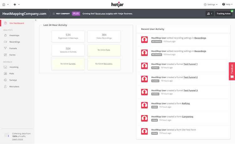
Hotjar is another great tool, and was previously one of IMPACT’s heat map choices.
The design of their main dashboard and menus is more appealing than LuckyOrange’s, and the design is consistent across their toolset.
They also offer a few other features (like funnels). However, for our use case, and anyone that uses HubSpot for funnels and conversion, that wasn’t a strong enough reason to stay with it.
The main drawback we experienced with Hotjar was the static image heat map versus LuckyOrange’s dynamic heat map we chatted about earlier.
While there is a free version with limitations, the paid versions start higher than LuckyOrange ($29/month+).
Although while LuckyOrange calculates pageviews per month, Hotjar’s pageviews are calculated per day, so this may be a good option if you have a lot of pageviews.
Hotjar also has an excellent Heatmaps guide, which is particularly beneficial if you're a customer of theirs since it includes some setup and direct examples from their platform. They have some great case studies and graphics to give you some additional perspectives.
If you tried LuckyOrange and it wasn’t for you, I’d recommend giving Hotjar a try.
Other Options for Consideration
The other options we reviewed appeal more to specific audiences. They all cover what you need in a heat map tool, ut if you’re an enterprise, startup, or just want a longer trial, then compare with these other tools.
VWO
If you run an enterprise business, you may want to see if VWO is a better fit. It’s a little more expensive than some of the other tools, but that may be worth it for you instead of relying on multiple separate tools.
Some of these more extensive features include A/B Testing, Multivariate Testing, Split URL Testing (send traffic to two URLs of the same landing page), a Visual Editor and Code Editor (for making visual, HTML, CSS, and JS changes to your site), and Campaign Scheduling (to control when tests run). Like LuckyOrange, VWO also has dynamic heat maps that make their data that much more reliable.
FullStory
Wow, FullStory does a lot. It does so much that their feature page has a dropdown so you can filter their features by your job type (Product Management, Engineering, Customer Support, UX Design, and Marketing).
For data visualization alone, they do conversion funnels, user trends, heat maps, slowest pages, and top UTM sources and referrers. They also have features for visitor recordings, custom events, determining frustration signals and error clicks, and profiles and session histories per user.
While there is a free version, it only covers 1,000 sessions per month. The next step up starts at $849/month (100K+ sessions), and that doesn’t make sense for most people.
Unless you are a qualifying startup, in which case you could get 80% off FullStory for Business. At that price point, FullStory becomes much more competitive in comparison to what you can get from these other tools.
Crazy Egg
Crazy Egg is more of a jack-of-all-trades, master-of-none.
It has the standard heat maps and recordings, but is more affordable than VWO or FullStory . It also has A/B testing and a visual editor, making it one of the more cost effective ways to get those features. However, Crazy Egg’s recordings are limited unless you have a custom plan, compared to LuckyOrange’s unlimited recordings.
If you’re not sure where to start and for some reason you don’t want to use LuckyOrange, Crazy Egg is a good starter option
Don’t Get Heated - Stay Cool and Pick the Heat Map Tool For You
While all of these tools tick the necessary boxes for a heat map tool, the most important consideration for you is which one fits you and your business’ needs.
If you’re not sure where to start, go with something affordable with the essentials. It’s hard to pass up LuckyOrange in this case.
If you’re a heatmap pro and you need something specific, go with the tool that best aligns with your goals and the benefits you need for your business.
Have questions or disagree with my analysis? Let me know! You can reach out in IMPACT Elite, even just to shout out that you’re crushing it with your heat map tool of choice. And if there’s a specific tool you have questions about, let us know and we’ll see if we can help you figure out the best option for you.
Free Assessment:
/Assets/Icon%20Library/Arrows/Grey%20Arrow%20-%20Prev.svg)
/Assets/Icon%20Library/Arrows/Grey%20Arrow%20-%20Next.svg)