/Assets/base/Navigation%20Icons/TAYA.svg)
/Assets/base/Navigation%20Icons/Sales.svg)
/Assets/base/Navigation%20Icons/Web%20design.svg)
/Assets/base/Navigation%20Icons/HubSpot.svg)
/Assets/Icon%20Library/AI%20Mastery.svg)
/Assets/Icon%20Library/Learning%20Center%20Laptop.svg)

May 30, 2019
/Assets/Icon%20Library/x%20corp.svg)
/Assets/Icon%20Library/whatsapp%20logo.svg)
/Assets/Icon%20Library/Email.svg)
What are you wearing right now?
Wait, that was a little creepy. Let me reword that.
Think about the outfit you’re currently wearing. What does your outfit say about you?
Often times (whether right or wrong) people make a first impression based on the clothes you wear.
They make assumptions about things like your style, your personality, your age, or even the type of impression you want to make.
There are also different outfits for different occasions.
For example, you wouldn’t wear a bathing suit to a job interview.
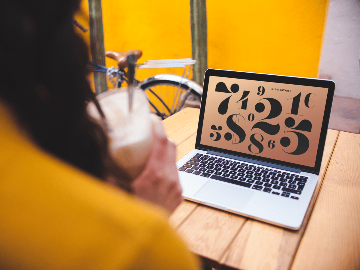
The same can be said about the fonts you choose to use in your branding and in your website's design.

Fonts, similar to the clothes your wear, provide people with a first impression about who you are.
They’re one of the first things people see when they discover your company so they can set the tone for your entire brand.
That’s why you need to be intentional and strategic with the ones you choose.
Why Is Choosing the Right Font so Important?
It’s all about choosing an “outfit” that fits your brand.
Some fonts are more casual and expressive, while others are more buttoned up and reserved.
Choosing the wrong font can completely change the personality of your brand thus giving people the wrong impression about your company.
In the example below, you can see that by just changing the font on these iconic logos to Comic Sans the personality and feel of these brands completely changes. Brands that looked clean and refined now look childish and playful.
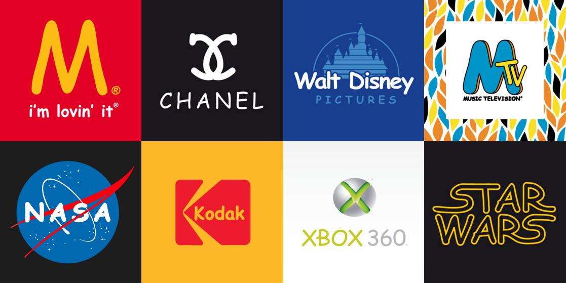
Photo Credit: Lingo
That’s why choosing a font that compliments your brand is so crucial. You want to make sure people have an accurate perception of your company.
So where should you start with choosing a font?
Before you can choose a specific font, you need to understand the different categories of fonts. While there are a ton of different categories, such as script, display, gothic, the two main categories are serif and sans serif.
Serif vs Sans Serif: What’s the Difference?
Understanding the difference between these two categories will help you start narrowing down which one is right for you. Fortunately, recognizing the difference between the two is pretty easy.
The answer is simply in the name.
A serif is a decorative stroke that finishes off the end of a letters stem (sometimes also called the “feet” of the letters).
In turn, a serif font is a font that has serifs, while a sans serif is a font that does not (hence the “sans”). Simple, right?
Notice the difference in the example below.
The serif font is more ornamental and has serifs extending from the ends while the sans serif font on the left has clean and very precise ends.
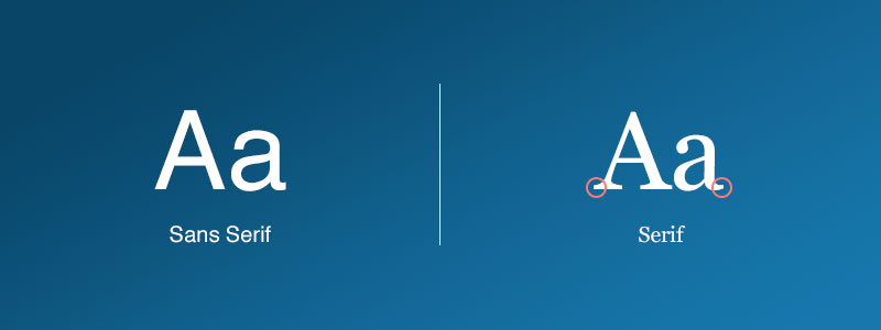
Both of these styles have their own unique personality and communicate very different messages.
That’s why it’s important to understand each style and make sure you’re choosing a font that aligns with the message you want your brand to communicate.
Now that you understand the difference between serif and sans serif fonts, let’s dive deeper into the background and psychology of each style of font.
Serif Fonts Say Traditional, Established, and Trustworthy
Serif fonts have a history that dates all the way back to the 18th century when stonemasons would carve letters into rock.

Today, we see a lot of serif fonts in traditional mediums such as newspapers, magazines, and books. That’s why serif fonts are typically seen as more classic and refined and are used by companies who want to exude these traits.
As mentioned above, the most notable characteristic of serif fonts is their decorative tails and strokes.
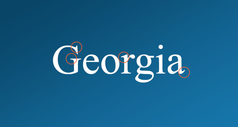
Serif letters also commonly use strokes that vary in weight meaning some areas of a letter may be thick while others are thin.
What Does a Serif Font Say About Your Brand?
The distinct characteristics and history of serif fonts give people a feeling of elegance, confidence, and trustworthy.
This usually makes them a good fit for companies who want to appear more reputable, established, and serious.
Professional businesses such as law practices, editorials, and insurance companies are all examples of companies that a serif font would be a good choice for.
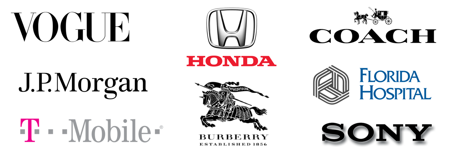
Photo Credit: Different Perspective
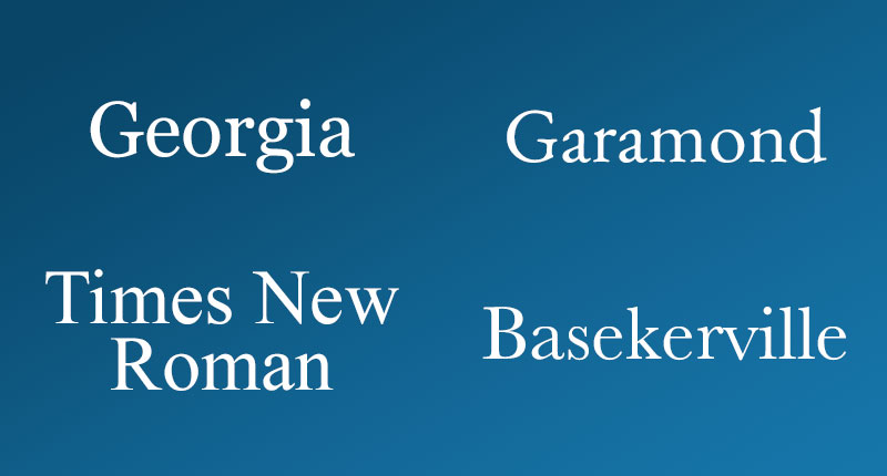
Some of the more notable examples of serif fonts include Georgia, Garamond, Times New Roman, and Baskerville.
Let’s take a look at some serifs in action.
Examples of Serif Fonts in Design:
Dawson | Orr

Dawson | Orr is a Florida-based law firm that has more than 60+ years of experience. They use a serif font to show people that they are experienced and knowledgeable when it comes to helping them with their litigation needs.
The use of serif in their logo and headers, give you the feeling that their team is established, educated, and going to take your case seriously.
The New York Times

The New York Times is a timeless publication that’s been around since the 1850s.
From their logo to the fonts used in their articles, they use a serif font to give people the feeling of tradition and reputability.
Serifs are also conventionally associated with print newspapers so their use of this font also creates a sense of formality and credibility.
Sans Serif Fonts Say Modern, Approachable, and Clean
Sans serif fonts, on the other hand, communicate a completely different message.
While serif fonts focus heavily on embracing tradition and history, sans serif fonts take the opposite approach and embrace simplicity and the feeling of being modern.
The main characteristics of serif fonts are their lack of serifs and use of simple, clean lines that are the same width throughout.
The clean, crisp lines of sans serif fonts are the main reason many web designers prefer this style of font for on-screen use.
The clean lines and sharp edges are able to render out more clearly on a screen which increases legibility for users.
What Does a Sans Serif Font Say About Your Brand?
Sans serif fonts give off a feeling of being casual, informal, friendly, and very approachable. Companies who want their brands to appear more youthful and relatable tend to use sans serif fonts.
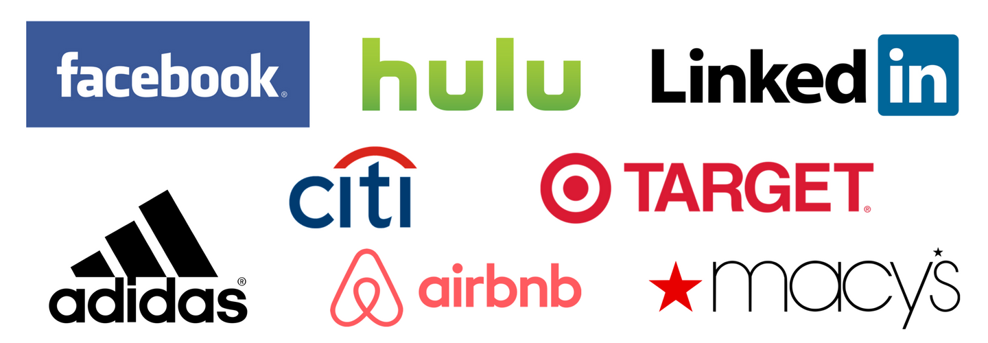
Photo Credit: Different Perspective
These traits make sans serif fonts are a popular choice among many start-up and tech companies who want to give people a sense of being cutting edge and more humanistic.
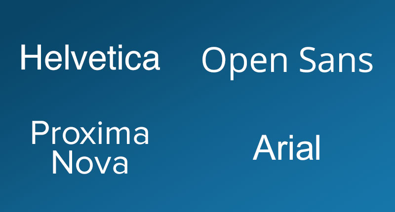
Some of the more popular serif fonts include Helvetica, Open Sans, Proxima Nova, and Arial.
Examples of Sans Serif Fonts in Design:
Wix

If you work in the digital marketing world chances are you’ve heard of Wix. They’re a cloud-based CMS that makes it easy for people to build websites.
Wix wants people to know that their product is easy to use, offers great customer support, and makes creating a website fun, and they accomplish that with their font choice.
By choosing a clean and rounded font, they give people a feeling of relaxation and approachability from the second someone interacts with their brand.
Creating a website is no longer intimidating.
HubSpot
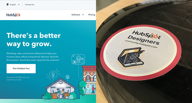
HubSpot is another example of a company that uses a sans serif font in their branding.
The rounded and clean appearance of their logo and website fonts give people similar feelings of friendliness and approachability.
This youthful font helps humanize their brand and makes their company more relatable.
Sans Serif or Serif - So, Which One Should You Use?
The short (and slightly vague) answer is there’s no one size fits all solution.
While we’ve seen a number of high profile companies start to rebrand themselves and make the switch over to a sans serif font, that doesn’t mean you need to jump on the bandwagon too.
You need to choose a font that’s going to that conveys the right message and embodies your brand’s personality.
It’s different for every company.
For example, a trendy tech company, such as Uber wants their brand to convey a much different message than a more buttoned-up company like The New York Times.

Before starting your search for a font, brainstorm some of the qualities and characteristics of your brand. Also, think about the medium in which people are going to be interacting with your company.
This will give you a roadmap to follow when researching fonts. You can then check any possible fonts against your brainstorm list to make sure it fits those qualities and use cases.
Remember, a font can drastically change the way your brand is perceived by people.
Apple is an interesting example of this.
In the early days of Apple, the tech giant primarily used a serif font in its branding before eventually switching to a more modern looking sans serif font.
Look at the two examples below. Which one looks more like the cutting edge industry leader we all know today?
![]()
Overall, you want to ensure that your font (and all of your design choices for that matter) reflect your brand.
Choose the Font That Exemplifies Your Brand
When used properly and chosen for the right reasons both serif and san serif fonts can be effective. What’s most important is choosing a font that’s right for your brand.
It’s all about finding a font that will give people the right first impression and continues to embody the qualities of your brand.
While there’s no one size fits all solution to picking the right font for your brand, there are some general guidelines you can follow to help you make the right choice:
1. Don’t Overload Your Brand With Too Many Fonts
It can be easy to want to choose a ton of fonts to use in your designs, but doing so can actually hurt your brand.
A rule-of-thumb to follow when choosing fonts is to stick between one to three different fonts.
Any more than that and your designs will begin to look cluttered and you’ll run into the issue of the different fonts starting to compete with one and other.
That being said...
2. Choose Fonts That Have the Right Amount of Contrast.
Choosing multiple fonts for your brand can be an effective way to create hierarchy in your designs. However, choosing two fonts that have the right amount of contrast while still working together can be tricky.
Online design tool Canva suggests finding fonts that have a shared quality. For example, maybe two fonts that have a similar letter height or width or fonts that are created by the same designer.
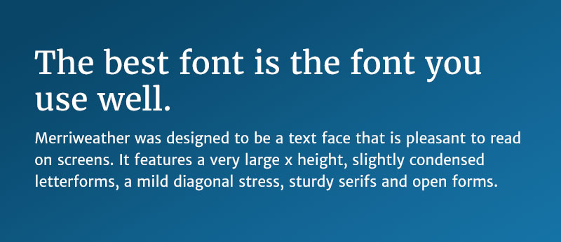
Merriweather and Merriweather Sans are a good example of two fonts that contrast each other nicely, but still feel cohesive.
These fonts were both created by the same designer so they share a lot of similar qualities in the spacing and shapes of the letters that help the fonts feel more related.
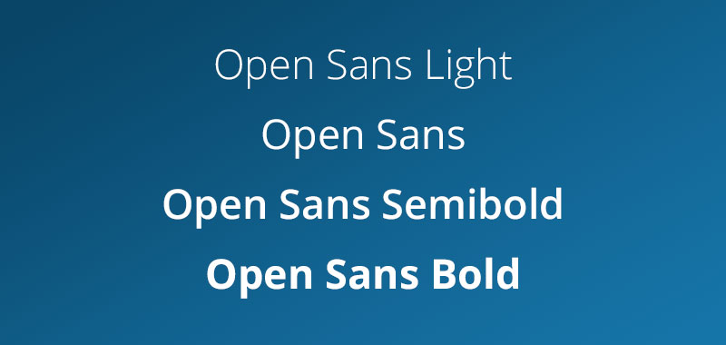
3. Look for a Font With Multiple Weights and Styles
A font that has multiple weights and styles (such as light, semibold, bold, etc) makes the font more versatile and allows you to communicate different messages throughout your designs with a single font.
4. There are no hard set rules.
Companies that are more traditional don’t need to stick to only serif fonts and vise-versa.
While serif fonts are associated with being more traditional and sans serif fonts are typically more modern, there are always exceptions to the rule. It’s all about HOW you use the fonts.
Free: Assessment
/Assets/Icon%20Library/Arrows/Grey%20Arrow%20-%20Prev.svg)
/Assets/Icon%20Library/Arrows/Grey%20Arrow%20-%20Next.svg)