/Assets/base/Navigation%20Icons/TAYA.svg)
/Assets/base/Navigation%20Icons/Sales.svg)
/Assets/base/Navigation%20Icons/Web%20design.svg)
/Assets/base/Navigation%20Icons/HubSpot.svg)
/Assets/Icon%20Library/AI%20Mastery.svg)
/Assets/Icon%20Library/Learning%20Center%20Laptop.svg)

Jun 27, 2017
/Assets/Icon%20Library/x%20corp.svg)
/Assets/Icon%20Library/whatsapp%20logo.svg)
/Assets/Icon%20Library/Email.svg)

There are a number of challenges SaaS companies face when it comes to marketing and growth. Challenges such as customer retention, standing out in a crowded industry, and convincing new people your service is worth investing in.
The solutions to many of these challenges start with a SaaS company’s website.For many of your customers, this is the first interaction a person will have with your brand.
Through these interactions, you can differentiate yourself with the use of clever content, give users an interactive tour of your software to establish trust, and even delight current customers with things such as a helpful support hub.
If your company is consistently missing its growth and customer conversion goals, it may be time to reassess your site to make sure it’s setup to help you address these challenges.
To make this task easier, I’ve researched and analyzed different SaaS sites from around the web, and drawn upon my own experience as a web designer and developer to compile this list of the most common mistakes SaaS companies are making on their websites.
1. Telling, Not Showing -- Period.
If you’ve watched Website Throwdown, you’ve heard it before: Simply talking about your software without ever actually showing it is one of the biggest mistakes you can make on your SaaS website.
Including relevant screenshots, videos, or gifs of your software, makes it easier for users to picture themselves using it and evaluate it for their needs and skills.
With such a large focus being placed on UI/UX design nowadays, you can’t afford to NOT showcase your software on your website. When including images of your software, make sure your screenshots are contextually relevant to content surrounding it.
Just placing random screenshots of your software on your site isn’t enough to make a lasting impact with visitors. Having screenshots that are out of place or too small to see any software details can actually have the opposite effect and create a negative user experience.
The screenshots you use on a site should make it easy to communicate a message to the user and serve as an alternative to reading walls of text. When highlighting a specific feature try using a screenshot that is zoomed into that feature.
This example from Invision is a perfect example of how to incorporate screenshots.
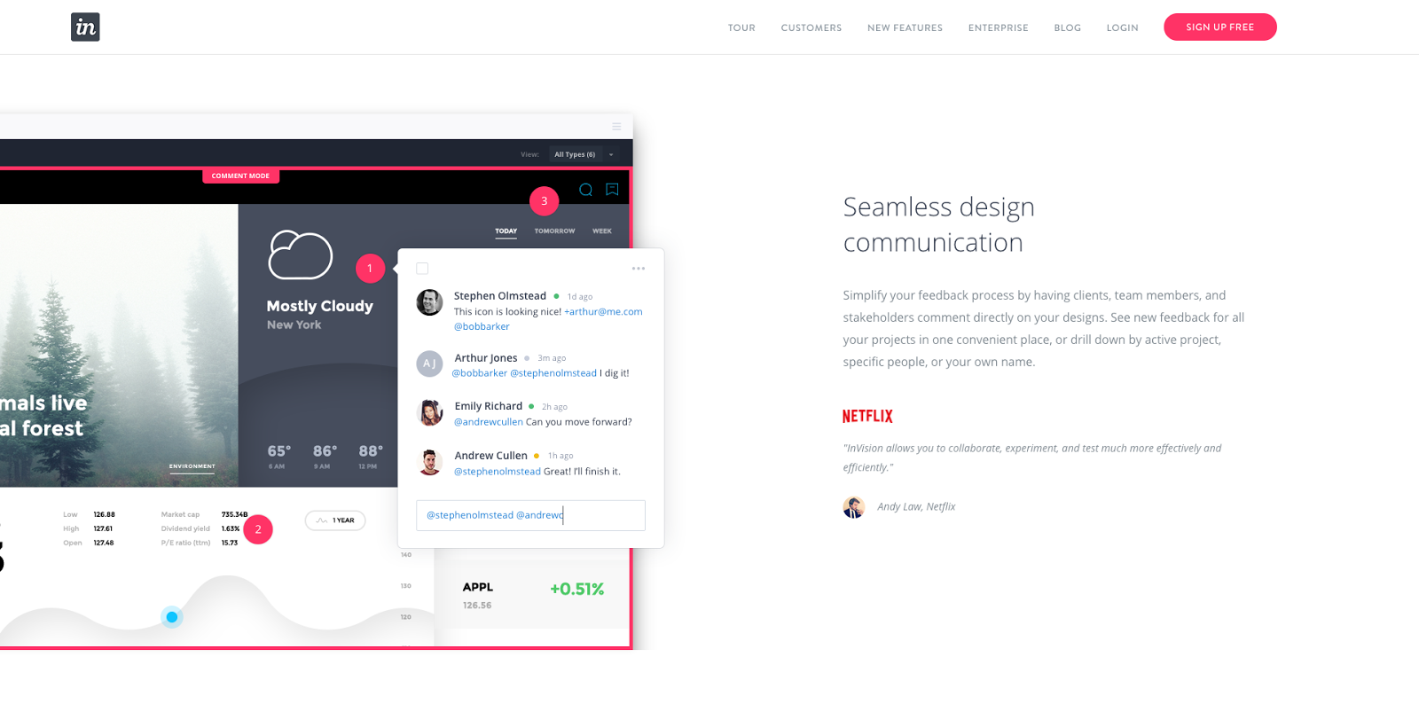
Notice how the company has a short descriptive paragraph that talks about communication, and right next to it is a large, clear screenshot of a team communicating within the tool. You get a very clear idea of what the UI of the software looks like and how it can solve for communication issues.
2. Insignificant Visuals
Building off of the last point, make sure the visuals you’re showing resonate with your visitors. Use images that are going to display the major benefits of your software that people will actually want to see.
Show your biggest selling points or most popular features. Every illustration, screenshot, gif should serve a purpose other than just being visually appealing.
3. Overly-Technical Content
Working closely in a technical industry like SaaS can make it easy to forget that at the end of the day you’re still marketing to real people. Just because you’re working in a cut and dry, technical industry doesn’t mean your content has to feel that way -- in fact, most people don’t respond to this regardless of their industry.
Using content that shows a little personality and speaks in a way that resonates with your buyer persona emotionally is a great way to separate yourself from your competitors.
Avoid using overly technical jargon that may confuse visitors or sound robotic.
When crafting content for your site you’ll also want to make sure you’re delivering your content in small easy to digest sections; avoid long walls of text (unless that’s what your persona prefers!
Mint, for example, does a great job of crafting their content for their persona.
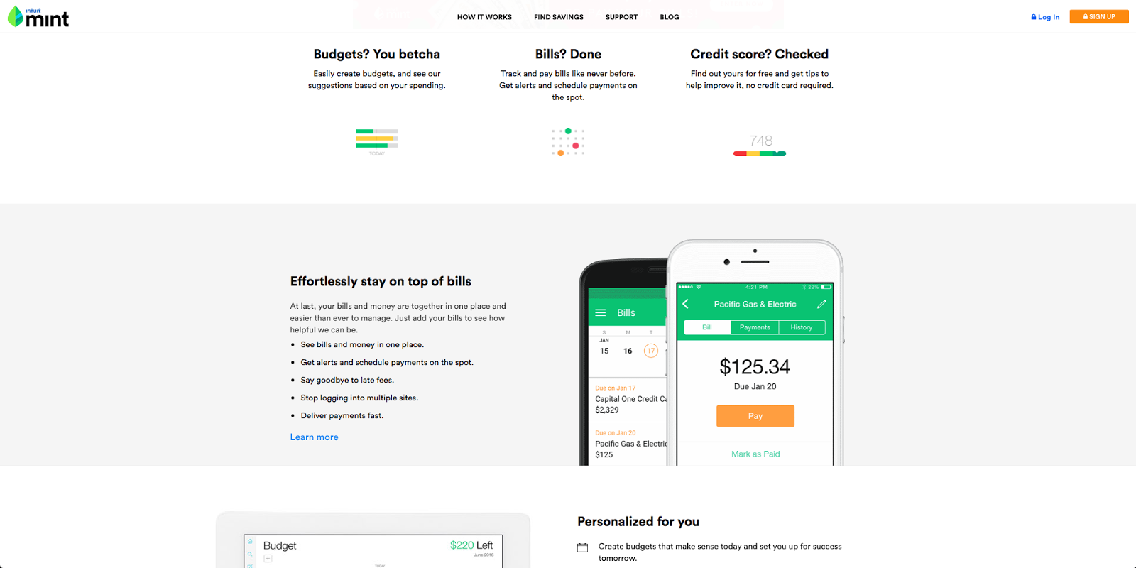
As you’ll see below, the company uses a friendly tone that doesn’t get overly technical. It keeps its focus on the problems its software solves. The team also uses bulleted lists and short three-column sections to keep the content easy to skim and remember.
4. Lofty and Vague Value Propositions
The average human attention span now hovers around 8 seconds.
That means when a person first comes to your website you’re only given 8 seconds to accurately explain to them what you’re all about. That’s not a lot of time, but it’s the reason why having a well-crafted value proposition is so important.
A lot of sites in the SaaS industry make the mistake of including too much fluff and jargon in their value propositions. You end up reading these statements two or three times and still being unsure of what they’re offering. Take this value proposition for example:
“Innovative solutions for people searching to aggregate and optimize their online marketing to improve sales via maximizing conversions.”
Wow, that’s a mouth full.
It’s long, filled with jargon, and doesn’t really tell you what’s being offered. When it comes to learning how to create a clear value proposition, Neil Patel, of Quick Sprout, mentions three key elements to keep in mind when writing your value proposition. The three elements include:
- Eliminate the fluff. Cut out any words the proposition can live without.
- Immediately explain what you’re offering. You’ll have plenty of time to convince customers to buy your software, but for the proposition keep it simple and introduce visitors into what you’re offering.
- Use a subheading to explain your product’s superiority. Once you draw visitors in with a clear statement, you now have the opportunity to simply explain why your software is different from its competitors.
5. Focusing too heavily on Features Instead of Benefits
When writing content for your site, also stay focused on your products personal benefits instead of its cold, technical features. Focusing your content around the emotional and life changes your product brings about will resonate more effectively with your audience and make it more memorable.
How many of your competitors say they offer a feature like “Unlimited File Storage” or “No Downtime?”
Probably too many so this doesn’t really offer much value to the visitors. It doesn’t explain how it’s going to solve their problem or make their lives easier. Dig into each one of your features and try to ask yourself “What problem does this solve for our customers?”
This article can help you better understand how to do this.
6. No Option to “Try a Free Trial”
The last SaaS website mistake that can really put a halt to new conversions is not including a “try before you buy” or free trial option.
Even with all the beautiful screenshots on your site, people still don’t know if the product will really perform as they need it to unless they can get their hands on it. Offering a free trial gives your visitors the first-hand experience they need to feel more comfortable about investing in your software. It lets them know exactly what they’d be paying for, eliminating any fence-sitting.
One company that really gets this right is UxPin.
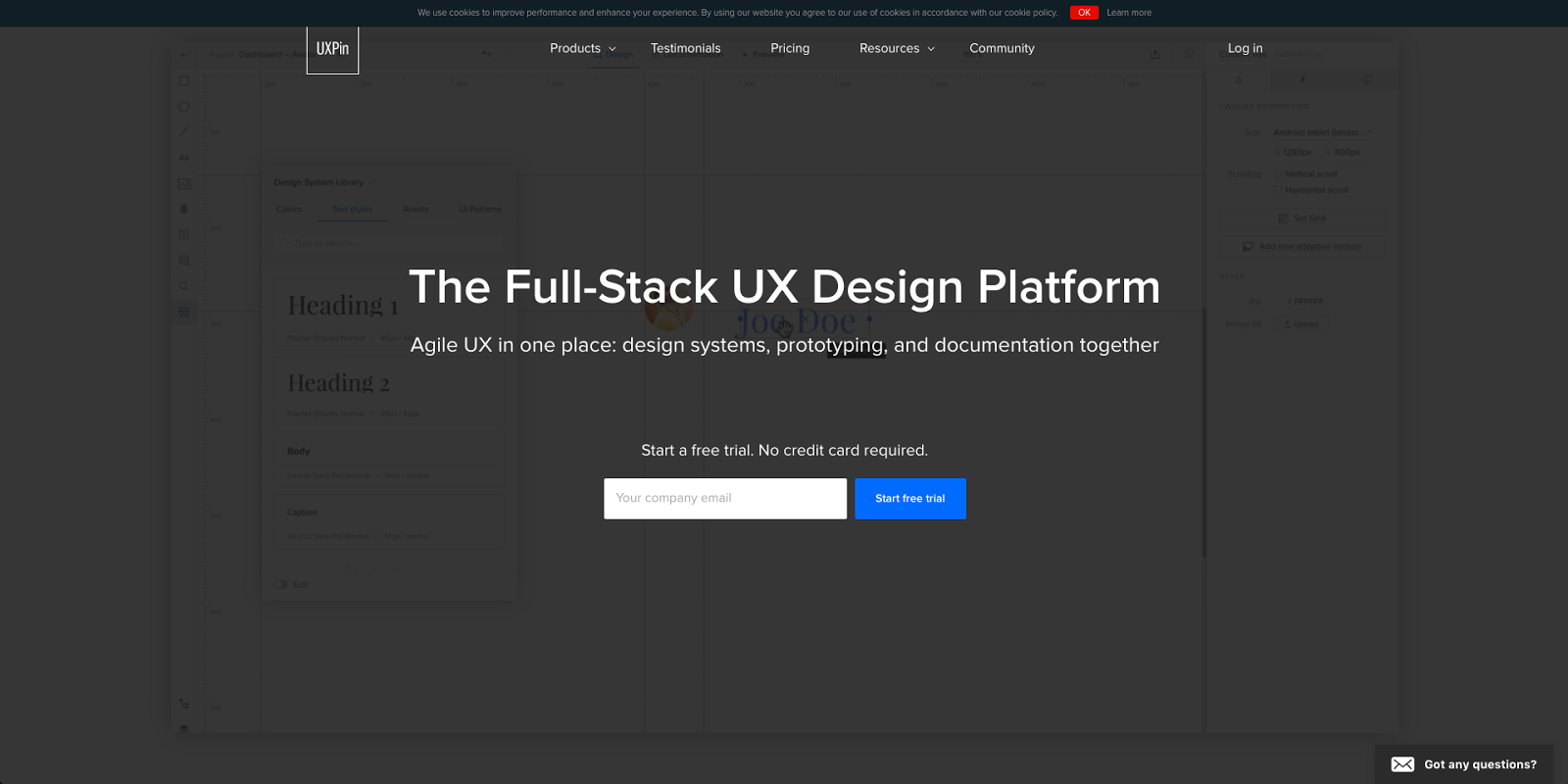
As soon as you arrive on the company’s homepage, you’re presented with the chance to begin a free trial. The team makes it even easier to try by putting the one form field you have to fill out right on the homepage.
How Does Your Site Stack Up?
Is your website is suffering from any of these mistakes? Making tweaks such as keeping your content simple, using contextually relevant images, and focusing your content around your software’s benefits will give your site’s UX a huge boost.
To get additional help with your SaaS site, use the button below to talk to us about redesigning your site on the HubSpot COS.
Free: Assessment
/Assets/Icon%20Library/Arrows/Grey%20Arrow%20-%20Prev.svg)
/Assets/Icon%20Library/Arrows/Grey%20Arrow%20-%20Next.svg)