/Assets/base/Navigation%20Icons/TAYA.svg)
/Assets/base/Navigation%20Icons/Sales.svg)
/Assets/base/Navigation%20Icons/Web%20design.svg)
/Assets/base/Navigation%20Icons/HubSpot.svg)
/Assets/Icon%20Library/AI%20Mastery.svg)
/Assets/Icon%20Library/Learning%20Center%20Laptop.svg)

Sep 10, 2019
/Assets/Icon%20Library/x%20corp.svg)
/Assets/Icon%20Library/whatsapp%20logo.svg)
/Assets/Icon%20Library/Email.svg)
Before we begin, I’d like you to do me a favor. Select your musical accompaniment from this earnestly-accumulated all-yellow playlist:
Yellow Submarine by The Beatles
Yellow Ledbetter by Pearl Jam
Colors by Donovan
Yellow by Coldplay
Yellow by Amine
Big Yellow Taxi by Joni Mitchell
Yellow Lights Harry Hudson
Yellow Raincoat by Justin Bieber (don’t hate)
There, that’s better.
Music, like color, has the ability to profoundly affect our mood.
Right now, the song you selected is influencing your emotional state and your perception of my words. You can’t help it.
The power of color
Color has power, and you don’t need to be a synesthete to feel it. There’s a reason we say someone who’s sad is blue or that an optimist sees everything with rose-colored glasses.
It would not be an overstatement to suggest that color affects us in every waking hour, in every interaction, in every moment our eyes gather light.
IMPACT has written extensively and admirably about the use of color in design and branding. There (and elsewhere), my colleagues' thorough scholarship examines just how important color is in our lives.
Without providing too much overlap, I will remind you all that colors are typically organized in several ways.
One of the most useful, for design, is by warm (yellow, orange, red) and cool (blue, green, purple). Furthermore, certain colors complement each other (like purple and yellow) while other colors clash (like red and orange).
Everyone, including designers, artists, and decorators, can agree that the right shade is essential to a particular idea coming to life, be it on the canvas, on the screen, or anywhere else.
Although it is one of the three primary colors, yellow is one of the lesser-used in the traditional color wheel.
Still, it is a powerful, conspicuous choice for businesses, designers, and others hoping to attract attention — and it’s always been that way.
Yellow in the past
There is actually much debate over exactly how the ancient Greeks saw color.
Although their philosophy was rich with explorations of sight, light, and color, the correlating vocabulary is relatively limited. Historian Maria Michela Sessi, writing in Aeon, notes that yellow
“seems strangely absent from the Greek lexicon. The simple word xanthos covers the most various shades of yellow, from the shining blond hair of the gods, to amber, to the reddish blaze of fire. Chloros, since it’s related to chloe (grass), suggests the colour green but can also itself convey a vivid yellow, like honey.”
Although Homer’s epic poems The Iliad and The Odyssey used much figurative language, the Greek word “yellow” appears very rarely, used only to describe the hair of certain characters. In a world of Greek and Trojan heroes, Achilles’ yellow hair would have stood out (although the adjective is sometimes translated as “fair”).
The word “yellow” (coming from ancient Dutch and German roots) has been in the English language for more than a thousand years, but it appears only scantly in early literature.
Middle English poet Geoffrey Chaucer, like Homer before him, uses the word almost only to refer to blonde hair (which makes sense, as “blonde” did not enter English until after his death in 1400).
Shakespeare uses the word almost never. The only time the word appears in his major tragedies is in an angry rant by Juliet. However, he does give the word occasionally to his ethereal characters.
For example, Fairy Queen Titania describes “Neptune’s yellow sands.”
Elsewhere, it is a color of death or disease. A comedic character says of an enemy, “I will possess him with yellowness.” In The Merry Wives of Windsor, a servant describes someone as having a “little yellow beard, a Cain-colored beard.”
Cain, the biblical figure responsible for the first murder, is a stock figure of detestation. Additionally, Judas Iscariot, the disciple who betrayed Jesus Christ, was frequently depicted in yellow.
Thus we see yellow as a color of both life and death. Of beauty and sinisterness. Of things exotic and quotidian.
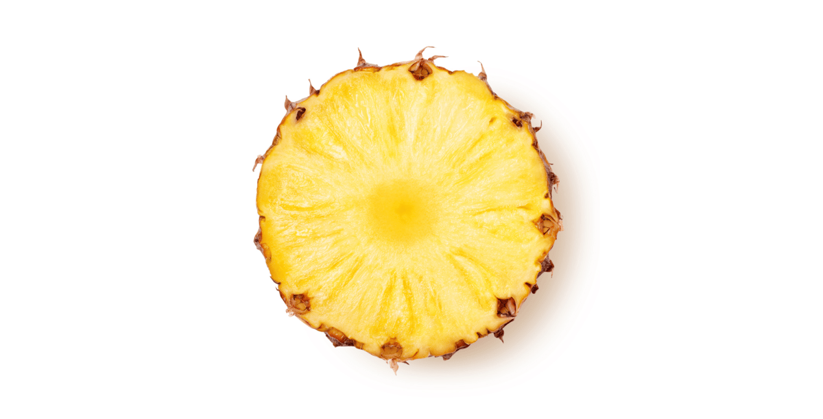
On one side, we think of yellow sunlight and flowers, of fields of grain and fruit, of warm candlelight and baked goods.
Chilean poet Pablo Neruda, in one of his most gorgeous elemental odes, writes
So, when you hold
the hemisphere
of a cut lemon
above your plate,
you spill
a universe of gold,
a
yellow goblet
of miracles
By contrast, light with a yellow cast can seem sickly, grotesque, and soiled.
In literature, we may think of the unraveling psyche in Gilman’s “The Yellow Wallpaper” or these haunting lines from T.S. Eliot:
The yellow fog that rubs its back upon the window-panes,
The yellow smoke that rubs its muzzle on the window-panes...
Considering the time period, we naturally align Eliot’s conceit with the mustard gas being used with devastating effect on the fields of France in World War I, but yellow can also make us think of jaundice, suppuration, urine, and yellow fever.
Of course, the color also has an ugly history as a racial slur.
Additionally, we might remember cultural disdain for yellow journalism or the folksy, old-west-sounding insult that associates the color with cowardice.
Traditionally, European artists used what was called “Indian yellow” as a paint pigment, which was imported to the West from Asia.
According to the BBC, the color was produced by inhumane force-feeding of poisonous leaves to cows.
In turn, their urine was collected and refined into the widely-used color — but this practice was made illegal in 1908 because of its cruelty.
Like any color, yellow is rich with associative history, symbolism, and meaning.
Today, regardless of positive or negative association, yellow is certainly an attention grabber.
It is the color that warns us away from wasps and hornets, and alerts us to danger ahead on the road.
Our eyes dart quickly to yellow school buses, taxi cabs, and, in some places, fire engines. (Although we naturally think of fire engines as red, research shows that yellow trucks are more noticeable and less likely to be involved in accidents.)

Yellow in the present
In a 2018 post on Southern Living, writer Maggie Burch does her darndest to convince the world that mustard yellow will be the color of 2019, claiming “This condiment-inspired hue is the perfect compliment to any room.”
While I admire Ms. Burch’s sincere prophecy, I have to doubt her prescience.
Here we are, heading down the back-stretch of 2019. I’m not sure the hardware stores are struggling to restock Benjamin Moore 321. Plus, she spelled “complement” incorrectly, and I give less credence whenever I see a spelling error that didn’t get caught by QA.
In my mind, yellow will always be the preferred color of garishly cheery kitchens and gender-neutral nurseries. I don’t see it going much further (though my more fashion-forward teammates assure me it’s been quite prominent in this year’s clothing trends).
In corporate branding, yellow is seen as fun, energetic, young, and attention-grabbing. Still, it’s relatively uncommon compared to its primary color brethren.
If you were to start naming prominent logos featuring red as the main design element, you might quickly think of Coca-Cola, CNN, Adobe, or Target. For blue, Ford Motors, Facebook, IBM, or GE might jump to mind.
But for yellow?
Can you name another without really thinking about it?
The fact is, yellow holds just a slim share of the design market.
Proceed with caution
According to IMPACT senior web developer Tim Ostheimer, yellow is scarce in web design.
He says, "As a web developer who has worked on hundreds of websites, I can't think of more than just one or two that used yellow." Tim theorizes that too much yellow can cause eye strain and may prove difficult for ADA compliance.
Often, designers seem to opt for the softer, warmer tones of orange when making accents, CTA buttons, or colored text.
(This can vary by locale, though. In the southwest, for example, and on the west coast, we see a greater prominence of yellow. Also, South Florida’s art deco past yields some noteworthy yellow designs, whereas New England yields more austere colors.)
Speaking broadly, in graphic and web design, you should treat yellow the way you do a flashing yellow traffic light: Slow down, proceed with caution.
There’s nothing subtle about yellow, even in small doses.
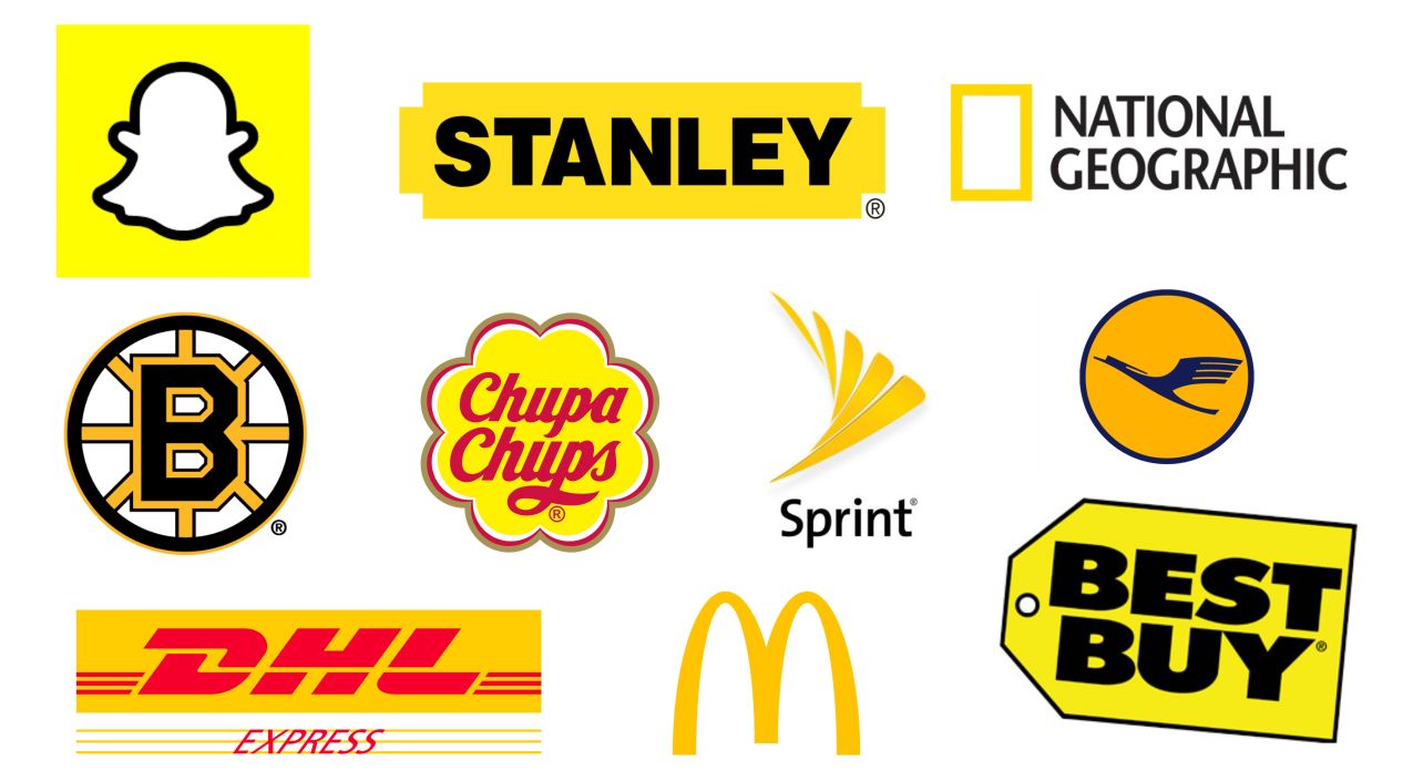
The corporations featured in the image above all use yellow prominently in their logos and branding material. However, go to their websites and you will often see a different story.
Stanley, a revered maker of tools and construction equipment, structures its homepage like this, beautifully balancing the yellow with rich, earthy tones:

Yellow is merely an accent.
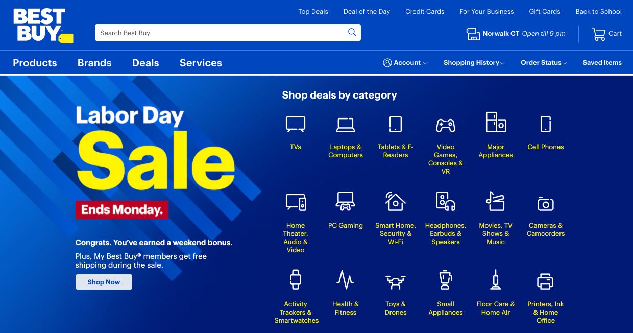
Here’s Best Buy, deep into its back-to-school push, using blue as an offset:
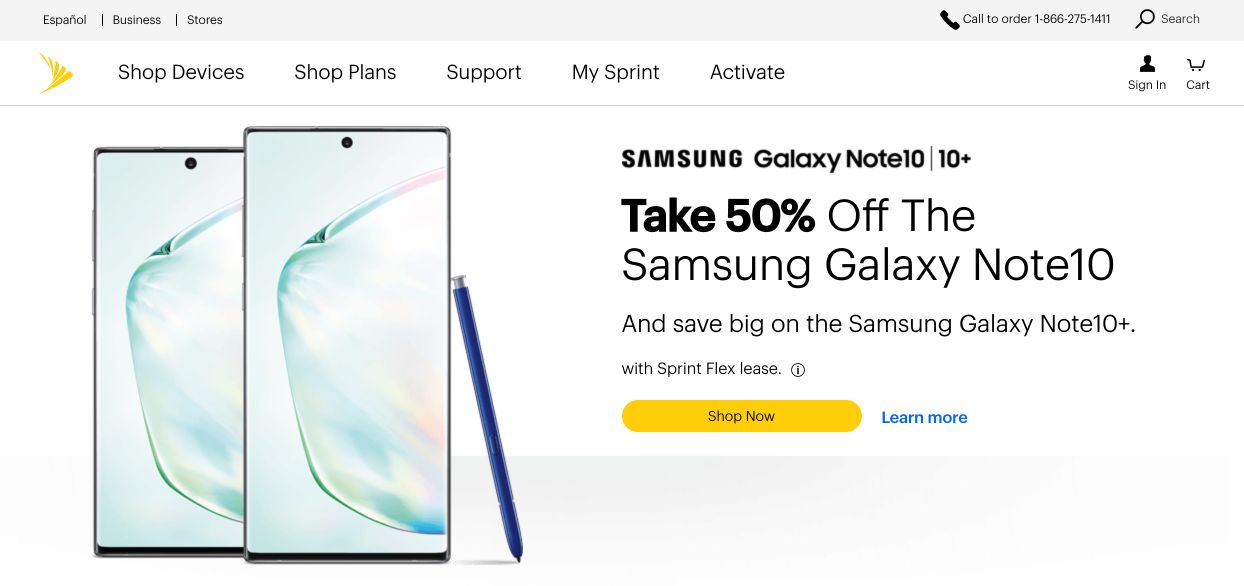
Sprint, similarly, is even more reserved in its use of its signature color:
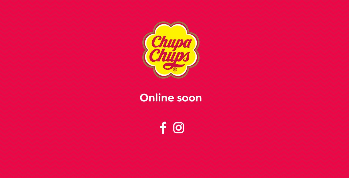
Even beloved lollipop maker Chupa Chups, with a website under production, chooses to minimize the effect of the yellow with a complementary shade of pink.
In each case, yellow is used as a subtle accent, a splash of bright focus, a quick reminder of brand identity.
By contrast, DHL goes more all-in on the yellow, but I don’t think anyone would mistake the shipping firm as being a purveyor of good taste:

With the more liberal use of yellow, it is difficult to know what to focus on or to determine what we should be clicking first. The yellow pulls our attention in too many directions at once.
Snapchat, too, uses a straight yellow palette for its desktop site:
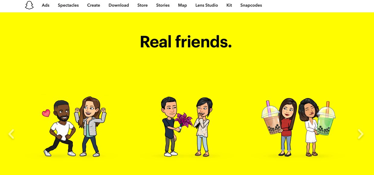
The social media company keeps the design simple and pleasing by using dark contrasts, but the bright yellow background creates an effect that may not always be cheery or lively, but overwhelming.
The effect of any design is a matter of opinion, but as these examples attest, yellow is likely best used sparingly.
Considering many companies that have yellow as a key element of their branding still use it only minimally, all businesses should probably take that as an indication.
Here, with eyewear manufacturer Moscot, we see yellow done well.

First off, a richer, more amber yellow tone feels softer on the eyes. Second, there is enough yellow to establish brand identity and guide your eye to the “shop now” button, but not so much as to overpower or overwhelm.
The warmth of the hero image, the coolness of the gray product boxes, and the black framing all balance the yellow color.
Yellow does pair particularly well with black, just ask the Steelers, the University of Iowa, and the opening credits of Star Wars.
A dark color serves to temper the energy and power of yellow, harnessing it for more effective use.
After all, there is a reason yellow is the default color of turn signals, post-it notes, and road hazard signs: it commands attention. But too much can be overwhelming and disconcerting.
In design, use yellow cautiously and intentionally. A little goes a long way.
The anthropology of color
As the old idiom says, beauty is in the eye of the beholder. While it is never possible to create a design that pleases everyone, considering personal and cultural differences, certain best practices should be kept in mind.
Yellow is the brightest of the warm colors and appears in the natural world only sparingly. A design heavy on blue or green might feel peaceful and calming because those colors are prevalent in our natural world. We’ve evolved to see great swaths of blue and green. Yellow is just too strong.
With designs like DHL’s or Snapchat’s, we’re overwhelmed by too many calls for attention. At Sprint, we’re tastefully reminded of the brand color as we’re invited to shop.
While Chris Martin walking down a British beach singing about everything being all yellow seems artsy and romantic, the effect of an all-yellow world (or a mostly-yellow website) would be too much to bear.
Free: Assessment
/Assets/Icon%20Library/Arrows/Grey%20Arrow%20-%20Prev.svg)
/Assets/Icon%20Library/Arrows/Grey%20Arrow%20-%20Next.svg)