/Assets/base/Navigation%20Icons/TAYA.svg)
/Assets/base/Navigation%20Icons/Sales.svg)
/Assets/base/Navigation%20Icons/Web%20design.svg)
/Assets/base/Navigation%20Icons/HubSpot.svg)
/Assets/Icon%20Library/AI%20Mastery.svg)
/Assets/Icon%20Library/Learning%20Center%20Laptop.svg)

Mar 28, 2019
/Assets/Icon%20Library/x%20corp.svg)
/Assets/Icon%20Library/whatsapp%20logo.svg)
/Assets/Icon%20Library/Email.svg)

Have you ever scrolled through a website minding your own business when you are suddenly met with the cold stare of other human beings?
They seem happy, but their smiles only touch their mouths. Their eyes are staring at you without emotion. Also, they’re awkwardly touching each other's hands.
No one in the photo wants to be touching each other. Man, this is uncomfortable.

You, my friend, have met 171108017 - one of literally billions of stock photos that have been used on websites since the dawn of the internet. (BTW, Happy Birthday internet!)
If you’re guilty of using photos like 171108017 on your website, it’s okay. We’ve all done it at some point. And we’re here to help you stop.
Whether you’re using stock photography or custom photography, your goal is to be authentic. You want the photos to feel real—not contrived.
When people skim the contents of your website, your imagery and photos are a critical component to your messaging; they help to illustrate what you're talking about and help people better envision it.
In fact, according to Brain Rules: If you “...hear a piece of information, and three days later you'll remember 10% of it. Add a picture and you'll remember 65%.” Sometimes the photo is the only thing the visitor will take away from a page.
If you have the wrong image, you risk alienating the user right away.
Here are some common mistakes you could be making with your photo choices -- and more importantly, how to fix them.
1. You’re Using Stock Photography
Okay, that title is a little tongue in cheek.
Of course, you’re using stock photography because that’s the only choice for a lot of organizations!
But you can’t blame me for calling it a mistake.
In many situations, organizations aren’t thinking enough about the user when selecting stock photos and they end up using cold, unnatural, generic images that can create a sense of inauthenticity like the one I described in the intro.
In an ideal world, we would all have the time and money to hire a professional photographer to take original photos, but most of us can’t.
That, however, doesn’t mean you will have a mediocre outcome with your own photography.
Try doing it yourself! The photographic capabilities of some current smartphones are astounding. Just make sure you have good light! Not to mention, “authentic” images resonate.
If stock photography really is your only choice, stick to the big guys like Getty Images, iStock Photo or Shutterstock because of their seemingly endless supply of photos.
There are also some decent free stock photo sites out there as well, like Unsplash and flickr if you want something less conventional.
2. Your Photos Don’t Have the Right Emotional Pull
If you don’t have the right tone, subject matter, or connection to your audience, your website will feel off.
Your photo choices play a big part in this.
Are yours saying what you want them to say or are they just fillers?
Each image you use should have a specific reason and strategy for being there.
Imagine a funeral home with photos of people enjoying themselves. That’s mixed messaging at its worst. Not only does it not quite work, but create a confusing experience for the user.
Take this example from the personal banking section for Fifth Third Bank:
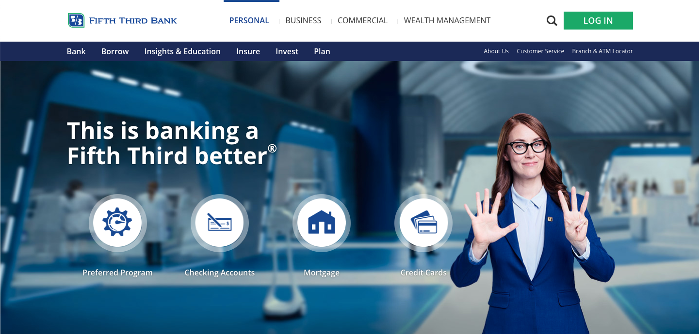
They had the opportunity to connect to their audience with a warm photo, but missed the boat with a cold photo that may only connect to space age lab techs.
What does this photo really say that connects with the user or describes what Fifth Third can do for them?
This doesn’t touch on pain points or establish their value. It feels “top-down” and one dimensional.
3. They’re Unrealistic and Unnatural (The “Cheesy” Kiss of Death)
If your website is met with an eye roll, you’re clearly not succeeding.
You want the visitor to feel as though the scene they are viewing is one that they can relate to and understand.
You don’t want your photos to look like actors were hired and the scenario is staged. The goal for all images is authenticity and resonance.
The visitor will “check out” if they don’t feel a connection to the imagery.
For example, the World Bank fell into this trap with this hero image:
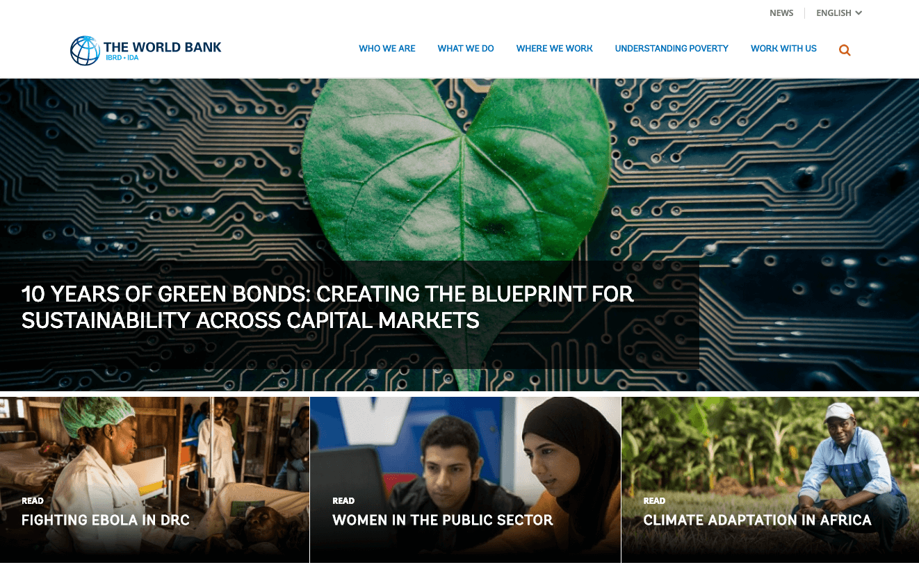
Sometimes photos can be a little too “on the nose.” This photo is far too literal and misses the emotional connection mark.
Any of the sub-topic images are more compelling and resonate with the viewer as a relatable experience.
I would rather see an actual scene from the results of Green Bonds on sustainability and why it matters to me.
4. Your Photos Are Cropped Awkwardly
While the subject in the photo may be attractive, having a zoomed in view of their nose is not ideal.
There might be a good reason for that, which is fine, but keep in mind what your audience would want to see. It’s probably not a nose.
When you crop a photo awkwardly, you risk not showing the information the viewer is supposed to see or even distracting from it, if it is showing.
To avoid this, think about all the ways the photo can be viewed — desktop, tablet, and smartphone.
Be sure to test each of these devices (and browsers on them) as you’re putting content into a website. This will help you catch poor visual experiences before they have the chance to face visitors.
5. Your Photos Are Poor Quality
We want our website to be as efficient and lightning-fast as possible. Otherwise, visitors will likely abandon your website very quickly.
Unfortunately, sometimes image optimization can push the photos on a site to look less than stellar.
They become fuzzy or pixelated.
Visitors might seriously doubt the quality of your brand if you aren’t even presenting a positive front with quality images.
What’s the answer? Tools like TinyPNG and JPEG-Optimizer can help. They will compress the photo without the quality taking too much of a hit.
6. You’re Using Photos Without Permission
Google image search is not a photo farm to graze upon. Make sure the photos you are using are not copyrighted.
Photographers take their work very seriously and are often taken advantage of without their knowledge.
Karma has a way of saying “hello!” when you’ve probably forgotten you're using an image without permission. The fines can be hefty, so don’t take the chance.
See #1 above for places to avoid this.
Here Are Some Questions to Ask Yourself When Selecting Photos
Now, this may be a lot to try to avoid, but it’s easier than you think. There are certain things to look for that will help weed your image selections down.
- Do these connect with my audience?
Look at who your audience is and try and view the website from their eyes. Will it resonate or does it feel thin? The goal, again, is to be as authentic as possible. -
Do the photos feel “canned”?
Ask yourself “Does this feel unique? Would another website of a similar industry likely have a photo like this?” You don’t want the visitor to feel like they aren’t getting a “unique to your website” experience. -
If there’s text over it, can you read it?
It’s important to have enough contrast on a photo for either light or dark text to be visible. If not, putting an overlay over the photo will sometimes work, as long as important aspects of the photo aren’t being covered. No one should have to strain their eyes to read the text. -
Does it align with my messaging? If your image doesn’t make sense for your copy you run the risk of sending mixed signals. This can be extremely confusing and off-putting for a visitor.
-
Does it work for mobile?
Photos will adjust differently on mobile than desktop. Make sure all important aspects of the photo are still visible on mobile. Text that is readable on desktop may not be readable on mobile. You might have to treat the overlay different if there is one.![Desktop-example]()
![Mobile-example]()
Left (Desktop) gradient overlay going left to right, Right (Mobile) gradient overlay going bottom to top
A Few Tricks When Searching Stock Photography
If you’re turning to stock photographs specifically, what you put in the search field makes a huge difference in the results.
One or two words more or less will get you vastly different results. Here are a few tips to keep in mind:
Use “candid” when searching.
This tends to give you a more natural looking result. It also tends to weed out the photos of people posing for the camera.
Avoid subjects staring at the camera.
You don’t want the photo to feel posed—that’s nearly the definition of “stock”. And the goal is to find something that doesn’t look like stock. Look for scenes that could actually happen in the real world and that you want associated with your brand.
Include “soft focus” in the search field.
These results are often more unique and have a warm rich feeling to them. They create a more authentic feel, which is what we all go for.
Proper Photography Is Better for Everyone
This may seem like a lot to think about when selecting photography for your website, but it’s worth it for your audience. Imagery on your website tells a story words sometimes can’t. You want to get it right for your audience while you have a chance.
Avoid these mistakes and you are sure to create a better user experience.
Free: Assessment
/Assets/Icon%20Library/Arrows/Grey%20Arrow%20-%20Prev.svg)
/Assets/Icon%20Library/Arrows/Grey%20Arrow%20-%20Next.svg)