/Assets/base/Navigation%20Icons/TAYA.svg)
/Assets/base/Navigation%20Icons/Sales.svg)
/Assets/base/Navigation%20Icons/Web%20design.svg)
/Assets/base/Navigation%20Icons/HubSpot.svg)
/Assets/Icon%20Library/AI%20Mastery.svg)
/Assets/Icon%20Library/Learning%20Center%20Laptop.svg)

Jul 14, 2022
/Assets/Icon%20Library/x%20corp.svg)
/Assets/Icon%20Library/whatsapp%20logo.svg)
/Assets/Icon%20Library/Email.svg)
At any given moment, IMPACT has its hands in a number of initiatives in an effort to implement They Ask, You Answer and achieve our marketing objectives and key results (OKRs).
From lead generation to blogging to email marketing campaigns to social media, we're always juggling — and we’re not alone.
This is a common occurrence for marketers in every industry and business and at all levels.
Your team likely has access to a number of cutting-edge marketing platforms, such as HubSpot, Google Analytics, Semrush, Lucky Orange, Facebook, LinkedIn, Instagram, Twitter, YouTube, Vidyard, and more, but because of this, tracking and reporting on the effectiveness of your efforts is not as simple as it might seem.
Each of these tools serves an important purpose and helps you more effectively execute your marketing, but it can be incredibly time-consuming to log into each one of them on a daily basis to check performance — time many marketers simply don’t have.
This is where dashboards can be so helpful.
Dashboards can take your data from multiple sources and display it in a visual manner that makes it easier to understand and derive insights quickly. One of our favorite dashboard tools for doing this is Databox.
In this article, we’ll share:
- Why marketing KPI dashboards are so valuable.
- Why we recommend Databox for marketing analytics.
- 13 Databox dashboards you can use to track your efforts.
Why marketing KPI dashboards are so valuable
A marketing dashboard can provide a quick snapshot of where your key performance indicators (KPIs) stand in relation to your business objectives. But the benefits don’t stop there.
Marketing dashboards enable you to assess, on a daily basis, whether you are making progress and provide you and your marketing team an opportunity to take proactive action if it looks like you're not going to hit the target.
But if you have multiple initiatives and goals attached to your marketing efforts — and who doesn’t? — one dashboard alone just doesn’t cut it. You need multiple dashboards to cover all the specifics.
And you're probably not the only one who needs a dashboard.
You may also need to cater to multiple audiences with your marketing metrics. Some dashboards are purely for you, but some are for your marketing team, and others are for the company's leadership.
That's why we recommend Databox.
In a nutshell, Databox is a business analytics platform designed to help companies, including marketing agencies, of all shapes and sizes monitor, analyze, and improve on the performance of the metrics that matter most to them — all in one place and in real-time.
With Databox, users don’t have to log in and jump from platform to platform to see all their numbers.
It also promises to connect data from any tool (with 70+ one-click integrations, SQL database, API, Google Sheets, Excel, and even third-party integrations like Integromat and Zapier), track it from any device, and then easily build and share detailed custom reports, monitor trends, and discover insights.
(Editor's Note: IMPACT may receive a small commission if you sign up for Databox services, but this has not impacted our analysis in any way.)
Below I've shared just some of the digital marketing dashboards we’ve found most valuable for tracking your performance, particularly if you are a HubSpot user.
1-2. Lead generation dashboards
Arguably marketing’s most important metric should be leads.
How many are you generating through your marketing efforts? What marketing channels are working? How many are sales qualified? How many are closing?
To answer these questions, you can first look at the Attract dashboard.
.png)
Download the HubSpot Mktg + Value Journey Canvas (Attract)
This marketing KPI dashboard allows you to easily view metrics from HubSpot around how you're attracting leads. It dives into things like:
- Visits by source
- Organic traffic vs. goal
- Device type breakdown
- Blog views
- Blog subscribers
- Top blog posts by CTR
- Subscribers by day
You can use this information as a launchpad to answer questions like:
- How are your marketing and sales efforts measuring up?
- Where are your visitors coming from?
- When are your blog posts generating the most activity?
From there you can look at the Convert dashboard to understand what these leads do next.
.png)
Download the HubSpot Mktg + Value Journey Canvas (Convert) template
This dashboard includes data from HubSpot on:
- Visits by source
- Organic traffic vs. goal
- Whole marketing funnel
- MQLs
You can use this to monitor campaign performance in real-time, determine which channels are best for converting leads, evaluate how engaged your email contacts are, and see which landing pages have the most submissions.
3-4. Email performance dashboards
Email is still one of the most important marketing channels for many businesses. In fact, 89% of marketers use email as their primary channel for generating leads.
Because of this, you should be very careful about how often and to whom you send emails.
If you’re investing in email marketing, you should also be doing a lot of testing — subject lines, sender names, body copy, different email formats (from highly designed to stripped-down, plain HTML), and send times. You should also be experimenting with video in email, especially in the sales process.
Watch to see how all of these different variables (volume of emails sent, copy, email format, etc.) impact your deliverability, open rates, click-through rates, and contacts lost.
You can keep track of it all through this email performance dashboard.
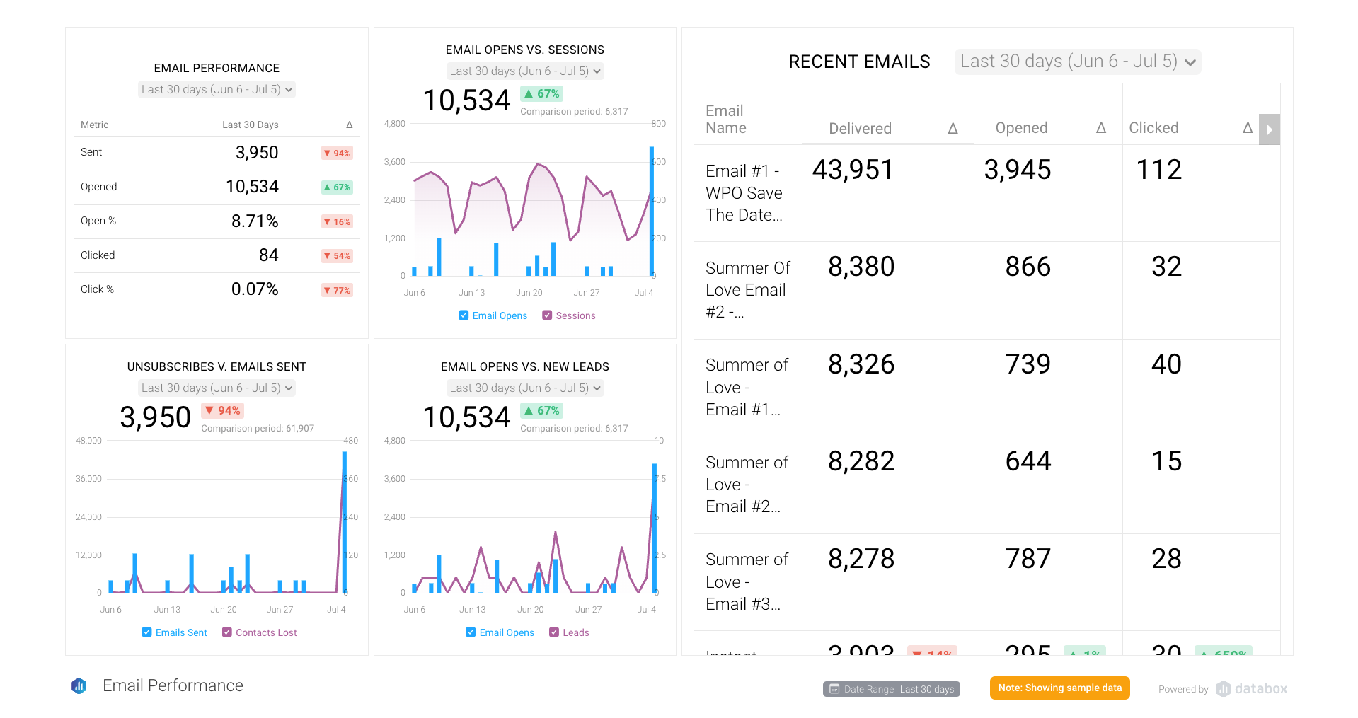
Download the Email Performance template here for free from Databox.
This digital marketing dashboard helps you and your team keep a close eye on overall email performance, while also digging deeper into:
- How your email campaigns are impacting website visitor traffic and leads.
- The number of unsubscribes you’re getting.
- The performance of individual emails you’re sending.
The data comes directly from HubSpot and is a tremendous time-saver because, even though all of this information is readily available in your HubSpot portal, it would be incredibly time-consuming if you had to track it down on a daily basis.
You can also have a separate dashboard that helps you keep a close eye on audience email fatigue to learn what occurs when subscribers aren't opening your emails or (even worse) are sending them to spam.
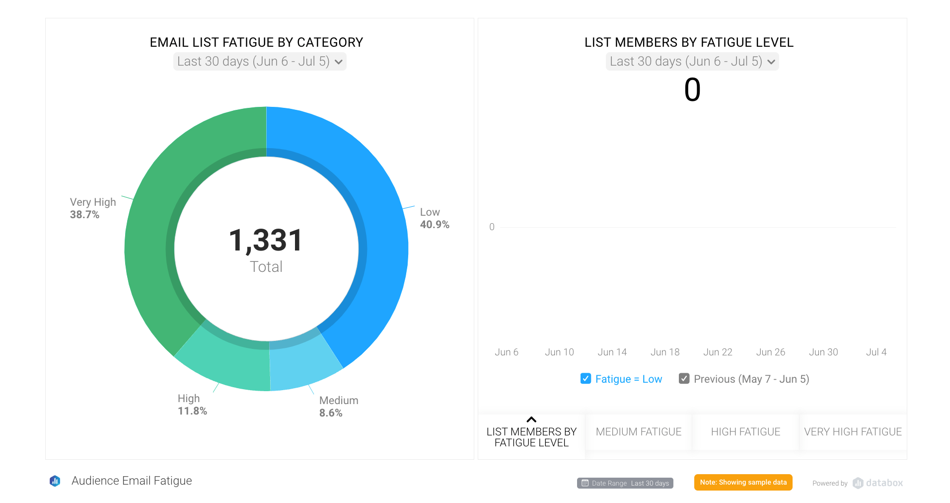
Download the Email Marketing Fatigue template here for free from Databox.
Email fatigue generally occurs when you are either sending your audience too many emails or they feel the content in the emails you're sending isn't relevant to them.
This marketing dashboard shows an overall breakdown (via pie chart) of your audience by level of fatigue, as well as specific bar charts showing how each category (low, medium, high, and very high) has changed over the last 90 days as compared to the previous 90 days.
5-6. YouTube performance dashboards
If you’re investing in video marketing (which you should be), you likely also have a YouTube channel.
With that in mind, you should create a YouTube Channel Overview dashboard.
.png)
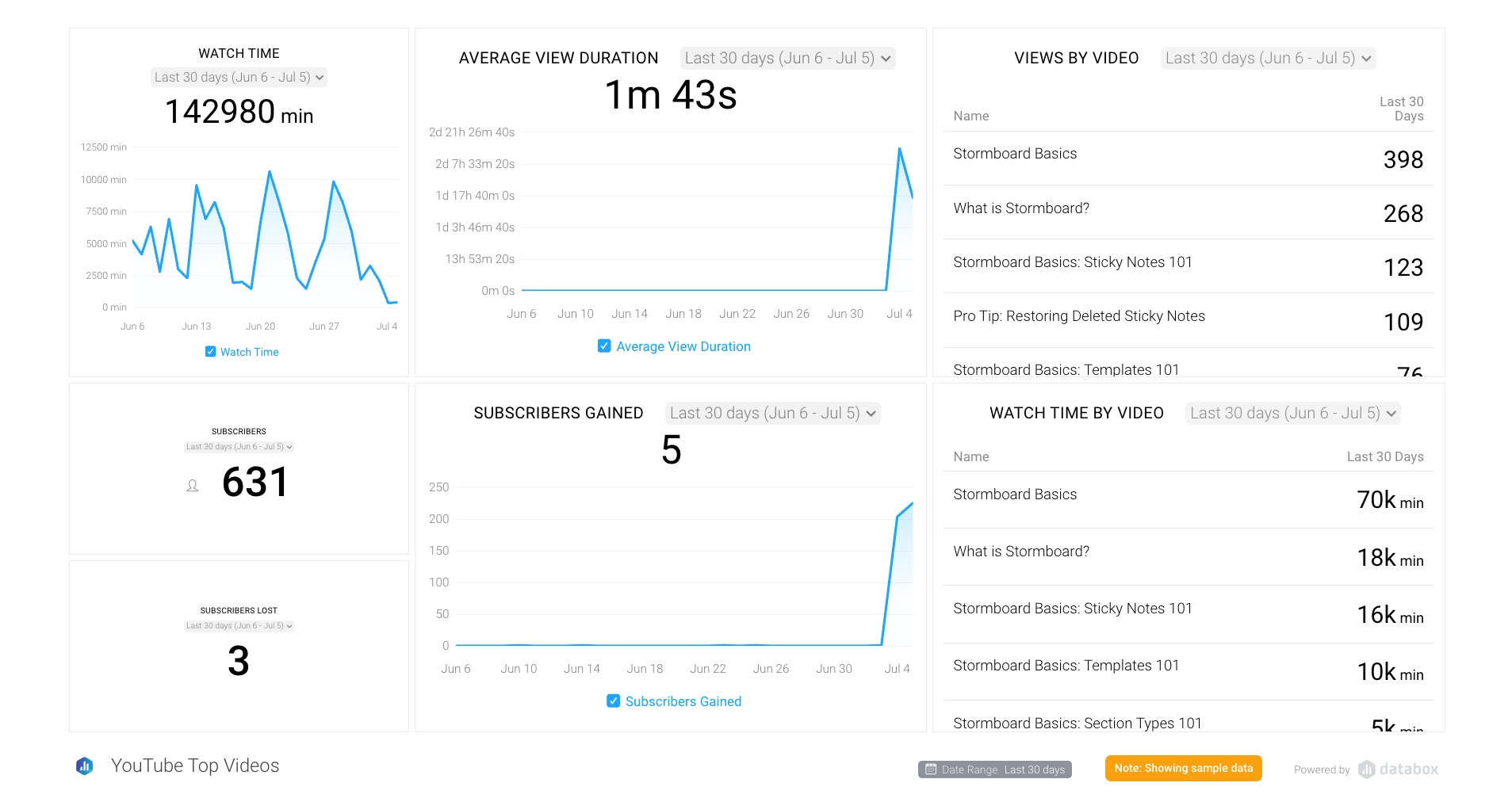
Download the free YouTube Multi-Channel Performance Databox template here.
This dashboard includes basic metrics on total subscribers, top videos by watch time, and subscribers gained over time.
(Side note: You can even include data from multiple YouTube channels in one dashboard!)
We recommend checking out the overview dashboard at least once a week to understand how your channels are progressing in terms of overall audience growth and to spot trends that might point to strong interest in particular content topics.
Any time you see something out of the ordinary — whether it's a really positive metric like a sudden spike in new subscribers or a red flag like a drop in views — dig deeper to determine the root cause.
Having channel-specific dashboards makes this extremely easy.
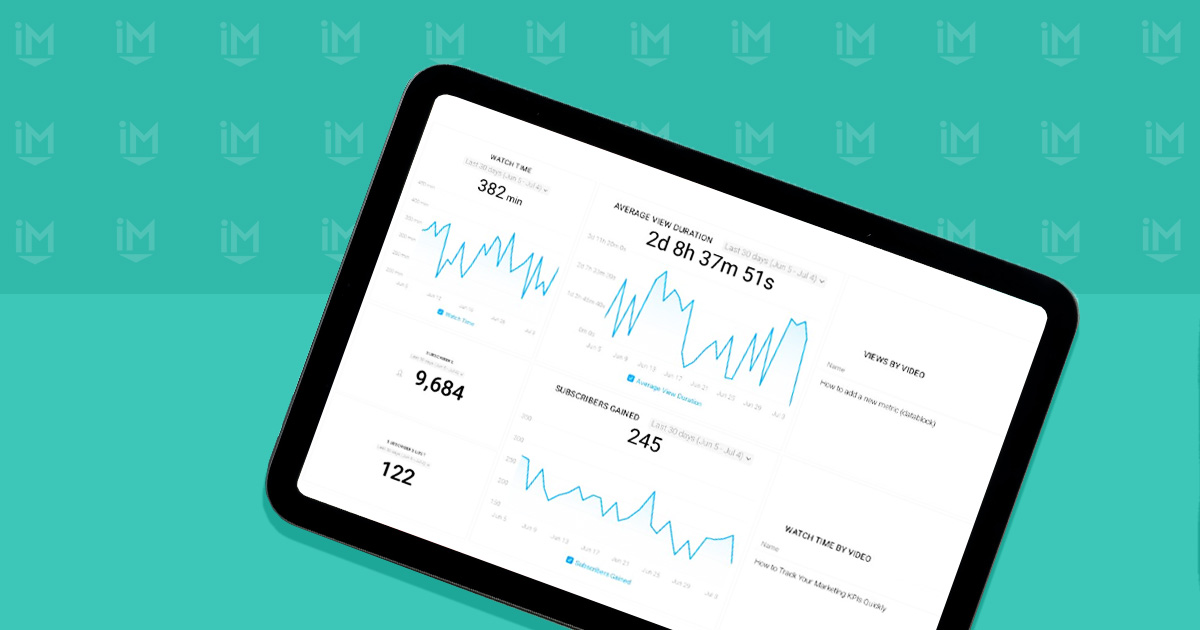
Download the YouTube Top Videos dashboard here for free.
These channel-specific dashboards contain an additional layer of detail on metrics like:
- Watch time trends
- Average view duration
- Number of views
- Video engagement
- Subscriber growth
- Unsubscribes
- Top videos by views and watch time
There is so much good marketing data available in these dashboards that you’ll almost never need to visit YouTube itself to understand what is going on with your channels.
7-9. SEO and Audience dashboards
Any marketer worth their salt is using Google Analytics to track website performance, so it should come as no surprise that you should be looking closely at Google Analytics data on a regular basis via Databox.
Here at IMPACT, organic traffic is one of the most important metrics we track. We get close to half a million visits to our website a month, and understanding what is driving (or not driving) that traffic is crucial to our ability to continue to grow it.
For instance, we could use a Google Analytics SEO dashboard from Databox to track the website content that is performing best for us.
It includes a list of our top organic landing pages, organic clicks by page and by search query (from Google Search Console), traffic from organic search, and organic landing page quality (basically, bounce rates and completion rates for people visiting our site via an organic search).
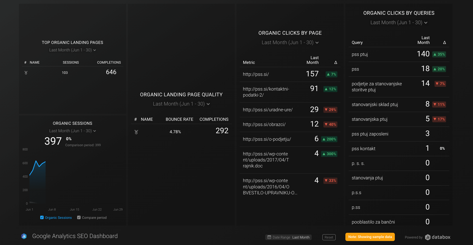
Download the Google Analytics SEO template here for free.
One of the most valuable things about this dashboard is that it provides users with the information you need to prioritize your CRO (conversion rate optimization) experiments and understand the composition and behavior of your audience.
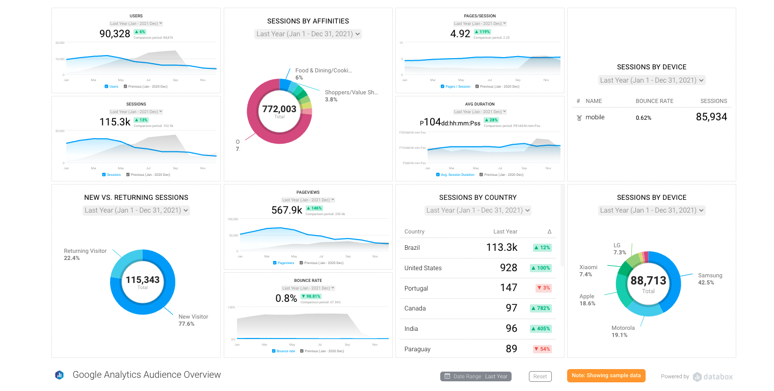
Download the Google Analytics Audience Overview Dashboard template here for free from Databox.
This dashboard tracks:
- Users
- Website sessions
- New vs. returning sessions
- Sessions by affinity
- Pageviews
- Bounce rate
- Pages per session
- Sessions by country
- Sessions by device
Another thing you’ll want to track closely on this dashboard is trends relating to mobile vs. desktop sessions.
With mobile browsing increasing, pay particular attention to mobile ranking factors, such as page load speed and data use on the specific mobile devices your visitors are using, to ensure your site renders correctly on them.
We also recommend having a dedicated dashboard helping to explain shifts in usage trends or traffic growth.
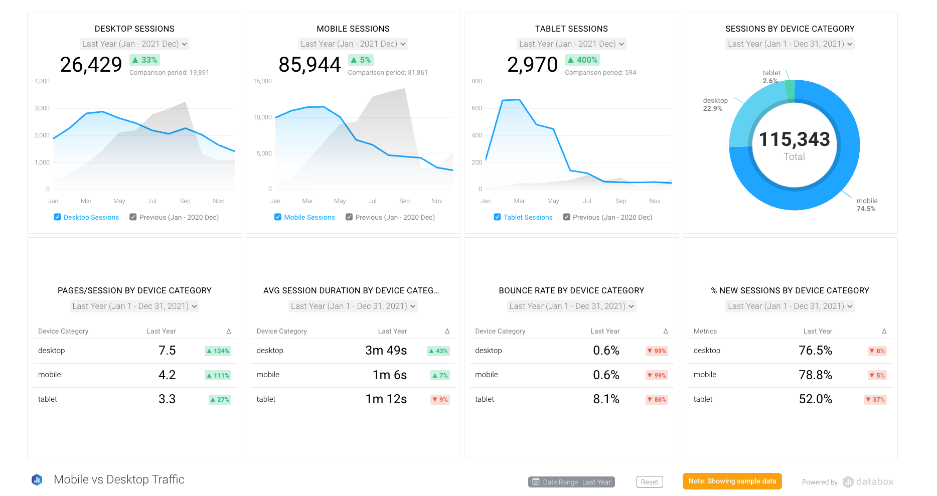
Download the Google Analytics Mobile vs. Desktop vs. Tablet Traffic Dashboard here for free from Databox.
This dashboard includes data on:
- Desktop, mobile, and tablet sessions compared to the previous month
- A breakdown of sessions by device
- Pages per session by device
- Average session duration by device type
- Bounce rate by device type
- Percentage of new sessions by device type
All of this data is tracked monthly and compared to your performance in the previous month.
10. Blog performance dashboard
At the core of any strong inbound marketing strategy, especially one centered around They Ask, You Answer, is content marketing — specifically blogging.
![]()
Download the Blog Performance Dashboard template for free from Databox.
The Blog Performance Dashboard can help you, at a glance, tracks such metrics as:
- Number of blogs published this month compared to last
- Total blog views this month compared to last
- Blog email subscriber growth
- Top blog posts by page views
- Top blog posts by click-through rate
The blogs that get the most views are not necessarily the ones with the highest click-through rates, although there is some overlap.
In fact, you can use this data to identify blogs that get a lot of views, but that don't get many click-throughs, and then create offers specifically for these posts to capitalize on the traffic they are attracting.
This is low-hanging fruit when it comes to optimizing your website for lead generation and a simple tactic that anyone can use.
11-12. Online advertising performance dashboards
With the growth of data available via Google, LinkedIn, Facebook, and Instagram, paid online advertising can be an important part of your marketing strategy.
Our clients have found great success with Facebook Advertising in particular.
Enter the Facebook Ad Performance dashboard. You can use this to closely track the performance of your Facebook ads and make sure that your spend doesn't exceed your monthly budget.
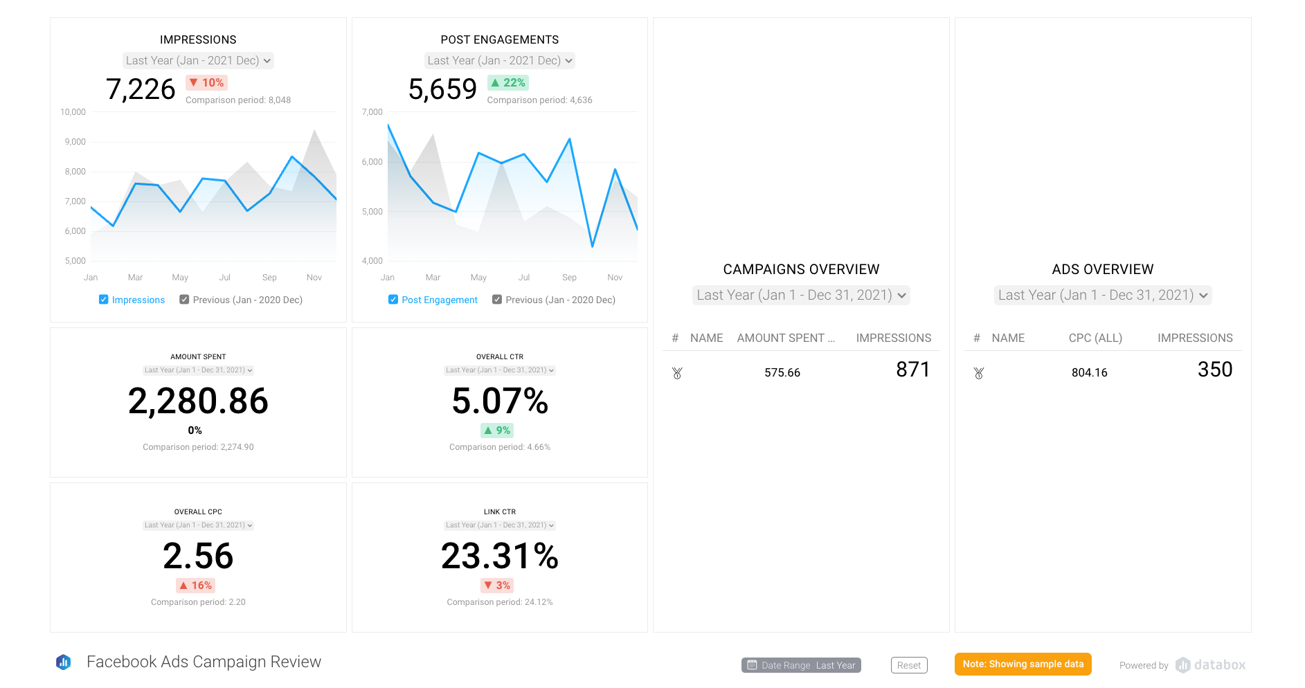
Grab the Facebook Ads Campaign Performance template from Databox for free.
With this dashboard, you can tell at a glance how your ads are performing this month as compared to last month in terms of:
- Impressions
- Post engagement
- CPM (cost per thousand impressions)
- Ad frequency
- Click-through rate
- Link clicks
- Cost per click
You can also do this with your LinkedIn ads.
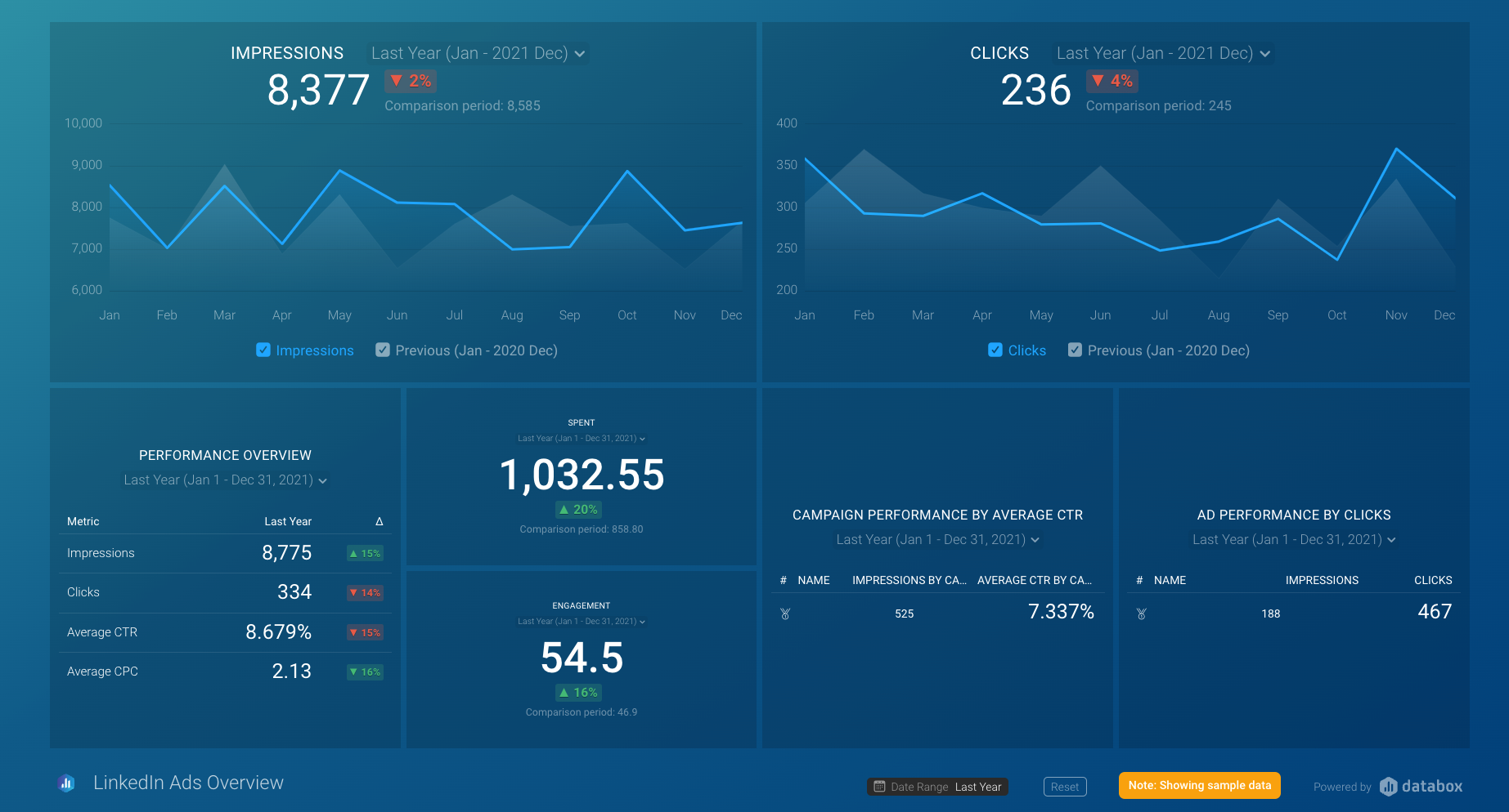
Download the LinkedinAds Overview Dashboard template for free from Databox.
Much like the Facebook ad performance dashboard, this LinkedIn dashboard provides a high-level overview of your ads' performance, as well as the ability to drill down into the details of individual ads.
13. Drift dashboard
Users want to see live chat, and Drift is one of the most popular options for getting this feature on your website.
With this in mind, you can use the Drift Overview dashboard to track your performance.
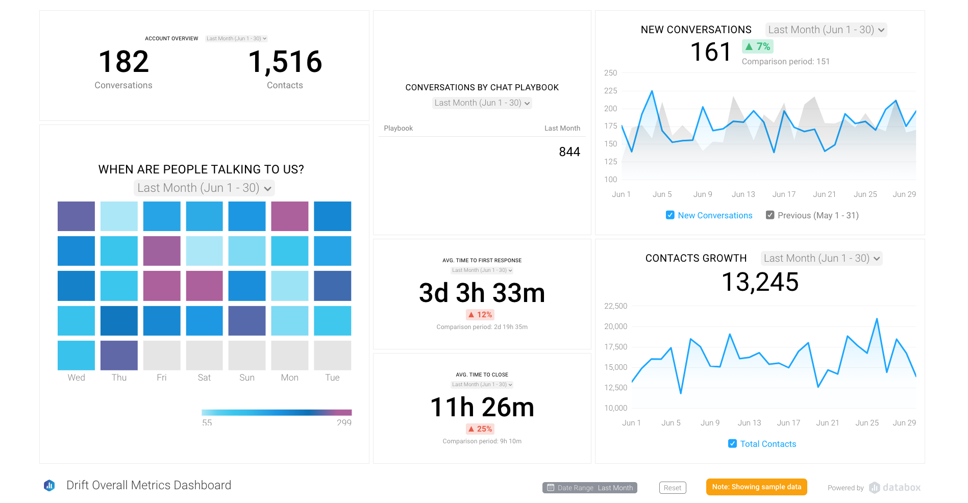
Download the Drift Overview template from Databox for free.
The dashboard includes data on:
- New conversations
- Conversations by agent
- Contacts growth
- Average time to first response
- Average time to close
- A heat map showing the days of the month when most people are engaging in chats
Watch this closely to see how Drift is impacting your new contact growth. However, your sales team can also use it for a valuable snapshot of KPIs, such as average time to first response, that they need to meet under your sales and marketing service level agreement.
Dashboards make you more efficient and effective
It's not an exaggeration to say that many marketers couldn't do their jobs effectively without dashboards like those provided by Databox. They are that valuable to you, your team, and the people you report to.
Here are just a few of the benefits you can enjoy because you have all of your data in one place:
- Stay focused on your goals: Because you can see your progress toward meeting a marketing goal at any time, you can keep everyone focused on it. If you get behind, you can react quickly.
- Connect your activities to outcomes in real time: When an email performs well, the whole team knows about it. When a video performs poorly, you can see that too. This transparency helps you celebrate the wins and adapt your plan so that you’re successful.
- Communicate better internally: Dashboards like those from Databox can be accessible to anyone in your company. This eliminates the need for people like your CEO or CMO to constantly ask for updates on your key OKRs.
How are you monitoring your team's performance? Databox and HubSpot are some of our favorite tools for doing this.
Want to learn how to get started? Check out our IMPACT+ course, “Fundamentals of ROI Reporting in HubSpot.”
Free Assessment:
/Assets/Icon%20Library/Arrows/Grey%20Arrow%20-%20Prev.svg)
/Assets/Icon%20Library/Arrows/Grey%20Arrow%20-%20Next.svg)