/Assets/base/Navigation%20Icons/TAYA.svg)
/Assets/base/Navigation%20Icons/Sales.svg)
/Assets/base/Navigation%20Icons/Web%20design.svg)
/Assets/base/Navigation%20Icons/HubSpot.svg)
/Assets/Icon%20Library/AI%20Mastery.svg)
/Assets/Icon%20Library/Learning%20Center%20Laptop.svg)

Mar 12, 2019
/Assets/Icon%20Library/x%20corp.svg)
/Assets/Icon%20Library/whatsapp%20logo.svg)
/Assets/Icon%20Library/Email.svg)
“Dude, I ‘Slacked’ that to you earlier.”
Sound familiar? Unless you are still woefully mourning the loss of AIM, you’re likely using Slack at work.
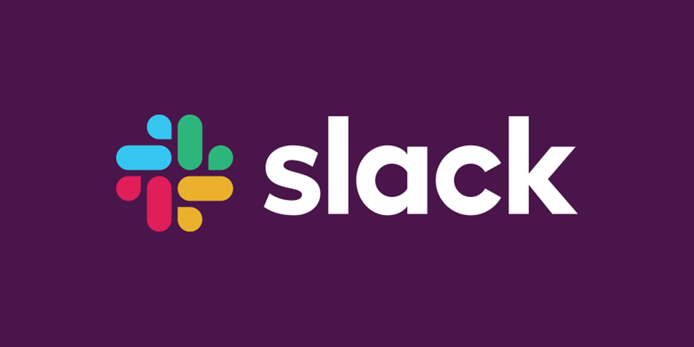
Having launched in 2013, Slack is a collaboration hub for work. Allowing people to work together more efficiently by keeping conversations, files, and to-do lists in a single app that operates across desktop and mobile.
We use it here at IMPACT, and quite frankly, our remote culture depends on it.
At the end of January, Slack introduced a major change. Gasp!
They decided to redesign their logo, and users around the globe were less than satisfied with the results.
I mean really, who actually likes change?
But, in most cases, the reactions went beyond not liking a little change.
There were the comparisons:
Clippy how you have changed. #slacklogo #slackbot #clippy pic.twitter.com/ra5vCQ5OOr
— Nate Schloesser (@nateschloesser) January 17, 2019
We all love ducks! 🐣🐥🦆 #slacklogo #slack pic.twitter.com/IhVlkyTg9a
— Dan (@Betraydan) January 17, 2019
wow, love the new slack logo pic.twitter.com/s0pf0AHsju
— Chris Warriner (@King_Darian) March 1, 2019
And then, the really bad comparisons:
... pic.twitter.com/cQAOH37RE7
— Christian Dakota (@codydohertyy) January 16, 2019
Yeah...that’s a little rough. But, as it goes with logo design, once you see it, you often can’t unsee it.
Finally, there were the unoriginal accusations:
Let’s play that fun new game: “Is it the new Slack logo or a random medical group?”#branding #slack #logo #design pic.twitter.com/a4RldEJRO1
— Christopher Grande (@chrisgrande) January 16, 2019
@SlackHQ #slacklogo Updated Again 🎉
— MiniCreo (@MiniCreo_Apps) March 1, 2019
But now it looks quite familiar 🙃 😄https://t.co/4SipOqCcLA pic.twitter.com/9GDXr8UBu5
I don’t know what all the fuss is about. Personally I love Slack’s fresh, unique, never-been-seen-before logo update… pic.twitter.com/tpFc9PuPGk
— Ryan (@thisisryanon) January 17, 2019
But, to their defense, Slack isn’t the only brand to ever find themselves at the wrong end of the Twittersphere.
Airbnb went through a similar social situation in 2014.
I can't get over @Airbnb's logo looking like a clinic for women's health. pic.twitter.com/fAFbrQ0dYx
— Simone Giertz (@SimoneGiertz) September 21, 2016
As did Uber in 2016.
Aww, Uber killed off its iconic butthole logo. RIP in peace little butt https://t.co/qFkFjWwRQD pic.twitter.com/LBdqacSCwR
— Casey Newton (@CaseyNewton) September 12, 2018
While some of these examples are pretty funny (come on, your 15-year-old self knows they are), others raise serious social and emotional concerns.
It proves the point that everyone can always relate a logo to something.
With that said, there are some key takeaways with Slack’s rebrand that we should all take into consideration next time we find ourselves in the same seat.
1. Have a Reason for the Redesign
This might seem obvious, but trust me when I say it’s not. Sometimes we see clients who are just bored of looking at their logo, and they want someone with creative inclinations to work their magic.
That’s never, ever a good idea.
Slack actually didn't do that. They had practical reasons behind their decision to redesign. In other words, they got this part very, very right.
Excessive Restrictions
Slack knew that their existing logo, though liked, was simply not doing the job they wanted it to.
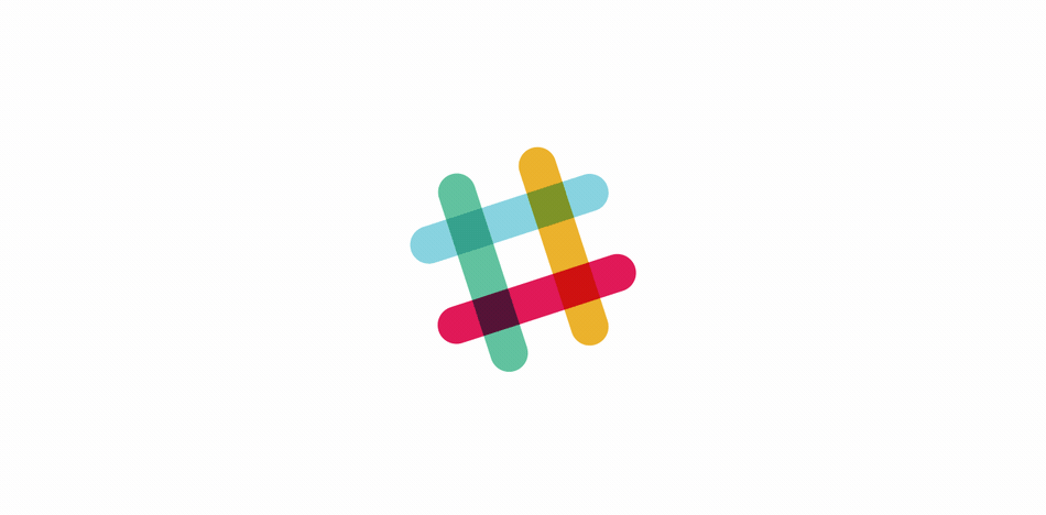
Their first logo was created before the company launched. It was distinct, fun, and the octothorpe (a fancy name for pound sign or “hashtag”) mirrored the character users saw when creating a channel.
But, they quickly found that they made it too complicated.
The logo was 11 different colors (holy crap! Can you imagine trying to embroider
The logo also had a very specific 18º rotation.
Talk about a brand standards nightmare. I honestly don’t understand how they dealt with it for so many years.
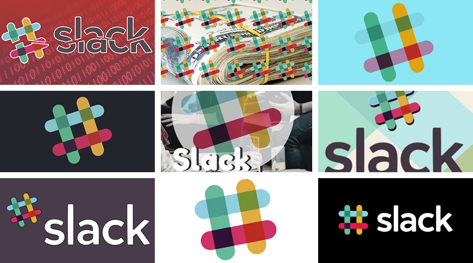
To compensate for these difficulties, Slack developed multiple versions of the logo that worked for very different purposes.
But, this meant that every single version of their app button was different, and, each one was different from the actual foundational logo. What? Kind of defeats the point of having a logo in the first place.
With any type of brand cohesion out the window subsequent designs for the brand suffered. There wasn’t a single, recognizable style that represented Slack.
A redesign seemed like the only solution.
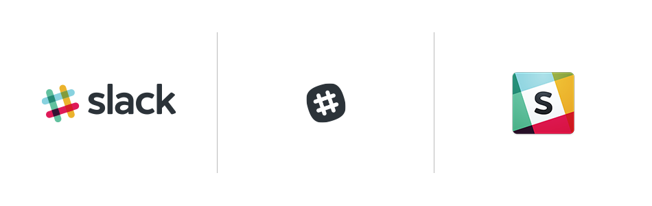
Having recognized and understood the visual mistakes their brand was making, Slack commissioned help from the team at Pentagram, who helped bring their new visual identity to life.
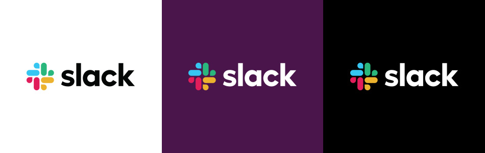
Now, I’m not saying if I endorse the new visual identity, but given the parameters listed above, Pentagram delivered.
Pentagram describes the process in a case study on their website:
“Derived from the original logo and built on a grid, the new octothorpe is comprised of two basic geometric shapes––a speech bubble and lozenge––that can be extracted and used as graphic elements. The speech bubble evokes communication and connectivity, and will form the basis of a system of customized icons, illustrations and motifs with rounded corners that echo the shapes of the logo. The new octothorpe can scale up or down to optimize legibility at various sizes.”
Visual problem = solved. That makes any designer’s heart happy.
The Brand & Company Is Evolving
Every brand goes through evolutions, sometimes those happen naturally as culture and core values progress with the changing environment. Sometimes, these evolutions happen at a specific crossroads.
For Slack, it’s the latter.
Slack is planning a direct IPO in 2019.
Visually, it’s time to stop messing around with 11 troublesome colors on
When your company goes public, it enters a new tier. Your name becomes known even outside of your users and your logo has to age well.
Did Slack’s hashtag really have a 10-year shelf-life? Or maybe even longer?
Does the new mark have the potential for a 50-year heritage?
While that question has yet to be answered, it is clear that some sort of change was needed.
2. Consider Your Audience
Now, here’s where things start to get a little fuzzy. Slack’s redesign also teaches us a lot about considering your audience during a rebrand.
Yes, the new logo solves a lot of problems Slack was having with their visual identity and, it certainly helps mature the brand in the eyes of investors, but what about its users and prospects?
Here’s where they missed the mark.
Desktop & Mobile Experience
The response from Slack users was HUGE.
All of a sudden, on February 26, they had new icons across their desktops and mobile devices and it was hard to find.
We went from a very bright, argyle patterned app to one that primarily used aubergine with some small colored icons.
I used to have a desktop app that was clearly legible and distinct in my Mac’s dock. After the redesign, it became one that barely stands out unless I have a notification bubble sitting on top.
Even worse, just a few short weeks after the unveiling of the rebrand, Slack decided to switch up its look on mobile, making it difficult to differentiate from apps like Google Photos and iPhoto.
As an avid Slack mobile app user, it’s incredibly frustrating that a once distinctive app is getting lost in my “messengers” folder along with the likes of Google Hangouts and Facebook Messenger.
As it currently stands, these extremely familiar app colors are almost lost on the aubergine background. It blends into the background of my dock, barely noticeable between my Creative Cloud apps. If it weren’t for the notification bubble, I might not even notice it was there.
The jury is out on whether these changes went through user testing groups, but they absolutely should have. At the very least, the implementation of the desktop app design could have better highlighted the new logo.
Unexpected Connotations
So, some of the tweets above were pretty harsh.
In fact, a number of people were downright offended by the imagery, suggesting that the white space of the new logo resembled a swastika.
Were they wrong? Absolutely not.
Colors and symbols have different meanings in different cultures and contexts and even if you personally do not see it that way, it does not stop others from doing it.
Again, I can’t confirm that Slack didn’t do their due diligence when it came to testing the new logo, but outcomes like this show the importance of doing so.
As a brand, you need to take into account how your symbolism can be perceived by everyone in your audience.
As a Designer & Brand, What Can You Do?
It’s 2019.
As a graphic designer placed in charge of visually representing a brand, you have to consider how every angle of your design is representing that brand, and what this imagery could mean in terms of backlash.
Misinformation and harassment are front and center. Gone are the days of keeping your opinions to yourself, tucked away in forums, or on a small personal website.
Slack’s logo launch endured all of it. The good, the bad, and the downright ugly.
Again, part of the strategy for any public facing brand needs to be considering how the imagery associated with that brand (as unintentional as it may be) could be misinterpreted. No matter how good your intentions, things today can be twisted into something hideous or hateful.
As a designer can you prepare for and control how each individual interprets your work?
Of course not, but you can take some steps to try and prevent it.
Think about submitting your imagery to test panels to essentially rip it apart.
If you want to know what the Twitterverse is going to do with a potentially unsavory mark, test it. At the very least, you can prepare your teams for the potential backlash and plan on how to address these types of opinions.
This test-first mentality can help you stand strong as Slack did, as opposed to a situation like Gap, where they pulled their rebrand in the first week.
3. Pay Attention to Competition & Differentiation
One of the key components of any redesign is the ability to bring originality to a brand.
A logo should be clean, replicable, identifiable, and like nothing you’ve ever experienced before.
At least, that’s the dream.
Unfortunately,
One of the biggest areas of backlash Slack endured was their inability to be totally original.
The new logo was compared to medical groups, other tech startups, and some of the most familiar apps on our phones (Google Photos, iPhoto, etc.).
Differentiation is important, but, from a design perspective, the lack of it may have been very intentional.
People are largely attracted to what is familiar. That’s why UX on different websites, for instance, can start to look and feel eerily similar.
But, that’s actually a really good thing.
Users know exactly how to use a familiar site. It lowers friction and makes navigating easier.
Logo design trends in a similar direction.
For example, ever since Apple decided to ditch skeuomorphism for flat design around 2013, the majority of logo and app designs have followed.
In 2019, there is hardly a logo out there that hasn’t been strategically decluttered, simplified, and flattened. Consequently, everyone ends up looking the same, but still different.
I usually sort my app icons by color because it's easier to look at and remember but this is just getting confusing. 🙈🙈 pic.twitter.com/vQatzi9xJA
— Noukka 🐨 (@noukkasigne) February 27, 2019
Is Slack’s logo overly inventive and groundbreaking? You can certainly make the argument that it isn’t and perhaps there should have been more effort to help it be more distinct.
However, it is likely they’ve made the decision to be on trend with their industry.
This conscious decision to blend in might be a good look in terms of a risky investment (and their IPO status), but to users, it’s just as comfortable as the rest of their home screen.
Thinking About A Rebrand?
Do it for the right reasons.
You don’t want to take on a project like this simply because you’re tired of your logo. Make sure you have concrete reasoning for a redesign.
Make sure you are partnering with an agency that understands these reasons and owns them as if they were their own reasons for the project.
That agency should not only be well-versed in design, but aware of the competition and the community that surrounds your brand.
If they have the ability to expect certain backlash or be compared to certain brands, you can own the situation and respond with unflawed reasoning to be able to uphold your decision.
Keep these questions in mind when interviewing an agency for a rebrand:
-
Why do you want to work with my brand? This company is going to give your brand the biggest makeover it’s ever seen. Do you trust them with scissors and your Rapunzel-length hair? Make them prove it to you.
-
Can you walk me through your process? Logo design is a highly collaborative process embedded with brand messaging strategy and subjective emotions. Make sure your agency of choice understand how heavily each weighs on the desired outcome and test them on how they get there.
-
How will you contend for my brand against my competitors? Make sure your agency of choice recognizes your competition’s tactics and understands how to apply them to your goals.
-
Who will be on my team? For the same reasons as question two, make sure the team pitching you is the same team that will be delivering. You’ll need to be able to trust this team with your brand. Be sure you're comfortable from the start.
-
What does branding mean to you? This one is tricky. There is no “right” answer here, but instead, one that feels right to you. Hint: There is a wrong answer - a logo.
So, Do You Actually Like the New Slack Logo?
That’s a tough question that’s going to come with a tough answer.
I respect the new Slack logo. As I mentioned above, it solves a very specific set of problems for the brand. In my mind, that’s a really successful redesign.
From a totally subjective, “do I like it” emotional standpoint. Eh, it could have pushed a little further. There was an opportunity to set the trend as opposed to following it. It doesn’t exceed expectations for me -- but it certainly won’t stop me from slackin’.
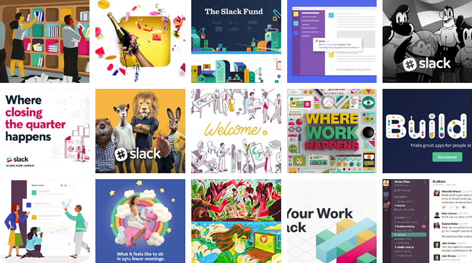
All images (excluding tweets) via Slack.
Free Assessment:
/Assets/Icon%20Library/Arrows/Grey%20Arrow%20-%20Prev.svg)
/Assets/Icon%20Library/Arrows/Grey%20Arrow%20-%20Next.svg)