/Assets/base/Navigation%20Icons/TAYA.svg)
/Assets/base/Navigation%20Icons/Sales.svg)
/Assets/base/Navigation%20Icons/Web%20design.svg)
/Assets/base/Navigation%20Icons/HubSpot.svg)
/Assets/Icon%20Library/AI%20Mastery.svg)
/Assets/Icon%20Library/Learning%20Center%20Laptop.svg)

Jul 23, 2014
/Assets/Icon%20Library/x%20corp.svg)
/Assets/Icon%20Library/whatsapp%20logo.svg)
/Assets/Icon%20Library/Email.svg)

 I have to be honest with you – I've had this title in my head for several months now, even before it was true.
When you do something as absurd as remove the sidebar from your blog, you tend to hold onto your optimism like a novice swimmer clinging to his life vest. It's really all I had.
I mean, you can't remove your blog sidebar, right? Every "ninja" and "guru" with a decent internet connection and a modest grasp of grammar and syntax has a sidebar on their blog. How else are you supposed to generate leads?
These were the demons I was fighting as I made the decision to remove ours. Luckily, it was a favorable decision and therefore a team effort.
My goal here is to help you understand why we did it. Why a marketing team, tasked with generating leads, would go against traditional methods of doing so.
Seems kinda silly, doesn't it? Sure it does. But let me show you why it worked.
We created contrast
Quick, what's the first thing you notice in the photo below?

It was the strawberry, wasn't it? (I know, lucky guess.)
Good, because I really wanted you to notice that strawberry. In fact, that strawberry is the single most valuable item in the entire fruit bowl.
Now take a look at this next image. What's the first thing you notice?

I'm not even going to try to guess your thought process here. Chances are if I polled our readers, I'd see as many responses as there is fruit in this bowl. There's a lot more going on here. A lot distracting you from that precious strawberry.
But in that first picture you saw exactly what was expected of you. I wanted you to notice that strawberry, and by eliminating the distractions around it, you did.
Forget the fruit...what about the blog?
This was the problem with our old blog layout – there were far too many things distracting from what was most important from a marketing standpoint: conversions.
Have a look for yourself...

Yikes. It's only been a couple of months and this already feels extremely dated. Apparently our blog was suffering from a severe case of Multiple Personality Disorder.
"Read this article..."
"Hey! Subscribe here!"
"Yeah, yeah that's great. But you should follow us on Facebook!"
I'm already exhausted.
Improving the reading experience by eliminating that noise also creates a huge benefit for you in the way of contrast. The quieter it is, the more likely they are to hear you when you do speak up.
How it worked
Before I get to the numbers, I'd like to show you one small (huge) change we made to our below post calls-to-action.
Because we removed all other noise, and as a result conversion opportunities, we knew we needed bigger things from our lone CTA below the post.
Instead of using the old, standard "click here" type calls-to-action that lead to the corresponding landing page, we wanted to try eliminating the middle man and allow for conversions at the most optimum time, right after someone finishes a post.
We call these "in-line CTAs" in that they allow readers to convert on a form without clicking off the page, thus shortening the conversion path.
Here's what they look like....

Here's how we created them:
- We created a new form in HubSpot for each offer for analytical purposes. (We want to measure in-line vs. standard CTA performance.)
- We created a new module within HubSpot's blog editor
- We designed and coded new styling for each offer (then pasted the code in our newly created module.)
When offers like these are made more accessible – and more importantly, are aligned with your blog content – the payoff is huge.
The numbers
I always use data to help assist my decision making. But a decision like removing our sidebar was based more on premonition, as there weren't many – if any – notable case studies to speak of.
The data came afterward, and boy was I curious. (As I'm sure you are too.)
For the sake of comparison, I used the same offer, our Beginner's Guide to Inbound Marketing, and its corresponding call-to-action (standard vs. in-line) to see which is performing better on our sidebar-less blog.
As seen below, our standard CTA saw a 3.3% view to click ratio, which means that out of one thousand visitors, 33 clicked through to the landing page. Of those 33, a little over 42% actually converted on the offer.

The result? 14 leads.
As for our new in-line calls-to-action, there's less data to compare, as we've eliminated the middle man. Out of 1,000 visits, 2.4% of readers actually converted right on the form.
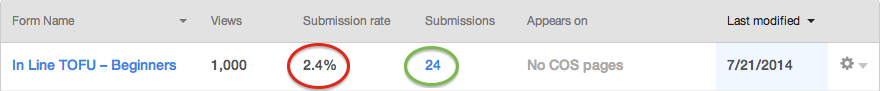
This resulted in 24 new leads.
A 71% increase over the performance of our standard calls-to-action on a blog that included a sidebar.
And this is only out of one thousand views. Extrapolate this out over several months, for every one of your offers, and you can see there is plenty to be excited and hopeful about.
The wrap
We eliminated conversion opportunities on our sidebar, yet increased our conversion rates significantly.
Challenge the status quo as it relates to the everyday tactics you're carrying out.
Just because it's the way things are, doesn't mean that's the way things will remain.
The fun part is finding out for yourself. Hang on to your life vest.
If you enjoyed this, I put together a guide filled with other hacks on getting the most from your blog and content strategy. Fill out the form below and it's all yours.
Free Assessment:
/Assets/Icon%20Library/Arrows/Grey%20Arrow%20-%20Prev.svg)
/Assets/Icon%20Library/Arrows/Grey%20Arrow%20-%20Next.svg)