/Assets/base/Navigation%20Icons/TAYA.svg)
/Assets/base/Navigation%20Icons/Sales.svg)
/Assets/base/Navigation%20Icons/Web%20design.svg)
/Assets/base/Navigation%20Icons/HubSpot.svg)
/Assets/Icon%20Library/AI%20Mastery.svg)
/Assets/Icon%20Library/Learning%20Center%20Laptop.svg)

Feb 26, 2016
/Assets/Icon%20Library/x%20corp.svg)
/Assets/Icon%20Library/whatsapp%20logo.svg)
/Assets/Icon%20Library/Email.svg)

 I’ve always loved the feeling of excitement and ambition that accompanies the new year.
The feeling that says “This is going to be my year. The one where I break out of my shell and take the world by storm.”
We all feel empowered as we make our resolutions and put our master plans into action. Nothing can slow us down or rain on our parade -- until we get that letter in the mail labeled “IMPORTANT TAX DOCUMENTS ENCLOSED.”
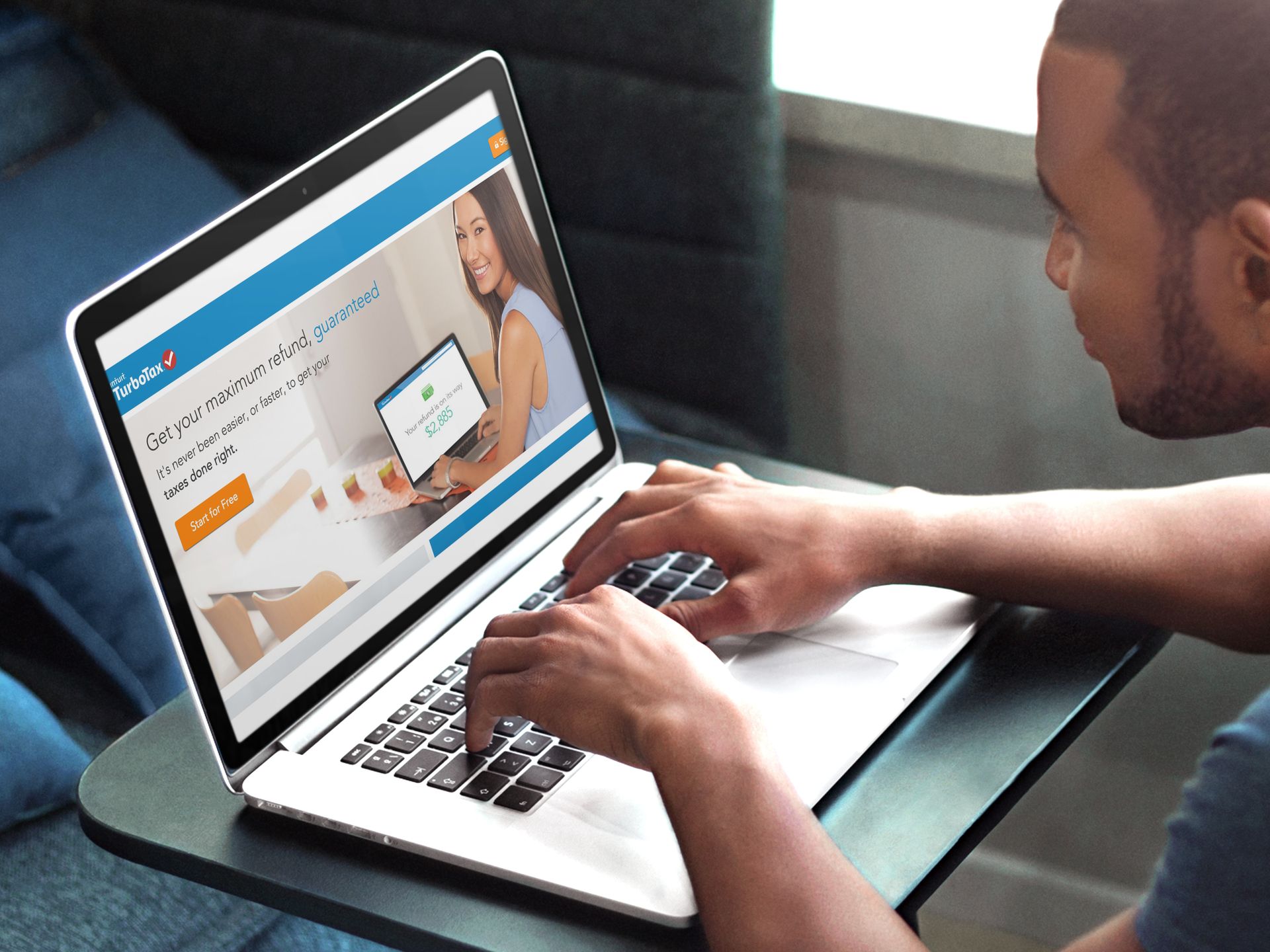
Taxes are stressful. Luckily,TurboTax has taken a lot of the headache out of the yearly burden with its software and also set a great example of good UX for all of us designers and inbound marketers in the process.
Exceeding Expectations
In the past, I would always procrastinate until the last minute with my taxes and find myself scrambling to put together any sort of deductions to ease the blow. -- “Does that stick of gum I lent my friend last week count as a ‘Charitable Contribution’?”
This year, however, I decided to put my adult pants on and be proactive.
After a cup of coffee and quick Google search, I was fortunate enough to be introduced to TurboTax. I’ll be honest; initially, I was skeptical of using an online software like this, but from the second I started using it, I can safely say all my preconceived notions of having to navigate through pages and pages of clunky dropdown menus and long forms were quickly put to rest.
The user experience TurboTax has built into its software is so well done it inspired me to put together this list of everything the company is doing completely right when it comes to UX; all in hopes of inspiring marketers to do the same with their product, services, and web experiences.
1. Using a Friendly Tone of Voice
TurboTax really nailed it with its brand voice and tone. Doing your taxes isn’t fun, but throughout its software, it uses a voice that says “We know taxes are a pain, but we’re here to help” and a tone that is always friendly, human, and warm.
As you walk through the filing process, you feel as if you’re just having a normal conversation with an accountant who's sitting right next to you, rather than going at it alone.
Establishing a voice that resonates with your audience like this one is critical. It makes your visitors trust you and can make you stand out from your competitors.
Take the screenshot below for example.

From the second you start the tax filing process with TurboTax, you feel as if you’re meeting a new friend for the first time.
Rather than just giving you a formal, robotic form and header that tells you to enter your name, the copy here keeps it conversational and personable. Using this kind of tone of voice keeps your users engaged and helps turn a normally annoying task into an enjoyable experience.
2. Building Trust with Microcopy
Tangible UX, the agency behind the design of TurboTax, discovered in its initial research that the software’s online visitors wanted to “feel more confident that TurboTax ‘had their back’.”
In other words, visitors wanted to know that they were in capable hands and that their private information was safe.
To help build that trust TurboTax used engaging microcopy throughout the site.
For example, if at anytime you feel skeptical about a certain question, you can click their “Why we’re asking” link to find out exactly why they need that information and what they plan on doing with it.

This small line of copy goes a long way when it comes to putting a visitor’s mind at ease. It adds credibility to your process and makes people feel more comfortable continuing it.
The same concept could be used to help users feel more comfortable converting on forms on your website.
3. Reinforcing Your Brand with Imagery
When it comes to making a strong first impression and converting a first-time visitor into a dedicated user, images are critical. Not just any old images, however, but visuals that are consistent and right for your brand.
Throughout its software, TurboTax uses illustrations that reinforce its brand and personable, energetic, and transparent tone of voice. The image below is an example of what a user sees when they finish filing their taxes.

Notice how they decided to use an illustration rather than a photo, along with bright colors. Not only is this consistent with the brand they’ve created for themselves, but it also delights the user congratulating them on their accomplishment playfully.
Key Takeaways:
At the end of the day, I don’t think anyone can ever really "enjoy" doing their taxes my taxes, but with a user experience that is reliable and easy-to-navigate, talks to you like you're a friend, and keeps you engaged, TurboTax definitely makes it possible.
Here are the three key things you can pull out of TurboTax’s incredible UX and apply to your own:
-
Remember who your audience is and create a tone of voice that will resonate with them. The last thing you want to do is risk coming off as cold and robotic.
-
Always be on the lookout for areas of your site that can benefit from the use of microcopy. Whether it’s a line of text on a form explaining how to fill out a certain field or some witty text near a button that encourages users to take action, a little bit of copy goes a long way.
-
Do your research when it comes to choosing imagery for your company. You can say a lot with a few simple images, just make sure they’re consistent with your company's brand.
Free: Assessment
/Assets/Icon%20Library/Arrows/Grey%20Arrow%20-%20Prev.svg)
/Assets/Icon%20Library/Arrows/Grey%20Arrow%20-%20Next.svg)