/Assets/base/Close.svg)
 ]
]
/Assets/arrow-facing-left--black-01.svg)
/Assets/base/Navigation%20Icons/TAYA.svg)
/Assets/base/Navigation%20Icons/navigation%20arrow%20-%20facing%20right-01.svg)
/Assets/base/Navigation%20Icons/Sales.svg)
/Assets/base/Navigation%20Icons/Web%20design.svg)
/Assets/base/Navigation%20Icons/HubSpot.svg)
/Assets/Icon%20Library/AI%20Mastery.svg)
/Assets/Icon%20Library/Gear%20icon.svg)
/Assets/Icon%20Library/Learning%20Center%20Laptop.svg)
/Assets/Icon%20Library/Click.svg)
/Assets/Icon%20Library/Link.svg)
/Assets/navigation-global--close-symbol-black-01-1.svg)
/Assets/navigation-global--close-symbol-black-01.svg)

Sep 4, 2020
/Assets/Icon%20Library/x%20corp.svg)
/Assets/base/Learning%20Center%20Resource%20Category%20Icons/Facebook_Messenger_logo_black.svg)
/Assets/Icon%20Library/whatsapp%20logo.svg)
/Assets/Icon%20Library/Email.svg)
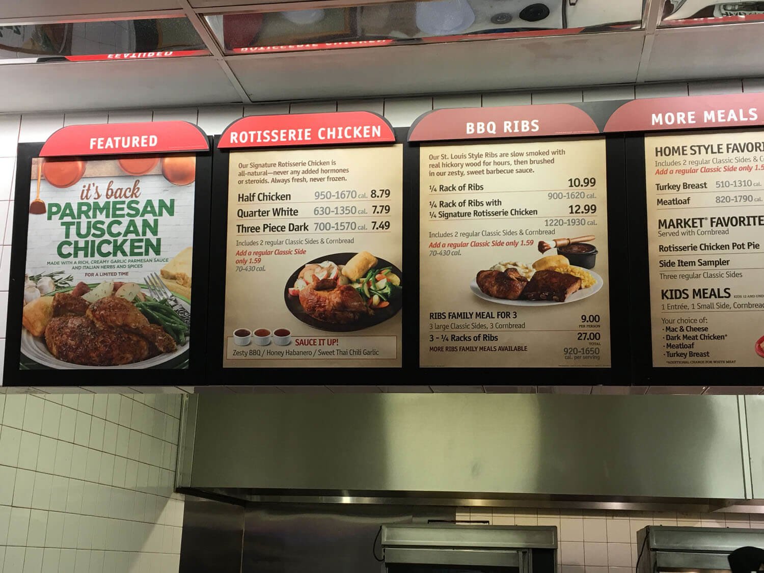
Last month, I ventured to one of my favorite fast food restaurants I hadn’t been to in almost 10 years; Boston Market.
The moment I walked in, the wonderful smell of rotisserie chicken, gravy, and sweet corn went straight through my mask, filling me with memories of visiting the restaurant when I was a kid.
As I looked up at the menu, I was pleasantly surprised at what I saw.
Not only was I still able to get my favorite meal (¼ chicken, corn, mashed potatoes, and cornbread for those wondering), but I found the menu's font size and spacing made it easy to see what was offered and find what I wanted, despite the many options.
The menu consisted of several panels, each with a large red tab on top and white text, mentioning the type of food or phrase (such as ‘sides’ or ‘featured’) highlighting what to expect on the below menu panel.
The text on the panels themselves had ample spacing. Categories in the menu ("kids meals," "market favorites") were the largest and used uppercase styling, with the food items themselves (meatloaf, ½ ribs) coming in as the second most prominent. Both also used bold font weights and were colored black.
When you put all this together, my menu experience went like so. I looked at the top red cards to find the food I was interested in, then scanned further into the panel to pick up on any individual categories I was looking for, and once I found that, I scanned the names of each menu item within it.
I highlight this case because oftentimes I find myself in situations where menu text is really small, and is instead supplemented by a large image of the item.
But in these situations, I have to walk closer to the menus, trying to read each one to find out what's chicken, ground beef, etc.
But if you don’t have near 20/20 vision, you might find yourself squinting and asking for someone else to read the names to you. Others might simply walk out without saying a word.
When it comes to your website, this is the last experience you would want your users to have.
Why font size matters
Not only does the wrong font size choice add frustration to a website experience, but it results in a decrease in conversions and session duration.
There have been several studies that show the effect of font sizes on people’s reading ability, and how age plays a factor as well.
In one study, it was found that “fixation duration decreased with increasing font size.” The effect was even larger in younger readers.
This means people spent less time on particular parts of content when the font size was increased, but would slow down when the font size was small.
Variations in your font size also affect your content’s hierarchy. Remember how I talked about how the font sizes on the menu helped make it easier for me to navigate the options and find what to order? Your website’s font size has the ability to do the same.
Take this Apple example below. Using different font weights and sizes, they make a clear distinction between the page title, lead paragraph, and individual sections of content.
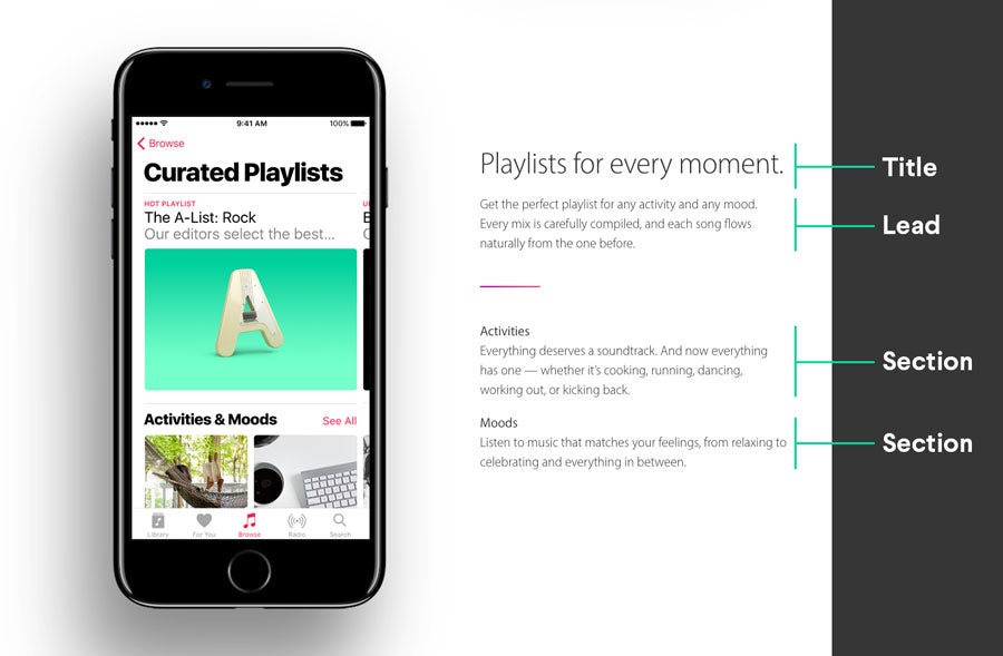
Executing a great visual font hierarchy like this also helps users can find where they want to go faster. This in turn, leads to a better user experience.
Based on these points, you can see how optimizing your website for the right font sizes is a foundational piece of your website.
Sometimes it’s not only the size that counts
Some of us may very well have body fonts that range between 20px - 24px and headers that are 30px - 70px, but that doesn’t always mean your website's typography is without issue.
Line height, font styles, kerning, and weights also each play an important part in conjunction with your font sizes to assure they work cohesively to assure the best user experience for users.
If you’re looking for more details check out this article on the theory behind web typography, the basics, and rules to know when reviewing what font styles you want to choose.
So why do we typically make our font sizes smaller?
Although many of us are fully aware of the fact that we ourselves prefer larger font sizes because they enhance readability, we still get caught in situations where we decide to decrease it on our websites.
What do these scenarios look like? How do we often fall into the trap of illegible website font sizes? And how can it be fixed?
Let’s take a look.
Too much content
As you’re laying out the content you want each of your webpages to have, it can be easy to run into a scenario where you have loads of information you want your users to read. On top of this, you might want to cram it into particular layouts that only exacerbate the length of content even further.
While it’s been shown that larger font faces help with readability, certain sizes won’t always work well based on the width of your content column.
So it’s only natural to want to shrink the font sizes to make everything feel less overwhelming.
However, if you know you're guilty of this technique, especially on your landing pages, you may be costing yourself conversions.
In one case study from Click Laboratory, one of their primary focuses for their client was to increase their font size across various areas of its website.
They tested increasing the font size to 13pt and added a little extra spacing between each line (known as line-height). “This simple change improved the bounce rate by 10%, the site exit rate by 19%, pages per visit by 24%, and an impressive 133% improvement in form conversion rate.”
As you can tell, some users aren’t going to stick around attempting to read content that’s too long or too small. This is why it's so important to take font sizes seriously when it comes to improving your overall website usability.
We go for mobile first
With a smartphone in almost everyone’s pocket, it’s no secret that we live in a mobile online world.
Now, with Google planning to rank all websites mobile experience higher than that of their desktop this month, the need for mobile optimization has never been higher.
In a race to adapt to this, many have begun making blanket changes to their mobile font sizes; decreasing them in the hopes that they are small enough for the sole purpose of text both fitting and not feeling too overwhelming long on mobile.
But in some cases, these sizes aren’t too easy on the eyes.
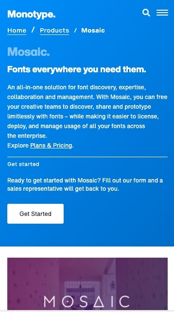
Above is an example of Monotypes product pages. On mobile, they have paragraphs and small headings that run around 10px - 12px, which is actually considered too small by Google’s standards.
In doing this, we’ve also neglected creating unique typographic experiences for smaller device sizes when they are needed.
For example, if someone is reading a blog article on your website, making your paragraph 14px across the board can inhibit legibility on long blocks of content like this.
While some other areas of the site may benefit from this smaller paragraph font, in this case, you might want to keep your paragraph font at 17px.
Let’s look at another example.
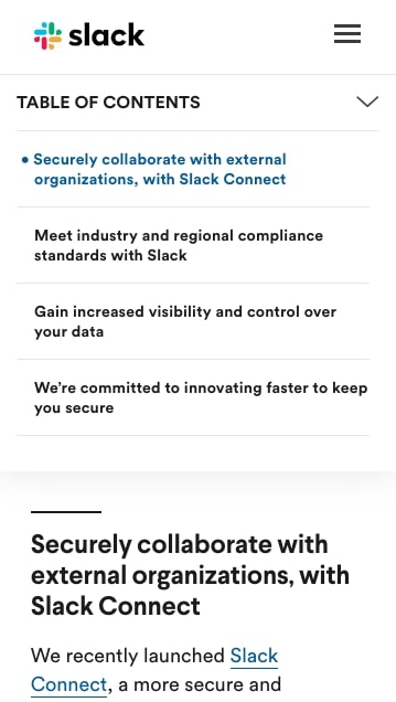
Slack’s blog articles utilize a table of contents. When you expand the menu for it on mobile, you see other sections of the in 14px font. This works well since their titles can run two to three lines.
Any larger in font and the menu might feel too overwhelming and harder to scan.
When thinking about mobile font sizes though, don’t go for a one-size-fits-all approach.
Understanding each of your pages layout, amount of content, and purpose should help you dictate how font sizes should vary on mobile devices.
So why go bigger?
Bigger font sizes not only hold more visual weight to grab the eye, but they also help usability, which can be the difference between your users converting or becoming frustrated and leaving.
Usability and accessibility
One of the biggest pieces of website user experience that tends to be overlooked is usability and accessibility, and font sizes play a huge role in this.
The usability of a website tells us how “effectively, efficiently, and satisfactorily its visitors or users can see or examine” a website, whereas accessibility refers to how users perceive, understand, navigate, and interact with a website.
For example, picture two buttons: the font size of one is 12 pixels and the other 16 pixels.

Depending on how your buttons are built these, the font sizes can affect the overall size of the button (or area users have to tap) and one will likely be easier for users to press than the other on mobile devices.
Apple also advises that it's best to use regular and heavyweight fonts and to avoid light and ultra-light. Using thicker fonts, alongside appropriately sized ones for each heading type, helps users better differentiate hierarchy.
This is important because typographic hierarchy subconsciously guides the reader, helping them identify which points to read first, and which are simply supporting statements.
But a more important concept large font sizes help with is ADA compliance online.
The core principle of ADA compliance is to “provide equal access to everyone on the web, including persons with a disability.” This means offering a consistent and equal experience for people regardless of their hearing and seeing abilities. Could someone with visual impairments (partial or full) be able to find a way to fill out a consultation form, download a resource, etc.?
If your website is fully accessible, they should.
Since screen readers are one of the few options those with visual impairments have to read a website, it's imperative that your website's font is correctly organized and properly sized. In some cases where companies hadn’t, they found themselves facing lawsuits.
Although there's no official ADA-enforced minimum size font for website use, it's usually recommended that you use at least 16px font for the body text.
Skimmability
It's no surprise that users are now scanning text rather than reading word for word in an effort to absorb the main points of a page. Making your font faces smaller only hinders your user’s ability to sift through the content faster.
Although larger fonts may appear clunky in rare situations, it has actually been found to help with reading time. In studies from Payame Noor University & IBM/Google, as the size of type increases, readers also exhibit slightly faster reading speeds.
Larger fonts have also been found to increase a user’s amplitude of saccades. This refers to how far the eyes is jumping when reading text, as opposed to your eyes smoothly progressing across each word as you read.
The higher the amplitude, the closer you are to ‘skimming’, rather than reading line by line.
While you might be thinking that encouraging skimming is detrimental, since that means people aren’t reading all your content, I would disagree.
It isn’t right to expect your users to read every bit of content on a page, and on every page they visit for that matter. Skimmability helps your users better locate what they might be looking for.
In fact, some users tend to scan a page first to gain an understanding of what to expect, and whether or not it's what they’re looking for before deciding to return to particular sections for a more detailed read.
Creating an experience where doing this is easy will help reduce user frustration as it allows them to better navigate your website's content.
Typographic visual weight is more apparent
If you thought reading speed alone would be all that’s improved, another study reveals that larger font sizes can stimulate certain emotions more effectively.
Many are also very familiar with the 2006 study from Nielsen Norman Group which explains how users read in a ‘F’ pattern before deciding whether or not they want to slow down and read further into the content.
Larger fonts with more defined header and paragraph styles allow users to better identify how to subconsciously classify the vast array of sections they may be reading. If they come across headers they are able to quickly identify as so, then they will move on faster to the next point.
This is extremely critical on landing pages where, in the first 3 seconds of reading, bold and clear headers could give your users insight into exactly what they could expect in a content offer. If that information they pick up is valuable enough to constitute a further read, then they will feel more compelled and comfortable to continue.
What exactly are good font sizes?
The answer...it depends.
Everyone will have their own set of rules, equations, and techniques they use to come to their outline of font styles for their headers and paragraphs. Size 12 may look huge in some fonts and tiny in others.
One thing that’s important to note is when you’re choosing font sizes, you can’t focus on desktop sizes alone. Responsive web design demands that you compile font sizes for a variety of screen sizes and devices to ensure the most optimal readability for them.
Below is the image from a blog article (that no longer exists) from Typecast that outlines font-sizes for H1s to H4s, paragraphs, and blockquotes.
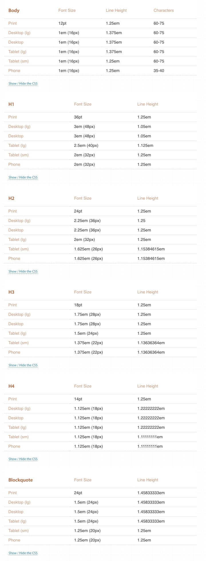
You’ll notice H5s and H6s were left out below, but that’s because these tend to be header tags that aren’t used as much and tend to have smaller font sizes than the body and are used less often than normal (footnotes, copyright info. etc).
You can also check out websites like Type-scale where you can plug in the font family you want to use alongside the type scale you want to use. This will help you set up a font size base that you can use to generate your font sizes for smaller devices.
There are some trends when it comes to font sizes. For example, the most popular paragraph font is 16px, because it roughly translates the standard 12pts used in printed material.
You can also use paragraph size as the baseline for the rest of your font sizes. There is what's known as a Golden Ratio Scale which you could use to calculate any heading sizes. But, using a tool like the one linked above is also an acceptable way to determine and test sizes.
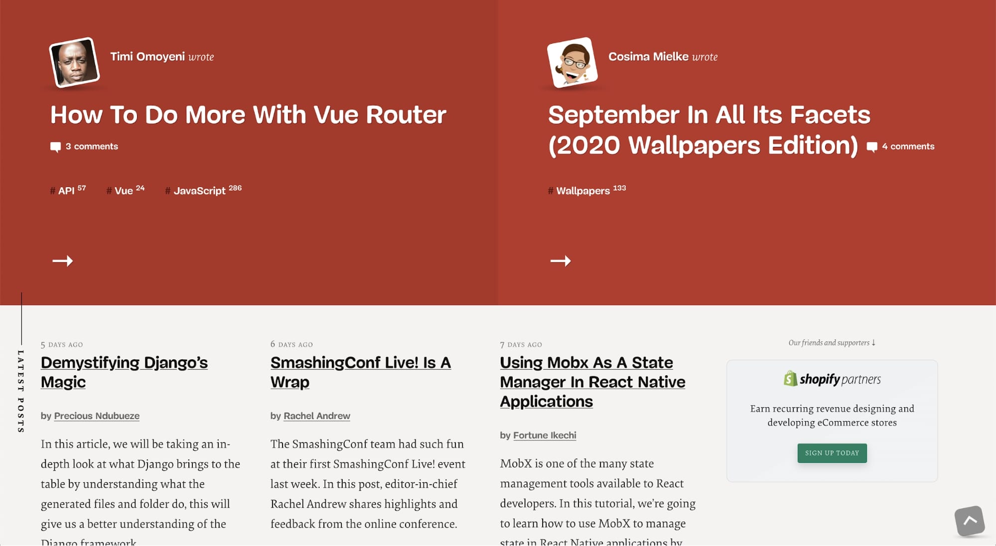
9 websites with great web typography sizes
If you’re curious about how other websites address font sizing on their website, I’ve compiled nine website examples featuring what ideal typographic font-weight, styling, and sizing should be used to improve UX.
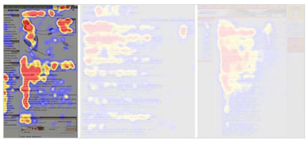
1. Smashing Magazine
Using both a large san-serif for headings and a serif for paragraphs, Smashing Magazine has made it easy to distinguish between different sections and skim an article.
Their blog article body font is also 21px big, making it one of the largest, and most legible, blogs I’ve ever come across. On mobile, they decrease it to a still appropriate size 18px, mitigating any readability issues for their mobile audience.
2. The Economist
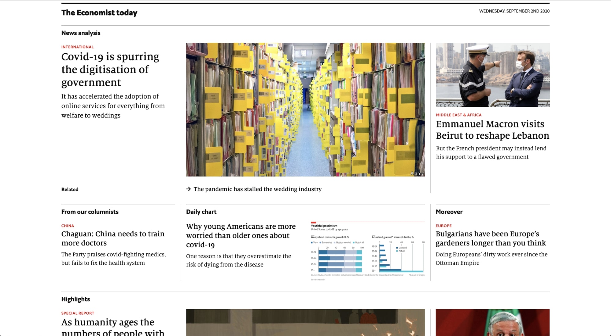
On their homepage, The Economist uses a combination of font weights, sizes, and colors to segment each blog article category from one another.
The weight and hierarchy of the words like ‘News Analysis’ and ‘Daily Chart’ help guide eyes to these tags first, before reading the articles, topics, or titles that reside in each.
3. 1stWebDesigner
1stWebDesigner does a great job of using font size and hierarchy to make it so the blog title is the first thing you read. Also, the use of the drop cap (In this case, the large letter at the beginning of the blog article body) acts as a familiar staple that indicates the start of the blog article.
Since this article is a tutorial and uses code snippets, blocking out the pieces of code with the typical code styling also makes it easy for readers to pick apart pieces of the blog article where the syntax is discussed.
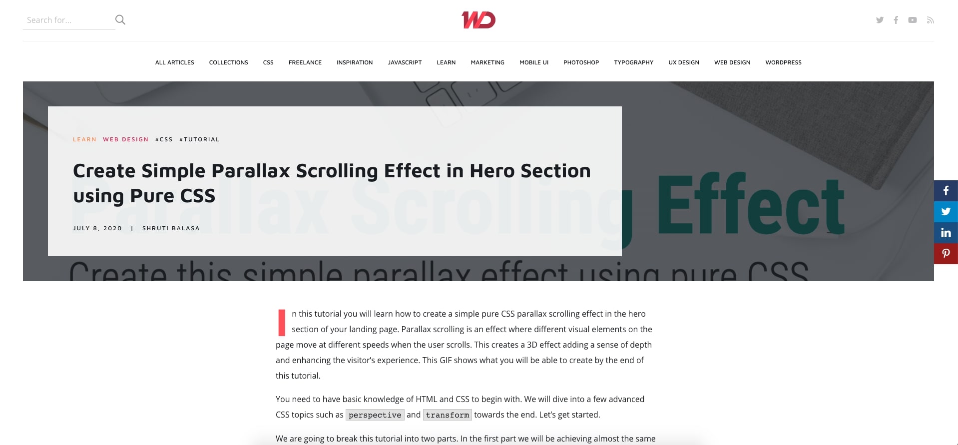
4. TechCrunch
TechCrunch uses an extremely bold and large font for their blog titles on any section of the site where they list articles. Not only does this make articles hard to miss, it also is great for those with visual impairments.
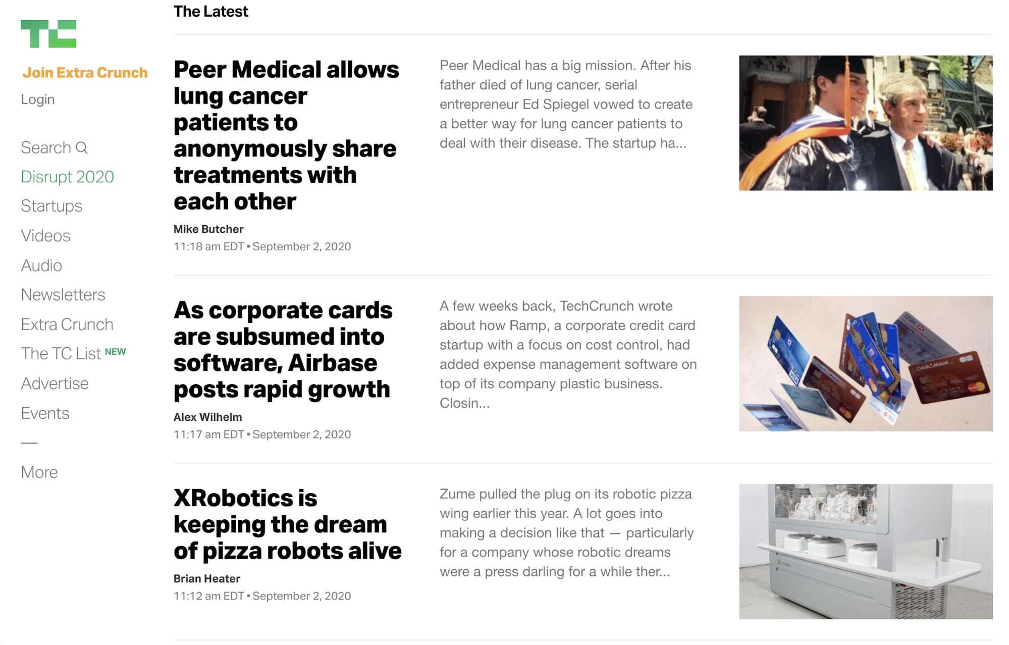
5. Wired
The use of font weight and size in Wired’s heading, like other examples so far, lets the user get an idea of what they are about to read.
What's also interesting is that Wired highlights the author in black text. If authors play a big role in your articles, techniques like this make them stand out in a very specific way.
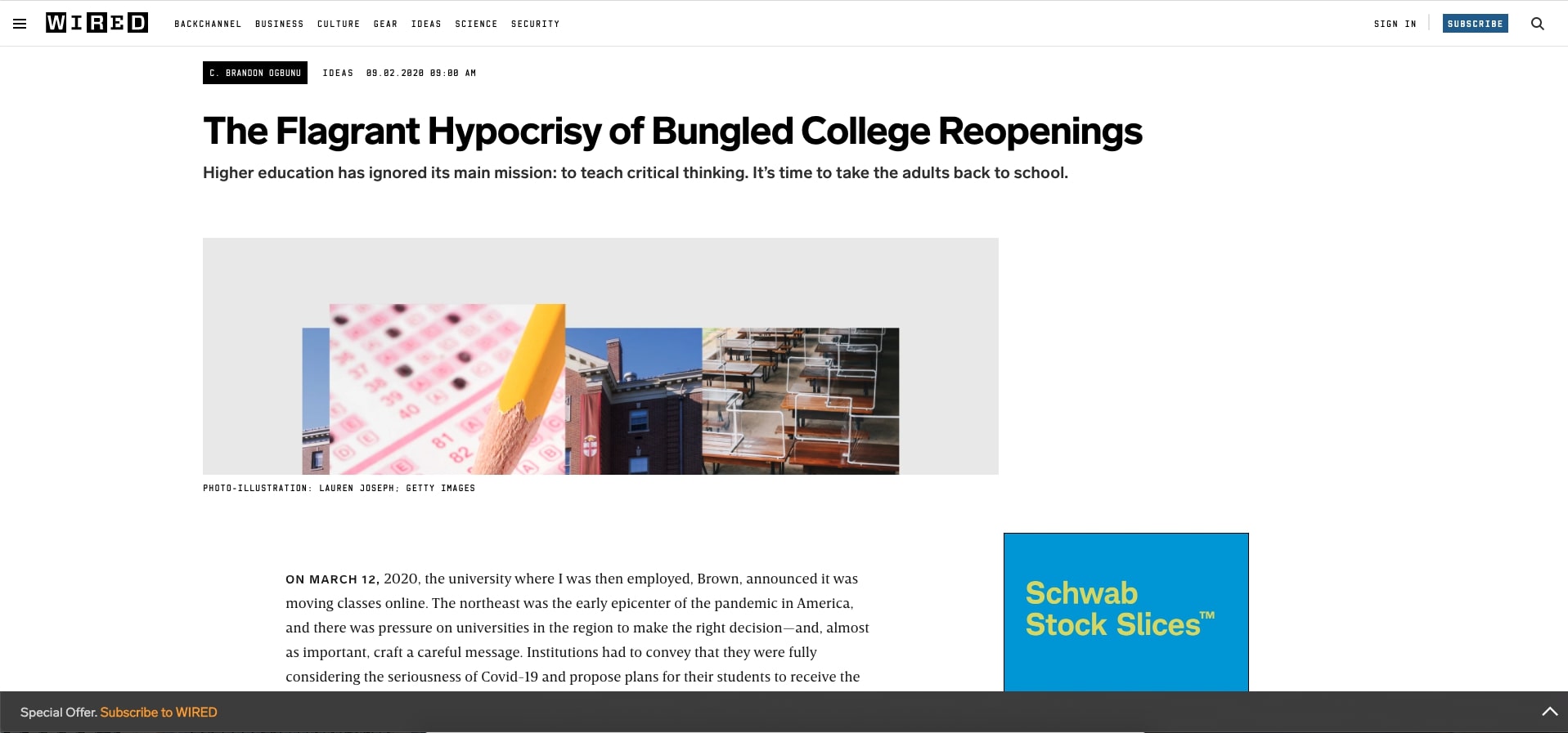
6. Quartz
When it comes to landing pages, many of us find ourselves overcomplicating the design (and in turn, font) but in this example, Quartz showed how that doesn’t always have to be the case.
On their newsletter landing page, they’ve made it so their headers and bolded copy focus on what will drive conversions — the value. This means the first time users scan through the article, it will be those points that they pick up on first.
7. Medium

Medium uses a few variations of their article layouts, yet for the most part, font styles are the same on each. The heading and subheaders within the article are bolded and easy to pick out when skimming.
Blockquotes take on styling and size similar to that of the H1 with extra spacing surrounding them. This signals to the reader that these pieces of the article represent either important points, or simply spoken quotes.
8. The Skimm
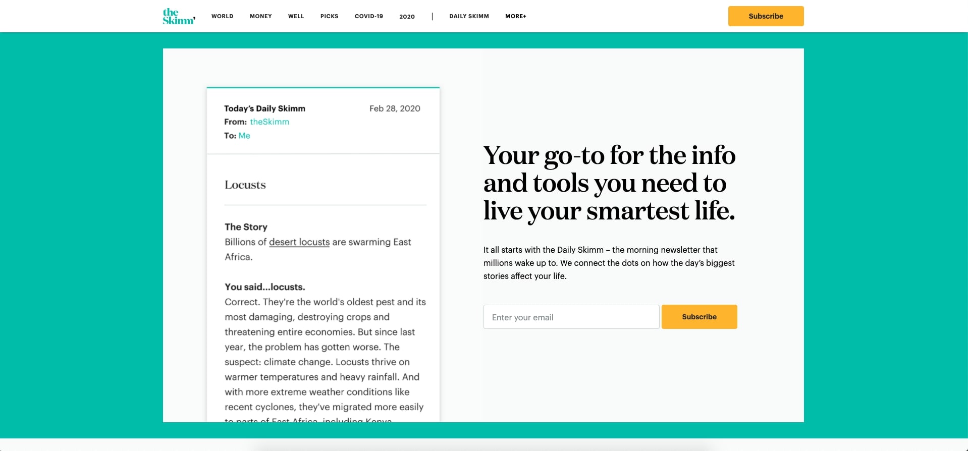
Throughout The Skimm’s subscription page, the headers denote some of the major pieces the newsletter covers, an important piece for those skeptical about adding another newsletter to their inbox.
Although it technically classifies as an image, the text used in the hero section visual of the newsletter is a very legible way to not only show what the newsletter would look like but also to make it so a user could actually read it if they want.
9. FastCompany
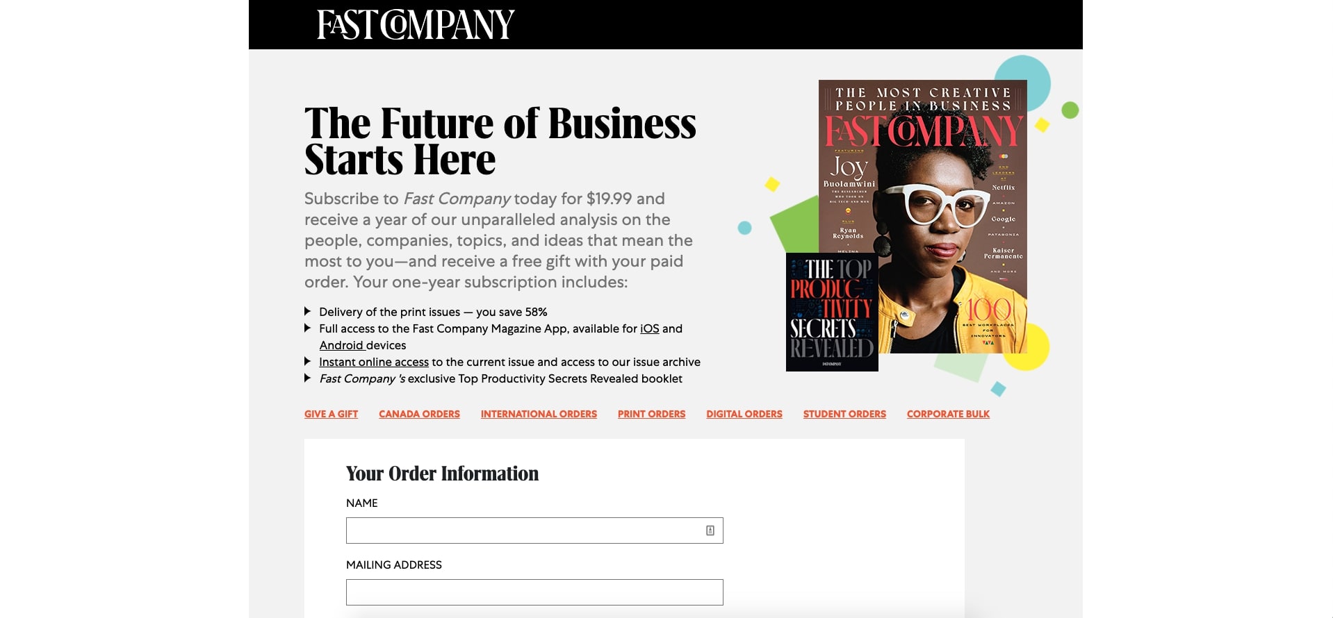
Fast Company keeps their landing page for their magazine subscription short and to the point. The darker tones of the H1 and bullet points help users understand first what that $19.99 a month is going towards.
The grey, but larger test blends in a little with the background, but acts as a more detailed value proposition for what topics they can expect.
Key takeaways
Optimizing your website font sizes is a low hanging opportunity for those looking to better their websites UX and increase conversions.
With some of the information above, along with the availability of font tools, it's easy to find and test new font sizes, and understand how to adjust them when it comes to mobile devices.
The most important thing is to start small. There's no need to make sweeping changes across your site, only for it to potentially have a negative impact.
Try taking time to review some of your highest views pages, both desktop and mobile, and implementing a set of new font sizes. If these updates yield positive results, you can begin to expand into other areas of your website.
Eventually, you should be able to standardize these fonts across pages, which will help provide consistency for your users as they navigate through your content.
Keep iterating based on changes to session time, scroll depth, and conversion rate. These can be leading indicators to whether or not your changes are improving your website's experience.
Free: Assessment
/Assets/Icon%20Library/Arrows/Grey%20Arrow%20-%20Prev.svg)
/Assets/Icon%20Library/Arrows/Grey%20Arrow%20-%20Next.svg)