/Assets/base/Navigation%20Icons/TAYA.svg)
/Assets/base/Navigation%20Icons/Sales.svg)
/Assets/base/Navigation%20Icons/Web%20design.svg)
/Assets/base/Navigation%20Icons/HubSpot.svg)
/Assets/Icon%20Library/AI%20Mastery.svg)
/Assets/Icon%20Library/Learning%20Center%20Laptop.svg)

Aug 13, 2020
/Assets/Icon%20Library/x%20corp.svg)
/Assets/Icon%20Library/whatsapp%20logo.svg)
/Assets/Icon%20Library/Email.svg)
Every morning when I wake up, I do the same thing: I grab my phone to scroll through a sea of emails.
In the past, I was greeted with the blinding white light of Gmail and although it helped me wake up, my eyes weren’t necessarily thanking me. Then, one day, this all changed. I noticed “dark mode” available on the Gmail app and, suddenly, my eyes could relax.
They no longer needed to adjust to the harsh brightness of the app so early in the morning, and I was reviewing my emails faster than ever before. However, at the same time, I quickly realized dark mode presented some unique user experience issues — ones that hadn’t been optimized for by the senders.
As if optimizing for different email clients did not already present a challenge. Now, we had to solve for dark mode!
Before I dive into the overall impact dark mode has on our emails, let's take one step back, and talk about what exactly it is.
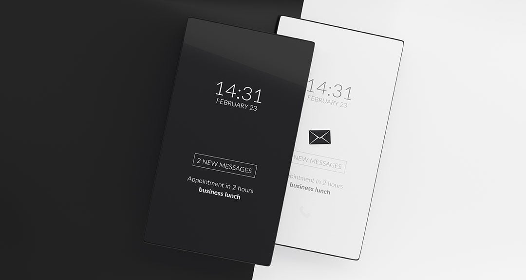
What is dark mode?
In short, dark mode reverses the color scheme of user interfaces from light to dark, and oddly enough, dark mode actually predates light mode by a few decades.
Some of the earliest home computers, the monochrome CRT (Cathode-ray tube) monitors, displayed greenish text on a black screen.
Word processor machines, or computers dedicated as text editors, also allowed for typing white text on a black background.

It wasn’t until the ‘80s that companies like Xerox and the CPT Corporation (who discontinued operations in the mid-1990s) made word computers that had a white screen with black text in order to replicate the look of ink on paper.
But the rise of dark mode today is still shrouded in mystery.
Andy Clarke, founder of the web design studio Stuff & Nonsense believes it originated from people who often work in control centers. “Because they’re looking at very large monitors, a very white bright interface would basically light up the roof.”
But many agree that its origins were likely to be found in coding. “Technical developers have been using dark themes in their code editors for about as long as I can remember,” says Clarke.
Most popular code editors, like Visual Studio code, all offer a dark mode or theme. As a developer myself who uses Sublime code editor, I’ve always used dark mode for readability and to reduce eye strain.

“It is counted that over 70% of software engineers code in a dark theme development environment.” I explore why this is the case in the next section, but regardless of what brought about this trend, it is a popular one.
Aside from Gmail, Facebook, Twitter, Instagram, Gmail, and Apple’s iOS have all introduced dark modes in the last 12 months and it shows no sign of slowing down.
What are the benefits of dark mode?
As mentioned above, bright white light and blue light can often contribute to eye strain, which can be accompanied by headaches and other discomforts in users. Dark mode can help decrease this, especially when looking at your device under darker lighting conditions (night time, dimly lit rooms).
Some also find dark mode improves legibility, which is why many tools, such as Slack, Facebook Messenger, the Adobe Suite have adopted it.
Dark mode also reduces your screen brightness which can help you save on battery life, especially if you use it more often than light mode.
Lastly, some people simply prefer dark mode overall, whether it’s due to the reasons above, or, because the palette is more their style.
How dark mode affects email templates (and how to optimize for it)
In terms of email, most email applications will typically be themed with a white background and dark grey/black text.
When dark mode is switched on, the application will check for instances of background, or bgcolor styles in the code of the email, and change them to a dark grey. Font color is also targeted, and changed from a darker hex color to white.


Dark mode is still relatively new and is not supported throughout all email clients and likely never will be, or won't be for a long time.
This is because maintaining the rendering engines used to parse emails is an extremely enormous undertaking. On the other hand, some companies just don’t believe it’s necessary to update their rendering engines if nothing is actually broken.
Currently, dark mode is only available for Gmail on Android 10 - 13, and iOS 13+, although many devices now have built-in options to activate dark mode on your phone, which not only changes your phone's color interface but your browsers and other applications as well.
Gmail aside, here’s a brief list of who’s pushing dark mode in their email application:
Mobile Apps
Desktop Clients
- Apple Mail
- Outlook 2019 (Mac OS)
- Outlook 2019 (Windows)
Web Clients
Even if a vast majority of email clients are lagging behind, there is still likely a large percentage of your subscribers viewing your emails in dark mode — especially with Gmail being the world’s largest email provider.
If your email isn’t optimized for it, you could be losing clicks and overall engagement.
Who would want to read an email that’s hard or impossible for them to look at, right??
Optimizing your emails for dark mode is a must.
To help you get ahead of what issues you can expect, here are some of the most common ones I’ve run into and what you can do to fix, or prevent them from happening.
Problem: disjointed color backgrounds
Oftentimes, e-commerce sales emails are built purely with different images and banners, highlighting different items you looked at, coupons, and promotions going on.
When splicing these together, it can look great against a default white backdrop, but on dark modes, it ends up looking disjointed.
Dark grey will replace any white areas, but JPG images with white backgrounds will stay how they are.

In the West Elm email above, we can see the large gap between the logo and “find a store” link. And the banner image indented in more than the other sections.
This issue can also lead to invisible sections if transparent images are used with text.
In the Peloton example below, the white testimonial text, which was a white image on a black background, shows up invisible in dark mode.


This can make your emails look broken and overall unprofessional, which reflects badly on your brand.
Solution:
If you tend to build emails this way, make sure each image section you build spans the full width of the email and fills in any potential gaps with additional white image pieces. This will keep the email’s visual consistency across both light and dark color schemes.
Also, avoid dark grey or white transparent text images. These do not translate well when converted to dark backgrounds. Instead, render out the full section with the colored background as one complete image.
Problem: invisible or hard to read logos
On average, about 28% of companies use black or gray-scale colors in their logos. As sophisticated as a black logo is, it is the least dark mode friendly.
Take a look:


In Medium’s case, their logo is tough to read against the grey, but for Reddit’s email, half the logo almost disappears entirely!
The last thing you want is for someone to read your email in dark mode, only for them to not see the branded element that lets them know who sent it.
Solution:
This issue is seen with PNG images, which have transparent backgrounds. This means they can take on the color of any image behind them.
Since most logos are a color other than white, they tend to work well against white backgrounds, but not all work for dark backgrounds.
To solve this, it's best to save files as JPG images with a white background, or, with a white outline around the letters/symbols included in your logo. If your logo is not against a white background, change the logos background color to match what's used in the email.
In doing this, the logo will look no different on desktop but will show up legibly on mobile.
Hacking a solution (*will need a developers help)
If the ideas above seem too labor-intensive, there is additional CSS you can add to your emails to help give you more control over how your emails are displaying when dark mode is active.
Litmus did a great job outlining the lines of code you can use, and how effective they are in different clients, so I recommend you the majority of the details there.
One example they suggest is using the dark theme CSS media query (which can detect when a user is viewing in dark mode) to display specific styles that are different from light mode.
To note, this code isn’t a direct copy-and-paste solution and is only used as inspiration for what you could target.
Example CSS:
@media (prefers-color-scheme: dark ) {
/* Shows dark mode-Only Content, Like Images */
.dark-img { display:block !important; width: auto !important;}
/* Hides Light Mode-Only Content, Like Images */
.light-img { display:none; display:none !important; }
/* Custom dark mode Background Color */
.darkmode { background-color: #272623 !important; }
/* Custom dark mode Font Colors */
h2, h2, p, span, a, b { color: #ffffff !important; }
/* Custom dark mode Text Link Color */
.link { color: #91ADD4 !important; }
}
But when in doubt, test, test, test!
Email clients are constantly changing, so whether it’s for dark mode or something else, it’s important to make testing your emails a routine task before you send them. This should now include viewing your email in dark mode and plain text on Outlook and Gmail.
You can do this either by sending test versions of your email to each of these clients and viewing them, utilizing an email testing tool such as Litmus, or testing email clients within your marketing tool (HubSpot’s email testing is powered by Litmus).
I highly recommend you make a conscious effort for your subscribers to optimize for dark mode. It will show you respect and recognize their decision to view your emails the way they want and that you’re dedicated to giving them the best experience possible.
Dark mode has already been adopted by so many platforms, that it's likely here to stay, so it's best to get started figuring out what you need to do to make sure your brand is ready to adapt!
Free Assessment:
/Assets/Icon%20Library/Arrows/Grey%20Arrow%20-%20Prev.svg)
/Assets/Icon%20Library/Arrows/Grey%20Arrow%20-%20Next.svg)