/Assets/base/Navigation%20Icons/TAYA.svg)
/Assets/base/Navigation%20Icons/Sales.svg)
/Assets/base/Navigation%20Icons/Web%20design.svg)
/Assets/base/Navigation%20Icons/HubSpot.svg)
/Assets/Icon%20Library/AI%20Mastery.svg)
/Assets/Icon%20Library/Learning%20Center%20Laptop.svg)

Dec 5, 2018
/Assets/Icon%20Library/x%20corp.svg)
/Assets/Icon%20Library/whatsapp%20logo.svg)
/Assets/Icon%20Library/Email.svg)

One of the most important elements of design is having a pretty good moment and that’s whitespace.
More and more designers (and clients) are moving toward the direction of giving whitespace the appreciation it deserves and it’s with good reason.
Not only does whitespace give websites the simple, clean, minimalist look and feel that is so desirable in current design aesthetics but it also allows content to be more digestible and accessible to the user.
What is Whitespace?
Remember the days when best practices were to keep all of the content above the fold?
The content was often so crammed into that small amount of space, that the page because extremely difficult to navigate and understand. Whitespace is the modern designer’s response to this.
Just in case this is your first time reading about whitespace, here’s a brief overview.
Whitespace (also called negative space) is the area between the elements on a web page (or physical page). These elements typically are images, typography, and icons.
It is often used to balance elements on a page by creating a natural flow for the user to navigate through the content. Thus, making the information easier to digest.
As web design has evolved, different types of whitespace have come about to allow elements to spread out and have moments of their own on the page.
Types of Whitespace
There are two main distinctions of how whitespace is used. These are macro vs. micro and active vs. passive. Let’s break those down:
Macro
Macro is the space between the elements of copy, graphics, images, etc. This is the most common distinction of whitespace.
Micro
Micro is the space between smaller elements such as letter spacing (kerning) and line height (leading). Although this distinction is not as directly apparent as macro whitespace, micro is just as important, if not more by improving readability for the user.
Active
When a website flows well and guides the user down a page to a conversion point (call-to-action, form, etc), this is an excellent example of active whitespace. Active whitespace is an intentional use to create structure and flow of a page.
Passive
Passive whitespace occurs naturally in elements such as graphics or text.
The theory of whitespace has been implemented successfully using background imagery, videos, textures, and patterns of all kinds. Some of the examples below have an excellent representation of whitespace that isn’t white.
8 Stunning Examples of Effective Whitespace in Websites
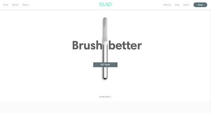
1. Quip
On its website, Quip uses active whitespace in the most straightforward sense, but with purpose.
By its name, Quip, one would not automatically assume the company sells toothbrushes. Placing the toothbrush front and center surrounded by whitespace guides the user’s eye directly to the subject and without question, it’s clear what the company does.
While the toothbrush and centered text pull the user to the middle of the page for brand awareness it is also serving as a guide to direct the user to the strategically placed call-to-action (CTA).
2) Apple
Another beautiful example of whitespace use is Apple.
As one of the early adopters of using whitespace on the web to showcase a product, Apple set the standard for building breathing room into their design.
In this example, not only does Apple execute active whitespace throughout the website well by placing imagery strategically to draw the users eye to specific elements down the page, but the company also uses passive whitespace to guide the user through the content without a hitch.
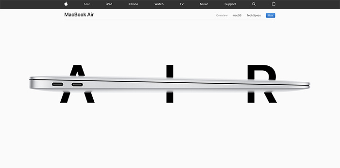
It’s no wonder why Apple repeatedly shows up in top website design lists!
3. Dropbox
In an ironic (and very unexpected move for its brand), Dropbox’s latest redesign uses color in its whitespace in a big way.

The color blocking is used as the whitespace (also called negative space) to group the content on the page from top to bottom.
The blocks help keep the copy contained while still providing ample breathing room for the content, you’ll see whitespace is also used on a micro-level through the line-height, font size, and kerning (spacing) of the text.
4) OwlLabs
Imagery is often used in the hero section of a website, however, selecting an image that works with your brand and doesn’t compete with your content can be challenging.
In other words, like elements on a page, you need to pay attention to the whitespace (negative space) within your imagery.
The image used in OwlLabs’ hero contains the right ratio of negative space to contain a strong value statement and CTA while still allowing the image to showcase the OwlLabs product.
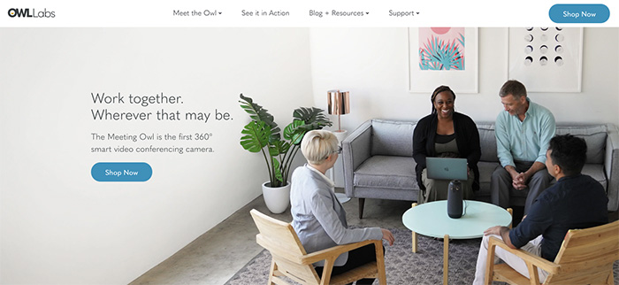
The whitespace and lines in the image also help guide the visitor’s eye not only into the image but simultaneously towards the message. Smart!
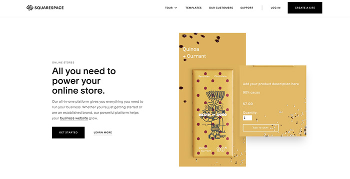
5) Squarespace
Two column layouts are a common solution to displaying content and imagery at the same time. However, these sections have a tendency to become over-designed or too tight to sections above or below on many websites.
Squarespace, fortunately, took the opposite approach to its two-column to allow the imagery and copy to speak for itself.
Each section on this page fills the entire viewport (visible area of a webpage on a display device) which causes the user to pause and digest the information and perhaps select one of the two CTAs before scrolling.
The increased line height of each line allows for reading ease and the subtle movement of the image blocks helps the page to appear dynamic.
6) Lyra
To fully utilize the power of whitespace, designers often pull in one or two concepts in order to tell a story on the page.
While the screenshot below is not the full site (you’ll need to click on the link above to see the full version) we can see from simply viewing the hero section the concepts used.
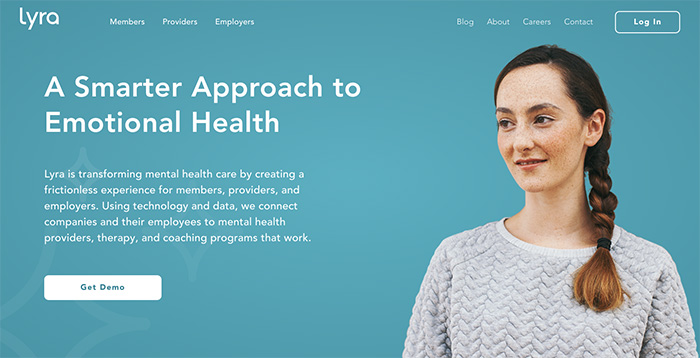
These concepts include the use of negative space in imagery, color to add depth to the page while containing the content, and ample spacing between sections to allow each section to fill the viewport at a time.
Also, although not a whitespace concept, by placing an image with the subject gazing in the direction of copy, brands and designers can help guide the user toward the message/next step you wish them to take.
7) WealthSimple
Not only is WealthSimple’s homepage a pleasure to navigate from top to bottom, but it is also an excellent example of how to use whitespace to tell a story and engage the user through the use of movement.
The angles of each image (surrounded by generous whitespace) draws the user’s eye onto the page with the coin animation taking over to continue to move the user down the page, pausing at the various text and CTA sections.
If you didn’t click on a CTA at the top, chances are pretty high that you will click on one down the page!

8) Stanford D.School
When considering the types of whitespace for a website design, the rule of thumb is to lean on the side of less is more.
Choose one or two types and carry them throughout the entirety of the website. There are few instances when applying several different principles comes together in a cohesive, well-executed site.
Stanford’s Design School site is one of the few executed exceptionally well.
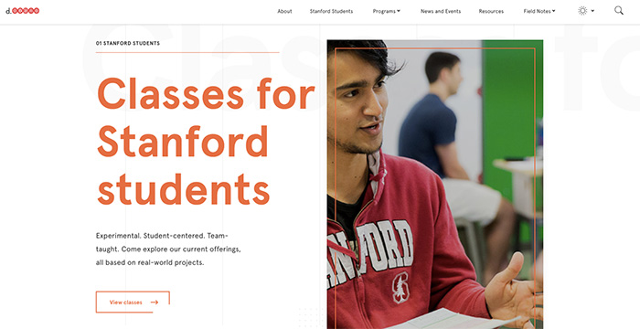
With a subtle pattern throughout, micro whitespace in the typography, movement with scroll, and strategic placement of content, the user is guided down the page experiencing each section at a time. This implementation of these types of whitespace helps the user to navigate the rather lengthy homepage with ease.
Just as an added bonus, the interactive hero can be mesmerizing which I am sure increases the sites on page analytics!
The above eight examples provide a diverse display of how whitespace can be used effectively in website design. As you can see, whitespace is integral in designing a website that executes strategy while at the same time being aesthetically pleasing to the user.
Need help redesigning your website? Talk to us!
Free: Assessment
/Assets/Icon%20Library/Arrows/Grey%20Arrow%20-%20Prev.svg)
/Assets/Icon%20Library/Arrows/Grey%20Arrow%20-%20Next.svg)