/Assets/base/Navigation%20Icons/TAYA.svg)
/Assets/base/Navigation%20Icons/Sales.svg)
/Assets/base/Navigation%20Icons/Web%20design.svg)
/Assets/base/Navigation%20Icons/HubSpot.svg)
/Assets/Icon%20Library/AI%20Mastery.svg)
/Assets/Icon%20Library/Learning%20Center%20Laptop.svg)

Oct 20, 2018
/Assets/Icon%20Library/x%20corp.svg)
/Assets/Icon%20Library/whatsapp%20logo.svg)
/Assets/Icon%20Library/Email.svg)
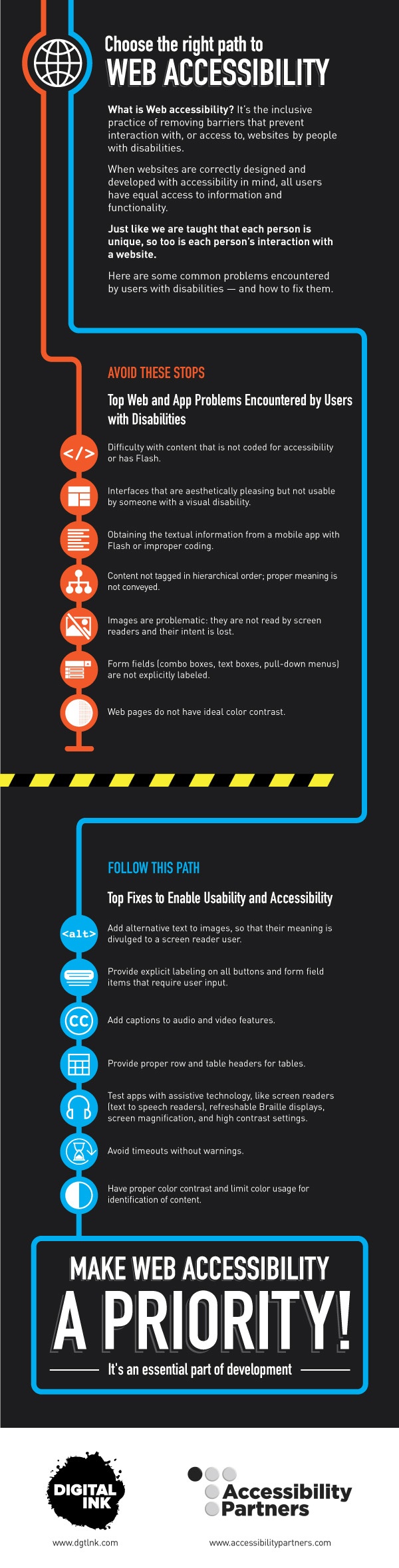
![Easy Ways to Make Your Website More Accessible Today [Infographic]](https://www.impactplus.com/hs-fs/hubfs/blog-image-uploads/web-accessibility-hero.jpg?length=1200&name=web-accessibility-hero.jpg)
Designers are very visual people by nature, so it’s easy to forget that there are underlying, less visual aspects of web design that can have a significant impact on the user experience for a portion of your website's visitors.
Unfortunately, the vast majority of websites don’t take accessibility into consideration during the design stage and, as a consequence, could be missing a major opportunity to tap into an important customer segment.
Let’s look at the statistics:
- There are more hard of hearing users in the United States than the population Spain, and more users who are blind and low-vision than the population of Canada.
- 7.6 million (3.1%) people have a hearing impairment and thus might rely on transcripts and/or captions for audio and video media.
- 8.1 million (3.3%) have a vision impairment and may rely on a screen magnifier or a screen reader, or might have a form of color blindness.
- Studies have found that 70% of websites reviewed for accessibility were given a ‘red’ assessment – in other words ‘significant potential commercial, PR or legal risk’. E
Failing to address accessibility in your website's design is not only a missed revenue opportunity - it may also expose your company to liability under the Americans with Disabilities Act (ADA).
Addressing Visual Impairment
The typical website visitor tends to judge a website by the colors, design, and functionality. For visually impaired visitors, the experience is different.
There are many types and degrees of visual impairments to consider, including:
- Vision conditions
- Low vision
- Cataracts
- Colorblindness
- And more
The list of visual impairments is long and given the large number of sites that are not designed with accessibility in mind, individuals with visual impairments are often left to choose from the handful of sites that solve for their needs.
The good news is that there are some simple things you can do to immediately improve your website's accessibility.
1. Check For Proper Color Contrast
Proper color contrast is very important to individuals with a vision impairment.
If the text is in a lighter color (gray, blue, etc) on a white background - a combination that is very common - visually impaired visitors may have a difficult time reading the text due to the low level of contrast.
The same rules apply to color on color text. Often designers will add a lighter color blue, for example, over a darker blue background. These types of combinations generally do not offer enough contrast for visually impaired visitors.
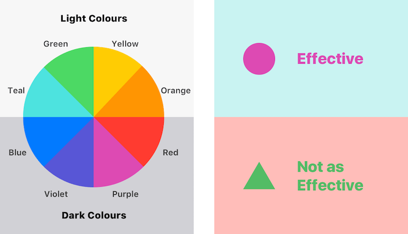
How can you be sure you have enough color contrast? This web-based color contrast checker is an easy way to test when designing for the web as well as for print materials.
2. Limit Color Usage of Content Identification
Taking proper color contrast into consideration isn’t only for text. Many websites use color to direct users through the website or for content identification. For example, you might associate all pages or content related to a certain product or service with a specific color.
Use the color contrast checker to test color contrast throughout your design, especially for graphics that are being used to illustrate the main topic of your content. You can also use the contrast checker to audit your graphics when designing new web graphics and print materials.
Your graphics and colors shouldn't be the main substance of your content -- instead, they should support the on-page copy. This is especially important when using color elements and text on form fields and/or buttons throughout your website.
3. Use More Text
Information architecture (essentially, how your content is organized) is an important thing to consider when it comes to web design as it directly impacts how a visitor navigates through your pages and whether/how they are able to identify the most important elements of the page.
Information architecture is especially important for users with a visual impairment, as they often rely on screen reader technology when navigating websites.
Start by using clean H1, H2, etc. formatting for your headers as this will allow both readers and screen readers to easily identify the hierarchy and main topics of your page. It also has the added benefit of being great for search engine optimization.
It's also important to use proper alt text on images and videos. Alt text acts as a cheat sheet for visually impaired visitors by providing them (and the readers they use) with additional information explaining what the image or video is about. And just like proper header formatting, alt text is excellent for SEO.
Finally, consider adding captions to videos and images. With the use of videos on websites on the rise, the addition of captions allows visually impaired users to understand the content while making the video more appealing when it is shared across different social media channels.
To identify images and video that might be missing alt text, run your website through a service such as Screaming Frog. The free version will tell you exactly where you are missing alt text and thus what you need to update.
Are You Ready To Get Serious About Accessibility?
The above are a few simple ways to get started with making your website more accessible. If your website needs an upgrade or you're thinking of tackling the issue of website accessibility, the infographic below provides clear “do” and “don’t” tips that will help you get started.
Free: Assessment
/Assets/Icon%20Library/Arrows/Grey%20Arrow%20-%20Prev.svg)
/Assets/Icon%20Library/Arrows/Grey%20Arrow%20-%20Next.svg)