/Assets/base/Navigation%20Icons/TAYA.svg)
/Assets/base/Navigation%20Icons/Sales.svg)
/Assets/base/Navigation%20Icons/Web%20design.svg)
/Assets/base/Navigation%20Icons/HubSpot.svg)
/Assets/Icon%20Library/AI%20Mastery.svg)
/Assets/Icon%20Library/Learning%20Center%20Laptop.svg)

Nov 29, 2016
/Assets/Icon%20Library/x%20corp.svg)
/Assets/Icon%20Library/whatsapp%20logo.svg)
/Assets/Icon%20Library/Email.svg)
When we think of graphic design, we usually jump to the superficial: color, shape, size.
But website design and redesign is so much more than that.
Speaking from my past experience as a web designer, I can relate to sometimes becoming too focused on visual elements like these, but as a now seasoned developer and inbound marketer, I know that to make your website the best of the best, beautiful in both form and function, it’s just not all about the aesthetics.
You also need to think about usability and user experience.
88% of online consumers say that they are less likely to return to a site after a poor experience.
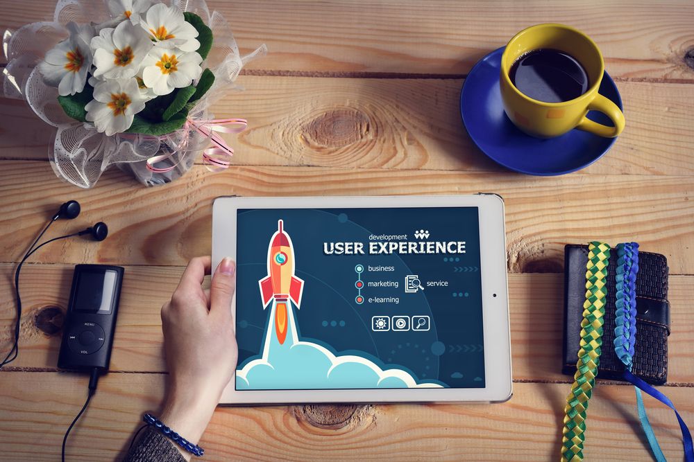
Still don’t think user experience is important? Take a look at these 30 eye opening user experience stats. With those in mind, here are 9 essential principles for designing a flawless user experience (UX), to help you and your designer increase on-site time, boost conversions, and so much more.
1. Visual Hierarchy Guides the Eye
What is visual hierarchy? It is one of the most important principles behind an effective web design and positive user experience.
As I stated in my, article, 15 Golden Principles of Visual Hierarchy [Infographic], “in Luke Wroblewski’s Communication with Visual Hierarchy, he explains that the end goal of visual hierarchy is to quickly communicate to the visitor the following:
- What is this? (usefulness)
- How do I use it? (usability)
- Why should I care? (desirability).”
When you use visual hierarchy the correct way in your website, you are showing the user where they need to go next, and what they need to do. It shows them what is important and what isn’t so important -- no need to think or wander around aimlessly.
Teamwork’s Project homepage does a good job of using visual hierarchy on their website.

The header is large and tells the user exactly what their product is, then the descriptive paragraph underneath gives you more detail. “Get Started For Free” makes it clear what Teamwork would like you do next after reading about their work and project management app.
2. White Space Maintains Focus
I know what you are going to say, “shouldn’t we keep as much above the fold as we possibly can?”
The answer is yes, but that doesn’t mean you should be cramming as much information as possible into this area. Effective design benefits greatly from whitespace. It helps your design breathe.
Whitespace, in web design terms, is “the space between graphics, columns, images, text, margins and other elements.” It isn’t necessarily white; it can also be a color or a pattern used in the empty space to help break up the layout.
Invision’s homepage does a great job of using whitespace to help differentiate between and focus attention on each of their product’s features.
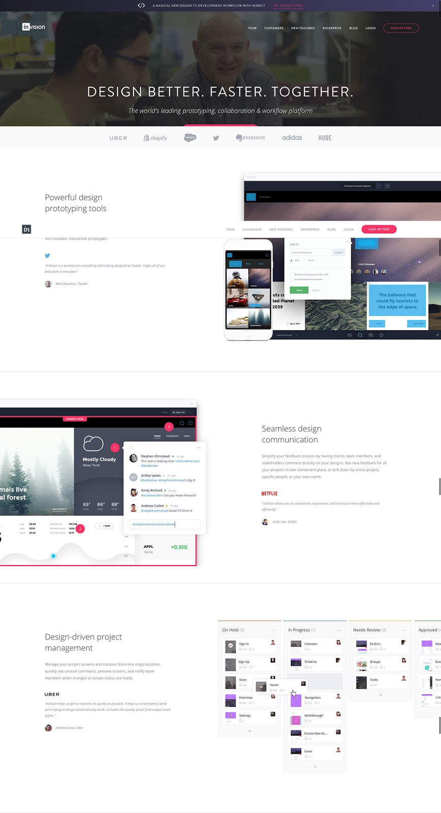
The spacing helps your eye distinguish the end of one section and the start of another, while also helping you focus on the description at hand without getting distracted by anything unrelated.
3. Navigation Should Reflect the User Journey
Landing on your website shouldn’t be like following a treasure map. You don’t want people lost or frustrated trying to get to where you want them to be (i.e. requesting a consultation, signing up for a free trial, requesting a demo, etc.). So, you need to make sure your navigation is very easy to navigate.
Think of your navigation as a series of street signs. If your signs aren’t clear, accurate, and direct, how are potential customers going to learn about your product or service? How can they know where to find what they are looking for?
When building out your navigation, keep your buyer persona’s user journey in mind and make it as easy as possible for this to be completed. Use words that they will recognize and resonate with and bring the most important pages in their decision making process to the surface. Don’t hide them.
4. Responsive is a Must
It’s 2016, almost 2017 (can you believe it’s only about a month away?), if your website isn’t responsive by now, you need to get on that website redesign train.
More and more people are doing searches on their mobile devices because they are constantly on the go. In fact, an infographic by UX Measure’s, states “52% of users say that a bad mobile experience made them less likely to engage with a company.”
Make sure your user has a great experience no matter where they are or how they’re viewing your website by making sure it’s mobile responsive and completely cross-browser and multi-device tested.
Google’s algorithm also gives massive rewards to sites that are mobile-friendly. Just saying!
5. Consistency Avoids Confusion
Consistency is key for almost everything in marketing, but especially for website usability and UX. As a marketer, you want your site to have that consistent look and feel in everything from color, font typefaces, and sizes to even layouts and tone of voice.
This consistency helps create a fluid, cohesive experience from page to page, minimizing confusion and making your site easier to navigate.
6. Some Things Should Never Change
Everyone wants to be front-runner of the constantly changing website world and yes that sounds great, but not at the risk of alienating your audience. With the internet being a mainstream part of our lives for nearly 30 years, consumers have certain expectations when it comes to navigating websites.
For example, they expect to go to your homepage when they hit your logo in the corner of your navigation. When it comes to designing your website, don’t stray too far from these conventions as they can ultimately confusion your user and create a negative experience.
If you want to to try something new, A/B test it and see how well it performs before rolling it out across the board. You can do this using HubSpot’s A/B testing or if you aren’t on HubSpot give Optimizely a try.
7. Setting Realistic Expectations Builds Trust
The last thing you want to do is to mislead a prospect. Be true to what your product or service does and set realistic expectations by showing your visitors exactly what they’re getting.
If you sell a software, you can do this by showing screenshots, including photos at different angles if it’s a physical product, or producing a video. Video helps persuade 73% of people to buy a product or a service, according to UX Measure’s Infographic. So, if you don’t have one for your company, it may be smart to start brainstorming one.
You can also set realistic expectations by being honest and forthcoming about things like service terms, conditions, and pricing. If you need help creating an awesome pricing page, Talia Wolf has an awesome article 26 Pricing Page Examples and Best Practices, that will help you get in the right direction.
8. Testing is Your Friend
When you design your website and build out your site structure, you should be thinking just like your visitor and how they would interact with it. Unfortunately, even with the best intentions, sometimes you get it wrong.
To see how your visitor are truly engaging with your site, do some user testing and gather some data through heat maps and recordings. This data will help you give people what they’re looking for and overall improve your site’s performance.
Here are a few sites to give a try to help you gather information on how your site is performing; CrazyEgg, UserTesting, Inspectlet, and Hotjar.
9. KISS (Keep It Simple, Stupid.)
Do you have too many chefs in the kitchen making the final decision on what your website looks like? This tends to happen more often than you think, and at the end of the very long process your website ends up being too confusing your potential customer.
Make sure your website is simple and doesn’t make your visitor think too much. The end goal of your website should be to have your visitor convert and become a customer and make it easier for them to find the answers that they are looking for.
From a UX standpoint, our friends at HubSpot, suggest you keep the following in mind:
- Colors - Less is usually more. According to CrazyEgg, “to borrow from interior and fashion design, the 60-30-10 rule states that three colors should be used in varying degrees (60%, 30%, 10%) to create the perfect harmony.” You can definitely go more than three, but I wouldn’t go more than five.
- Fonts - just like colors watch how many you use. Personally, I would stick to a maximum of two, one for the majority of the site with a second for headers. Just make sure that no matter what you pick, it is easy to read.
Design for Value
It is important to keep this question in the back of your head, when you are questioning a design element in your design: “Does this design element bring any value to the table?”
This is a question that we constantly ask ourselves here at IMPACT.
Just because it is cool, or looks great doesn’t mean it’s the answer to your lead generation or sales prayers. Every aspect of a design needs to bring something to the table and help you create an overall memorable user experience.
Free: Assessment
/Assets/Icon%20Library/Arrows/Grey%20Arrow%20-%20Prev.svg)
/Assets/Icon%20Library/Arrows/Grey%20Arrow%20-%20Next.svg)