Join 40,000+ sales and marketing pros who receive our weekly newsletter.
Get the most relevant, actionable digital sales and marketing insights you need to make smarter decisions faster... all in under five minutes.
 Think about that feeling you get when wearing new clothes for the first time, or when you pay an even dollar amount while getting gas. How about when you perfectly separate an oreo like a skilled surgeon?
That sudden surge of excitement and joy is “delight” and it’s a feeling that carries over from your day-to-day life to your experiences on the web.
“Customer Delight” has become one of the most common buzzwords within the digital marketing realm, but that doesn’t mean it should be taken lightly. It’s what makes people fall in love with your product and makes the experience that much more memorable (and worth talking about).
In this article I want to help you understand you some of the little ways you can delight your visitors, and show off some companies that are doing everything completely right.
1. Work in a Bit of Brand Personality
Your brand's personality is everything that makes your company unique and different from your competitors. It’s an important part of your company and should be felt throughout your entire website.
You can add in a splash of personality in a number of different ways on your site.
InVision does a good job of subtly adding personality to their site in the example below.

Notice how when you click off the InVision web blog tab, the title text changes to a little reminder to come back to the site. Something as little as this puts a smile on your visitors’ faces and also playfully gets them to come back to your page.
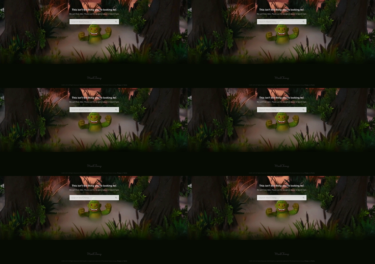
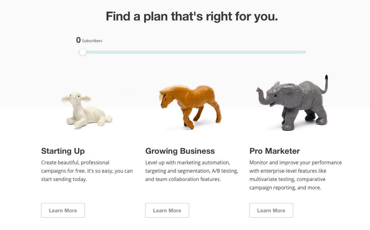
MailChimp is another great example. In their style guide, they describe the brand’s tone as “fun but not silly”, “informal but not sloppy”, and “weird but not inappropriate."

As you make your journey throughout the different pages on their site this tone becomes increasingly clear through the imagery they use as well as their conversational voice.

2. Simple Animations & Transitions
There’s a lot of debate about whether animations on websites are purely aesthetic or they serve a greater purpose.
I’ve always be a strong believer of the latter when they’re used in an appropriate way.
Page transitions and animated GIFs are great ways of captivating your audience and pulling their attention to a specific section on a page. Motion and animation makes it easier for us to explain complex concepts when showcasing products.
Animated GIFs are becoming a valuable tactic for many product-based companies because it help demonstrate functionality. This demonstration helps potential users visualize themselves actually using the app or product.
Take Wistia, for example on their tour page they use GIFs to showcase different areas of their software. This gives their users a strong idea of what they can expect when using the product before they even sign up.

On top of animations and GIFs, a number of big brands sites are using page transitions (such as elements fading in) and parallax scrolling.
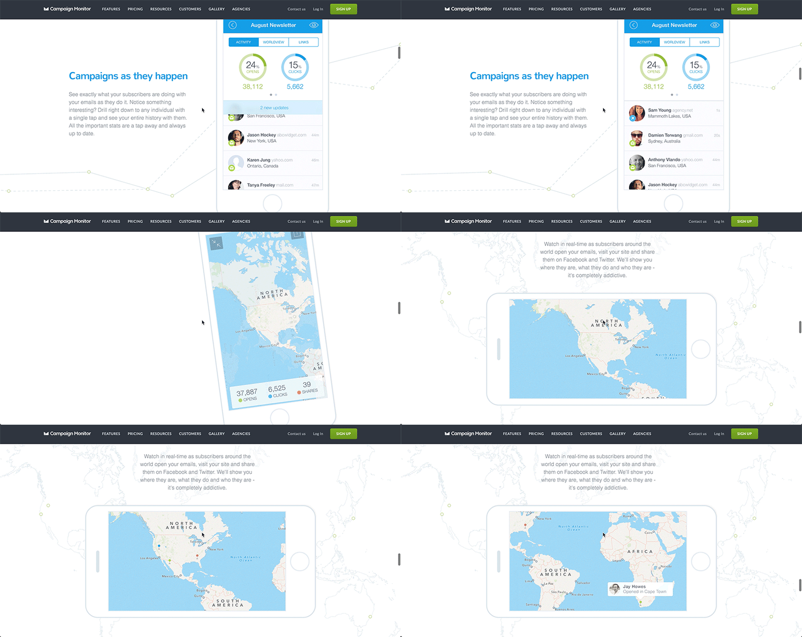
One of my favorite examples is the tour page for Campaign Monitor's “Monitor” App.

As you scroll throughout the page you’re followed by an iPhone that is constantly rotating and changing screens to showcase the different advantages of the app and how you can use it.
Something like this takes people “along for the ride” and illustrates your value. It shows them exactly what they’re getting, in turn, eliminating many of their questions and concerns they may have about making a purchase.
3. Interactive Page Content
I’m sure most people can agree with me; there’s just something about a website with a box that toggles, a switch that flips, or a draggable slider features that make me feel like I’m using a physical object.
These elements might be used to show an additional blurb of information or switch between different product offerings, or they might be purely stylistic. Regardless, they’re one of your most effective tools when it comes to delight.
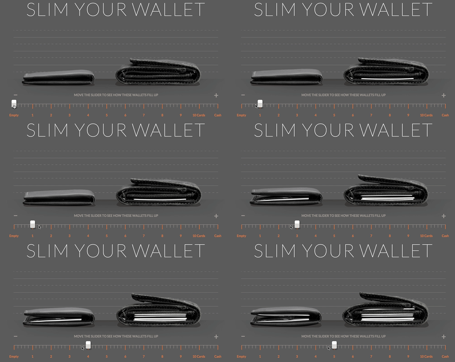
Take BellRoy for example.

They’re a company that prides themselves on offering the thinnest wallets regardless of how many cards or cash you carry and hey really drive this point home on their product page.
The wallet company uses an interactive slider that allows you to choose the number of cards in your wallet and compare what it would look like in one of their productsalong side an average wallet.
This is not only a great example of using interactivity on a website, it perfectly highlights one of the product’s biggest selling points.
CSS Weekly, on the other hand, takes a purely aesthetic approach with interactive content on their subscribe form.

As soon as you hover over the subscribe area you’re greeted by four friendly-ooking guys cheering you on as you start typing.
Even if I was having second thoughts about subscribing, I’d want to hit subscribe just to see what they’d do next.
How Can I Start Adding “Delight” to My Site?
Remember, as subtle and simple as these elements of “delight” may seem, it isn’t something that shouldn’t just be added onto a site as an afterthought or without reason.
It has to work hand-in-hand with a site’s functionality and purpose. A site will reach its full potential when all three of these key ingredients are blended and baked together.
Here area couple of tips for you to start delighting your visitors:
For Brand Personality --> Start with Microcopy
When adding brand personality to your website, start with your microcopy.
Using clever microcopy can go a long way for your company's overall tone. This can be anything from instructional text to form labels.
User Onboarding includes some friendly content when having users sign up for their email course. Talking to your visitors in this way humanizes your brand and reminds visitors that they’re working with real people.

Some other simple ways to sprinkle your brand across your site is to:
- Create a customized 404 page (we’re all human here so visitors are bound to end up on this page once in awhile. Why not give them a nice surprise?)
- Experiment with “friction-free” verbiage on your CTA buttons
- Showcase your company's culture on your “about us” page
Take Advantage of Free Tools for Animations & Transitions
Don’t worry if your design expertise doesn’t go much further than opening up MS paint.
Animations like those in this article have become increasingly more simple to implement on sites due to the vast array of online tools and softwares that are out there.
Use Heat Maps and Analytics to Find Opportunities for Interactive Content
If you’re looking to add some extra punch to your site by using interactive content, start by dissecting the heat maps or analytics of your high traffic pages.
You can gain a lot insightful information from this and it will give you a clear roadmap of where to start brainstorming.
For example, maybe you have a tour page that’s too long, causing prospects to fall off before reaching your form or offer.
Try solving this issue by condensing some of the less important content with expandable tabs that show more information when clicked. Use online resources such as CoDrops, CodePen or CSSDeck for inspiration when looking for interactive elements.
Free: Assessment

