Topics:
Lead GenerationJoin 40,000+ sales and marketing pros who receive our weekly newsletter.
Get the most relevant, actionable digital sales and marketing insights you need to make smarter decisions faster... all in under five minutes.
6 CTA Best Practices to Push All the Right Buttons for Your Audience

Jun 9, 2017

 Lead generation can be far from a fairy tale sometimes.
Occasionally, people find us, convert, become a customer, and we all live happily-ever-after. But at others, we meet frogs who view a few pages, then leave without telling us who they are or giving us any way of contacting them again.
(I mean, come on. Even Cinderella left a glass slipper behind.)
Unfortunately, as marketers we have to admit sometimes that maybe they weren't frogs. Perhaps they wanted to continue their buyer's journey with us, but simply didn't know how. Maybe the path to conversion wasn't as clear cut as we thought.
This is why every page needs a call-to-action (CTA) and every CTA needs to be bold, clear, and relevant.
Why Are Calls-to-Action So Important?
For those of you new to Inbound, strong CTAs are essential part of a conversion path and the lead generation process.
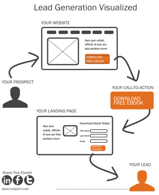
In most instances, they take your visitor to an isolated landing page where they can then convert (fill out a form) in exchange for a premium offer and enter your contact database, but they can really point users to anywhere you want.

Source: HubSpot
The point is, visually they guide your leads through your marketing funnel, showing them what they can (and hopefully should) do next. They provide direction and help your visitor take the next steps with your brand.
Without CTAs, your persona is less likely to engage with your content (let alone know how to) and more likely to leave your website without leaving a way for you to get in touch with them.
Creating CTAs with a high click-through rate (CTR) isn't rocket science, but it is a practice that requires testing to get right.
Fortunately for you, I'm going to share a few essential CTA best practices you can apply to any business' website.
1. Make Your CTA Action & Benefit Oriented
It sounds obvious that your call-to-action should be action-oriented, but I can't tell you how often I see CTAs that aren't.
To make your CTA action-oriented, you have to be mindful of the language you use in your copy (we'll get deeper into that in tip #2) and also what benefits your visitors are receiving.
The more descriptive you are about the action that you want your persona to take and what they'll get by clicking that button, the better.
Here are a few examples of bad CTA copy:
- Click here
- Download
- Submit
- Enter
- Request
- Continue
All of these CTAs use an action-oriented verb, sure, but they don't tell the viewer anything about they'll be getting by clicking through.
Frankly, they all sound like work and the last thing more people want or need on their plates is more work.
Rather than creating the illusion of work and establishing "mental friction," highlight your CTA needs to reflect a benefit; an action that your audience wants to complete.
For example:
- Get My eBook
- Stay Connected
- Join the Fun
- Let's Talk
- Give Me More
- Watch Right Now
When prospects see this type of copy on CTAs, they don't read it as work. They read it as they're getting something in return (and who doesn't like freebies?).
They're getting an eBook, they're staying connected, they're joining the fun. Be creative (while still making sense for what the offer is) and your CTAs will be far more inviting to prospective leads.
2. Keep Your Message Consistent
As I mentioned earlier, consistency is key when it comes to CTA copy.
In order to make it absolutely clear to your visitor what they should do next and why they should, you want your CTA to directly reflect the message of the content that came before it. (This is most easily done in your headline or microcopy before your actual button.)
For instance, if your CTA is at the end of an article titled "16 ways to boost your SEO rank on old content" and you want people to download a premium guide about SEO, don't simply say "Download Our Free Guide." Make your CTA read something descriptive and reminiscent of the content above like, "Boost your SEO Rank even further with this free guide."
Having just finished reading an article about this topic, this headline is more likely to resonate with the prospect, as a continuation of the journey they've just taken.
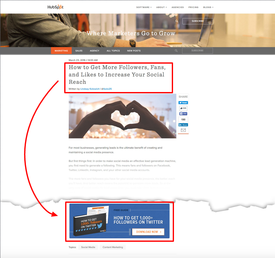
HubSpot is a master of this kind of alignment. Just take a look at this example below:

The team here knows what words interested their reader initially and got them to click onto the current page and uses that message to keep the journey going. Smart move, HubSpotters!
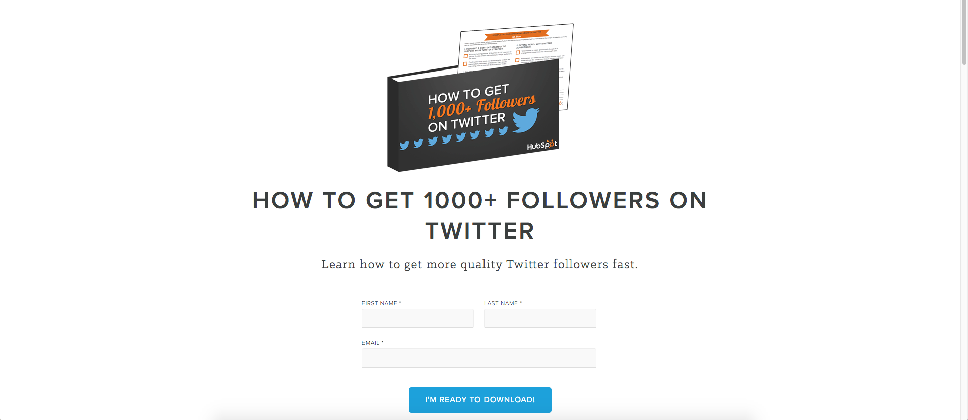
Also, make sure that the message carries over to your next step. For example, if your CTA leads to a landing page, use the same exact language from the blog article and CTA in your content to ensure relevance and avoid confusion.

If this landing page prompts an automated email, again, use the same keywords.
Consistency reduces confusion, creating a better use experience and making your conversion path seem much more streamlined.
3. Stand Out From the Crowd!
No one is going to be able to click on your CTA if they don't even know that it is there. Visually, it needs to stand out on the page.
Here are several things to experiment with:
- Size: A bigger CTA button or banner will definitely stand out more, but don't go overboard. Having too large of a CTA can risk getting lost due to banner blindness.
Whatever size you use, make sure that it is big enough to read, but also to see and click on mobile. Since more traffic comes from mobile than ever before, your site's mobile performance should be a top priority. Apple recommends a minimum size of 44 x 44 pixels for anything clickable. That's a great place to start.
- Contrast: An easy rule-of-thumb to make your CTA stand out is to create contrast with the surrounding content. Vibrant colors are great for creating contrast and drawing attention. When you're deciding on which color to use, a good way to start is by looking at the most common colors used on your website or landing page design and pick the opposite. You can also consider going with orange or red. These are generally accepted as the highest converting button colors.
- Image: If you use an image or custom design in your CTA, it should always be high-quality and relevant to the offer. Consider featuring an image of what you're offering or perhaps an image of someone enjoying it
4. Location, Location, Location.
Another important thing to remember when trying to get eyes on your CTA is location. If your CTA isn't in the right place at the right time (aka when your prospect is ready and willing to action), the opportunity may be lost.
So, where should you put your CTA?
Well, that depends on what its for.
As I illustrated in my example from tip #2, if your CTA is for a particular offer, placing it at the end of a relevant blog article may be your best bet.
If it is for a more middle or bottom-of-the-funnel action such as requesting a demo or call from someone on your team, perhaps reserve that for pages or articles that show intention to buy such as a pricing page or testimonials.
The idea is to take into account your visitor's current position in their buying cycle (and your marketing funnel) and ask yourself if they would respond to what your CTA is offering at that time; if it would interest someone in their state of mind.
If the answer is no, try a different location. The last thing you want to do is spam a prospective customer with a CTA they aren't interested in or ready for.
5. Always Be Testing
Even if you follow the CTA best practices I've shared here, always test different variations.
From your copy to your color and placement; all of these things can affect the performance of your call-to-action and the only way to know which combination will deliver the highest conversion rate is by trying them out.
Conversion rate optimization is fundamental to successful inbound marketing and fortunately, HubSpot, Optimizely, and other marketing softwares have made testing extremely simple.
According to HubSpot, here are some baseline goals to aim for:
- A click-through rate of 1 - 2%
- A conversion rate of 10-20%
To acheive these goals with your CTAs test your:
- Button Color
- Copy/Messaging
- Size
- Placement
To learn more about testing and how to push all the right buttons with your CTAs, use the button below to get your free copy of our popular guide, "How to generate even more leads from your calls-to-action!"
Free Assessment: