/Assets/base/Navigation%20Icons/TAYA.svg)
/Assets/base/Navigation%20Icons/Sales.svg)
/Assets/base/Navigation%20Icons/Web%20design.svg)
/Assets/base/Navigation%20Icons/HubSpot.svg)
/Assets/Icon%20Library/AI%20Mastery.svg)
/Assets/Icon%20Library/Learning%20Center%20Laptop.svg)

Apr 13, 2019
/Assets/Icon%20Library/x%20corp.svg)
/Assets/Icon%20Library/whatsapp%20logo.svg)
/Assets/Icon%20Library/Email.svg)
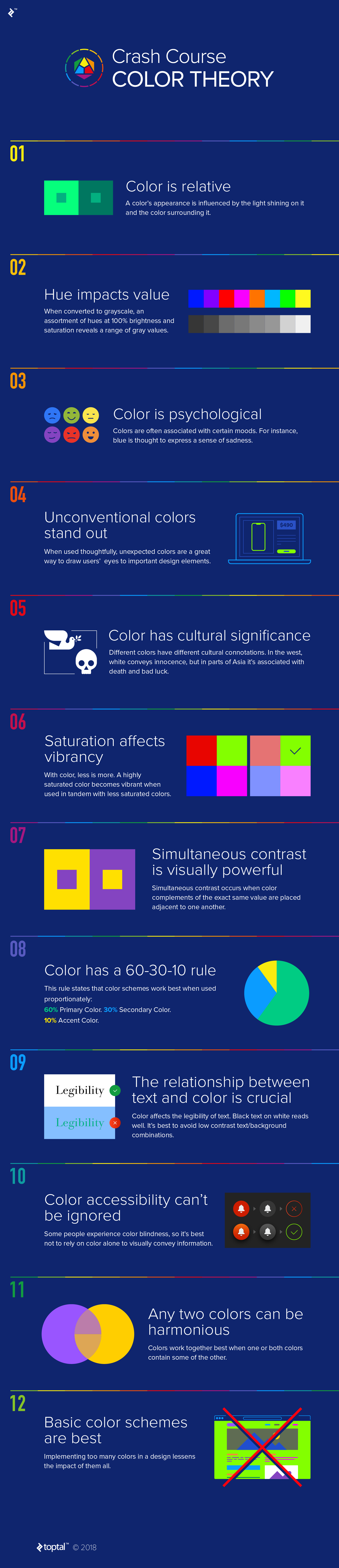
![Color Theory for Designers: A Crash Course [Infographic]](https://www.impactplus.com/hs-fs/hubfs/color-theory-for-designers-a-crash-course-infographic.jpg?length=1200&name=color-theory-for-designers-a-crash-course-infographic.jpg)
Color theory is something that has become second nature to all of us working in the design field, as instinctual as the shortcuts our fingers execute without really thinking about. It’s something we learned many moons ago, but not something we always get a chance to really meditate on.
Oftentimes in creating a design, we make color choices based on our instincts, but we hardly ever stop and think of the why. Now and then, it’s a good idea to revisit our roots and get in touch with our foundation. Knowing solidly where your choices come from (and why!) gives you confidence in your work and the ability to speak on the designs you create.
Color can make or break a design simply because there is so much to consider. Micah Bowers (author and creator of the below infographic) of Toptal states, “Color is packed with properties, and each property has a wide range of possibilities.” This is why color, according to Bowers, can often be tricky to work with.
The following infographic is a great snapshot of some of those many rules and principles we call on daily when working with color in our designs -- whether we're looking to contrast, complement, and so on. It highlights 12 key takeaways that I believe are often pushed to the recesses of our active minds. This infographic will refresh our memories on some of the most important parts of color theory, but first let’s talk about a few of the standouts.
Color is psychological
We often have our own developed color associations, but colors already have their own built in set of associations. There is a set of psychological reactions that can be caused by the way you use a color. Like Bowers says, certain tones of blue can create a sense of sadness while others create a sense of water-like tranquility. Some yellows can create a sense of joy and lightness, while others create a sense of danger or anxiety.
Unconventional colors stand out
I almost always have one unconventional color (ie. a bright accent color) in any given color palette. It gives you more control in guiding the viewer's eyes. Often I will use this type of color for anything relating to a BOFU (or bottom of the funnel) offering -- this could be a button, supporting text, background pattern, or illustration. Using this method repeatedly subconsciously builds a set of rules in the user’s mind that this color holds important to your website, brand, or content.
Color accessibility can't be ignored
In a technological world that is putting increasing focus on accessibility (as it should), it’s ignorant of us to convey information with color alone, as some of our friends experience color blindness. For example, an exit button should not just be red but also have an icon or text that conveys that message as well.
Basic color schemes are best
Anyone who’s worked with me knows this is my favorite. Sometimes less is more, and the more colors you plaster over a website, the harder it is to create an impact with those colors. Keeping to a more subtle schema gives you more power in the colors you do use.
Let’s dive into all twelve key takeaways with this infographic from Toptal.
 Infographic by Toptal
Free: Assessment
/Assets/Icon%20Library/Arrows/Grey%20Arrow%20-%20Prev.svg)
/Assets/Icon%20Library/Arrows/Grey%20Arrow%20-%20Next.svg)