/Assets/base/Navigation%20Icons/TAYA.svg)
/Assets/base/Navigation%20Icons/Sales.svg)
/Assets/base/Navigation%20Icons/Web%20design.svg)
/Assets/base/Navigation%20Icons/HubSpot.svg)
/Assets/Icon%20Library/AI%20Mastery.svg)
/Assets/Icon%20Library/Learning%20Center%20Laptop.svg)

Jul 2, 2021
/Assets/Icon%20Library/x%20corp.svg)
/Assets/Icon%20Library/whatsapp%20logo.svg)
/Assets/Icon%20Library/Email.svg)
Best Contact Us Page Examples
- Marvel App
- Sleeknote
- Zendesk
- Berry Insurance
- Freshworks
- Copper
- Stripe
- Yeti
- Atlassian
- River Pool and Spas
- Infinum
- Zeroqode Development (Formerly Bubblewits)
- Dollar Shave Club
- Buzzworthy Studio
- Squarespace
- Fitbit Health Solutions
- Adobe
- Mailchimp
- Anchor Foundation Repair
- Hootsuite
- Paypal
- Basecamp
- HubSpot
- Blue Bottle Coffee
- InVision
- Unbounce
- Lucky Orange
- IMPACT
- Monday
Contact us pages. Everyone has them, needs them, but are you really paying attention to the strategy behind them?
It’s true isn’t it? One of the most valuable pages on your website is usually an afterthought. It’s one of those things that has to be there, but often enough, you throw the necessary information on and leave it at that. What a waste!
The page name itself is a call-to-action; Treat it with some respect.
Contact us pages are often the go-to for a new visitor on a mission. It’s where they go when they have a question and truly want to speak to an individual at your organization.
They exist to serve the user with the purpose of providing them with information on how they can get in touch with you.
The goal of every contact us page is to convert by clearly and effectively presenting the method(s) of getting in touch with a company as quickly as possible.
But what does that look like?
Contact us page best practices
Here are a few best practices that you should keep in mind when putting together your next contact us page:
- Set expectations. What should this form be used for? When can someone expect to hear back and how? All of that should be addressed on your page. Reassure the user that you will contact them back. Highlight your response time, or let them know who they will be hearing from.
- Avoid unnecessary copy. The purpose of your contact us page is one of the most direct. If the information is not focused on explaining how someone can communicate with you, it shouldn’t be there.
- Don’t ask for unnecessary information. Keep your form fields as short and to the point as possible. The information you ask should make sense for what will be received. This will not only make the form easier to fill out but make people feel more comfortable
- Offer more than one way to contact you. Sometimes users want to talk to you on the phone, or live chat, rather than fill out a form. Be sure to give them the option to choose the method they’re most comfortable with.
- Personalize as much as you can. Use features like smart content and conditional logic to adapt the page to the user’s needs. Do you have a different set of questions for a prospect than you do a user that needs support? Make sure your page displays the right questions and information no matter the persona.
- Include a video: Keep in mind that your contact us page is a landing page, and one the most powerful ways to increase landing page conversions is to include a video. There is a simple three-step framework that we’ve noticed does the trick — First, explain why the viewer needs the solution; Second, explain what the solution is; And third, explain what happens next if they use the solution (or how the solution works).
🔎 Related: The Selling 7: best landing page video examples
Now that you know what the best contact us pages include, ready to see some all-star examples?
You’re in luck. We’ve curated this article with the help of our entire team!
We have chosen our favorite contact us pages and we let you know why we like it, what they could have done better and some solid inspiration for your next contact us page redesign.
1. Marvel App
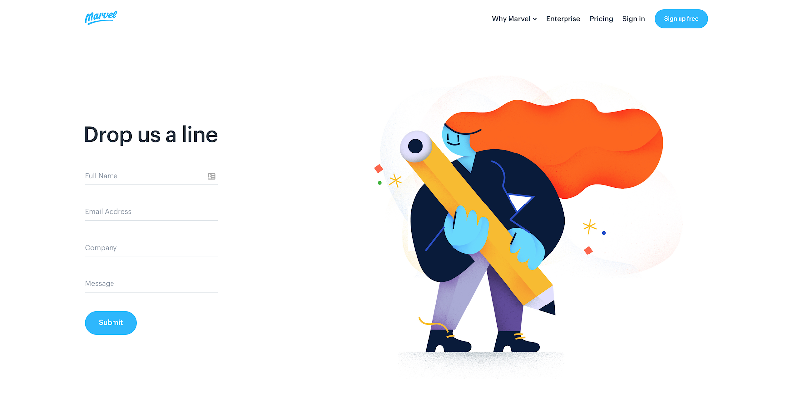
What a fun example! This contact us page from Marvel allows for users to fill out a simple, general form or segment themselves to find the specific help they need (i.e. sales, press, or support).
Next, the real photography used in the location section helps put a face to a brand and provides insight into the company’s office culture (employees appearing to be enjoying their job is a plus).
🔎 Related: The Ultimate Guide to Website Redesign Projects for Businesses
In terms of design, the addition of visual cues would have helped guide the user’s eye, subconsciously nudging them to the information below the fold.
Bottomline: Show some personality. This page highlights their brand culture both through illustration and actual photography making them exceedingly approachable.
2. Sleeknote
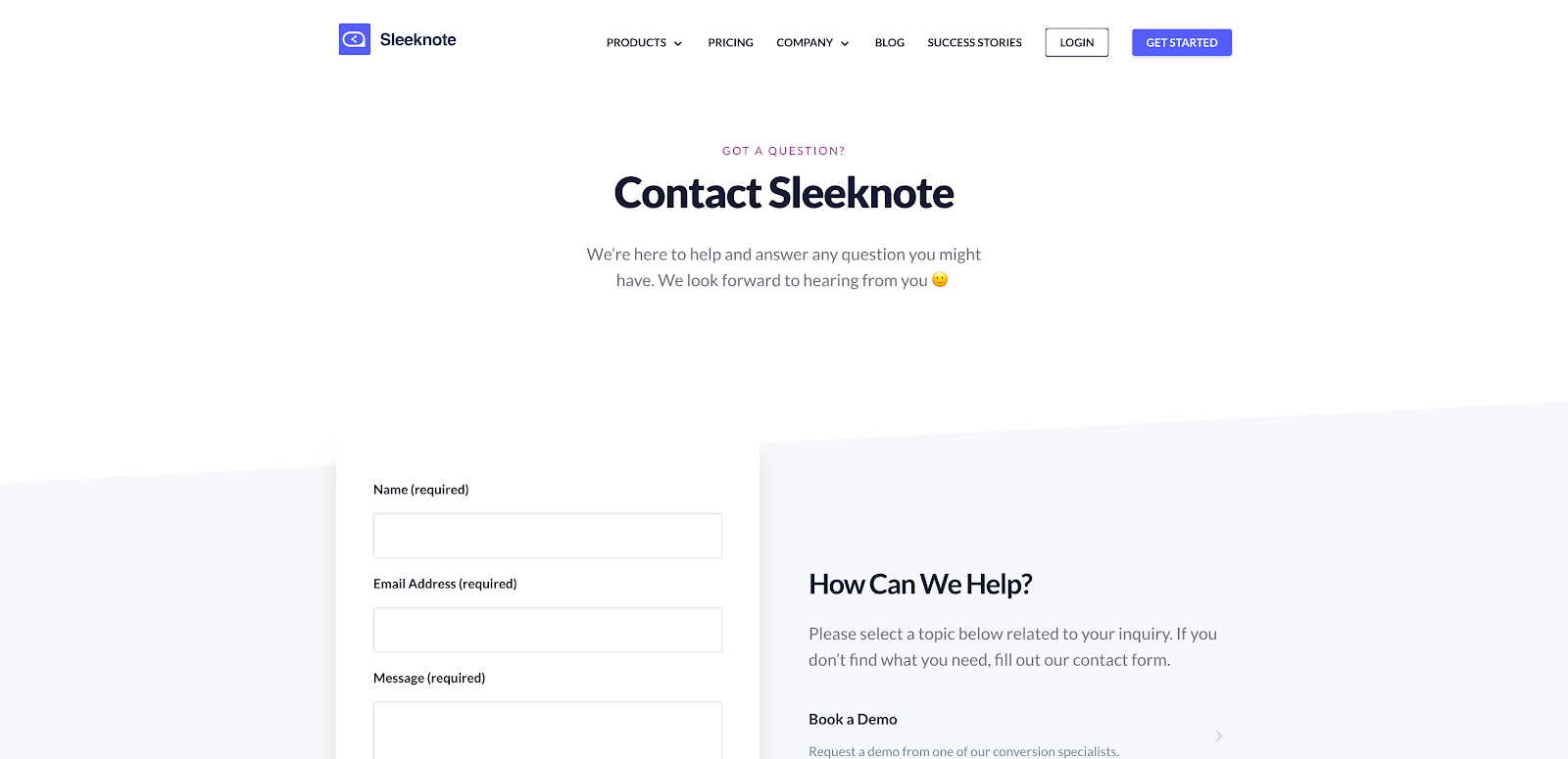
Rather than just filling out a form, Sleeknote also offers help to the user with links directing them to find additional information or take popular actions. They’ve also taken special care to add social proof, featuring trusted logos.
Visually, it’s great that form is short and all of the information is organized in a condensed manner, but consistent spacing between elements could enhance the experience and prompt scrolling to other areas of the page.
They even go as far to include a colorful CTA at the bottom of the page to move users further down the funnel with a free trial. They are really letting this page do some heavy lifting!
Bottomline: Go for it, don’t hesitate to include a next step on your contact us page. You have their attention, use it to guide them further down your funnel!
3. Zendesk
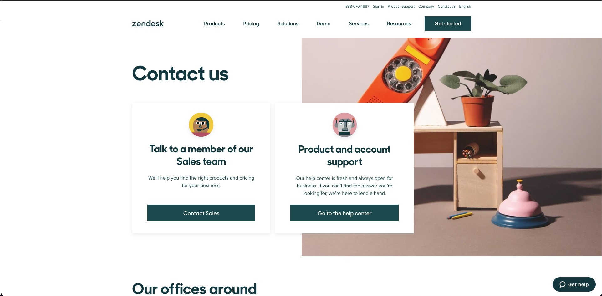
Zendesk hit all the major needs with its contact us page while maintaining a clean design and even including touches of self-selection. On the page, they have two directions for a user to follow: either talking to a member of their sales team or going to the help center for product and account support.
By choosing a path upfront, the website can show the user the content that is most relevant to them and, in turn, makes it easier for users to find what they’re looking for. There’s something more frustrating than not being able to find what you need on a website.
They also include location information with a link to a map.
Bottomline: Simplicity goes a long way. Make it clear for the user in which direction they should follow if they are looking for help on something specific.
4. Berry Insurance*
*Editor’s Note: Berry Insurance is an IMPACT client.
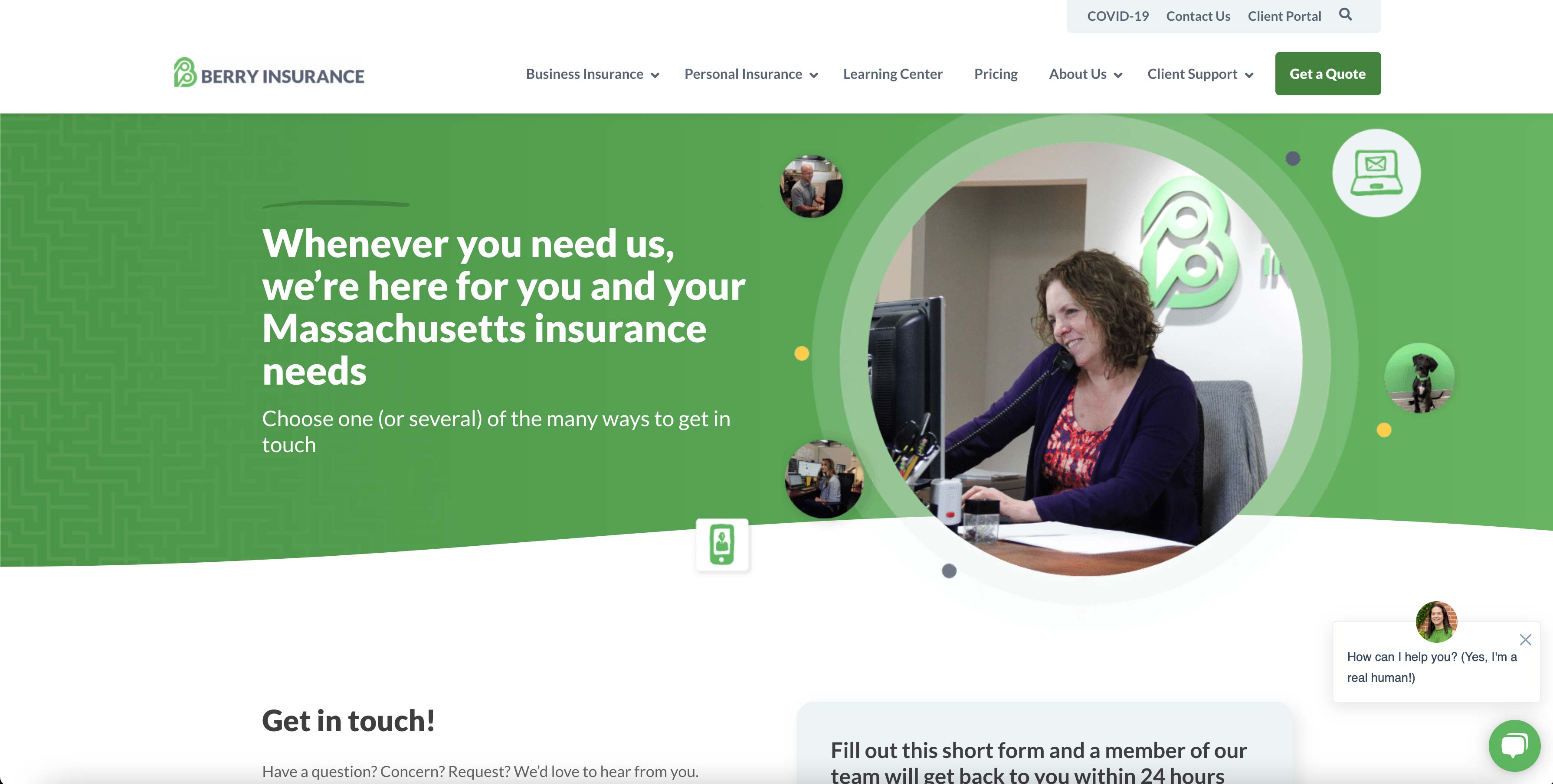
Berry Insurance is doing a lot of good things with their contact page.
First off, yay for real pictures of real people in their actual office! In a website world riddled with stock photo models, your contact us page is perfect time to show your true face.
From there, Berry Insurance includes all the different ways to get in contact with them, allowing you to pick which you prefer — whether it be via form, chat, phone, or email.
Along with all that information they have included when you can expect to hear back from a member of their team and detailed driving directions on how to get to their office which includes landmarks.
Lastly, they included a list of their team members in case you were looking to get a hold of someone specifically (and again including pictures of the actual person who would be talking to).
Bottomline: Depending on your industry don’t be afraid to get your team information out there so if your visitor is looking for someone specifically they can reach out directly instead of having to go through a general pipeline.
5. Freshworks
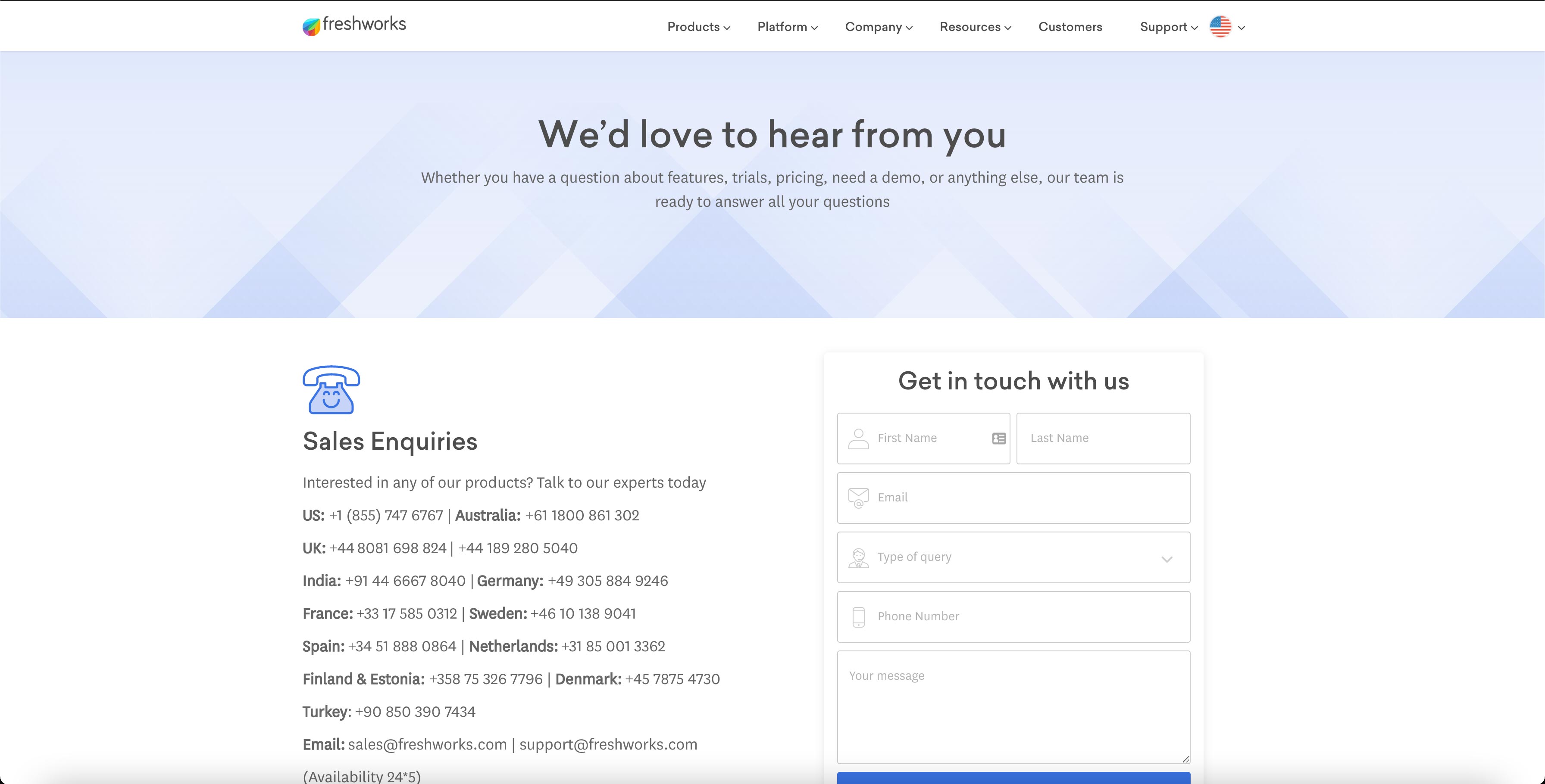
The last time we looked at Freshworks contact us page they had their form behind a “Get In Touch” button that opened a lightbox in the hero section.
Now, they pulled the form out from the “Get In Touch” button, as well as pulled out the sales inquiry phone numbers for each location.
This makes it easier for users to find the information they want while placing the form directly on the page has eliminated one unnecessary step to getting in touch.
Bottomline: Pay attention to how a user interacts with your page by using a heat mapping software like HotJar or Lucky Orange, and make the necessary changes to make the page more successful. Pull out the key important stuff so the user doesn’t have to search for it on the page.
6. Copper
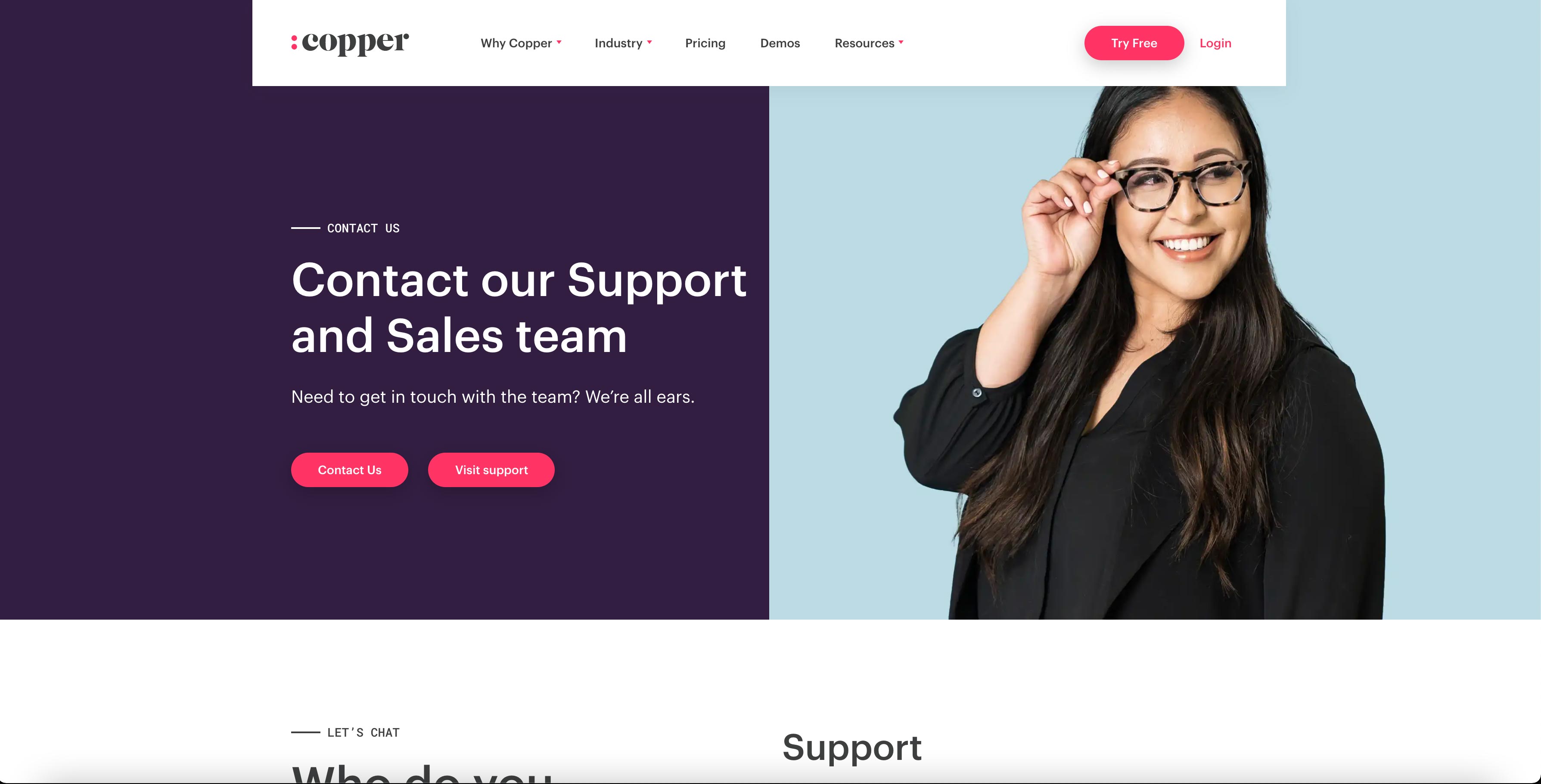
In this example, it’s clear Copper has paid special attention to keeping their contact us page consistent with the look and feel of their entire website.
The colors used are consistent with the brand and the imagery of a smiling woman is inviting and casual, which makes people feel more comfortable reaching out with a question or feedback.
Bottomline: The more approachable your brand appears, the more apt the user is to interact.
7. Stripe
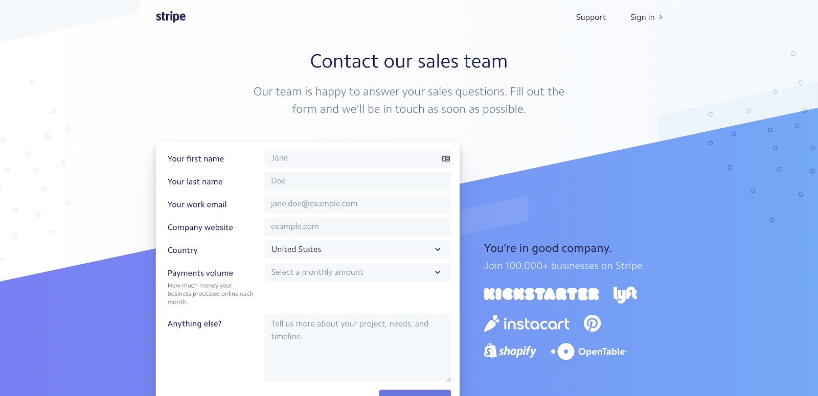
Stripe hits almost all of the major checkboxes for a successful contact us page. It has a clean design that makes it clear how to reach out to their team and the content on the page has a warm and friendly tone.
What we love most about this page, though, is how they showcase a handful of the companies they work with right next to the form. Showcasing companies that use their software, made me think “If these big companies trust Stripe, why shouldn’t I,” and helps to ease any reservations a visitor might have about reaching out to their sales team. Seeing these logos made me think “If these big companies trust Stripe, why shouldn’t I.”
The biggest thing lacking on this page is the type of contact information available to the user. The form is great, but users aren’t privy to location or any phone numbers.
Bottomline: Social proof is HUGE. If you’ve got it, flaunt it! Adding that extra element of trust right next to a point of conversion is a win.
8. Yeti
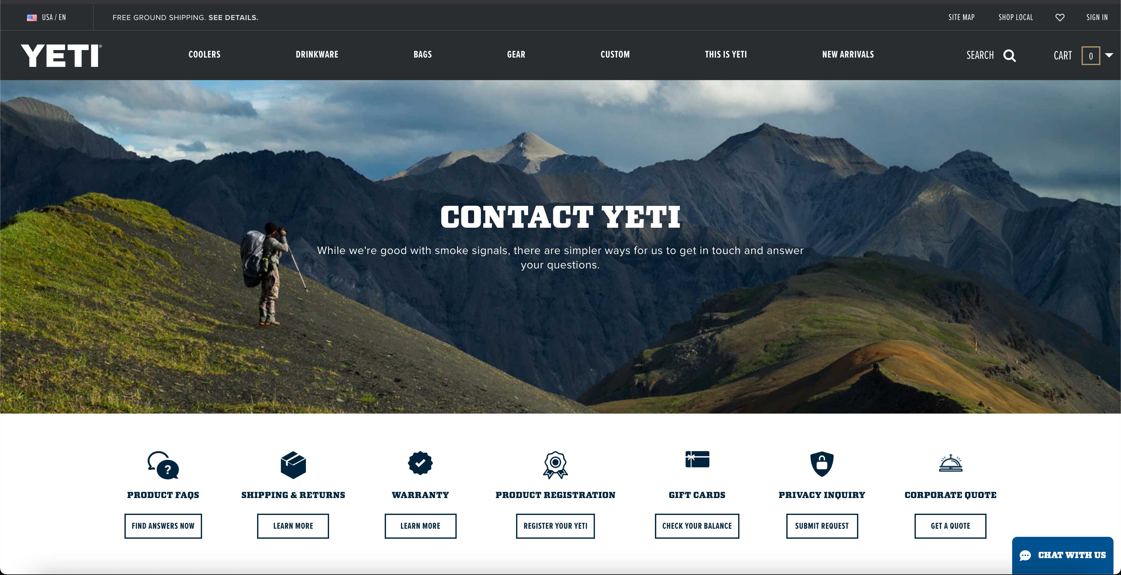
Yeti prides themselves on selling quality drinkware and coolers geared towards fans of the outdoors.
Throughout their entire site, they feature nature-themed photography and headlines such as “Built for the Wild” to reinforce their outdoorsy brand and resonate with their audience.
That effort doesn’t end on their contact us page.
Too often companies treat contact pages as an afterthought in the design process and end up tossing together a generic, templated page.
We love that Yeti carries their brand and voice onto the contact us page with a beautiful image of a hiker. They add to this with a cheeky line of text, “While we're good with smoke signals, there are simpler ways for us to get in touch and answer your questions.”
While all these elements are great and there’s plenty of essential information present (hours, corporate address, etc.), the page does lack a form. The “Send an Email” call-to-action might be better served as a form in a lightbox, instead of opening up in a brand new tab.
Bottomline: Just because contact us pages are a standard necessity, it doesn’t mean their content and their tone has to be. Stay true to your brand on this page, as well as any other.
9. Atlassian
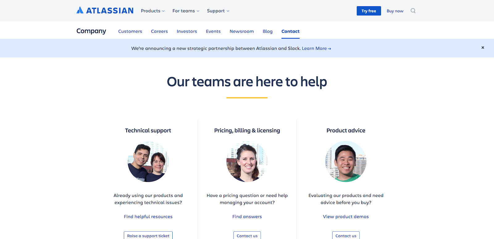
Atlassian is an enterprise software company that offers a number of different products geared towards keeping large companies organized.
Specialized in organization, it’s no surprise that their contact us page is extremely clean and well-organized. They make it easy for visitors to find the specific department they’re looking for and reach out.
They also made sure the page felt warm, friendly, and trustworthy by including the ability to reach out and give feedback directly to the founders.
🔎 Related: How to Create a Brand Messaging Strategy Your Audience Will Love
While the addition of real headshots are great as well, we don’t know who we are talking to. Adding in that extra personal touch would go a long way in showing the user that you care.
Bottomline: Don’t be afraid to be vulnerable. Atlassian takes a huge risk here asking for open feedback, but we’re sure the candid feedback they’ve received through this page has allowed them to improve their user experience.
10. River Pools and Spas*
*Editor’s Note: River Pools and Spas is an IMPACT client.
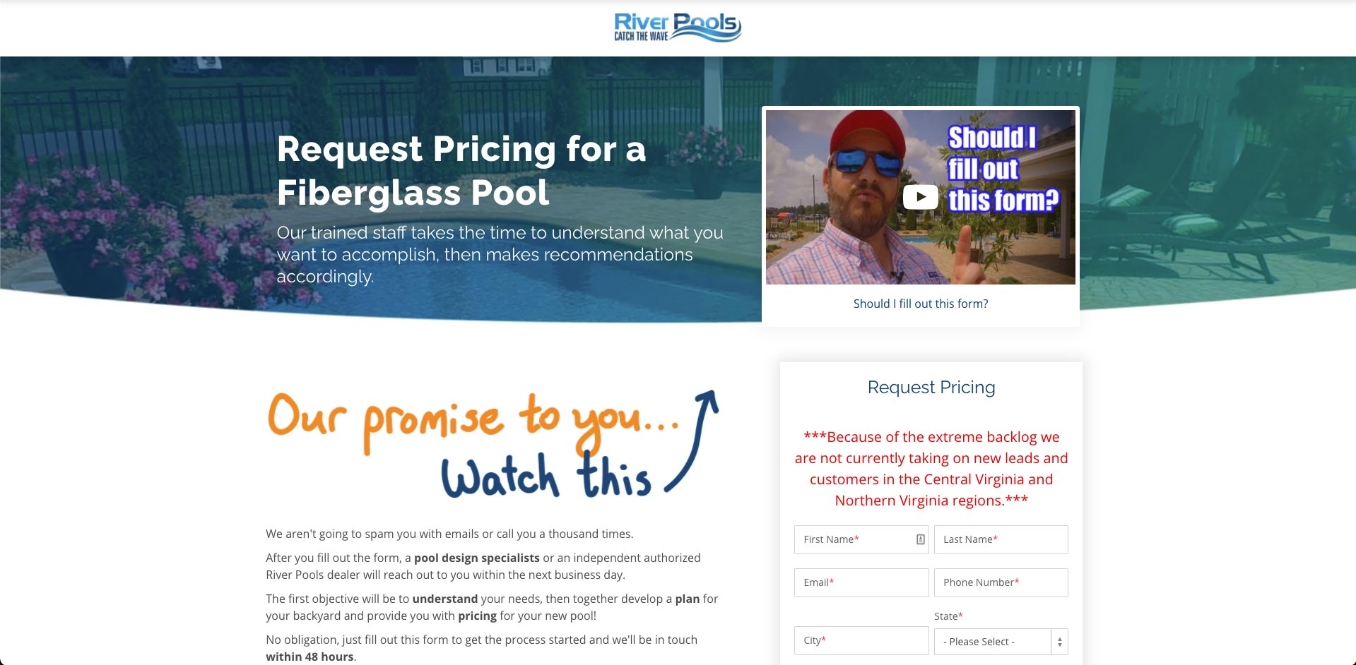
Just like IMPACT, River Pools and Spas includes a video of what to expect and what they promise will happen when you fill out this form.
They call out a little more attention to the video to make sure you watch and know the next steps. Not only does this make sure that you get the information you need, but also that you’re introduced to their team in the process.
Bottomline: We all know it can be daunting when shopping around for a big project to be done at your house and who is going to contact you and when. With these types of videos, visitors can have peace of mind knowing exactly what the process is.
11. Infinum
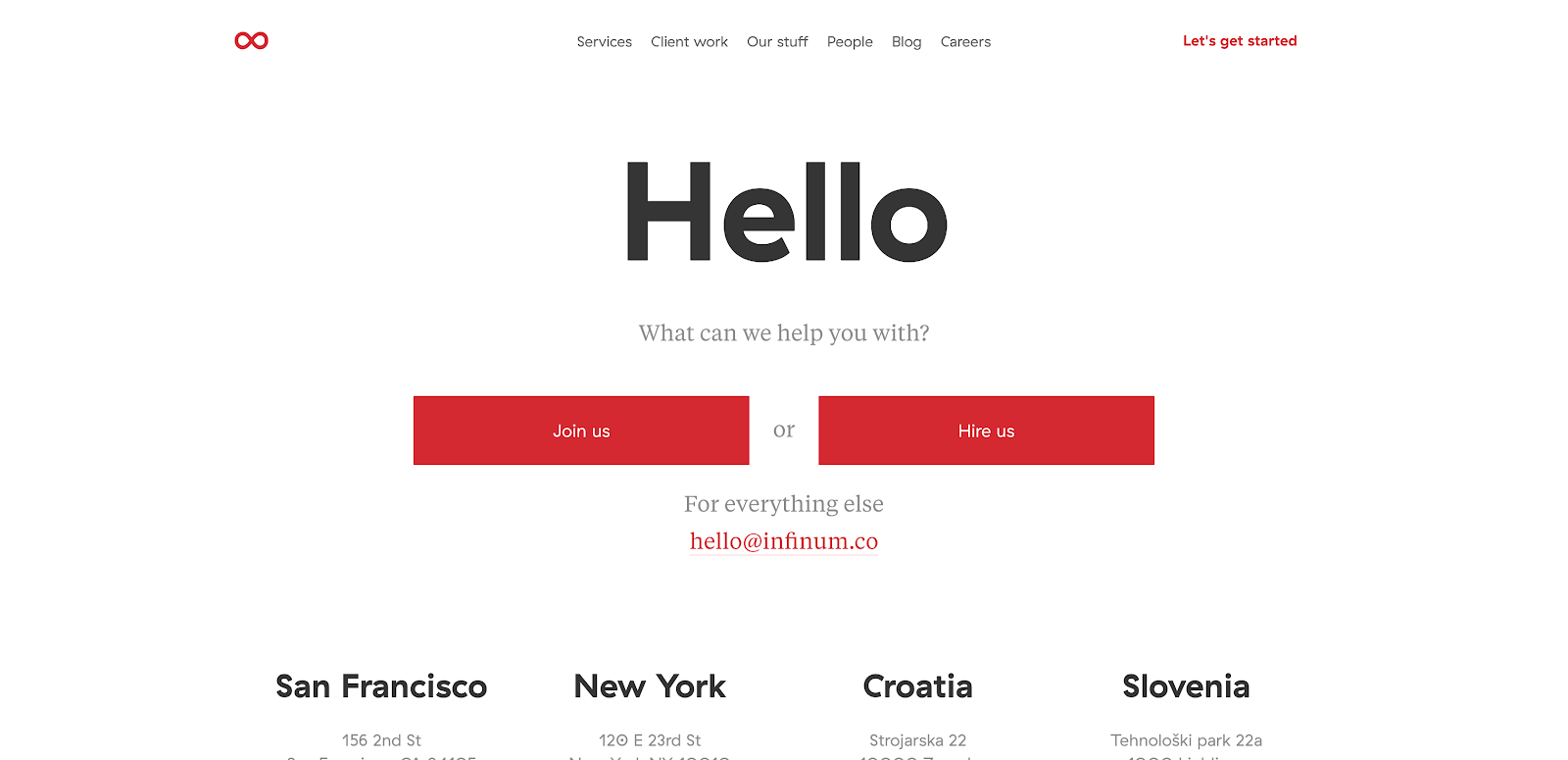
Sometimes the “short and sweet” route is the way to go. App development company, Infinum nails this simple approach.
As soon as you arrive on the page, you’re greeted with a giant friendly “Hello.”
From there, they let you know they’re here to help you and you’re presented with three simple options. The page is clean, the available actions to take are very clearly displayed, and the limited amount of content on the page is easy to read.
All the pieces are here, but the user experience after clicking the email address is lackluster. Instead of presenting the user with an on-page form, your computer’s default mail client is automatically opened for you to write the company an email. It’s clunky and the takeover is unwelcome.
Bottomline: Don’t overthink it. Sometimes keeping the design straight-forward and highlighting what the user is obviously looking for in the clearest manner can be very effective.
12. Zeroqode Development (Formerly Bubblewits)
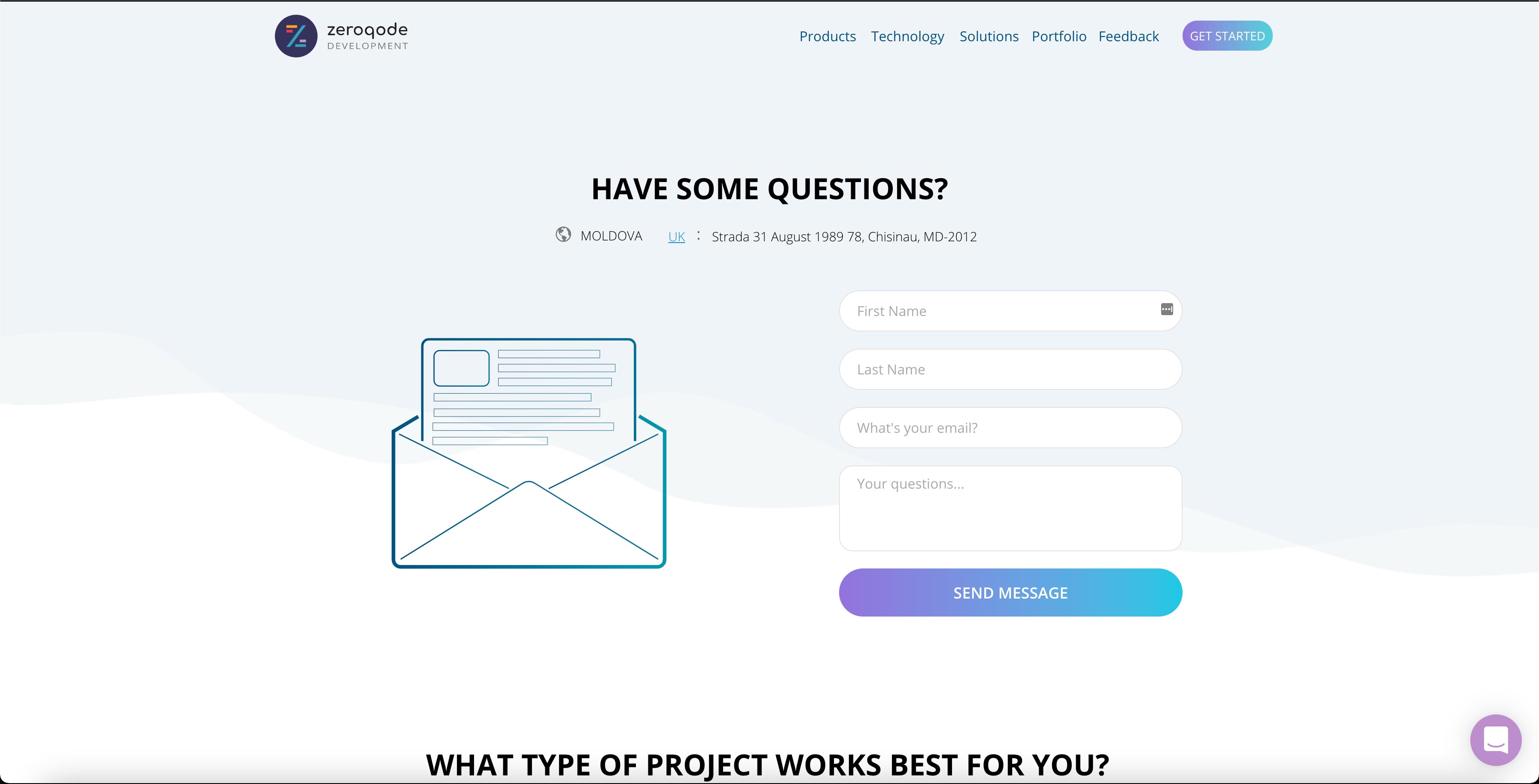
Zeroqode Development, a mobile app developer, takes their contact us page one step further by turning it into a source of lead generation. The first thing you see when you arrive is their short contact form, but the really interesting part is right below it where they’ve included a pricing table with links to “Get Started.”
It’s basically a half pricing page!
As clever as this is, the page still, unfortunately, lacks some visual direction cues to help get a user to scroll down to see it.
Bottomline: There is no rulebook saying your contact us page has to have a bottom of the funnel form and that’s it. Experiment with using your contact us page to further qualify leads.
13. Dollar Shave Club
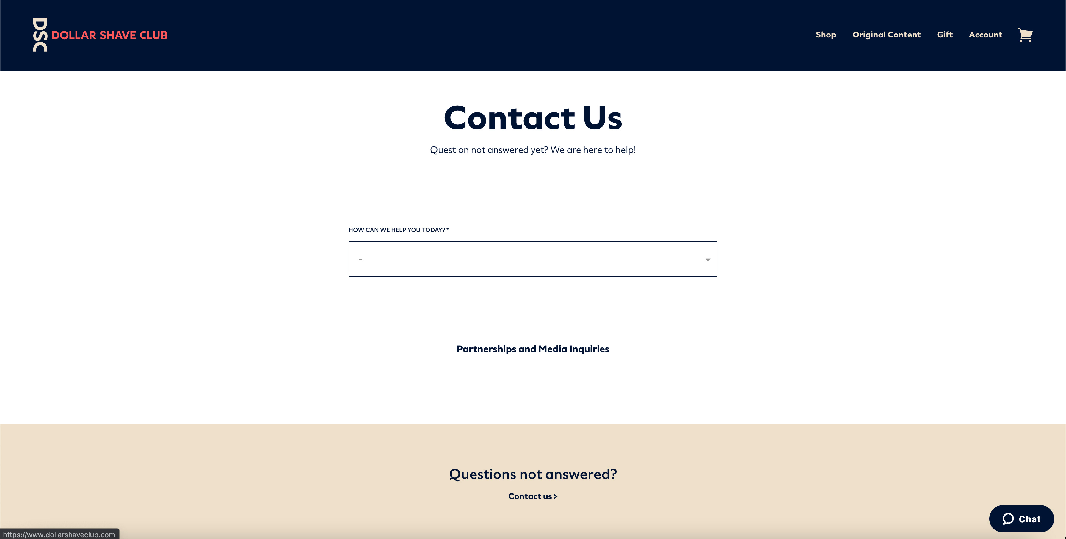
Dollar Shave Club (DSC) really wants to help the visitor and they prove that when you are quite literally greeted by a friendly drop-down menu asking how they can help you on this unique contact us page.
Rather than directly connect you with someone, DSC makes an effort to help you find the answer on your own first, saving you both time and energy.
Each question you answer in the page’s dropdown takes you to a more micro question until you (hopefully) find what you need. If you somehow don’t, they have included a CTA that changes the page content to a more traditional “contact” feel.
DSC offers the more traditional contact us page eventually, but they could put this information somewhere on the contact us landing page. It wouldn’t hurt the flow, but it would improve the experience of feeling like you need to jump through hoops to get a hold of a real human being.
Also, considering Dollar Shave Club has notoriously very funny copywriting, we would’ve liked to see some of that personality incorporated on the page.
Bottomline: Show some personality and don’t leave crucial elements out on your own contact us page.
14. Buzzworthy Studio
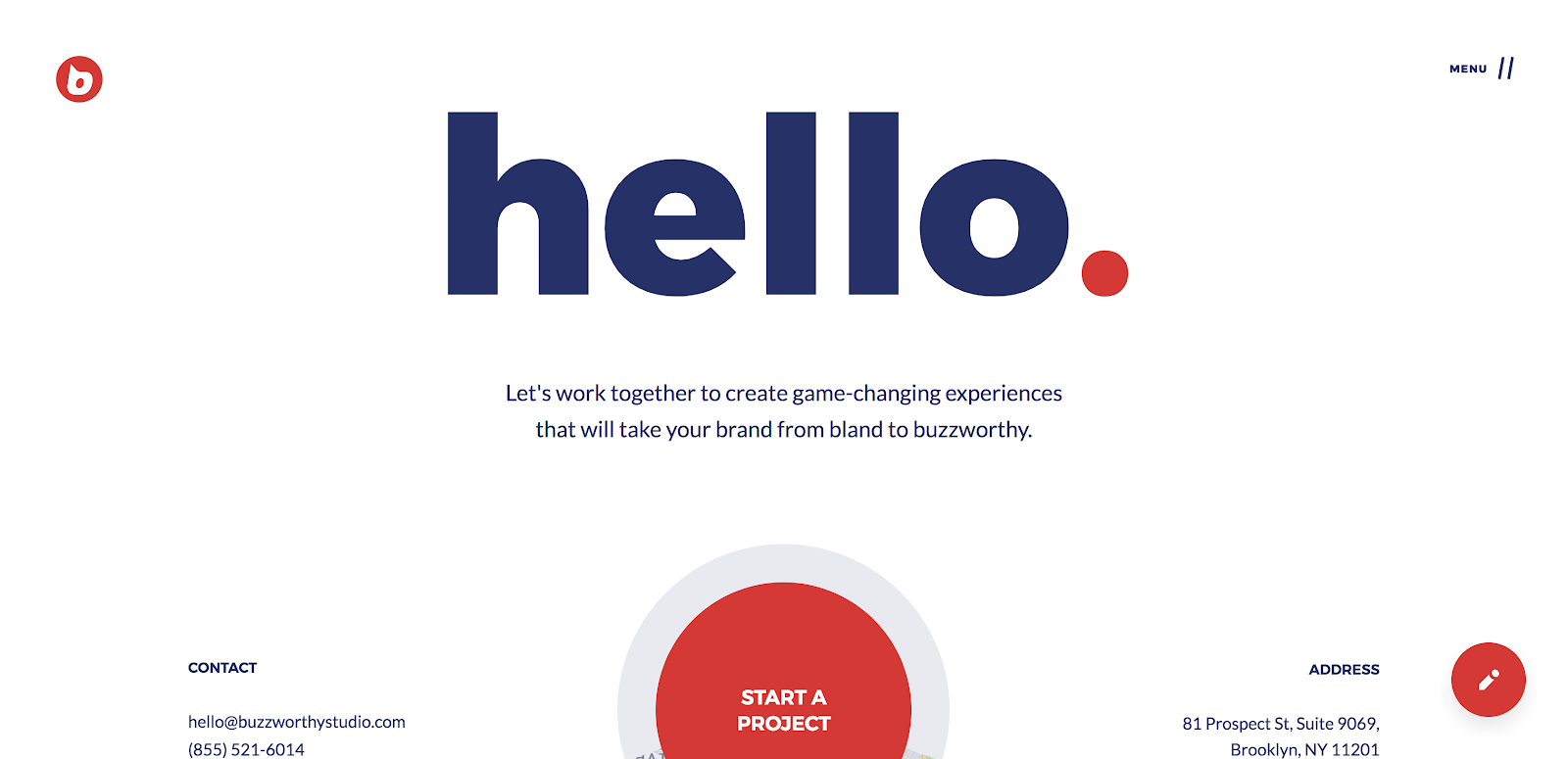
Buzzworthy is a loud brand, which is super evident on their site and their contact us page is no exception. Big text and a killer value proposition lead right into an eye-catching CTA. The contact info is also there, but they’ve succeeded drawing your eye to what they really want you to focus on - the Start A Project CTA.
While we are loving the CTA, it’s too low on the page on the desktop version. The overall page design could be enhanced if they reevaluated the responsive breaks and the user suffers from too much white space between elements, especially when there is no visual prompt calling them to scroll further.
Bottomline: Big text as a graphic doesn’t always work, but they succeed with minimal design elements because of the great copywriting. A usually plain contact page can always be elevated by great conversational copywriting.
15. Squarespace
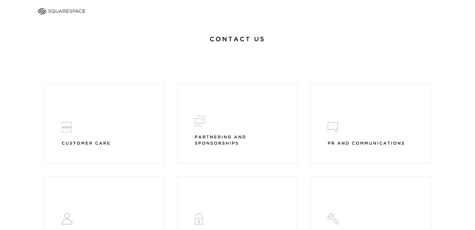
Squarespace’s minimalist design is a big departure from some of the other examples we’ve shared, but that is exactly why it’s made our list!
Instead of an either/or approach to their contact us page, Squarespace has determined that users venture to this page to find information in one of six categories.
Once the user self-selects, the link takes you to an easy-to-fill-out form or a topic help center they browse at their own pace.
It’s simple, to the point, and taking the user exactly where they need to go.
Bottomline: Don’t be afraid to play up who you are. The greatest thing about this page is that all of the answers are literally in “square spaces”!
16. Fitbit Health Solutions
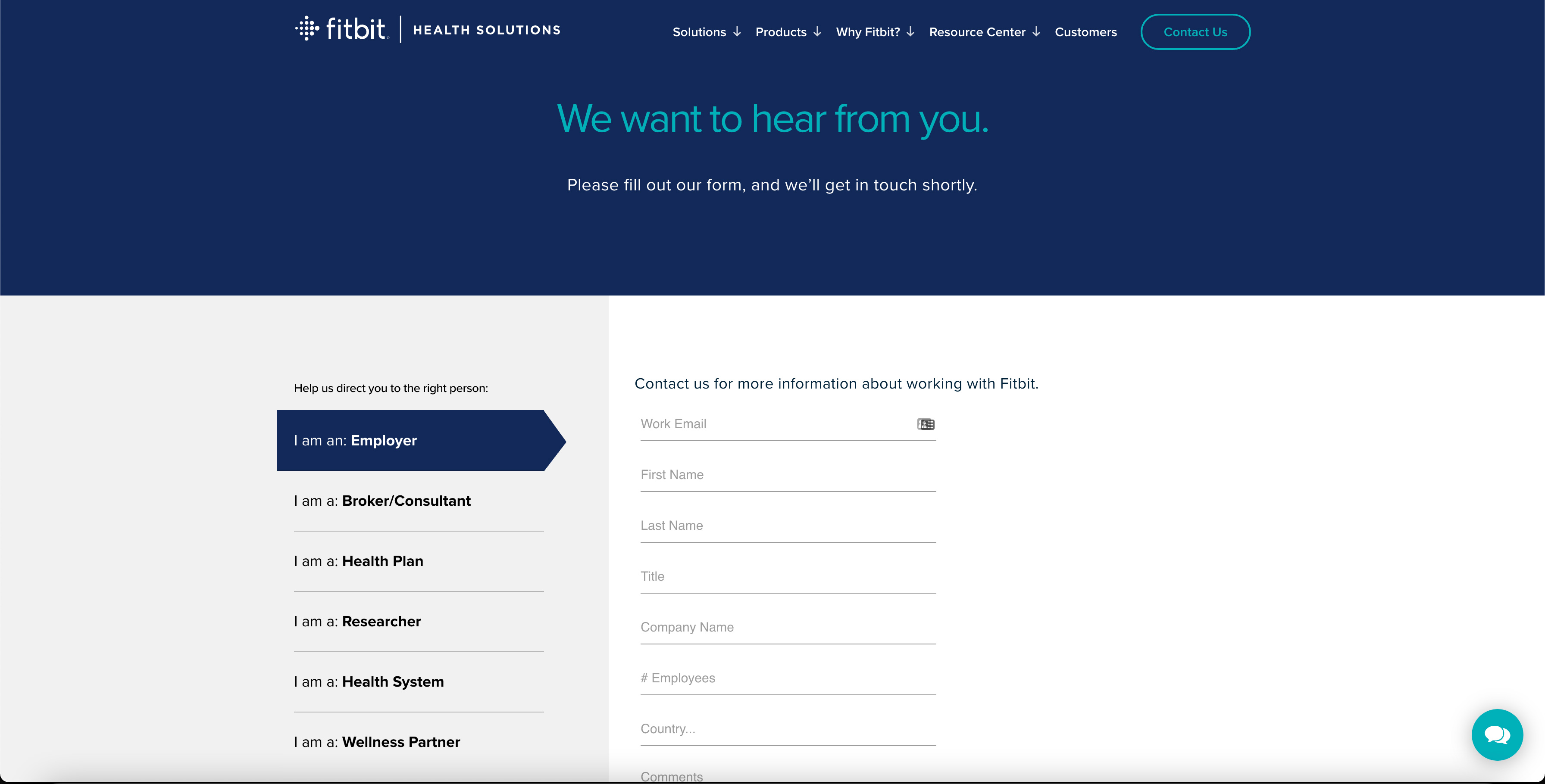
This is a great example of a page that nailed simplicity and style, all in one. We’ve seen a lot of simple contact us pages, which we love and have praised, but Fitbit has done them one better. The user is met with a simple statement about what to do on the page, and what the follow-up response will be.
The user can then identify who they are (likely so their information can be directed to the most appropriate place), and fill out a short form. Everything has been styled. Everything is on-brand. The user doesn’t skip a beat in this experience.
If you are looking to reach out about something else they have given the user a few different other options.
Bottomline: If you have different solutions for different types of users that requires different form information, create a user experience that is clear for the user to identify who they are.
17. Adobe
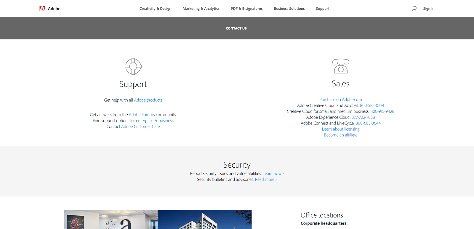
Now, Adobe does a great job of segmenting.
Upon arrival, visitors are asked if they are looking for sales or support and, in either case, the user can choose how they would like to receive more information. They can link over to the community forums, be directed to the help desk, or simply call one of the many phone numbers provided.
From there the user can see global locations and even drill down into very specific links about media inquiries, sponsorship, and research. Finally, if none of those options hit your fancy, you can simply call them at their 800 number or live chat with them. This page is a win from all angles!
The only thing this page really lacks is that signature Adobe style. It’s straightforward and to the point. It’s all about the information on the page, and rightfully so, But, users are left with a very plain page that doesn’t give any nods to design consistency. Make it a showcase!
Bottomline: This is a great layout for adding a lot of useful links to a single page in a way that isn’t overwhelming. Think about the information you need to provide to your users, can you rearrange elements to make it more helpful?
18. Mailchimp
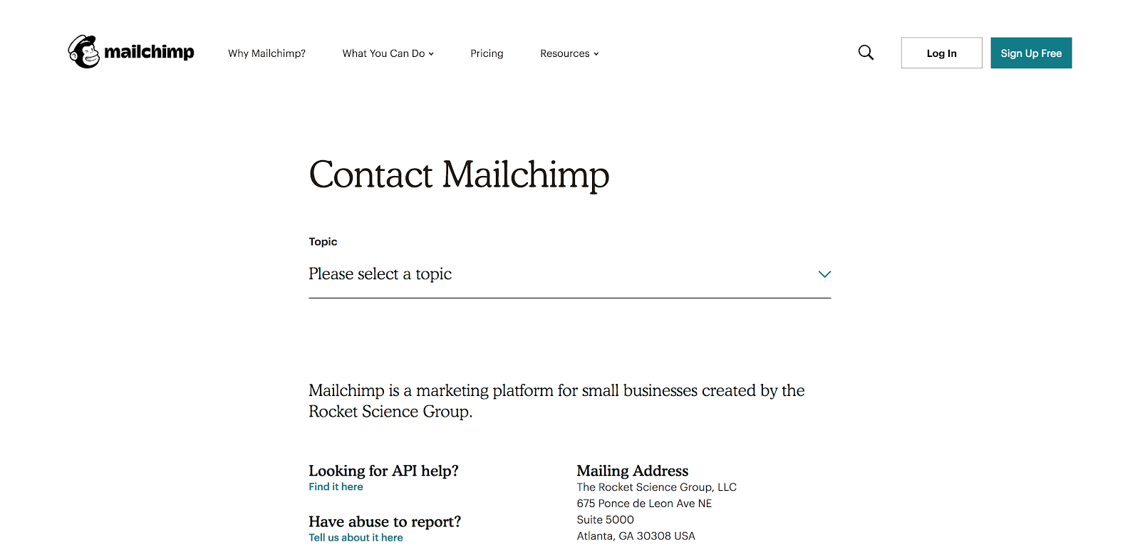
Mailchimp starts with a simple and direct title which goes right into a self-select module.
Having the ability to self-identify takes the user exactly where they need to go to get the most relevant information for their journey.
From there, there is a simple mailing address and some direct links to very specific “contact us” questions regarding APIs and abuse.
Overall, we like where Mailchimp was going with this page, but it does lack a form. A simple form or live chat would remove the boundary to getting an answer, even with such a helpful page.
Bottomline: Think about the questions you address often and add that very specific information to your contact us page. You’ll get users the info you need and you’ll save yourself some hassle.
19. Anchor Foundation Repair*
*Editor’s Note: Anchor Foundation Repair is an IMPACT client.
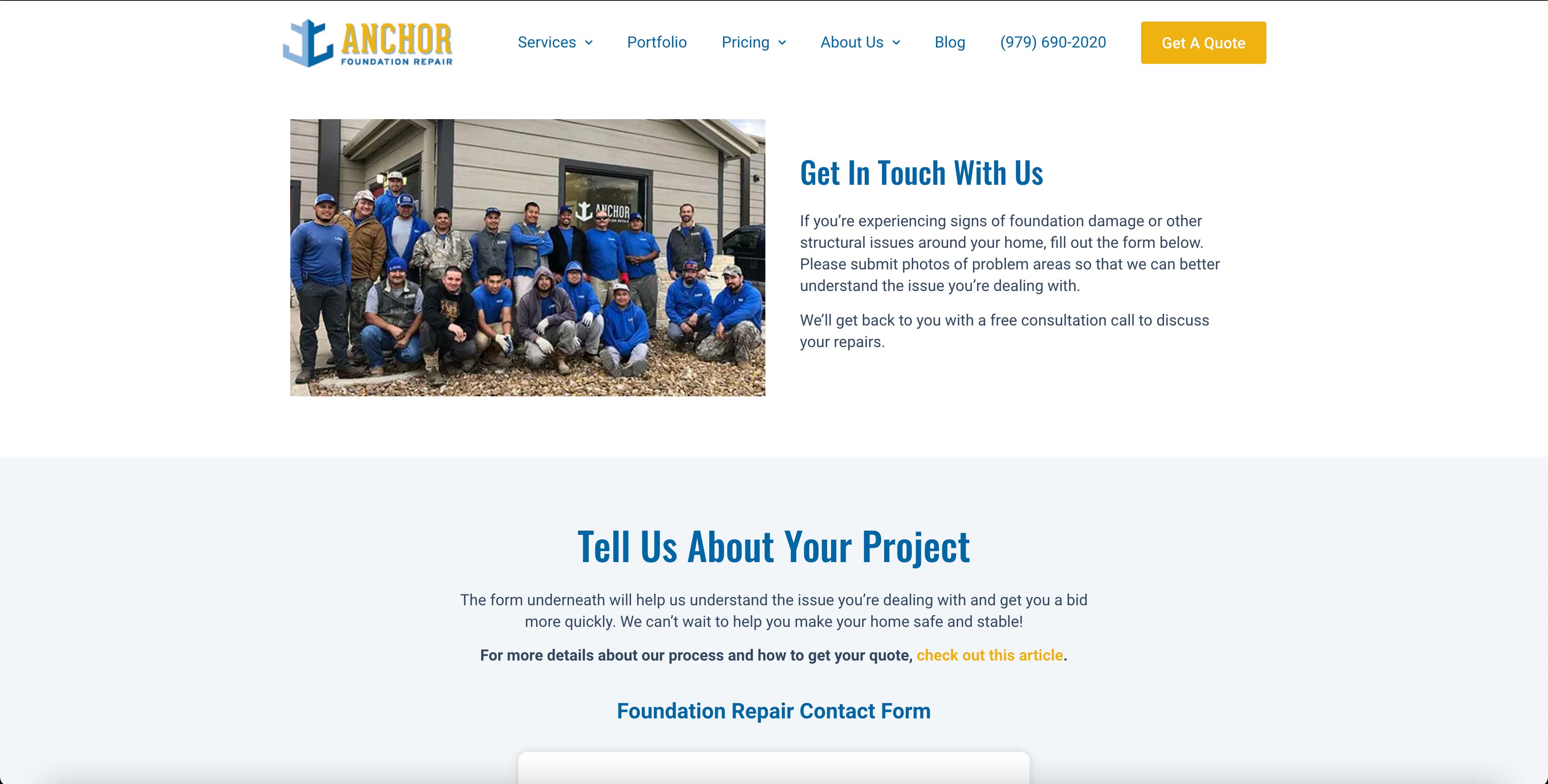
We love how Anchor Foundation Repair shows a picture of the team on their contact us page so the user knows who they will be talking to and working with.
Alongside the team photo, they go on to clarify that if you need a free estimate to give them a phone call. For any other reason, use the form below.
Anchor Foundation Repair also asks for two things before filling out the form: photos of your problem areas will get you the most efficient service and read more about their process and how to get your quote.
While creating a video would make this landing page even more successful on how to get your quote, this is a create intermediate step until you can get that video up to help answer some questions people may have.
Below the form, Anchor Foundation Repair includes social proof from customers who have previously worked with them.
Bottomline: We know everyone likes to read reviews before requesting work from a company they have never worked with before, don’t hide your reviews, bring them front and center.
20. Hootsuite
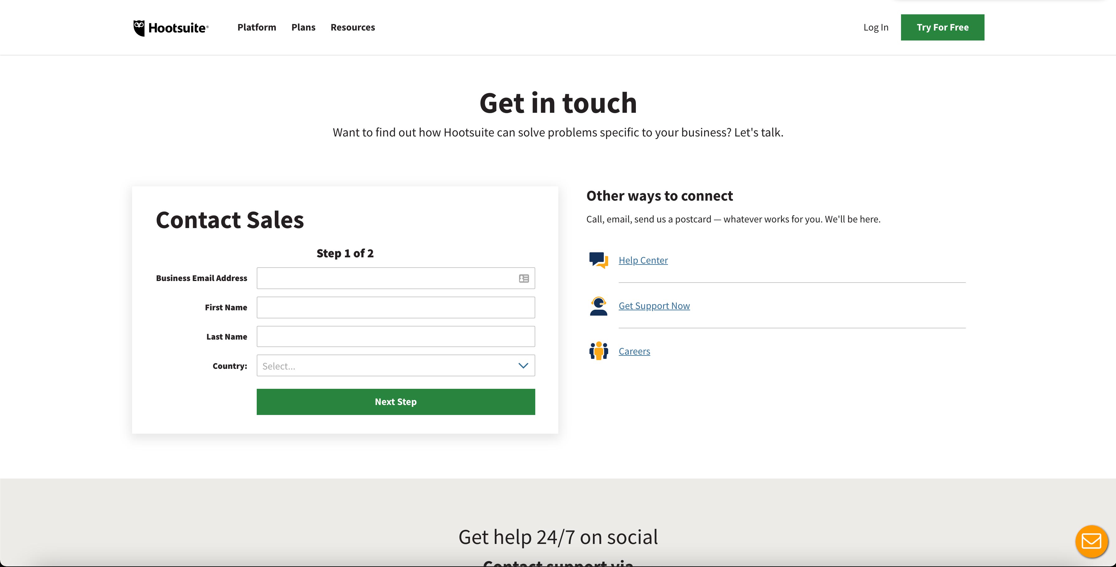
Hootsuite has made it exceptionally easy to get in touch with them on their contact us page.
Likely reflecting a common user behavior, they start the page off with a simple sales form. If that isn’t what you need, they provide other ways to connect and find answers to the right of that form including social media and their help center.
Lastly, you have all of their international offices listed in case you want to reach someone more in your area.
Sales is clearly Hootsuite’s top priority here, but we have to assume that many users are also coming to the page for support.
We’d prefer to see support carry the same weight as sales on this page and present the user with more of an either/or choice.
Bottomline: If you have a multi-purpose contact us page make sure you give your user options and don’t pigeon hole them to the standard one page form.
21. PayPal
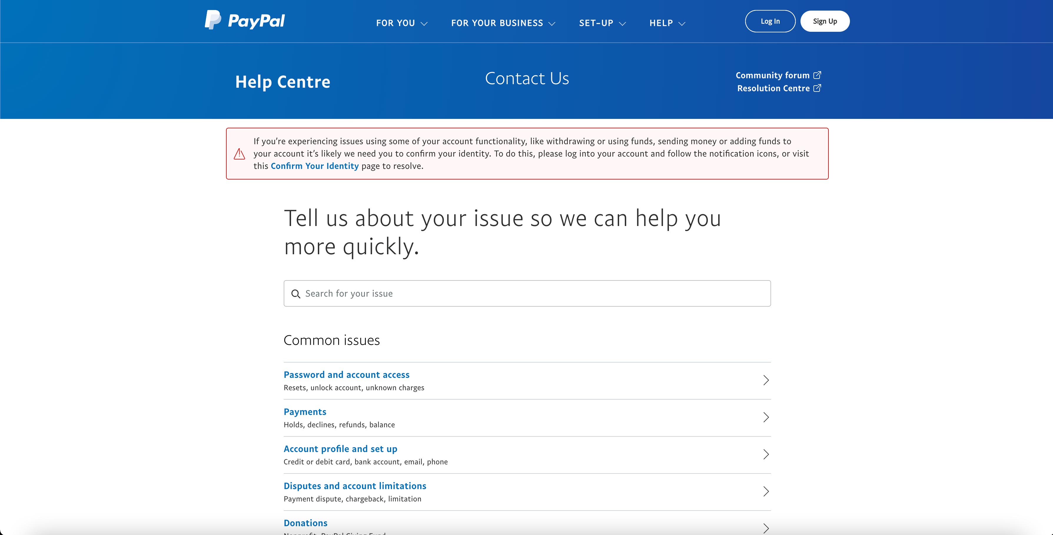
We are really drawn to how user-centric this page is!
The copy immediately starts the conversation by showing the most common issues users face and then requiring them to choose their path.
If none of those apply, they have the ability to enter their search query in the search bar at the top of the page. Then, further down, PayPal provides four other, more traditional ways to get in touch: message us, ask the community, resolution center, and call us.
To take the page up a notch, a form or a live chat feature would be helpful for users. Sometimes, you just want to be able to reach out.
Bottomline: Approach your contact us page from a solution-based standpoint. Your visitor most likely has something in mind they’d like to hear from you about, work from there.
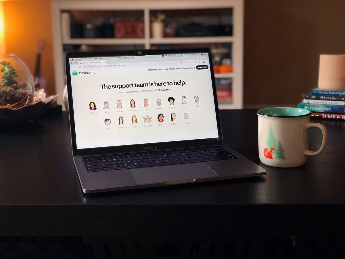
22. Basecamp
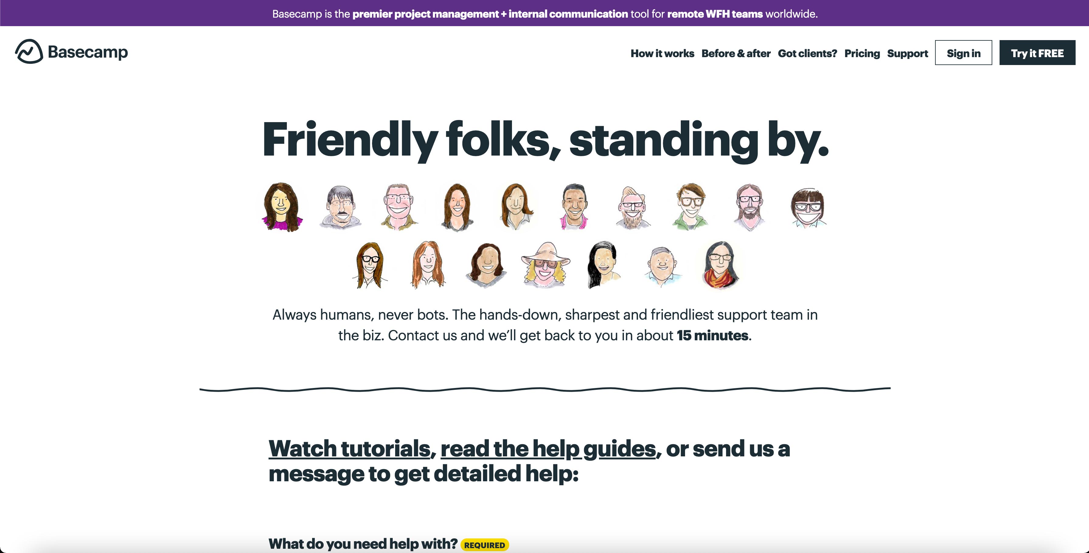
From your first touch on this page, you know who you will be talking to and how long it’s going to take before they respond.
To top it all off, this page could not be more on brand! The illustrations keep the user experience extremely consistent to that on other pages.
It is also great to see how long and when you can expect a response from the team.
Bottomline: Give your brand a face! Letting the user know who’s going to be on the other end of their interaction builds trust and makes people feel more comfortable and confident that they’re actually talking to another human being, not a bot.
23. HubSpot
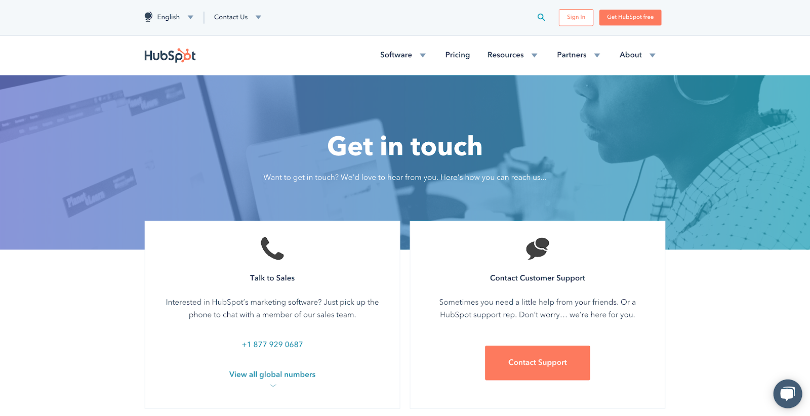
HubSpot’s contact us page allows users to “pick their path” to help them get to the most relevant answers they need quickly.
As the user scrolls, they will find local phone numbers to HubSpot’s domestic and international locations, and they even provide driving directions to the nearest headquarters!
Lastly, there is a live chat function on the page. In the event that you need assistance, right this minute, you can click over and start a conversation.
As useful as the page is, it would be nice to see jump links based on global regions to help the user navigate the long page.
Bottomline: Consider your audience geographically. If your audience would best be served by their own location, make sure they are able to easily be guided to the best source.
24. Blue Bottle Coffee
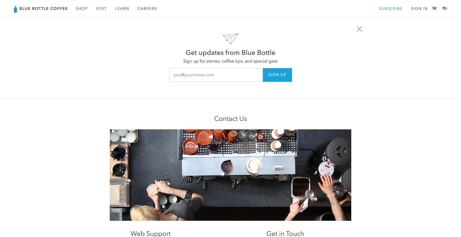
Blue Bottle Coffee’s contact us page is highly simplistic, but that’s what makes it brilliant. It provides a way for you to keep in touch (with the subscription form), an image to stay on brand, multiple ways to contact different departments and a very short contact form.
With the page being so simple, it would be great if they could use smart content to pre-populate the email field in the contact form if the user has input it in the subscribe field. It’s a small gesture, but one that users would appreciate.
Bottomline: We’ve covered a lot of examples that include a TON of information, this one keeps it simple. Don’t be afraid to put the basic elements out there and leave it at that.
25. InVision
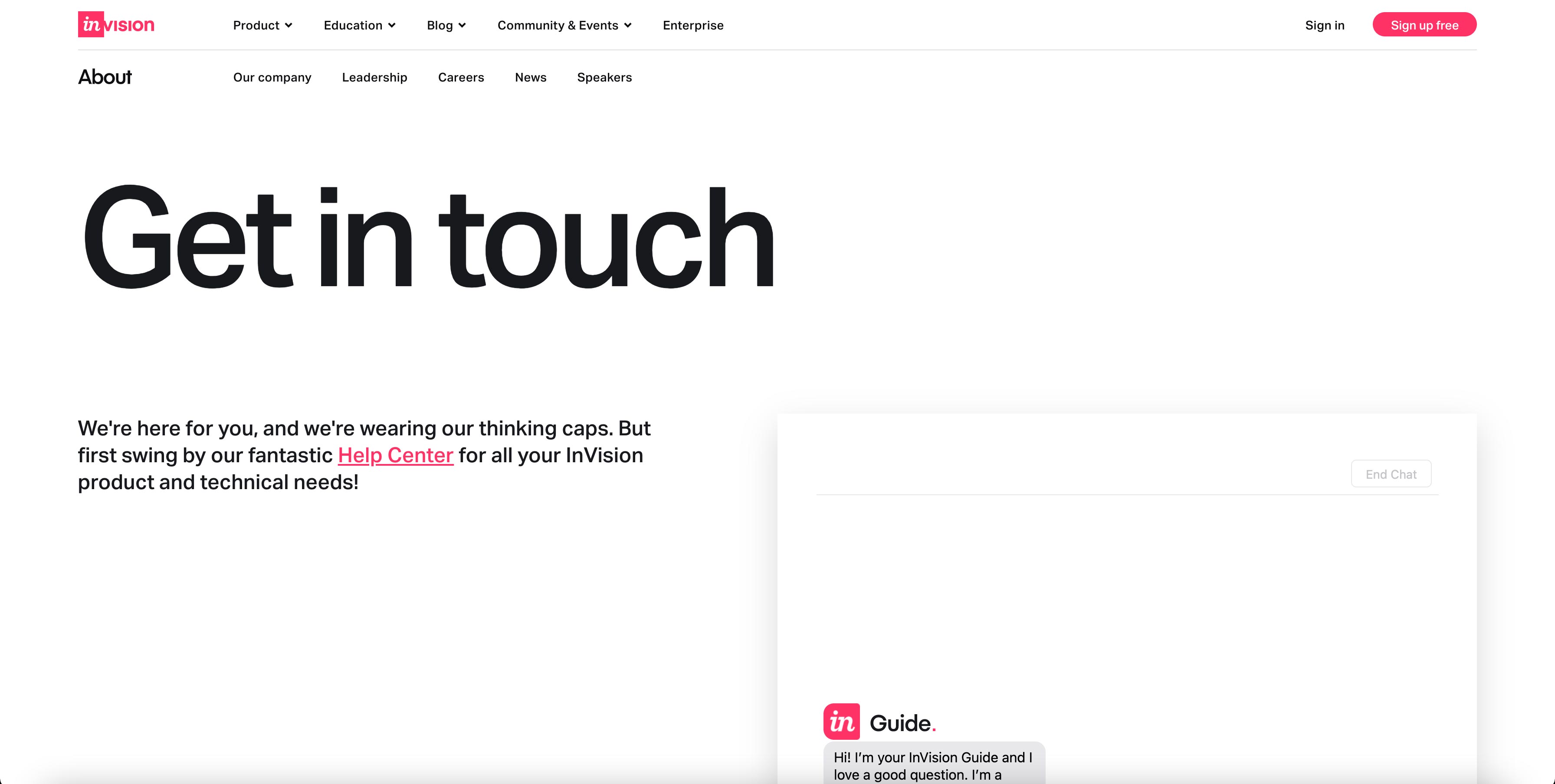
The last time we looked at InVision’s contact page, it was part of a much larger company page that provided the user with multiple facets of information any user could potentially be looking for on a contact us page.
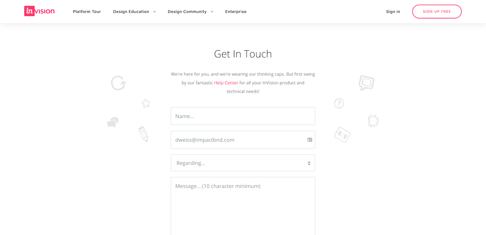
InVision now takes a different approach with a simplified, dedicated contact us page. With this contact page, they have a form where you can select a topic, and if you select a specific topic it redirects you to another page. While this is good because it is bringing you to the right location, the redirect is slow so you could start filling out the form and be redirected to the new page. There is no visual cue that you may be redirected.
Bottomline: Sometimes less is more, but don’t take away too much of the important information.
26. Unbounce
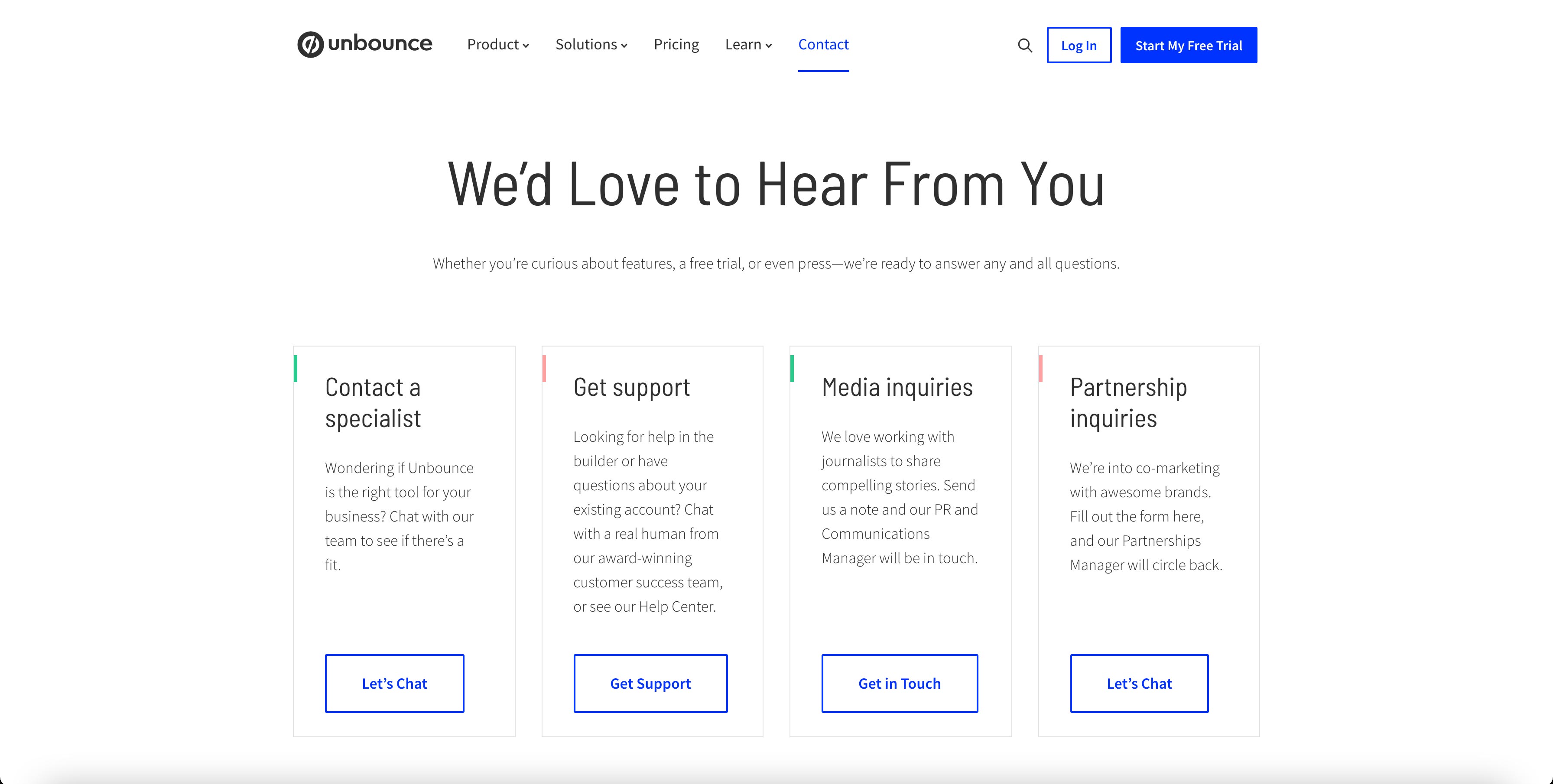
Unbounce has covered all of their bases on their contact us page.
They’ve included multiple ways to contact them based on your need, from contacting a specialist to partnership inquiries, plus, on top of that, they have given the location of their digs as well as phone numbers.
They even encourage people to “Give us a call—or better yet—drop into our headquarters to say hi in person.”
With Unbounce having a lot of different avenues to be contacted, it is great to see the most popular reasons why people reach out to them and how to get in contact with them. Bringing that personality to the forefront shows that you are welcoming and encourage them to reach out.
Bottomline: Be friendly!
27. Lucky Orange
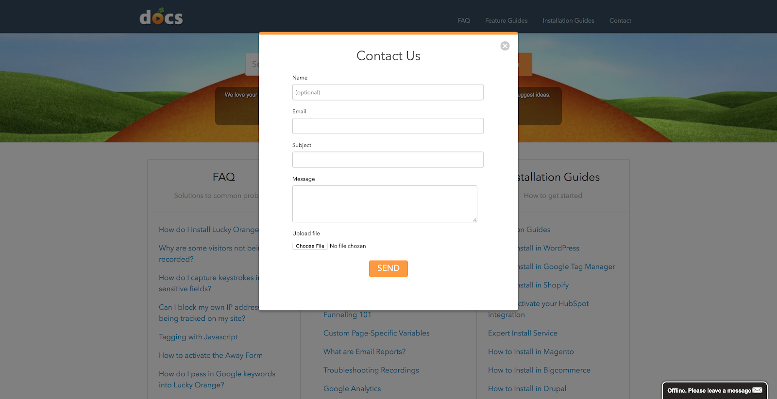
This page gets right to the point.
As soon as it loads, you are presented with a simple contact us form in a pop-up modal. If contacting them directly isn’t something you want to do, simply click away from the modal and choose one of the many options that can help the user on their journey.
This is a great lead into the knowledge center that lives beyond the form.
Now, as brilliant as the form modal is, the user doesn’t have the option to move past the form and then bring it back again. It’s use it or lose it and that could be very frustrating to some users.
Bottomline: Think about how you can isolate the features your users are really after on your contact us page, make things very easy and obvious for them.
28. IMPACT
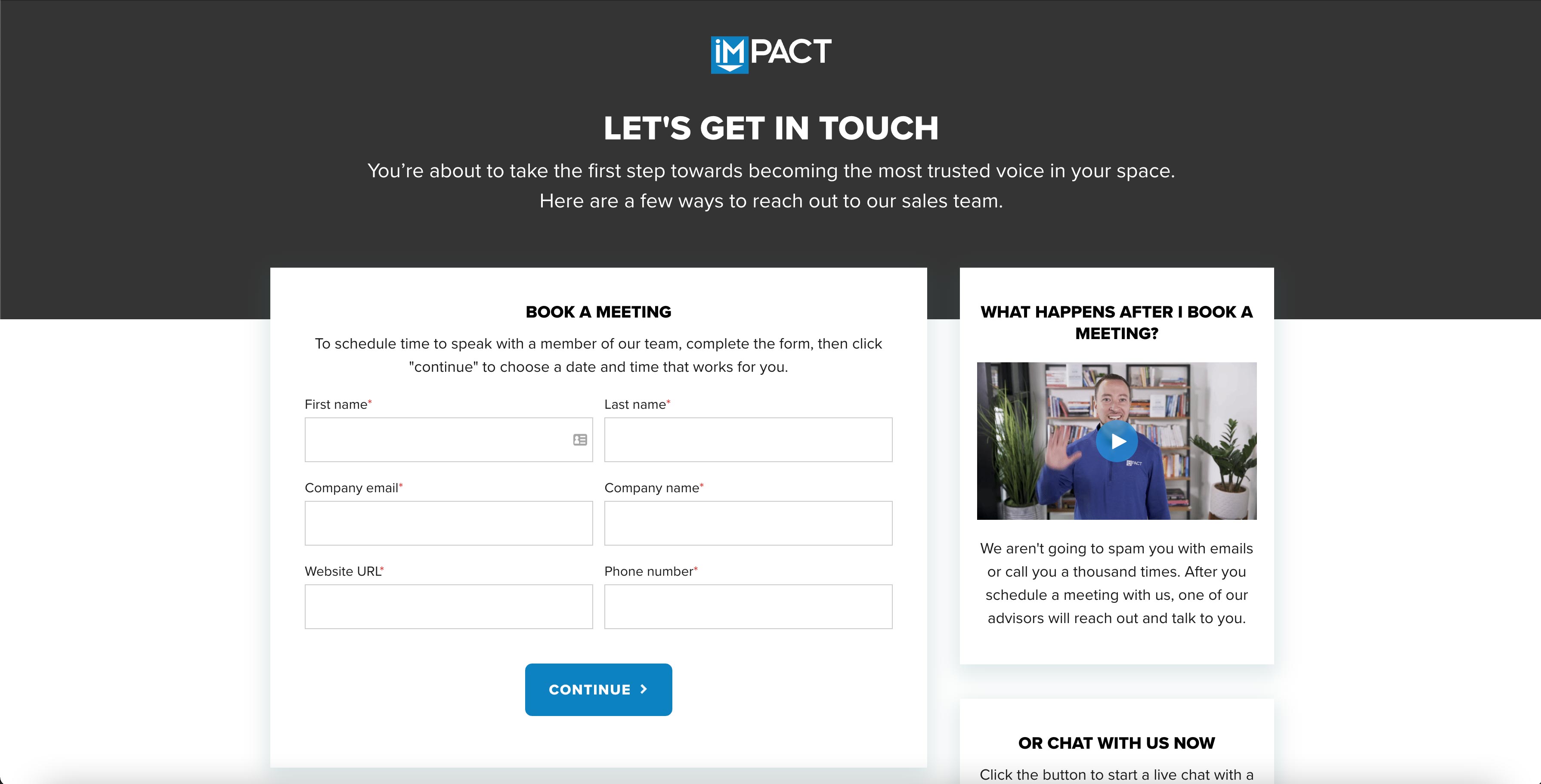
IMPACT is the first of this kind of landing page, where we actually see a video on this. Based on the principles of They Ask, You Answer, one of the selling seven videos that will take your sales and marketing efforts to the next level are landing page videos.
In this video, IMPACT talks about what will happen after a user fills out the form and when you can expect to hear from us. It also humanizes our brand builds trust by actually introducing you to a member of our team that you’ll be working with.
Bottomline: Include a video on the landing page. Videos can help build trust and answer any doubts one may have from filling out the form. They help the landing page visitor realize it’s in their interest to share their info with your company since they provide a passive engagement medium where visitors can experience your message with very little effort.
29. Monday
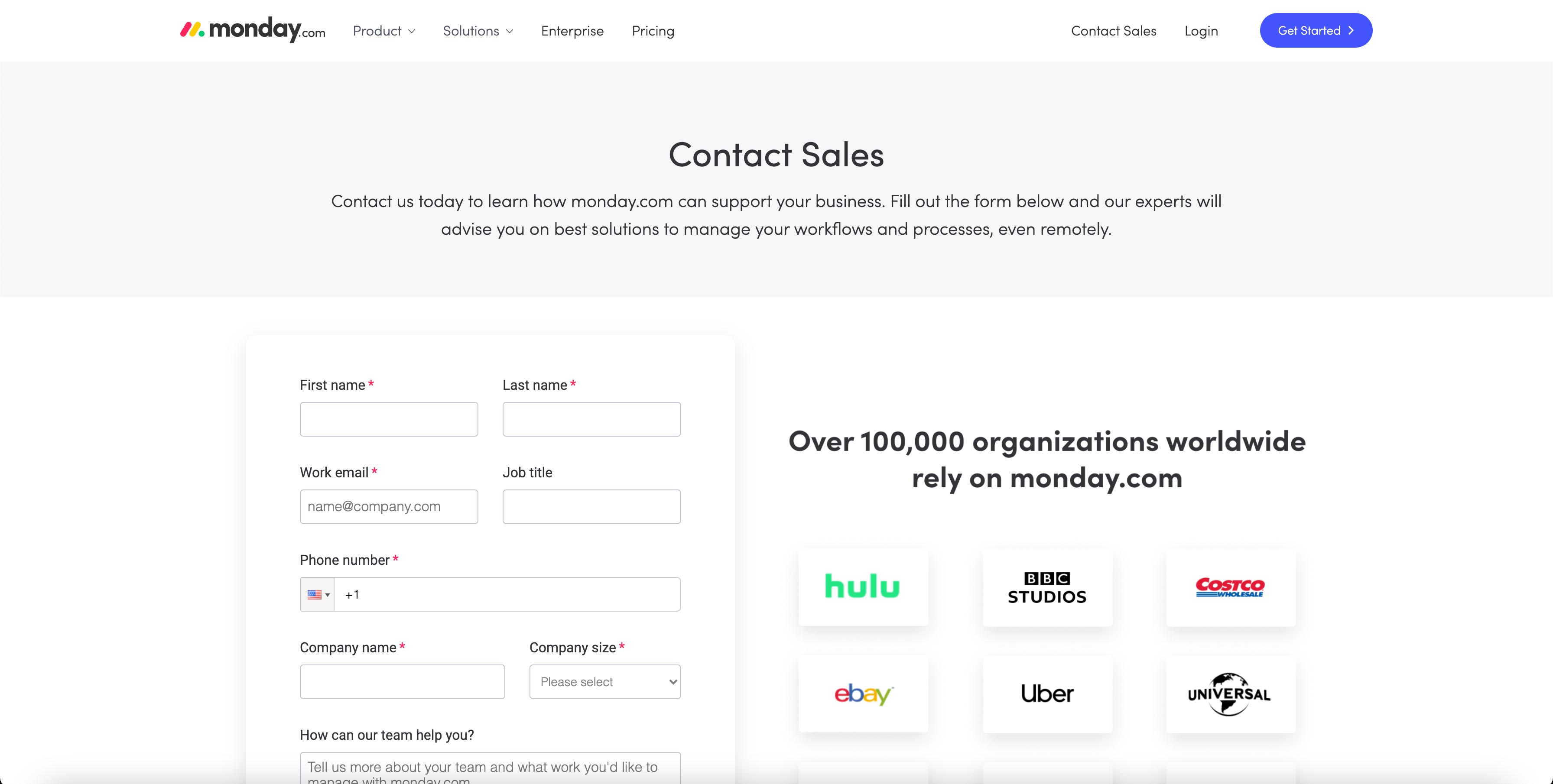
Not only does Monday provide the typical form to get in contact but they also provide the user with links directing them to other valuable information that seem like common pain points — learning about the software, how other teams are using it, and how to get instant answers in their support resources.
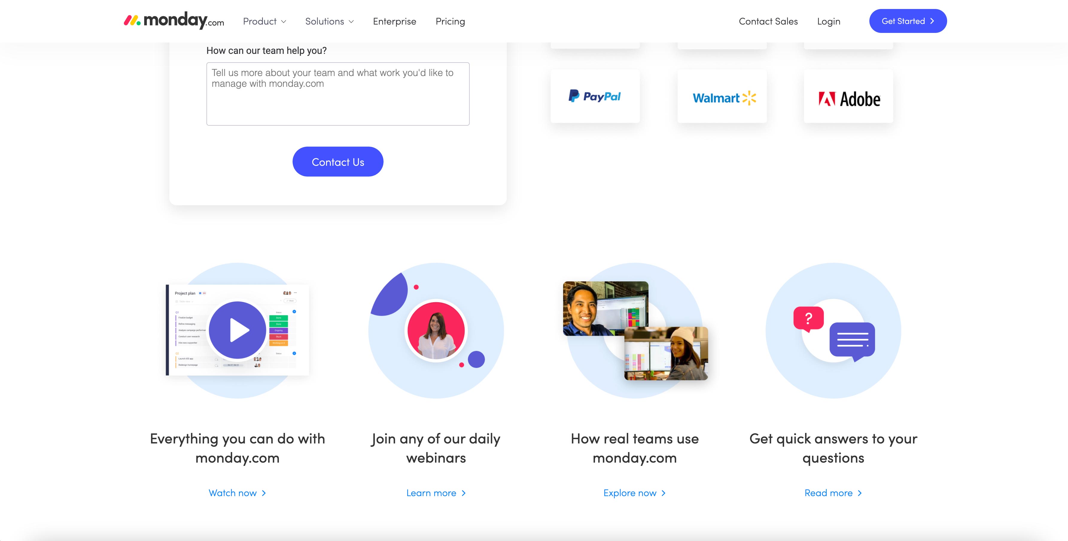
They’ve also taken special care to add social proof, stating how many organizations use their tool and showcasing logos of some of the most notable.
Bottomline: Give users some other avenues to gather information while they are waiting to hear from you.
Bottom line, here's what you need to know
If you’re thinking about revamping your contact us page, keep our best practices in mind and just, be inboundy! You always want to be thinking about how you can be more helpful to your users.
Make things as easy as possible for the user to complete and don’t forget to set the right expectation for when they’ll hear back from you.
🔥 Keep Going: 46 Best Landing Page Examples to Inspire Yours in 2021 [Updated]
🤔 Or Maybe This One: 27 Best About Us Page Examples for 2020 & How to Create One
Free: Assessment
/Assets/Icon%20Library/Arrows/Grey%20Arrow%20-%20Prev.svg)
/Assets/Icon%20Library/Arrows/Grey%20Arrow%20-%20Next.svg)