/Assets/base/Close.svg)
 ]
]
/Assets/arrow-facing-left--black-01.svg)
/Assets/base/Navigation%20Icons/TAYA.svg)
/Assets/base/Navigation%20Icons/navigation%20arrow%20-%20facing%20right-01.svg)
/Assets/base/Navigation%20Icons/Sales.svg)
/Assets/base/Navigation%20Icons/Web%20design.svg)
/Assets/base/Navigation%20Icons/HubSpot.svg)
/Assets/Icon%20Library/AI%20Mastery.svg)
/Assets/Icon%20Library/Gear%20icon.svg)
/Assets/Icon%20Library/Learning%20Center%20Laptop.svg)
/Assets/Icon%20Library/Click.svg)
/Assets/Icon%20Library/Link.svg)
/Assets/navigation-global--close-symbol-black-01-1.svg)
/Assets/navigation-global--close-symbol-black-01.svg)

/Assets/Icon%20Library/x%20corp.svg)
/Assets/base/Learning%20Center%20Resource%20Category%20Icons/Facebook_Messenger_logo_black.svg)
/Assets/Icon%20Library/whatsapp%20logo.svg)
/Assets/Icon%20Library/Email.svg)

Here at IMPACT, we build a lot of websites for our clients and work hard to stay on top of the latest web design trends and best practices.
One big web design trend that has emerged in the last year is a move from multi-image, framed sliders, to huge, responsive image headers featuring a single "hero" image. When done well, such headers can be captivating, and with the right images, beautiful.
Awhile back, we created an article about a few websites that rock parallax scrolling. In a similar fashion, I would like to share a few of my favorite sites that make use of responsive, full-width image headers.
Starbucks
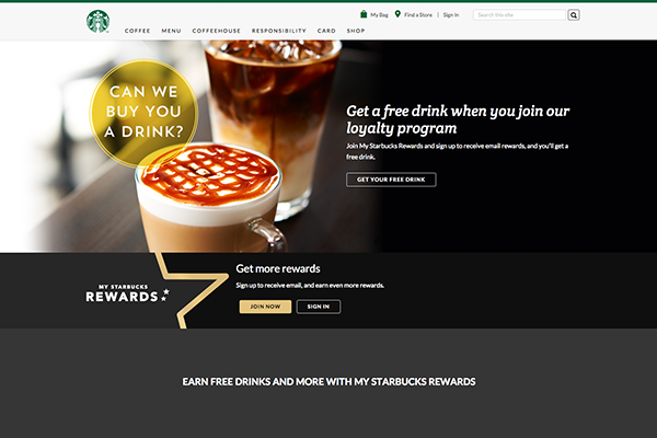
The imagery that Starbucks uses for their homepage just makes me crave more coffee...even if I probably don't need any!
It is warm and inviting, and showcases the main focus of the website - their loyalty program and customer app. After taking in the beautiful homepage header, everything else on the site just feels like supplementary information about Starbucks and their services.
And if you are already logged into your account, the homepage shows you an additional info bar that displays how many points you need until your next reward. It is both straight to the point and informational.
HubSpot

It should come as no surprise that marketing automation software company Hubspot does a great job at its own marketing. In conjunction with the launch of its new, upgraded software that enables clients to personalize the content on their websites, the company recently revamped its own site to be more interactive and engaging.
Now, the header really emphasizes how HubSpot's services can help potential clients, and it also displays a fact about Hubspot that helps establish social proof.
National Gallery of Art
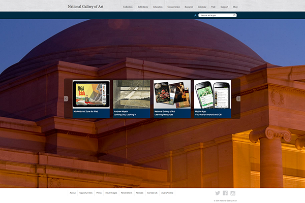
The National Gallery of Art is one of my favorite places in the world, and I love that they use their homepage header - which covers the entire page - to show off some of the beautiful works of art that are housed in their galleries. Every time you refresh the page, you are given another wonderful work - or even an image of the gallery itself - to look at.
And for those who think its important to keep your homepage "above the fold," this is a great example of how the Smithsonian has gone against the grain and pulled it off.
Adobe Creative Cloud
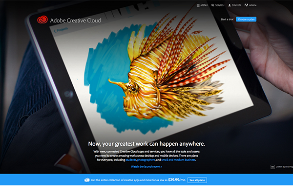
The nearly full-page header image on Adobe Creative Cloud's site brings all the emphasis to its latest news or, in this case, a hot new product - its Creative Cloud apps.
It is clean and eye-catching, and completely responsive.
sweetgreen
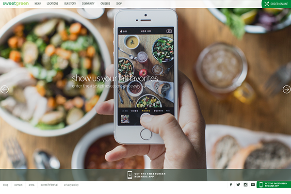
The clean look of the sweetgreen site reflects on their healthy services and ideals. And, like the Starbucks site, it makes you hunger a bit for their menu items.
Not only do you get a full-page image that also functions as a slider, but the full-width style of the images are carried over into the look of the subpages as well. Talk about consistency.
And I can't talk about the sweetgreen website without mentioning the site for their annual sweetlife festival. It mimics the overall design of the sweetgreen page, but still has its own unique design that fits the feel of the festival.
tumblr
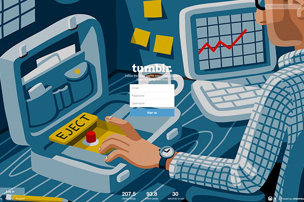
I just love the simplicity of the tumblr login page.
It is clean with simple text and a main focal point - a form you can fill out to become a user. There is very little information on this homepage, and even fewer links to click on (or to distract the visitor).
The only information you are given about tumblr itself is a counter for the number of blogs and posts that have been created. And of course the "30 seconds to join" finalizes what is essentially a simplistic and concise Call-to-Action.
Their use of a completely responsive image that fills up the entire screen's width and height is a great way to not only showcase the art and other posts of current tumblr users, but to also introduce future users to the idea of what Tumblr is.
tumblr really doesn't have any other pages aside from its user's blogs. Sure, there are some necessary subpages, like their terms of service, but even their support form doesn't take you away from the homepage.
The focus remains clear - it's all about the users.
So What?
Responsive images are a good way to capture the interest of your site's visitors, to quickly explain your company's purpose, or to pull in leads through a simple Call-to-Action.
You don't need to have sliders, though some sites have made good use of them, like sweetgreen and the National Gallery of Art.
Yet large and shiny responsive headers aren't the solution for everyone. As with most web design grends, it's important to assess what information you need to focus on before you determine how to best showcase it on your site.
Knowing your audience is imperative for creating an engaging homepage. And because some of your site users may have large computer monitors, a good second step would be to make sure that any images you use for such a large header are of a high resolution and as clear as possible.
What are your favorite websites and why? Let me know in the comments!
Free: Assessment
/Assets/Icon%20Library/Arrows/Grey%20Arrow%20-%20Prev.svg)
/Assets/Icon%20Library/Arrows/Grey%20Arrow%20-%20Next.svg)