Join 40,000+ sales and marketing pros who receive our weekly newsletter.
Get the most relevant, actionable digital sales and marketing insights you need to make smarter decisions faster... all in under five minutes.
12 Sexy Blog Design Examples Worth Envying

Sep 17, 2015

 A blog is an integral part of any Inbound Marketing strategy's success.
Hosting content and driving traffic to other parts of your website, your blog is often the hub, the lynchpin, the head-honcho of your initiatives -- but somehow it still manages to get overlooked from time to time.
Your blog is one of the most frequently viewed pages on your website (and one of the most popular amongst new visitors). As a Marketer, you need to make sure that yours is making the best first impression.
Here are 12 sexy blog designs that help inspire your next redesign -- and maybe even make you a little envious.
1. Digital Telepathy
With their large, vibrant, high-quality images Digital Telepathy does a wonderful job catching your eye with their blog design.
The white text set against colored, photo backdrops not only directs your attention to the title of each blog post, but it gives the blog a clean, sophisticated look.
It's easy to overuse images and clutter your design, so if you want to focus your design around big photos, take notes from these guys.

2. Rokivo
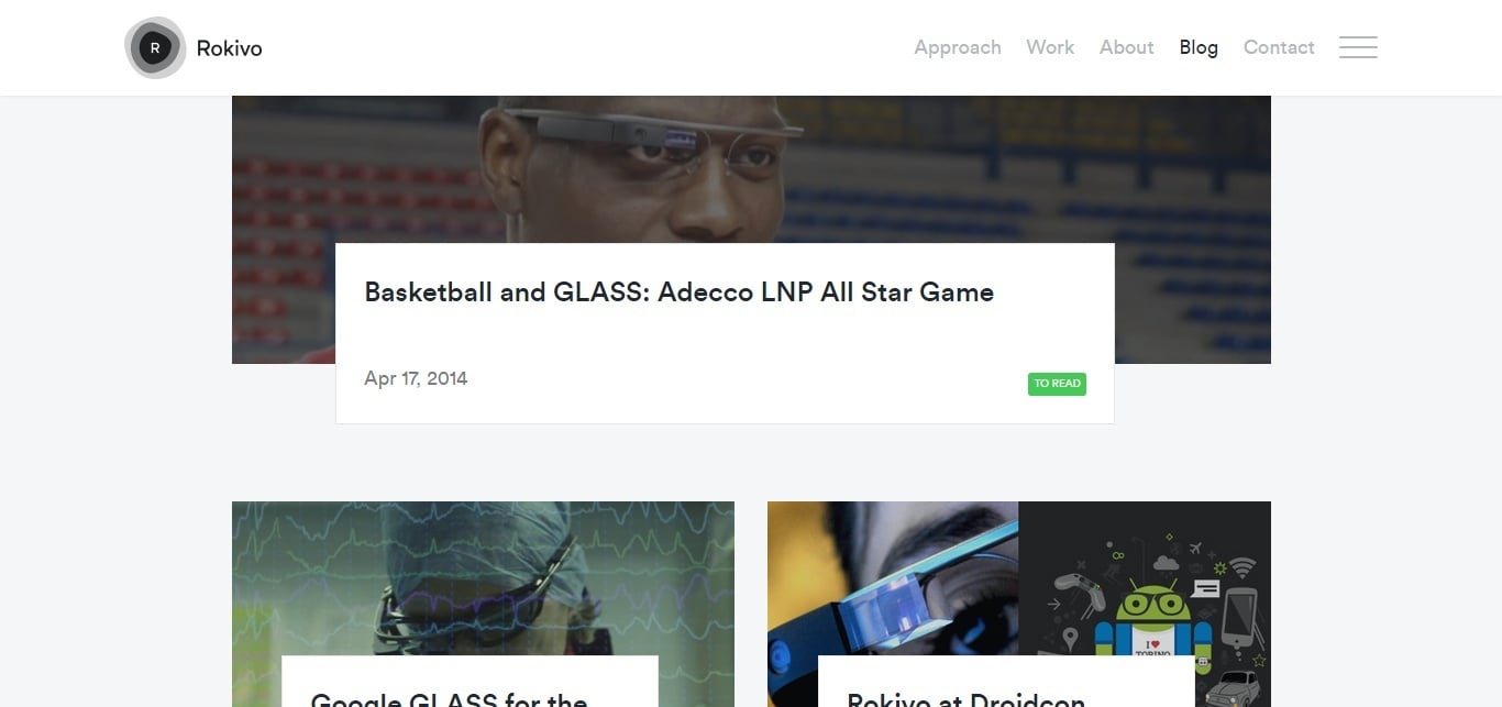
One of the best things about this blog design is how they used spacing between each post to de-clutter the page.
I also love how they use a bigger image to highlight the latest post while older posts use smaller images.
The white box sitting on each post image provides contrast for the blog title and the bright green "to read" button draws the reader's attention immediately.
3. Wistia
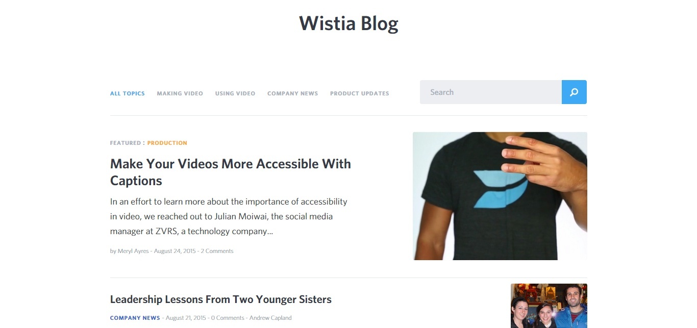
When used correctly, white space is a great tool for creating clean, simple design, like Apple for example.
Wistia gets creative here by taking a couple of features that you would normally see in a sidebar (categories and search) and placing them above the posts. This way the user gets functionality without sacrificing aesthetics.
This use of white space allows for the blue navigation menu at the top and the CTA area at the bottom to instantly grab your attention.
4. Infinum
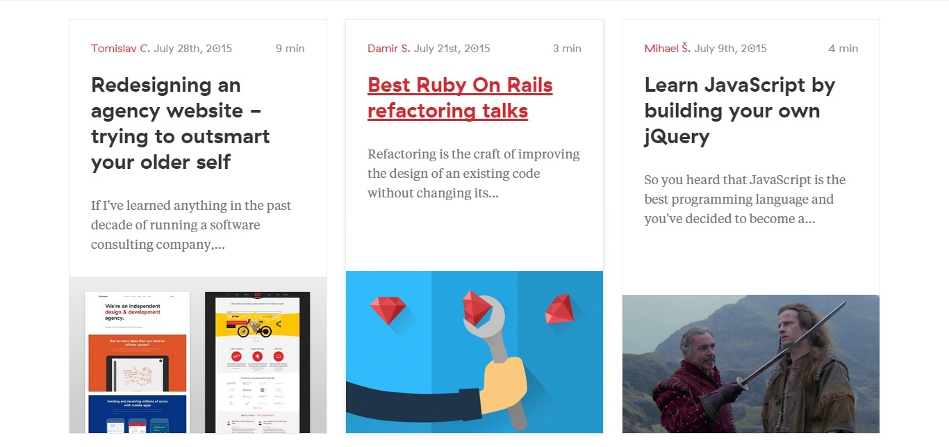
Similar to Wistia, Infinum also features white space -- only their contrasting color of choice is red, instead of blue.
The team here cleverly draws your attention to the latest article by using a large featured image, then uses a tiled layout for older pieces.
5. Sidekick
The Sidekick blog has always been one that has impressed us here at IMPACT. Rather than using prominent images for each article, Sidekick has one big hero image with a CTA overlayed on it.
This opportunity to convert is the first thing you see when you land on the page and with their inclusion of social proof (70,000+ Subscribers Receiving Exclusive Content), the team starts building your trust in their brand right away.
Aside from this, the blog's navigation bar remains fixed, so the red subscribe box is always present, and as you scroll, the blog posts are featured in white boxes, with black text, maintaining a minimalist look.

6. Minimal Monkey
This is definitely one of the most unique blog designs I've seen.
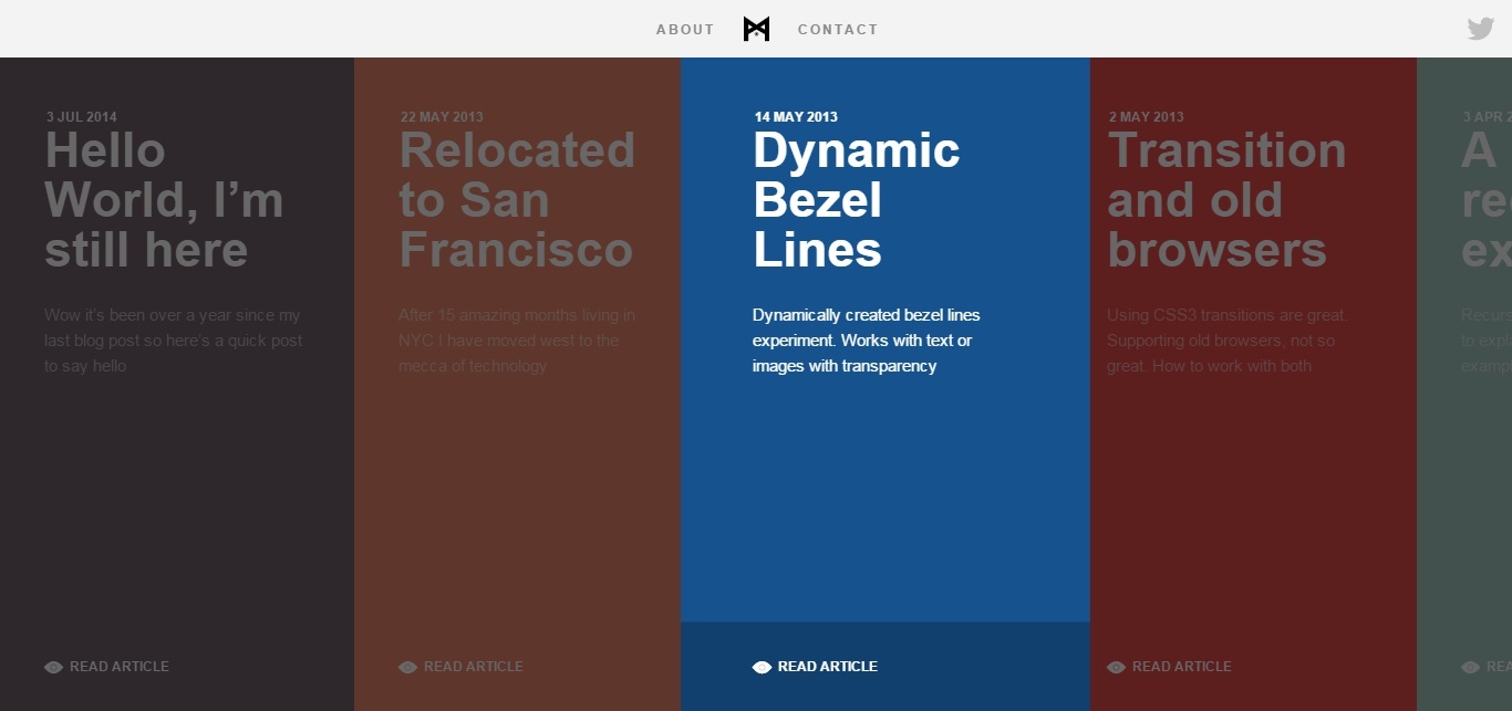
Rather than moving down the page like most websites, you scroll from left to right to view older blog posts. The presentation is better on mobile than on desktop, but considering that most traffic nowadays is from mobile devices, this is a smart move.
With their bold use of color, contrasting white font, and subtle fades when browsing through the selection, Minimal Monkey's blog truly stands out.
7. Eye Heart World
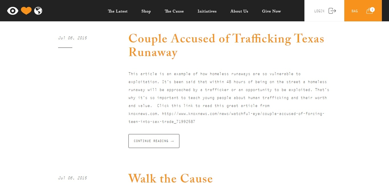
Getting people to support your cause requires an emotional appeal. Eye Heart World accomplishes this with dark, bold images and contrasting white headlines on their homepage and blog page.
Below the fold, they use white space and a bright orange font for their headlines. Since they use their blog primarily to announce news updates, the posts are short and the headlines are the most important feature of the post. Their striking use of color does a flawless job of communicating this.
8. Built By The Factory
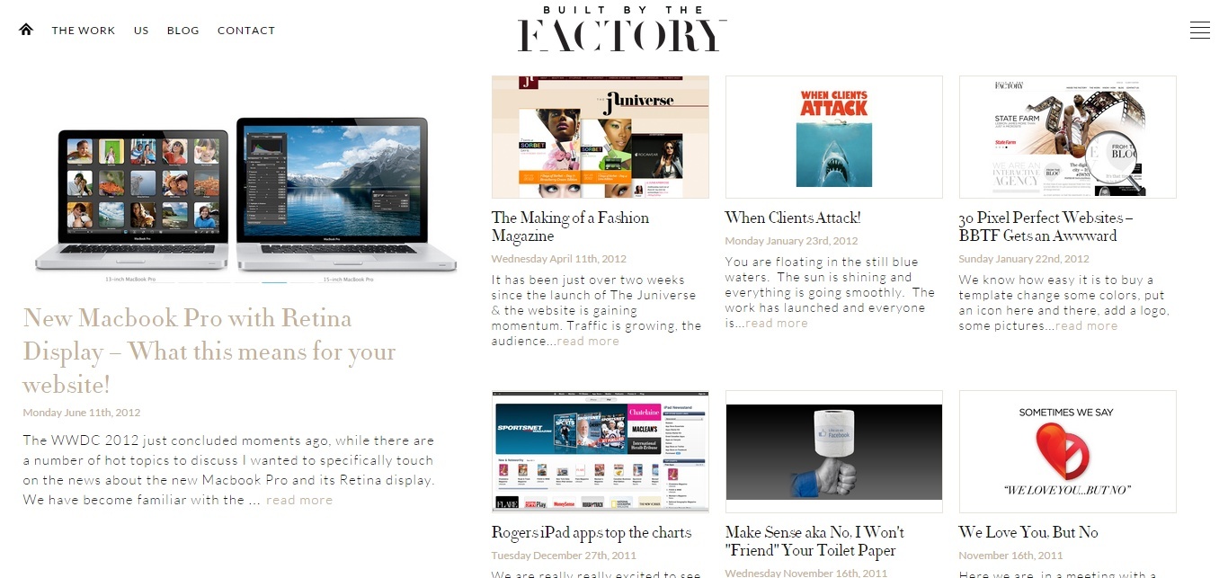
Built by the Factory does a great job of uniting both old and new media with their blog.
As you scroll down the page, their navigation blends in with their white background and a new logo appears. Between the black and white contrast, the font style, and these effects, the blog feels more like a traditional print magazine than a digital one.
Like some of our other examples, Built By The Factory features their latest post with a big image before displaying other recent updates clustered together with smaller images. After scrolling below these, the older posts are listed one-by-one in a single column.
9. Eppi Design
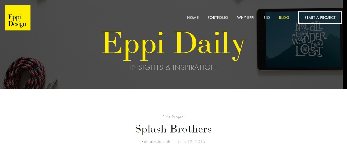
Contrast is what makes Eppi's blog one to follow.
Aside from their use of yellow and gray in their hero, the blog posts are set on a white canvas, with gray text and a vivid black headline. The only color in the body of this page is the orange "read more" text below each post, making the course of action on this page clear.
10. The Car Crush
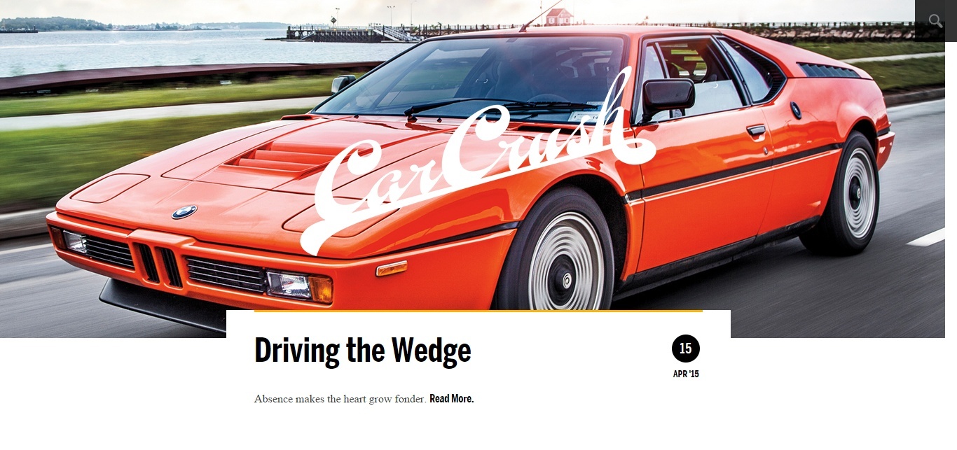
To fully appreciate this design, you really have to go to the website yourself. When you first arrive on the page, the latest blog posts consumes the space above the fold and previous posts are listed in a single column below.
As you scroll, the white logo disappears and then reappears in each image. The same effect happens when you're reading the actual post as well.
These touches are subtle, but they make the reading experience that much more "delightful."
11. Channel Island Surfboards
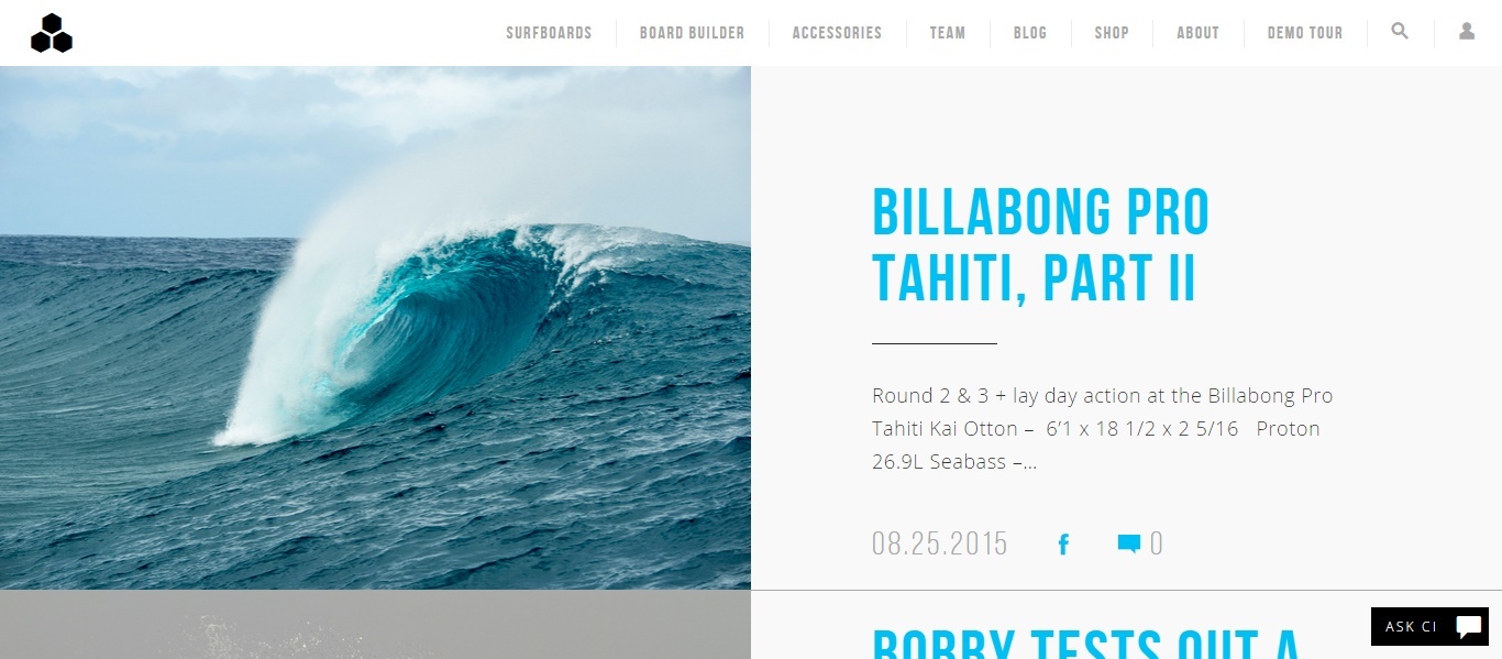
The blue and white palette throughout this blog truly brings their content to life, drawing inspiration from the seaside lifestyle that Channel Island is all about.
Their blog uses an infinite scroll and large images to engulf you in their content and help you envision yourself using their product. It's easy to get caught in the current. (Pun very much intended.)
12. Susan Piver
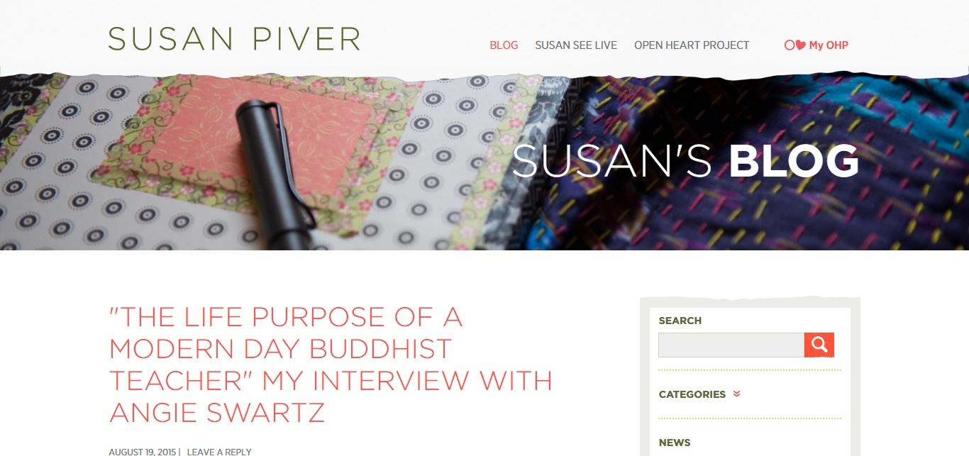
You may have noticed that very few of our examples have sidebars and that's because (We removed ours for a reason, after all,) but they do have their time and place.
A great example is Susan Piver's blog. Notice how the sidebar is consistent with the rest of the design and adds a little contrast, without being distracting.
The use of a modern font and plenty of white space gives her blog aesthetic appeal, without being super trendy -- in some cases, your persona might prefer a classic look over a trendy one.
Free: Assessment