/Assets/base/Navigation%20Icons/TAYA.svg)
/Assets/base/Navigation%20Icons/Sales.svg)
/Assets/base/Navigation%20Icons/Web%20design.svg)
/Assets/base/Navigation%20Icons/HubSpot.svg)
/Assets/Icon%20Library/AI%20Mastery.svg)
/Assets/Icon%20Library/Learning%20Center%20Laptop.svg)

/Assets/Icon%20Library/x%20corp.svg)
/Assets/Icon%20Library/whatsapp%20logo.svg)
/Assets/Icon%20Library/Email.svg)
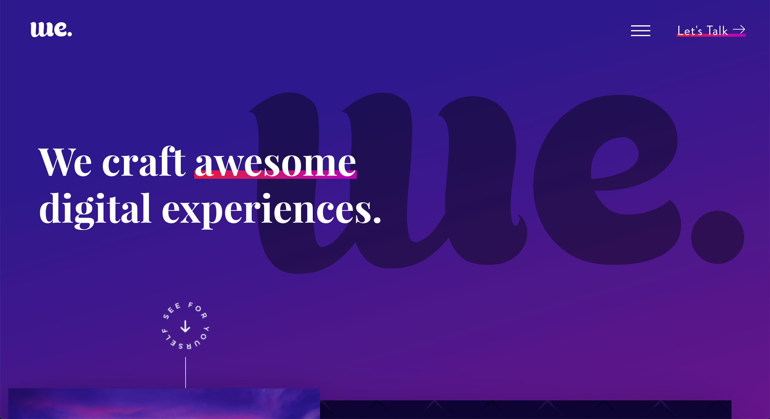
At this point, you likely how important the hero space of your website is.
The hero is no longer just the start of your webpage or a place to put your value prop.
A powerful hero can start a journey, make a user feel something, or even communicate your product or purpose without words.
Quite frankly, it’s the “hero” of the story that is your page.
So, What Makes a Great Hero?
A great website hero can accomplish many things.
Depending on the page, it can convey what your company is and does or what your product will solve for the user. It can identify who your audience is and help them relate to your mission. It can even evoke emotions, but overall, a successful hero grabs your attention and sets the tone for your whole website.
By best practices a good hero typically has a header, some supporting text, and a call-to-action button (or some kind of next steps). These can be accompanied by an image, video, or illustration that support the mission of the page.
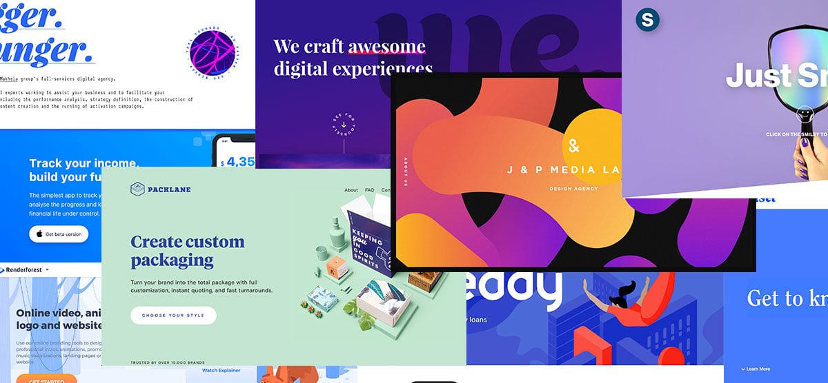
So, let’s take a look at 10 websites that are doing just that in beautifully creative ways.
1. Station
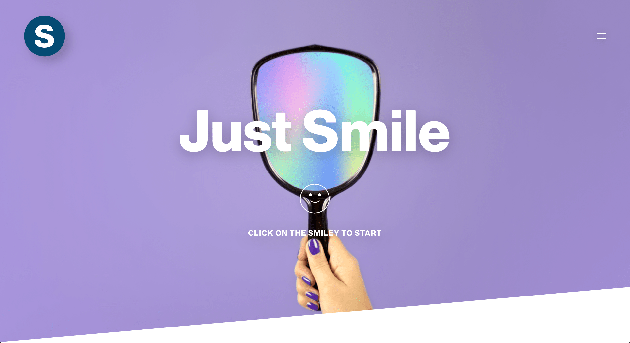
Okay, this one actually feels like an episode of black mirror...
This isn’t Station’s homepage hero, but I couldn’t pass up the opportunity to show you guys this.
This page starts by asking permission to use your computer’s camera.
If you agree it then gauges your smile with a percent bar (how could you not try to get to 100%?!). Then, once you reach 100% it congratulates you and moves you onto the next piece of content.
This is a super fun and immersive way to involve your audience -- that is if they’re not too scared to turn on their camera.
My one qualm with this would be that it is very unclear what the context of this hero is. Even the copy and button that leads to this page leaves much to the imagination.
2. Renderforest
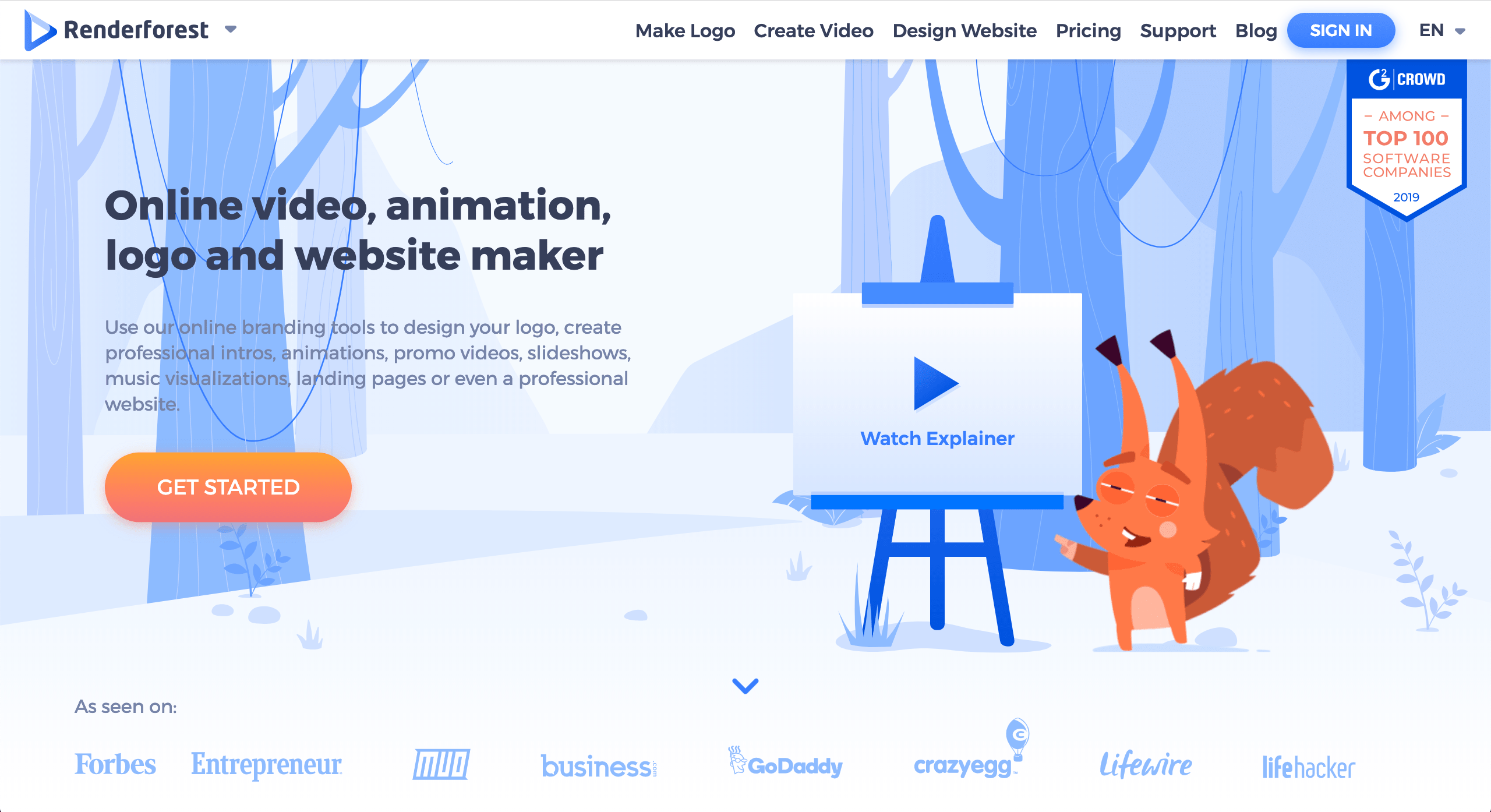
I think Renderforest is doing a really strong job of using color to direct focus as well.
Though most of their hero is in a monochromatic blue palette, they use orange to draw the user’s eye to the “Get Started” button as well as the cute little creature directing you with an animated point to the explainer video.
Renderforest gets bonus points here for not only including a video in their hero (it really is the way of the future), but giving it a direct title that lets their users know what to expect.
Where I think this hero could use a little work is in the secondary text. The combination of tones behind the font and the lightness of the font make that text a bit hard to read.
3. Current Haus
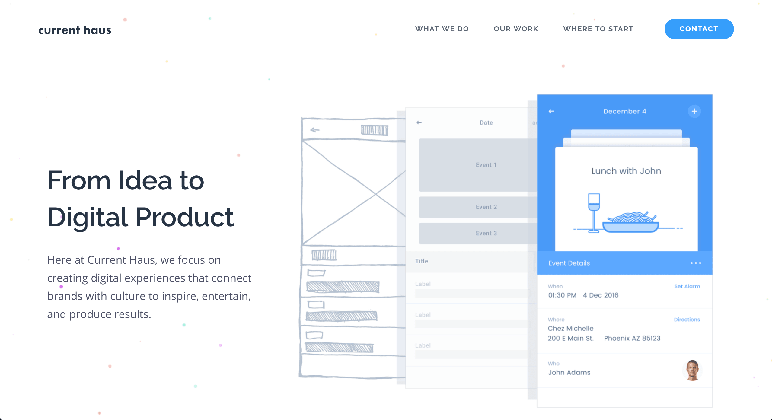
Current haus is another site with a very limited color palette, but that uses color to strategically draw the user’s eye (yes, I know I have a type).
I think the strongest element of their hero is their illustration. I could almost tell exactly what they do, just by looking at that picture and in a world where we have about 5 seconds to grab someone’s attention on the web, this is brilliant.
The imagery also perfectly aligns with their copy. You can actually see a project going from idea to finished product.
4. Incomee
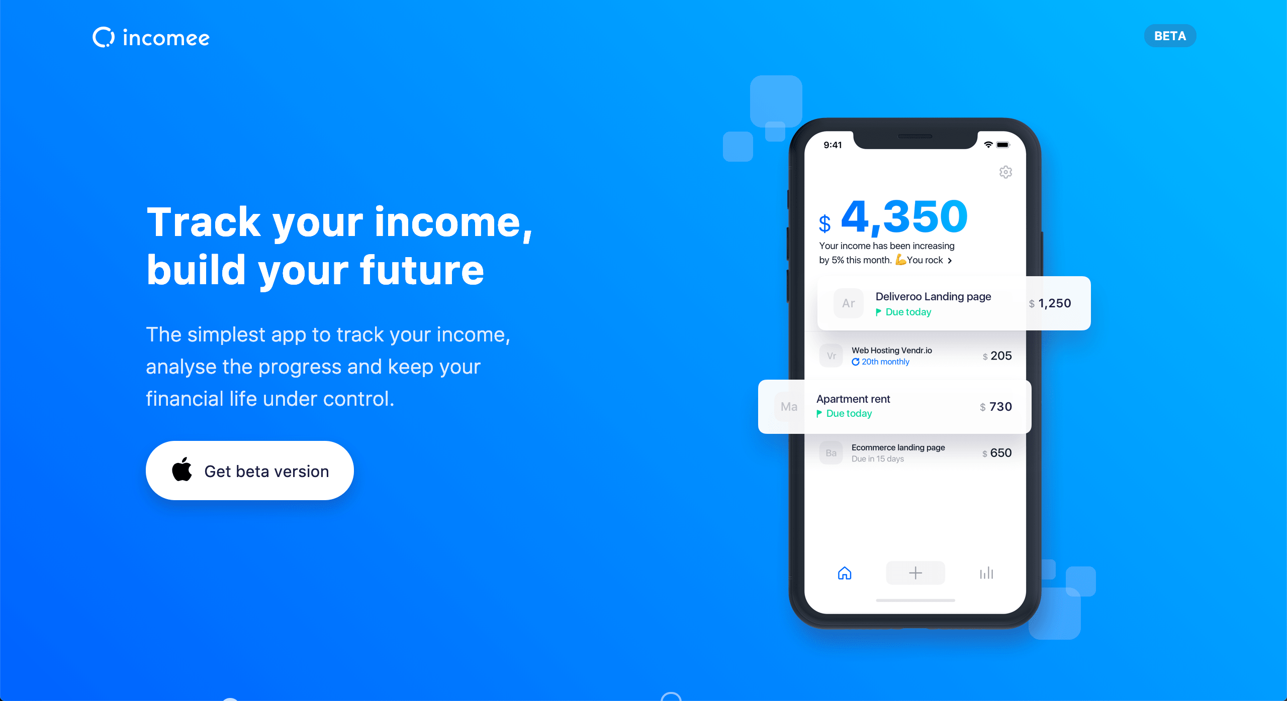
Incomee’s hero is bold yet simplistic. Content is limited in words and in visuals and I think this works very well to in quickly getting their message across.
The strongest trait on this hero is how these individual elements load.
Each element loads independently, starting with the phone, then the call outs on the phone, then over to the left where each piece of content loads top to bottom.
This is genius because this subtly tells the user exactly what order to digest their content in while also grabbing attention with motion. I repeat, GENIUS.
5. Creddy
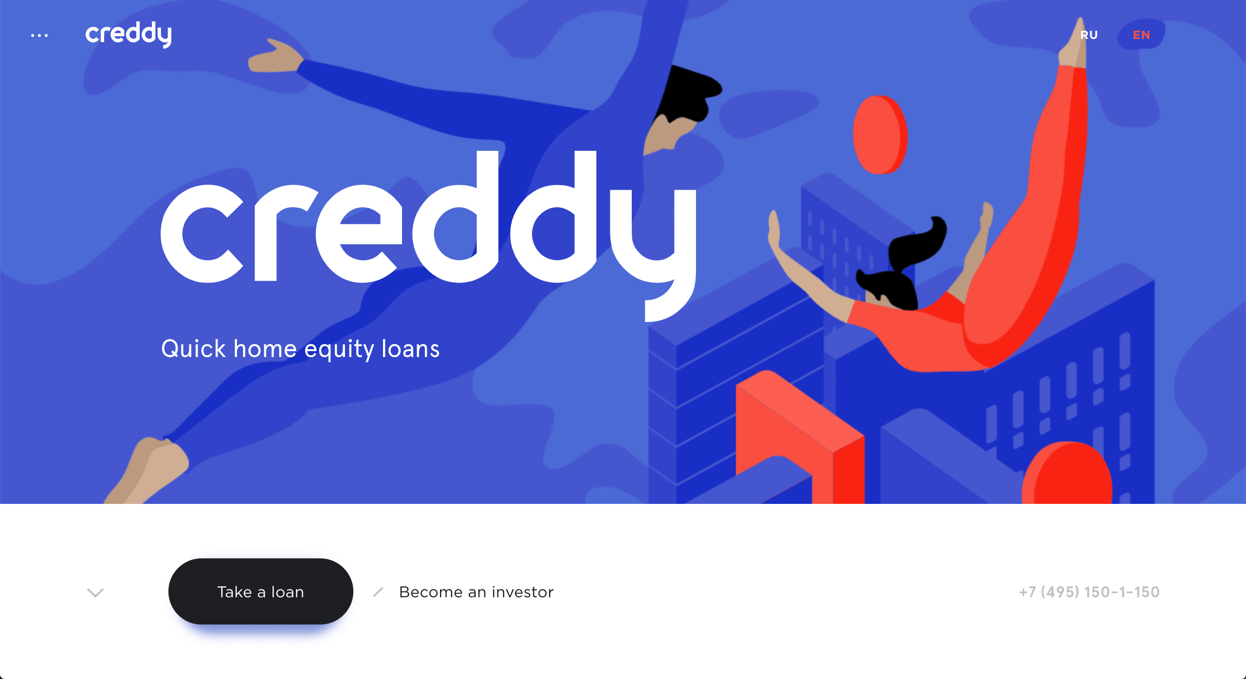
Creddy opens with a bold and beautiful custom illustration that is more to evoke emotion and tone of their product rather than what it actually does.
Home equity loans aren’t really the sexiest product offering, but this creative hero really grabs your attention.
The brevity of the content stands in stark contrast to the more detailed illustration, which, in just four short words ,tells you what creddy is, which is then seamlessly transitioned into possible next steps for both of their personas.
6. Wellset
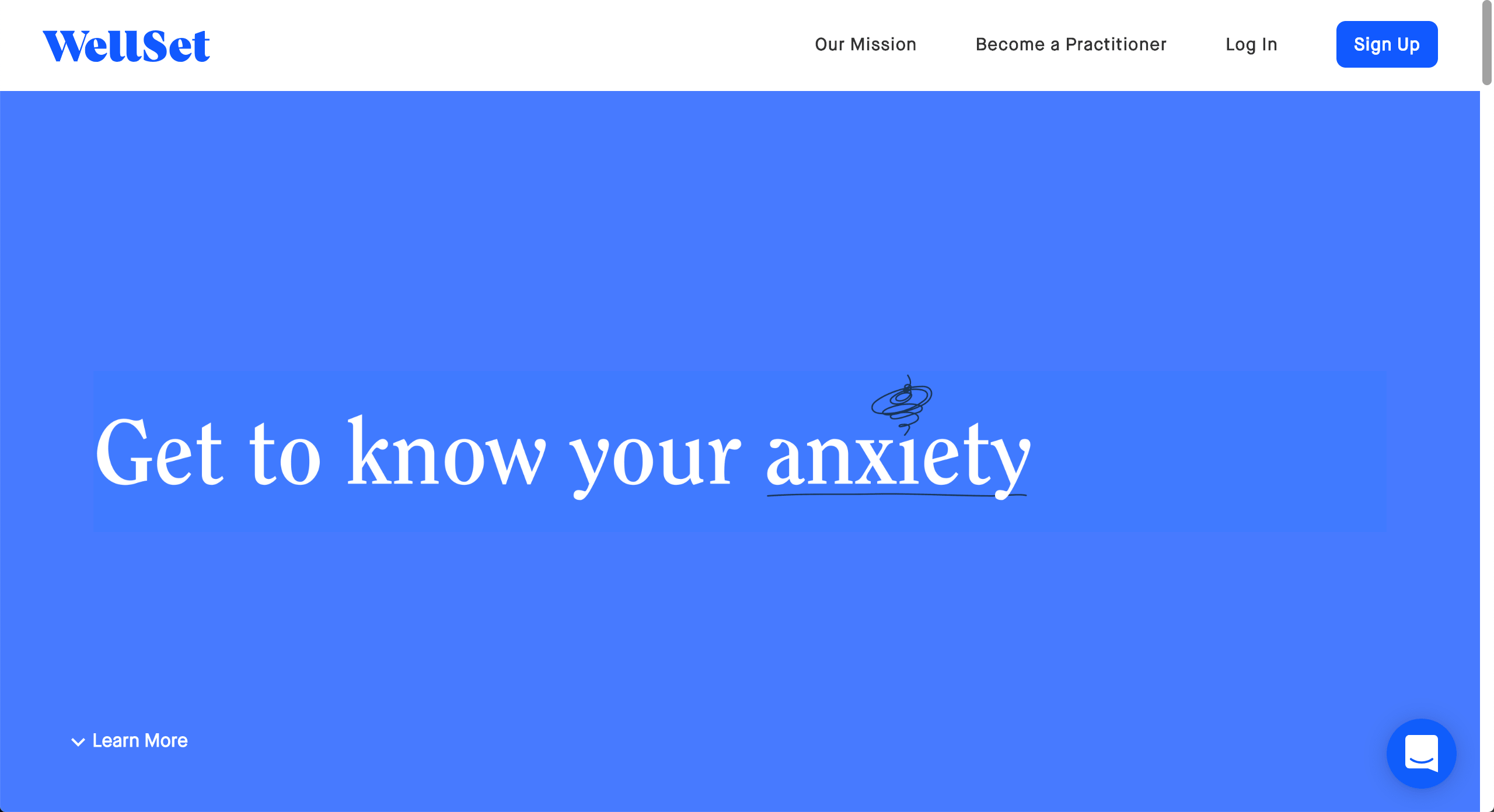
What I love about WellSet is they get straight to the point.
Simple, clean, and bold in design, there is minimal content and minimal distraction.
The only graphic it really relies on is scribble above the word “anxiety” and while simple, it is something that would immediately resonate with anyone in their audience.
They also immediately begin to identify their persona with their hero copy then provide a clear journey to the user to learn more.
7. Packlane
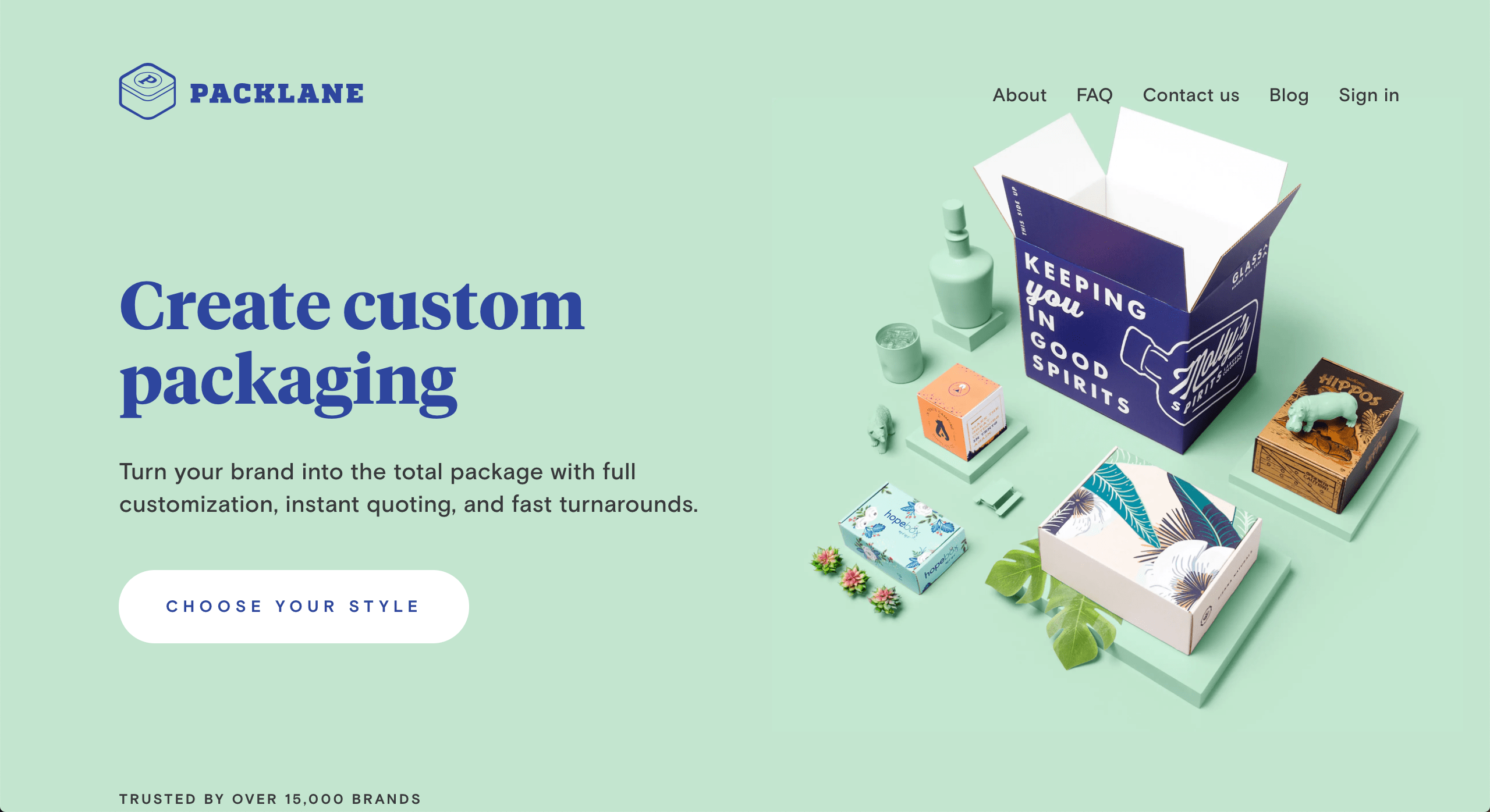
What makes Packlane a knockout is the fact that they make their product (which is actually the packaging here) the hero of their site.
Their imagery beautifully demonstrates this with the contents of the package being monochromatic, almost blending into the background. This lets the packages, the only items in color, truly stand out.
This idolization of the product works almost as a project gallery and shows the user right off the bat what they are capable of.
8. Web Effectual
Web Effectual is another site that really uses animation to benefit how user’s experience their content. Togo loads first, then their value prop, and finally a prompt for next steps.
It’s bold, has great visual depth created by their overlapping elements, but is still simple and easy to digest.
9. J & P Media Labs
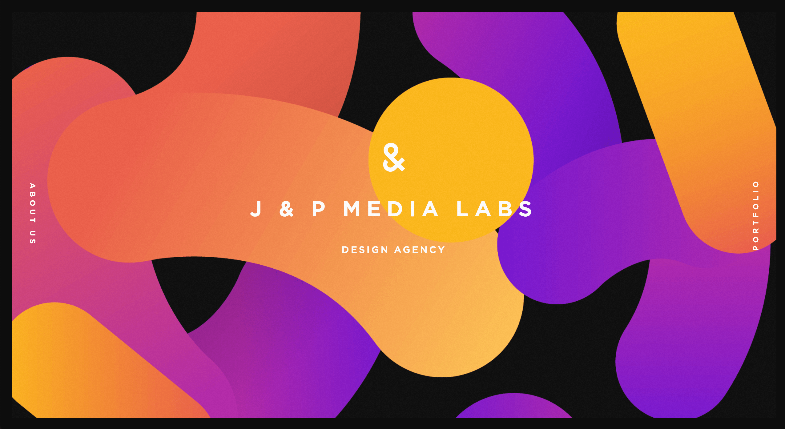
J & P Media Labs’ website is very interesting to me, overall -- but it definitely kick starts with its hero.
You land on this beautiful hero that looks like a canvas you’d see in an art gallery, but despite having so much to look at, the user only has 2 options of where to go “About Us” or “Portfolio.”
Limiting a user journey like this can be helpful in guiding users to the info they need most, right off the bat.
10. OpenNode
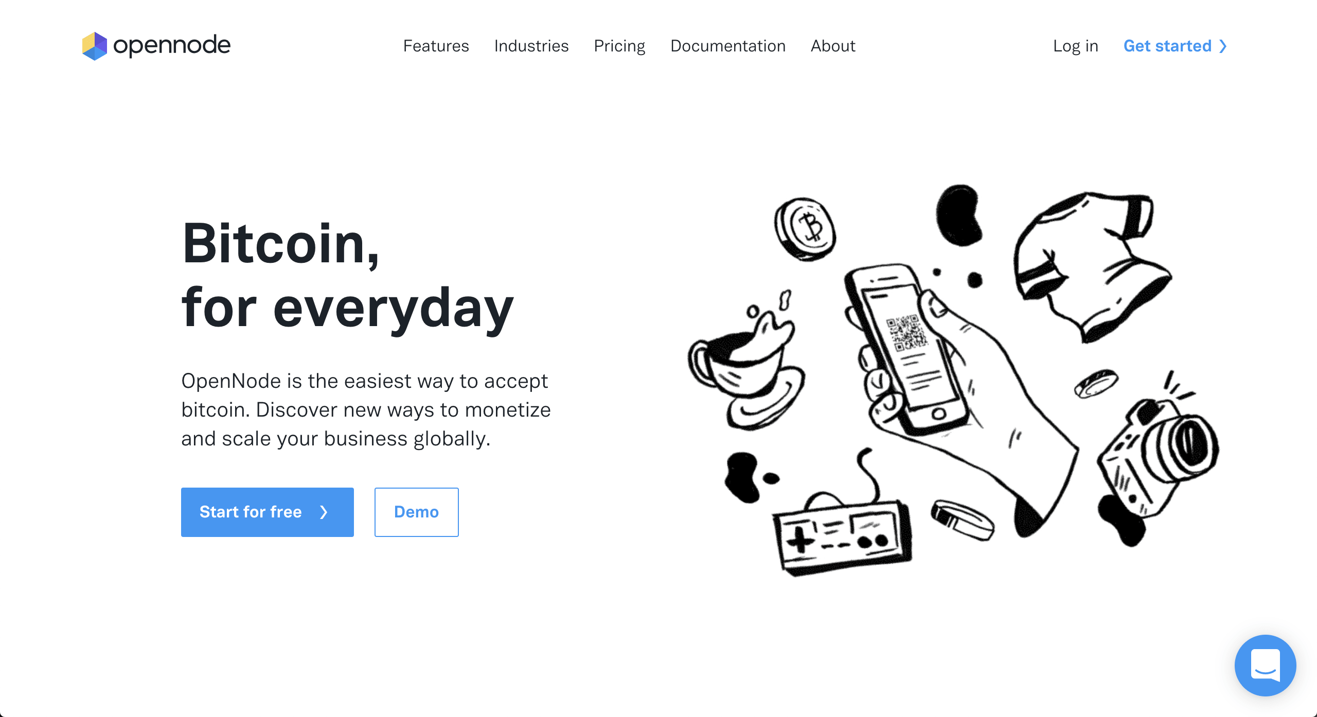
Although on first glance, OpenNode’s hero appears in stark black and white, I actually find it quite clever as it strategically draws the user’s eye to a few key players here. The blue highlight guides you first to the “Start for free” button and then the chat bubble, which I assume are their focuses of where they want to drive traffic.
Another piece of this hero that I love is this custom illustration. It truly helps paint a picture of what they do, allow you to accept bitcoin easily for a whatever it is you sell.
It is also subtly animated with the different items bobbing and the QR code scanning. This enhances the user’s viewing of this image, by helping them digest what they are seeing through small clue.
Even Heroes Have the Right to Dream...
Yes, I did just reference Five for Fighting, but let’s not dwell on it.
We’ve just looked at 10 pretty awesome hero sections that I hope you geeked out over as much as I did.
Not all of these are practical, but we do have the opportunity to take some pieces from heroes like these and use them to inspire our own sites.
My best advice to you is to start with a crazy dream of a hero section and figure out how you may need to change it/simplify it/rebuild it to make it work for your audience.
Free: Assessment
/Assets/Icon%20Library/Arrows/Grey%20Arrow%20-%20Prev.svg)
/Assets/Icon%20Library/Arrows/Grey%20Arrow%20-%20Next.svg)