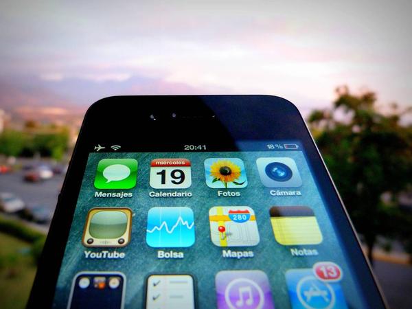
The mobile optimization revolution is changing the way that consumers and companies interact with each other.
According to a survey by Get Satisfaction, "80.5% of website visitors are accessing websites through mobile phones." But are you providing the experience the same as your visitors move from one device toanother?
If your brand isn't able to deliver, you might be in trouble.
Consumers are looking for a seamless experience across all of their devices.
You want to break out of the 1200 x 800 pixel website mindset. Designing a website for mobile isn't about all those fancy sliders or flash. It's about tailoring your site to fit the needs of your visitors.
The Rise of Mobile Optimization
2013 is the year for mobile optimization. According to Cisco, the amount of mobile devices will soon out number the number of people on Earth. Now that's a lot of mobile devices. Ultimately, that number will continue to increase each year, as everyone and anyone jumps on the mobile device bandwagon.
In 2012, the number of people accessing the web on mobile devices spiked. Increasing mobile traffic by 70%.
Are you taking advantage of this growing trend? If not, you could be losing the opportunity to increase website traffic and conversions.
In March, Marriott conducted a survey to see what people would be willing to give up on their vacation for 25% off their stay. You might be surprised by the results. Marriott concluded that more people would be willing to give up alcohol during a vacation than to go through their vacation without their smartphone.
There is no denying the fact that people are attached to their smartphones.
Are you prepared for this mobile revolution?
1. Seamless Integration
You may have noticed that in the last few months, companies were revamping their mobile site.
With more users accessing websites through smartphones and tablets, it's becoming more apparent that companies need to consider the design of their mobile site.
Being mobile is no longer about what device your target audience is using, it's about creating a user experience that has a seamless integration between your desktop version and mobile. People are using multiple devices to view your site. Therefore, you need to have a site that is optimized for multiple screen sizes.
Users are looking for responsive sites.
Not sure if your site is responsive? A great trick is to drag one corner of your internet browser until it is the size of a smartphone. If the size adjusts accordingly, then you can start viewing that page on other devices besides your desktop or laptop. If not, you’re sure to have a growing number of frustrated visitors.
We are living in the digital age, where technology is taking companies and customers away from their desktops and laptops. your only form of interaction is no longer a desktop.
While designing your mobile site, want to ensure that it's functional and displays your brand image. You also want to take into consideration the experience of your users.
While designing your mobile site ask yourself these questions:
- Have I thought through how people will use their mobile device on my site?
- Have I placed an emphasis on my content (as you should) rather than graphics or navigation?
- Have I provided relevant options for exploring and pivoting?
- Has my design and content maintained clarity and focus?
In today's fast paced world, you also might want to interact with your users offline, by integrating offline media into your new mobile strategy through QR codes and text promotions.
Who wouldn't want to be the first to hear about promotions and special offers? I know I would. With so many mobile devices glued to the hands of Americans, these are two easy ways for brands to continually interact with users.
Consider: Use QR codes and text promotions to provide special deals and offers for users that continuously engage with your company through their mobile devices.
2. Whole New Dimensions
Cellphones are no longer just for communicating with family members and friends.
People around the world are using their smartphones to access the worldwide web. Whether it's to watch TV or videos, to shop, and / or as a way to stay in contact with family and friends on the internet; accessing the Interent on mobile devices is on the rise.
Mobile Shopping
When was the last time you went shopping on your phone.
It's okay, you don't have to admit it, but 67% of shoppers actually start on one device and complete their purchase on another.
Companies need to take into consideration the tech savvy generation. Most mobile shopping purchases include; books, magazines, tickets to films and concerts, clothing, music and even dvd's.
So, maybe your customers aren't purchasing your products or services from their mobile phones, but you can still intertwine mobile shopping and the in-store experience. Join the two by allowing users to compare prices, find coupons, and utilize geolocation to find all the items on their shopping lists.
Mobile Apps
Besides accessing the Internet on their phones, people around the world are communicating with each other through social networking sites. Accessing Vine and Instagram can be difficult unless you're using your smartphone. However, these two apps are great for getting your users to take photos and videos of themselves with your products.
Other fantastic mobile apps include shopkick, Square card reader, Foursquare, Retail Me Not, Facebook, and Pinterest.
User Generated Content
Who wouldn't love the brand exposure?
One of the best places to encourage user generated content is through social media. Your customers are able to share their experiences using your product or service. Search is a big part of mobile optimization, allowing you to expand your reach from your users devices to offline.
One of the easiest ways to get your users to actively engage is by asking them to take photos of them using your products. Gap is a great example. They've dedicated a board on Pinterest where they showcase users wearing their clothing.
/Assets/base/Close.svg)
 ]
]
/Assets/arrow-facing-left--black-01.svg)
/Assets/base/Navigation%20Icons/TAYA.svg)
/Assets/base/Navigation%20Icons/navigation%20arrow%20-%20facing%20right-01.svg)
/Assets/base/Navigation%20Icons/Sales.svg)
/Assets/base/Navigation%20Icons/Web%20design.svg)
/Assets/base/Navigation%20Icons/HubSpot.svg)
/Assets/Icon%20Library/AI%20Mastery.svg)
/Assets/Icon%20Library/Gear%20icon.svg)
/Assets/Icon%20Library/Learning%20Center%20Laptop.svg)
/Assets/Icon%20Library/Click.svg)
/Assets/Icon%20Library/Link.svg)
/Assets/navigation-global--close-symbol-black-01-1.svg)
/Assets/navigation-global--close-symbol-black-01.svg)

/Assets/Icon%20Library/x%20corp.svg)
/Assets/base/Learning%20Center%20Resource%20Category%20Icons/Facebook_Messenger_logo_black.svg)
/Assets/Icon%20Library/whatsapp%20logo.svg)
/Assets/Icon%20Library/Email.svg)
/Assets/Icon%20Library/Arrows/Grey%20Arrow%20-%20Prev.svg)
/Assets/Icon%20Library/Arrows/Grey%20Arrow%20-%20Next.svg)