/Assets/base/Navigation%20Icons/TAYA.svg)
/Assets/base/Navigation%20Icons/Sales.svg)
/Assets/base/Navigation%20Icons/Web%20design.svg)
/Assets/base/Navigation%20Icons/HubSpot.svg)
/Assets/Icon%20Library/AI%20Mastery.svg)
/Assets/Icon%20Library/Learning%20Center%20Laptop.svg)

Mar 12, 2021
/Assets/Icon%20Library/x%20corp.svg)
/Assets/Icon%20Library/whatsapp%20logo.svg)
/Assets/Icon%20Library/Email.svg)
Average landing page conversion rate
The average landing page conversion rate falls around 2.35%. The top 25% sites are converting at 5.31% and above, while the top 10% are looking at 11.45% and above.
Congratulations! You've laid out a strategy and your lead generation efforts are working! You're generating traffic and creating qualified leads, but is it enough?
While landing pages are easily the most important pages on your website (they're where you convey value, earn trust, and convert visitors into leads), marketers often struggle to understand their performance.
With no clear picture of whether or not you're on the right track, it's easy to feel stuck. So, to help unstick you, we've decided to shed some light on the situation and address the all-too-common question: "What is a good landing page conversion rate?"
We've also collected five examples of landing page elements worth experimenting with if you find that it's time to get your numbers up.
The truth about landing page conversion rates
They're subjective.
Factors like your industry, product or service, and your target audience all weigh in on your ability to convert visitors into leads, and leads into customers.
However, I'm fully aware that people love their numbers, so I dug up some insights from WordStream to shine a little data on the situation:
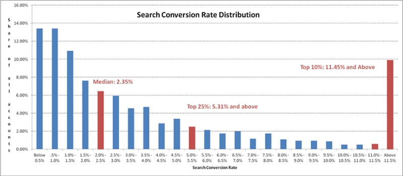
The chart above reveals that the median conversion rate is 2.35%. The keyword here is median.
A closer look reveals that the top 25% are converting at 5.31% and above, while the top 10% are at 11.45% and above, but, it’s important to realize this graphic is focusing on conversion rates on the account as a whole, not single landing pages.
So we know what the benchmark is for a website, but what about a landing page on its own?
I decided to look around further and came across this compelling study from Unbounce.
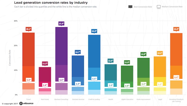
In this report, Unbounce studied the performance of 74.5 million visits to more than 64,000 lead generation landing pages created within its platform by Unbounce customers.
The landing pages spanned 10 different industries (travel, real estate, business consulting, business services, credit/lending, health, higher education, home improvement, legal, and vocational studies/job training).
This is where it gets interesting.
The best conversion rate varied significantly across all the industries, while the median conversion rate hovered between 3-5.5%.
But, as I mentioned earlier, your conversion rate will still vary due to the type of industry you're in, the offers you put out, environmental demand, and your audience's behavior.
After seeing this data, you may realize your conversion rate numbers either aren't where they need to be or better yet, have room for improvement.
I recently came across a quote during one of my Pinterest-binges that lends itself really well to this situation:
"Why settle for average when amazing is attainable?"
So while the average median conversion rate of all 10 industries hover around 4%, the businesses within those who stand out are the ones that refuse to settle.
To help inspire your business to rise up, we've put together some landing page improvement tips aimed at turning a good conversion rate into an amazing one:
Improving landing page conversion rates
To take your landing page conversion rates from average to amazing you need to clearly convey the value, reduce risk, leverage scarcity and urgency, eliminate distractions, and reduce friction. Let's dive into how to accomplish each of these and look at some examples.
1) Clearly convey the value
Many of us create fantastic content for our readers that quickly become meaningless because it’s hidden behind a call-to-action (CTA) that provides no value to your users.
When users come across a CTA, they need to immediately see the gain of clicking it. If that value isn’t clear enough, users instead concern themselves not with what they are gaining, but the cost of clicking.
What you need to do
Don’t focus on copy that explains what the user needs to do to receive your content. Instead, use copy that outlines the benefits the offer has and the pain points it relieves. Make sure the value of clicking outweighs the cost.
Also, be explicit in the copy you use on your button. Button copy like "Submit" or "Buy It" is extremely generic and vague. Not to mention, this is an opportunity to let your brand tone shine and get visitors excited about the experience with you.
"Submit" masks what the action is and leaves users wondering what they are actually receiving on that next page. "Buy" is just as bad and reminds users that there is the next step of actually having to pay for something, causing them to forget about value over cost. Even if you are trying to be straightforward, use terms that emulate the process, for example, “Start Shopping” or “Add to Cart.”
Related: Why Your “Read More” CTA May Be A Conversion Killer (& 12 Better Options)
Examples
What Unbounce does really well is leveraging its value proposition to ensure that all of their visitors can easily identify the benefit of using Unbounce landing pages.
Rather than a button that just says "learn more," Unbounce explicitly says what they will see and learn about on the next page.
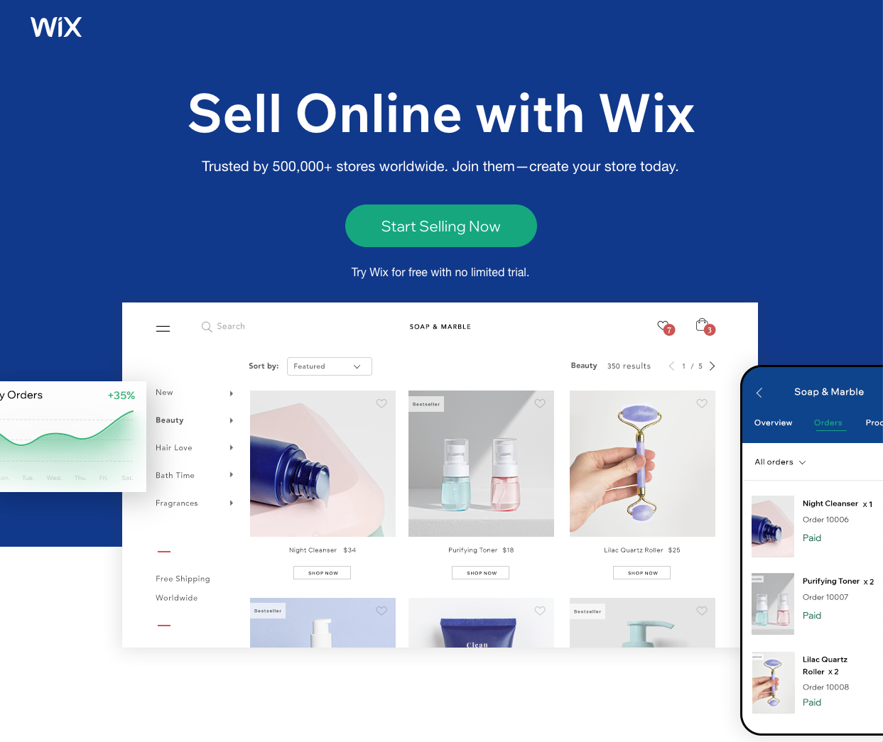
Wix has e-commerce specific templates to help online stores easily set up their websites. The call-to-action and value proposition on this landing page makes it clear what the value or benefit of clicking through will be. They are quite literally making the button copy the main reason for being on this page. People want to sell.
2) Reduce risk
According to Dr. Robert Cialdini, a psychology professor at Arizona State University, “People see an action as more appropriate when others are doing it.”
It’s the age-old thought process that if “everyone’s doing it, it must be ok.”
Depending on the action users need to fulfill to receive the benefit, adding something extra to assure their information is safe in this way, or that others have also participated helps users feel more comfortable converting.
What you need to do
People are risk-averse, which means “most people would prefer a sure outcome than to take a risk at something that has potentially higher value.”
With this in mind, include testimonials, reviews, ratings, FAQs, awards, and accolades on your landing pages and website. Regardless of whether your visitors are other businesses or individual consumers, they need to trust you before they buy from you. They want to know they are not alone and that your site is credible.
Examples
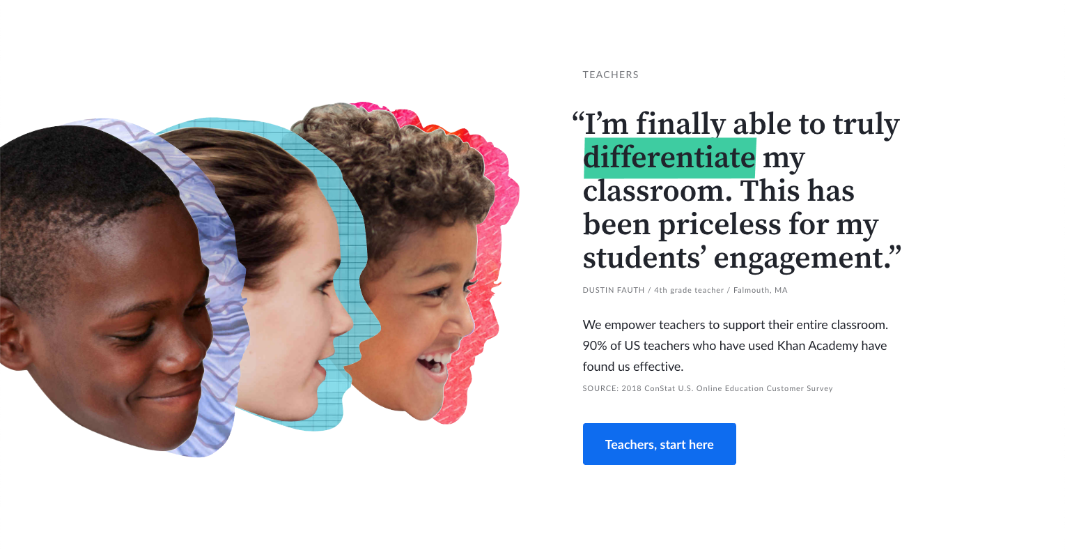
Khan Academy offers educational needs for students, teachers, and parents. What better way to make a teacher feel comfortable joining than including a testimonial from a fellow teacher. The testimonial pinpoints an especially challenging problem for teachers nowadays — student engagement.
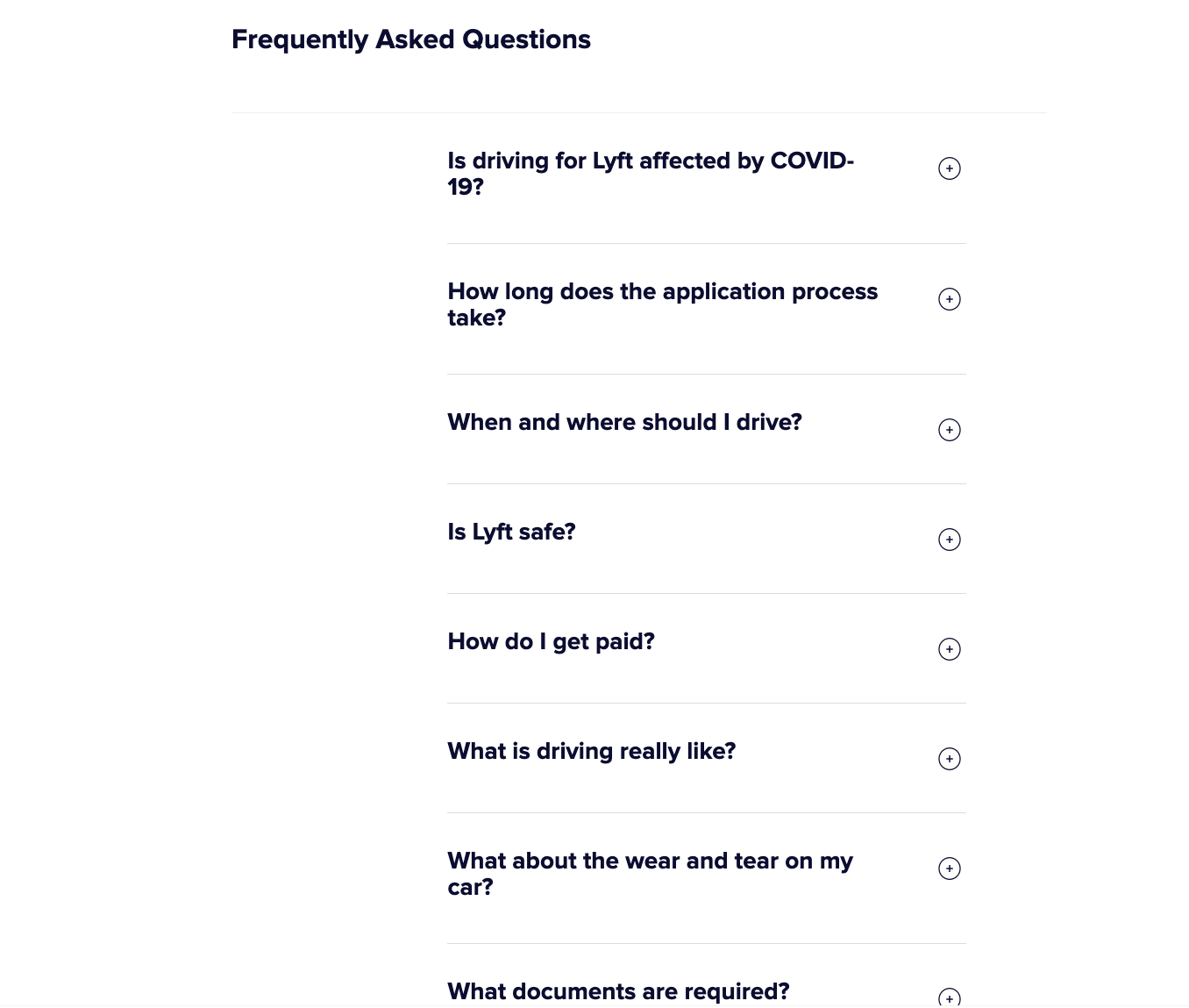
 Then we have Lyft. People who consider becoming Lyft drivers have a lot to think about. Lyft alleviates many of the concerns people might have by including an FAQs section on this landing page.
3) Leverage scarcity and urgency
Scarcity is the feeling that a product is in short supply and that it will run out in a short period of time. Ultimately, it induces that dreaded FOMO (fear of missing out).
When this is triggered, the person's level of desire for the item quickly rises, creating higher demand.
But scarcity alone isn’t the key to creating that demand. It’s a combination of the value of that item as well as trust within the vender that that deal will create when the deadline hits or the quantity hits zero.
What you need to do
The first thing you need to do is pick what will drive that urgency.
This could be the deadline for a sale, the quantity of a product you have, the end date of a program you’re running, etc.
Then, you need to stick to it.
Depending on the audience's level of interest in the offer, do not extend the deadline of when you can receive it, or worse, change the quality left of it. This will break down trust between you and the people converting since it now seems you’ve lied to them to entice them.
You can extend your offer if you notice conversions are very low, and you want to experiment with tactics to increase conversions on it. However, this should be done rarely.
Once you have your offer, dates, and/or quantity set, it's up to you how you want to present it.
Make sure you make any elements that promote the urgency obvious enough so there is a distinction between the normal deal.
You can start doing this by using keywords to promote urgency such as "now," "instant," "hurry," etc. Red also tends to be an ideal color psychologically to get the user's attention to act. And never underestimate the power of a countdown clock.
Examples
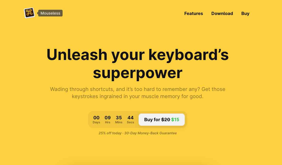
Mouseless creates urgency on its 25% off offer with an eye-catching countdown to when it expires. They also added some additional language — 25% off today to drive the point home. There is nothing more urgent than a deal that ends in just hours. People that were on the fence about buying it will probably jump on the offer.
Amazon has also mastered this principle by creating urgency when there are low quantities of items. To add a little more value, they also sneak in the copy below that specifies how much time you have left if you need the item immediately.
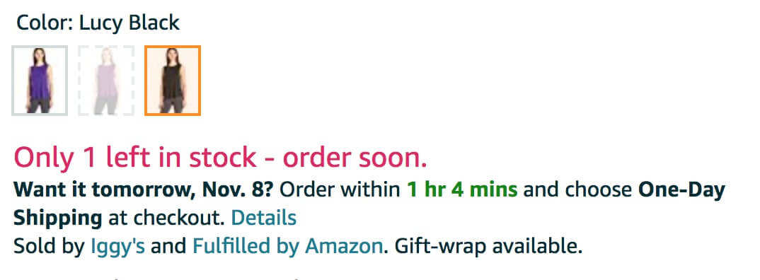
So long as Amazon doesn’t disappoint with the arrival time of one-day shipped packages, people will know to put their trust in that timeframe when ordering in the future too.
4) Eliminate distractions
You’ve likely heard the joke about dogs and how hard it is to focus when they see squirrels. Keep that in mind when thinking about your landing page layout too!
As the optimizer, it is your job to make sure you are drawing your users' attention to the most desired action on the page, almost like a magician.
As CopyHackers' Joanna Wiebe explains, “Magicians manage your attention by compelling you to notice what they want you to notice. Once they have your attention, they can adjust your perception to make you focus on something.”
Once you know what users should focus on, you need to use the way you lay it out, color, and form on your website to attract users.
What you need to do
First, you need to figure out your most wanted action. To do so, ConversionXL recommends you ask two questions:
- What’s the action you want your visitors to take most?
- What action do your visitors want to take most?
These two questions help you make sure that the action you are choosing is realistic and aligns with what your audience is doing.
For example, say you want your users to subscribe to your blog, yet you only ever show the subscribe CTA at the bottom of blog articles. Due to its placement, most people are probably focusing on the blog article and aren't scrolling to the end to see it.
You need to make sure you are giving users the ability to focus their attention on the right spot. If it’s not easily accessible or obvious, no one's going to convert.
Examples
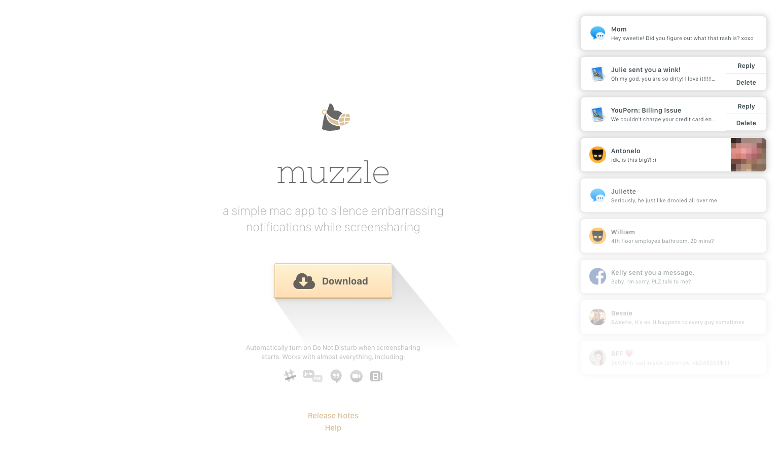
While, at first, it seems like the design of the page (with recognizable notifications filling the right side), it’s actually just a clever way of enhancing the idea of the muzzle app, which silences notifications while screen sharing. The only actions you can take on the page are to download the app, see updates to it, or get help with it.
The most important part of the page is the download button, which sits in the middle of the vast white page. It has a drop shadow that makes it stand out even more.
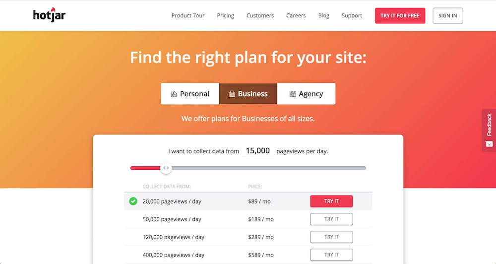
Hotjar does a really good job minimizing distractions by highlighting the slider with red and matching the selected value with a red button, gray background, and a check mark next to the plan below it.
5) Reduce friction
When we say friction in this context, we mean anything that may slow down or prevent someone from converting. Is your page loading slowly? Is it too difficult to find the next step?
One of the most common forms of friction on a landing page is form length. While you certainly don't want to sacrifice lead quality, finding a way to eliminate a form field (or two) could have a serious impact on your conversion rate.
According to Dan Zarrella, your conversion rate improves by almost half when the number of form fields is reduced from four fields to three.
It all comes back to value. If you find yourself creating a 10-field form for a standard ebook, chances are filling it out will not outweigh the value received on that ebook.
What you need to do
Friction can come in many different forms, but one of the most common problems tends to be with how forms are structured and organized.
First, make sure you consider the value of the offer; is it a webinar, one ebook, a downloadable pillar page? Then, brainstorm the value and benefits the offer(s) will bring your users.
You can then use this value to begin formulating how many fields, and what types, to show your user.
One ideal strategy when deciding this is to go a field or two less than the value, rather than trying to match it. This technique can impress your users if they recognize they don't need to do as much on their end to receive your offer, leading to more conversions.
Above all, make it easy for your users to figure out what they need to do, and don’t hit them with barriers that lead their expectations astray.
Examples
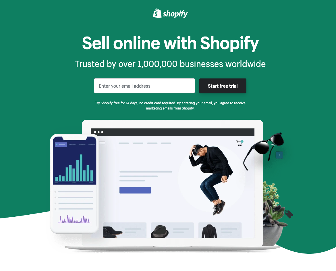
Shopify has managed to slim down their form to one field making it appear easy and less time-consuming.
You just have to enter your email address to begin the process. There isn’t even a credit card field that eliminates the concern of having to put some form of payment upfront before even trying the product.
Kyle Rush led an interesting ObamaCare online campaign, where they tested one full donation form vs. the same one that sequentially went through each question, but was ultimately the same length. The outcome was a 5% increase in conversion rate on it since users felt visually less overwhelmed when looking at the form.
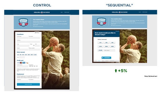
Sometimes it all comes back to visual impact. If you
6) Videos, videos, videos
If you’re not using videos on your landing page, you are missing out on a valuable way of creating comfort and trust. You can give the information on the page more context and even add a voice or visuals to aid the message.
Companies that use video in their content marketing show a 66% higher average website conversion rate. In fact, videos are so important for landing pages they are one of The Selling 7.
What you need to do
The most important things you need to do with your landing page video are to answer these questions:
- What's the solution you're providing?
- Why does the visitor need this solution?
- What's going to happen next?
Badda bing, badda boom. It’s as simple as that. If you’re effectively answering these questions with your video, you’re exponentially increasing your chances of making a conversion.
Examples
PartnerMD, a stellar IMPACT client, does it currently. Right off the bat, Charleen hits the viewer with the common pain points of the normal healthcare experience. Then, she quickly explains what PartnerMD offers and why concierge medicine is the solution to all these pain points.
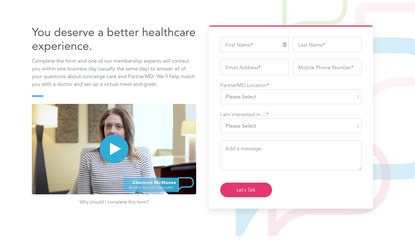
But here’s the most important part. In the video, Charleen explains why the form is sitting next to the video and what will happen when the visitor fills out the form! Imagine that?
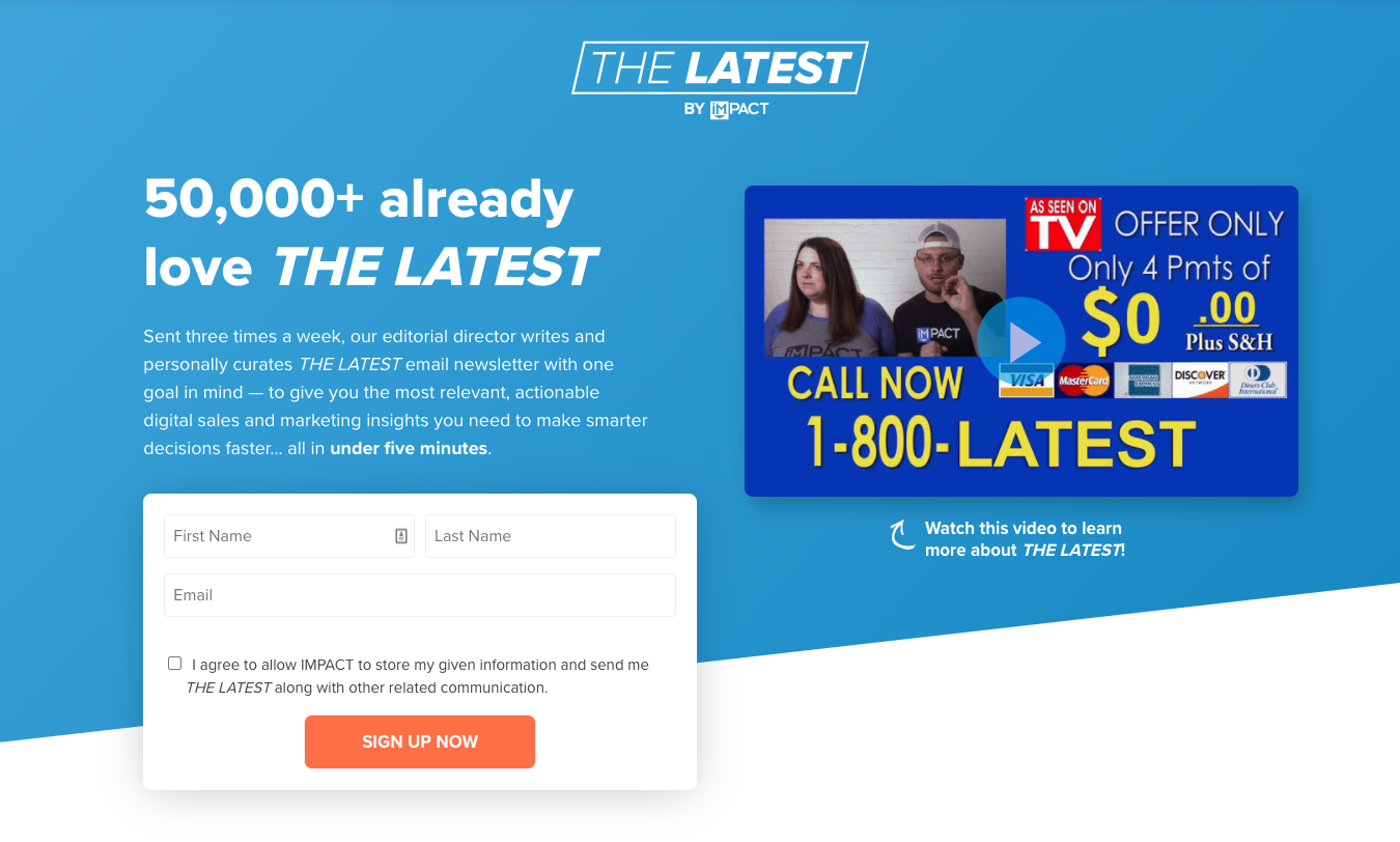
The landing page video for THE LATEST Newsletter, is not only incredibly fun, but it immediately hits those pesky pain points that someone normally experiences with lame newsletters.
You are very quickly put at ease with Liz’s natural way of speaking to her audience. She explains what THE LATEST is, why it’s different, and what you can expect to happen once you fill out the form. And who are we kidding, you’ll probably be signing up for THE LATEST.
Say goodbye to average-joe landing pages
Landing pages are an integral part of all your marketing — email campaigns, SMS, paid search, paid social, organic social, etc — so make sure they are set up for success. Whatever industry you are in, if you’re creating landing pages, you should be actively trying to convert visitors who land there. Test out the tips above and keep an eye for growth on those conversion rates!
Free: Assessment
/Assets/Icon%20Library/Arrows/Grey%20Arrow%20-%20Prev.svg)
/Assets/Icon%20Library/Arrows/Grey%20Arrow%20-%20Next.svg)