/Assets/base/Navigation%20Icons/TAYA.svg)
/Assets/base/Navigation%20Icons/Sales.svg)
/Assets/base/Navigation%20Icons/Web%20design.svg)
/Assets/base/Navigation%20Icons/HubSpot.svg)
/Assets/Icon%20Library/AI%20Mastery.svg)
/Assets/Icon%20Library/Learning%20Center%20Laptop.svg)

Sep 11, 2018
/Assets/Icon%20Library/x%20corp.svg)
/Assets/Icon%20Library/whatsapp%20logo.svg)
/Assets/Icon%20Library/Email.svg)

A great clan once said, cash rules everything around us.
It can buy us food, shelter, smartphones, but one of the few things it can’t buy is trust.
Ironically, people need trust to feel comfortable spending their hard-earned cash with you and transparency about pricing is one of the most effective ways of building it in a digital marketplace.
Enter the pricing page.
Why is a Pricing Page So Important?
This is something IMPACT Partner, Marcus Sheridan has been stressing for years. In fact, last week, HubSpot CTO and Co-founder, Dharmesh Shah reiterated it in his keynote at INBOUND 2018.
If you don't have a pricing page or at least address cost on your website, prospect guards go up.
They immediately wonder, "Why? What are you trying to hide?"
Then they become frustrated as you've made it that much harder for them to evaluate if you're a good solution for them.
A well-thought-out, transparent pricing page lets people know you're not just trying to trick them into a sale.
It creates a better user experience, enabling the visitor to complete their own research (as any modern buyer wants) and ultimately, qualify or disqualify themselves, preventing your sales team from wasting time on someone who isn't a good match.
The way you present pricing on your website can drastically affect your overall bottom line, so I’ve put together these 9 sure-fire tips to build trust and boost conversions on your pricing page.
1. Use a Comparison Table (If Applicable)
No matter what I’m shopping for, when presented with many options, I end up wishing that there was a better way to compare the pros and cons of each one.
When people first arrive on your pricing page, make evaluating and decision making as easy as possible.
A simple way to do this is by laying out everything people need to know about each option in a concise, easy to read comparison table.
Pros Who Got It Right: The now-defunct Geoloqi. The geo-locating platform aced the test with a clear, direct comparison table on its pricing page. Standing only five rows tall, the chart delivered all of the key information about its plans neatly above the fold.
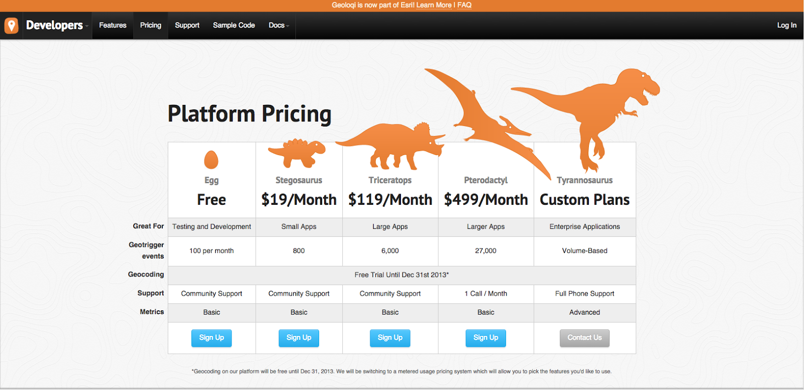
It also allowed for quick conversion by placing its CTAs at eye level when you first arrive. This way individuals who were ready to take action immediately did not have to go hunting for the next step.
Giving their plans those snazzy dinosaur names also gave this one a few bonus points, but we’ll get into that later.
2. Emphasize What’s Included
AC-Cent-Tchu-Ate the Positive. EE-Lim-A-Nate the Negative.
No, I’m not just singing show tunes (though I have been known to belt out a song or two in the office.)
The last thing you want to do when someone is considering your product or service is to draw attention to any shortcomings.
With this in mind, when displaying your different options side by side, highlight what each one includes and downplay features that are excluded.
This keeps the reader’s focus on the benefits they are receiving at each price point, rather giving them a reason to resist or think they’re getting the short end of the stick.
Pros Who Got It Right: Buffer. Though lengthier than that of Geoloqi, Buffer does a great job of laying out all of their product's available features by listing them down the side of their pricing page.
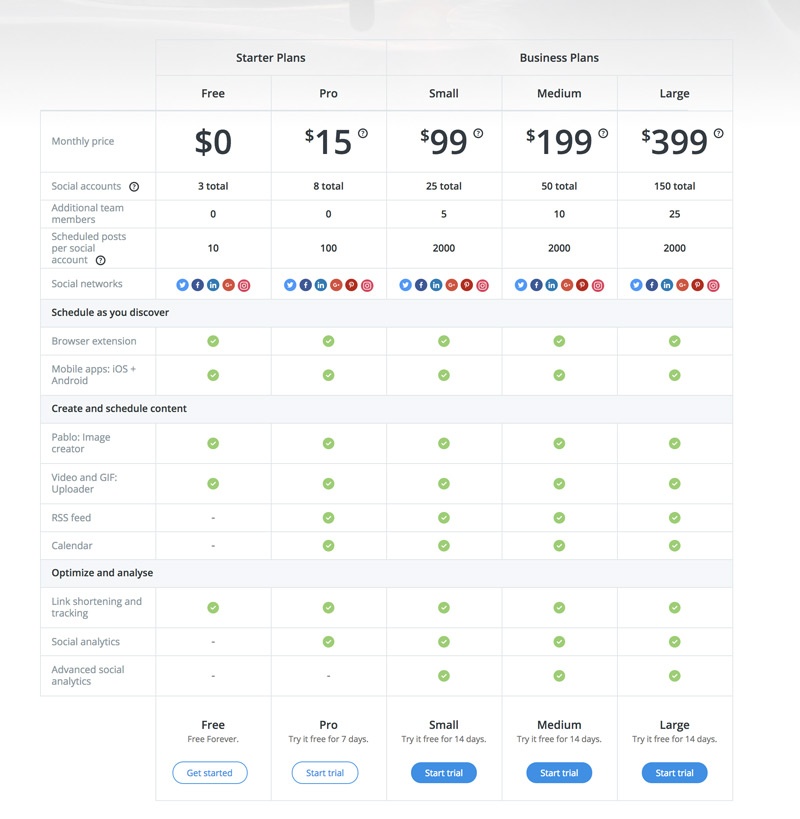
As you move across and down the page, bright green check marks make it clear what features are included in each plan, while those that aren’t are subtly "dashed out."
The design’s vibrant and inviting approach direct the reader’s attention immediately to the value, making what’s “missing” an after-thought.
But, don't get me wrong when I say downplay what's excluded. You don't want to hide these things.
You just want to tell people exactly what to expect.
Unlike making a purchase in a traditional store or office, online audiences can’t hold the product they’re buying (or contract they’re signing) in their own two hands.
They can’t look someone in the eye, shake their hand, or easily ask questions.
All they have to go off of is what is written on your website and perhaps some conversations, so make your page as detailed as possible.
On your pricing page, tell your audience exactly what to expect when doing business with you.
Be clear and direct about the facts, features, and terms of your product and explore ways to address common questions and concerns.
Pro Who Got it Right: HubSpot.
As you scroll on HubSpot's pricing page, they answer their most FAQ, nipping common objections in the bud before they can drive people away.

They make sure that their audience is well-informed about the price and details of their plans so they feel comfortable clicking through to the next page and know what will meet them on the other side.
They also end with their phone number in case you still have questions.
3. Limit the Number of Options
Options are great. Too many options are stressful. This is the psychological state of “Analysis Paralysis” in a nutshell.
When presented with too many choices during the decision-making process, people tend to over-think and freeze up.
They become so overwhelmed by their ability to make a final decision becomes paralyzed and no action is taken.
When people arrive on your page, you want them to act, not stare like a deer in the headlights, unsure what to do.
So, don’t bog them down with too many packages (especially if the difference is only a matter of a few small features/deliverables.)
4. Tell Them What to Buy
With Tip 3 and Analysis Paralysis in mind, another way to avoid overwhelming your audience is by identifying your “most popular” or “recommended” plan.
For someone who may not have done their research or doesn’t know exactly what they want, this suggestion will make the decision-making process significantly less stressful and present your brand as friendly and helpful.
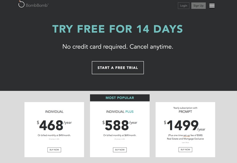
Pros Who Got it Right: BombBomb. The video platform does an excellent job of making it clear which plan they recommend with a prominent "most popular" banner and aqua accents.
5. Give Your Plans Personality
Don’t be afraid to get creative with the names of your plans. Discussing sales and money is never easy so anything you can do to make the experience easier and more welcoming is a must.
Try personifying your plans with descriptive names so that people can identify with them. This way if people arrive on the page and are a bit lost, they’ll be comforted seeing a name that clearly describes their situation.
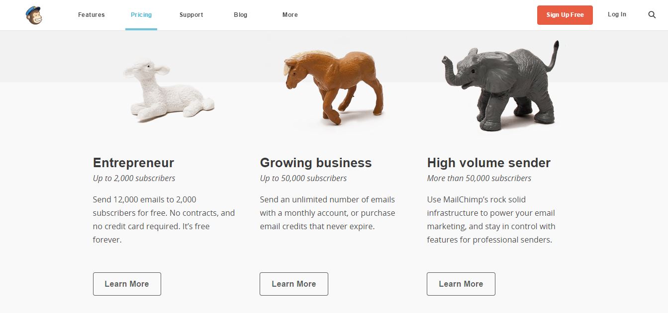
Pros Who Got it Right: MailChimp. The clever team over at MailChimp not only gives its plans name that a user can identify with, it alludes to their power using animal metaphors. (Forget are you a Taurus or a Capricorn? Are you a Lamb or an Elephant?)
This playful use of words and imagery not only makes it easier to choose a plan, it makes the page more engaging and interesting to look at.
6. Show Them Where Their Money Goes
How often have you gone shopping and wondered “why the heck does this cost so much?”
A great way to be build trust with your audience (and set yourself apart) is to tell them just that. Explain exactly where your buyers’ money goes and why you charge what you do.
Online or in-person, this kind of transparency is rare and seeing this information readily available alongside your price tags lets your audience know that you’re not just out to turn a profit.
Pro Who Got it Right: Buffer (yes, again). Now, this element is actually from their own pricing page, but it truly stands out to me to this day so I had to include it.
On their old landing page, Buffer included this straight-forward breakdown of where a buyer’s money goes:

It let people see the true impact of their money on the organization and made it clear that prices aren’t being hiked just for the sake of profit or padding executive wallets.
7. Capitalize on Industry Proof
It’s easy to boast on your website or make outrageous claims (like you invented the question mark); it’s not so easy to prove them. Support claims on your pricing page by including industry or peer proof such as:
- Awards
- Certifications
- Partner Logos
These associations not only help give your work and achievements more credibility, they also let you capitalize on their established brand recognition and reputation.
Pro Who Got it Right: Litmus. Litmus does a lot of things right on their pricing page, but one feature that especially caught my eye was their use of Partner Logos.
Right below their pricing table, Litmus shares testimonials and the logos of big-name customers like MailChimp, JetBlue Airlines, National Geographic, and Salesforce.

Having external support from large organizations like these speaks very highly of the Litmus product and its capabilities.
Seeing them instills confidence in their audience and plants the thought, “If it’s good enough for that big corporation, it’s good enough for my small business.”
8. Include Testimonials or Reviews
Similar to industry proof, including customer testimonials and reviews further help prove that your brand will deliver on its promises.
According to Google, 70% of Americans say they look for product reviews before making a purchase.
By including them directly on your pricing page, you will help provide your audience with the social reassurance they need to feel comfortable making a purchase from your organization.
Pro Who Got it Right: Treehouse. On their pricing page, Treehouse highlights testimonials from users from around the world.
Their quotes discuss the successes they experienced through the service and the relationships they formed thanks to it.

Having customer testimonials like these helps paint a realistic picture of what using Treehouse can bring to the lives of people just like them.
They help their audience envision what they can accomplish by using their product and also feel more confident in converting themselves.
9. Chat With Them
In a digital world, personal customer service is like currency, that's why conversational marketing is all the rage today.
To help build trust in your brand, offer a way for your audience to personally connect with someone from your organization like a:
-
Live Chat
-
Phone Number
-
Contact Us Form
People want to work with other people and presenting these options on your pricing page helps ensure your audience that there is, in fact, a face behind your brand.
They give your audience the option of reaching out immediately for answers as they’re evaluating their options on your pricing page and in turn, help speed up the conversion process.
In addition, even if not used, having a phone number or live chat gives prospective customers the psychological comfort that if they have any trouble or difficulties, help is within reach.
It reassures them that someone at your organization is waiting to speak with them and being held accountable for their satisfaction.
Pro Who Got it Right: Salesforce. At the very bottom of their pricing page, Salesforce presents its audience with the option to contact them via a landing page or more immediately via phone.

Not only does the company aim to provide their audiences with multiple options to connect, they make the extra effort to humanize their brand with a photo of one of their representatives. Now that’s a (sales)force worth reckoning with.
Don't Forget About The Price Tag
As you begin planning or updating your pricing page, remember to keep to your buyer persona in mind.
If people are confident in your brand and trusts that it has their best interest in mind, they will be more likely to set aside any other qualms and concerns and take a chance on your offering.
So, go the extra mile. Plan and develop a strong pricing page that will not only encourage conversion but make your audience more comfortable doing so.
Free: Assessment
/Assets/Icon%20Library/Arrows/Grey%20Arrow%20-%20Prev.svg)
/Assets/Icon%20Library/Arrows/Grey%20Arrow%20-%20Next.svg)