/Assets/base/Navigation%20Icons/TAYA.svg)
/Assets/base/Navigation%20Icons/Sales.svg)
/Assets/base/Navigation%20Icons/Web%20design.svg)
/Assets/base/Navigation%20Icons/HubSpot.svg)
/Assets/Icon%20Library/AI%20Mastery.svg)
/Assets/Icon%20Library/Learning%20Center%20Laptop.svg)

Apr 28, 2015
/Assets/Icon%20Library/x%20corp.svg)
/Assets/Icon%20Library/whatsapp%20logo.svg)
/Assets/Icon%20Library/Email.svg)
Imagine walking by a beautiful new gym that has a sign outside promoting an opening special and you decide it’s time to sign up for a membership.
When you walk in, you find out the gym wasn't what you expected at all and you walk out figuring you can find what you’re looking for elsewhere.
The same can be related to a user discovering your landing page. If the product or offer you are trying to sell is not clearly defined or your landing page’s UX is crowded with other offers that direct the user elsewhere, your conversions will suffer.
To help understand what type of interface your landing page needs to facilitate conversions, I have assembled five user experience tips with examples you can use to begin testing on your own pages.
1. Remove The Navigation and Footer
The last thing you would want is for the user to get distracted and leave the page. Removing your navigation helps isolate the user on the page while increasing the chance they will continue down the sales funnel.
As it is, a landing page is rarely a part of your navigation. It’s purpose is to be an opportunity to guide users down the sales funnel to receive an offer or product and having any external links on the page may jeopardize its conversion rate.
Take a look at Hubspot to see this in action. They performed A/B tests on several of their own landing pages in which they removed just their navigation. They found that their “TOFU landing pages saw a 0-4% bump in conversion rate” and their “MOFU landing pages had a 16% and 28% lift.”

How Can I Get Started? Try performing A/B tests on a few of your landing pages and analyzing the results. Afterwards, if you see a increase in conversions with one of those variations, you can update the page accordingly.
2. Create an Appealing Above-the-Fold
Check out this landing page from the mobile application Human.

Trying to get the user’s focus on the right content is crucial into driving them down your sales funnel. Human does an excellent job placing a large amount of white space around the value proposition and subheader.
This spacing forces your brain to direct your eyes to the first differentiating element in the white space, which would be the header content.
After addressing the value proposition, the user’s eyes are guided to the right side of the page, where a graphic of the application is shown.
Using the right type of image can help make the product more appealing while also giving a glimpse into what the product actually looks like.
If your users can’t decipher what your product is supposed to accomplish looking at the content and imagery above-the-fold, you will automatically lose their interest, including their business.
How Can I Get Started? Depending on your goal above the fold, try using different visual cues with font sizes, white space, colors, and imagery. If you choose to have a background image, make sure that it’s subtle enough to prevent distracting the user. Overall, keep the area above the fold balanced so it communicates the exact message you’re promoting.
3. Design a Clean Layout
Justin Mifsud, owner and editor of Usability Geek, exclaims that “one of the most serious [problems for companies] is that some landing pages have no logical sequence.”
This issue can be caused due to a landing pages being overcrowded with content, improper use of typography, and/or poorly executed design principles.
Once users arrive below the fold it is necessary to streamline the layout by articulating easy-to-digest information, appropriate white space around content, a strong call-to-action, and a submit button with actionable text. Make sure to remove friction in all of these areas to get the user down the funnel smoothly or you may confuse them.
How Can I Get Started? KISSmetrics has an excellent infographic about the proper anatomy landing pages should try to model with descriptions of each element. As the article specifies, there is no exact formula to make a perfect landing page, so try creating a few versions that can be used to perform a multivariate test. Remember to keep your layouts relatively simple and avoid an over abundance of content.

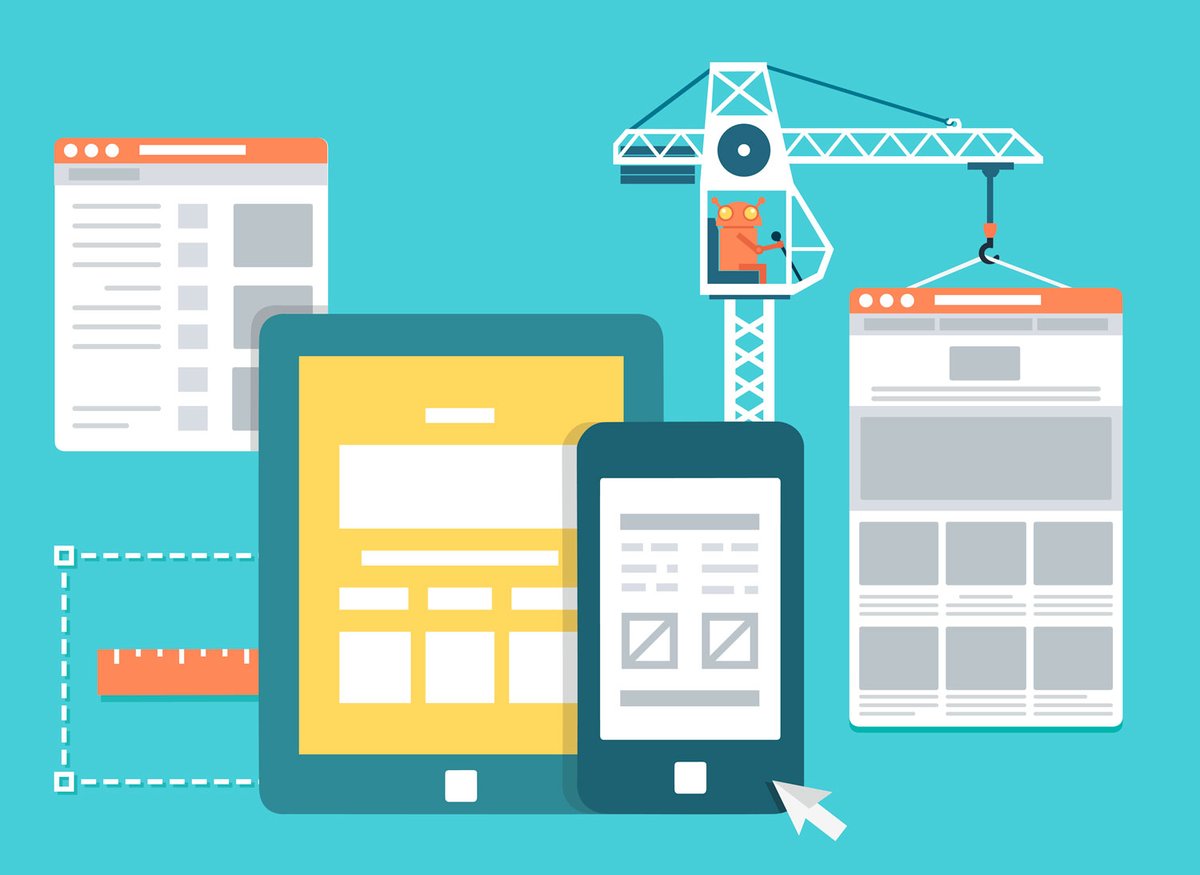
4. Make it Accessible for All Devices
Let’s get real here, we are in the year 2015, people everywhere are walking around, surfing the web on devices of varying screen sizes (--even the Apple Watch. Good thing that doesn't have a browser...yet.)
With Google’s mobile algorithm changing, “mobile friendliness” will now go hand in hand with your SEO more so than ever. According to the company, “with mobile search growing at 10x the rate of desktop, businesses that don’t have a mobile-ready site stand to lose up to 1/3rd of their traffic.”
Optimizing a landing page so users can view it on any platform, will make for a happier conversion journey and a happier customer. With the ever growing nature of people using mobile devices, it is no longer a choice to design for mobile, it’s a must.
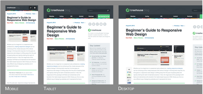
How Can I Get Started? Start thinking about mobile in the design phase of your site. It’s important to understand you may not be able to keep all the content you have on your desktop version and certain pieces may have to be removed. I suggest taking a look at this article by treehouse which does an excellent job of explaining responsive web design and how it’s even beneficial to think about mobile before desktop.
5. Testing is your Best Friend
Once you go through each of these steps, identify issues, and develop a couple new designs, it’s time to run some serious A/B or multivariate testing.
As Justin Mifsud mentions, you need to “test, monitor, interpret the results, redesign, test.”
Depending on how you’re organizing your content and design for your target group, each variant can drastically vary your bounce rate, but as you test and remold your design, you will begin to learn what resonates with your audience the most.
How Can I Get Started? I suggest trying two different ways to A/B test. One way is using HubSpot or one of these options and simply monitoring the numbers and adjusting accordingly. The other involves having actual users sit in front of a computer while you record their behavior as they critique the page(s). Incorporating this will allow you to learn exactly what your users are looking for so you don’t need to guess, saving some time spent testing.
Key Takeaway
While it’s easy to get caught up in the nuances of design and usability, it’s important to step back and see the bigger picture of who you’re actually designing for - the user. Make sure that you not only know who they are, but also their goals, fears, motivations, and values. They will be the ones who ultimately help cultivate the proper content, layout, and design of your landing pages.
Free: Assessment
/Assets/Icon%20Library/Arrows/Grey%20Arrow%20-%20Prev.svg)
/Assets/Icon%20Library/Arrows/Grey%20Arrow%20-%20Next.svg)