/Assets/base/Navigation%20Icons/TAYA.svg)
/Assets/base/Navigation%20Icons/Sales.svg)
/Assets/base/Navigation%20Icons/Web%20design.svg)
/Assets/base/Navigation%20Icons/HubSpot.svg)
/Assets/Icon%20Library/AI%20Mastery.svg)
/Assets/Icon%20Library/Learning%20Center%20Laptop.svg)

/Assets/Icon%20Library/x%20corp.svg)
/Assets/Icon%20Library/whatsapp%20logo.svg)
/Assets/Icon%20Library/Email.svg)


You’ve been underestimating an important member of your marketing team.
They’ve been working their butt off, adding direction and guidance to your website, helping your visitors get from one point to another, but day in and day out, they’ve been stuck in the same job. You’ve ignored them, never offering a promotion or even a new responsibility.
What’s a CTA button to do?
Alright, maybe that was a bit much, but the point is many businesses are resting on their laurels when it comes to CTAs and are not using them to their full potential.
Calls-to-action aren’t just links to the next page; they’re integral pieces of your website that when approached strategically can dramatically improve your conversion rates.
Let’s take a look at four creative tweaks you can make to your calls-to-action to showcase value.
1.Remove “Friction” Words
Take a look at your calls to action and remove friction words, or as Joanna Wiebe of CopyHackers describes them, words that imply loss, work, or obligation (aka things people don’t want to do.)
As an inbound marketer, the goal is to “delight” prospects and naturally guide them into converting by offering value with your copy and content. Friction words, however, dilute this effort.
Psychologically, friction words create the impression that work has to be done and chances are people are not coming to your website looking for more work on their plates.
The easier your conversion process is, the more likely your readers are to complete it and this all starts with the CTA button. High friction verbs you should erase from your CTAs include, but are not limited to:
- Submit
Note: “Submit” is what one of my IMPACT colleagues, Vin Gaeta, calls a “Conversion Killer”. It’s unspecific, cold, and implies that by clicking the button you are somehow making yourself inferior or succombing to a higher power. This isn’t Game of Thrones. I don’t know about you, but I don’t want to submit to King Joffrey or anyone for that matter, and neither will your visitors.
- Sign Up
- Register
- Download
- Buy
- Request
Note: A word like “request” implies that said submission may or may not be fulfilled. You want to make it clear that your visitor will have some sort of return for their efforts. Ambiguity is discouraging.
Now, if you saw your go-to button text on the list (which I’m sure many of you did) the solution is simple:
2. Highlight Rewards
Every time a person arrives at your button and offer, they complete an internal cost-benefit analysis, evaluating whether or not what you’re offering them is worth what they are going to have to do to get it.
Once you have taken the work out of your calls-to-action, replace it with rewards using verbs that highlight value and what the reader is receiving. Doing this will help increase the implied benefits and make your reader want to click your CTA. In other words, it will help ensure that their cost-benefit analysis goes in your favor.
As Wiebe suggests, your CTA should complete the sentence, “I want to [fill in the blank]”.
For example:
- I want to [watch my webinar]
- I want to [discover more options]
- I want to [get my infographic]
This ensures that the text speaks directly to the consumer and satisfies the need that they came to the page looking to fulfill. With this in mind, swap out your friction words for clear, beneficial alternatives like we did here using the examples from above:
- Sign Up → Get Started Now
- Register Now → Join Us
- Download → Get My [Insert Offer Type]
Note: Here, don’t be afraid to get even more specific to your offer. (i.e. Watch My Webinar, View My Infographic). An action that reflects the offer type makes the benefit that much more tangible.
- Request → Get My [Insert Offer Type]
(or if it’s a communication request) → Talk to Us
- Buy Now → Shop Now
Overall, depending on the context of the offer and action at hand, revise your CTAs to minimize the perceived effort and maximize the benefit. You can also consider experimenting with more engaging verbs like:
- Reveal
- Discover
- Unveil
- Watch
- Show
3. Keep the Focus on the Reader.
According to a study by Janrain & Harris Interactive, 74% of online consumers get frustrated when website content appears to have nothing to do with their interests.
Even if you don’t know the reader’s name or any other personal details, a simple way to personalize the experience is consistently direct value towards them. .
For example, instead of saying “View the Checklist”, say “View My Checklist”. Instead of “Learn More”, try saying “Tell Me More”.
In 2014, IMPACT did this for one of our highest performing eBooks that seemed to have plateaued. After brainstorming all of the possible changes that could be made to the conversion process, we changed our CTA text from “Free Download” to “Show Me How to Attract More Customers” and saw an 78.5% increase in conversions.


Unlike the original CTA, our new variation was actionable and inviting. It spoke directly to the reader by stating overtly what clicking on the button would do for them. It incentivized the action of clicking through and made it seem like friendly sharing of information, rather than a cold business transaction.
4. Use Visual Cues.
Text aside, the design of a CTA can dramatically impact the way it is viewed by your reader and ultimately the action they take.
As a marketer, the best way to convey value and importance through the design of a CTA is to make it stand out.
The human eye, by nature, is drawn to things that appear “misplaced” or break an established pattern. By breaking away from the general style of the page (whether that be by making the CTA a contrasting color or placing it in a circle on a page full of squares), you’ll not only be increasing it’s visual impact, but increasing its perceived value in the eye of the visitor.
The Wistia homepage is a great example of this concept in action. When you first arrive on the page, you are met by a full width video. While by size this video grabs your initial attention, but your eye is quickly drawn away to the striking blue CTA in the corner.
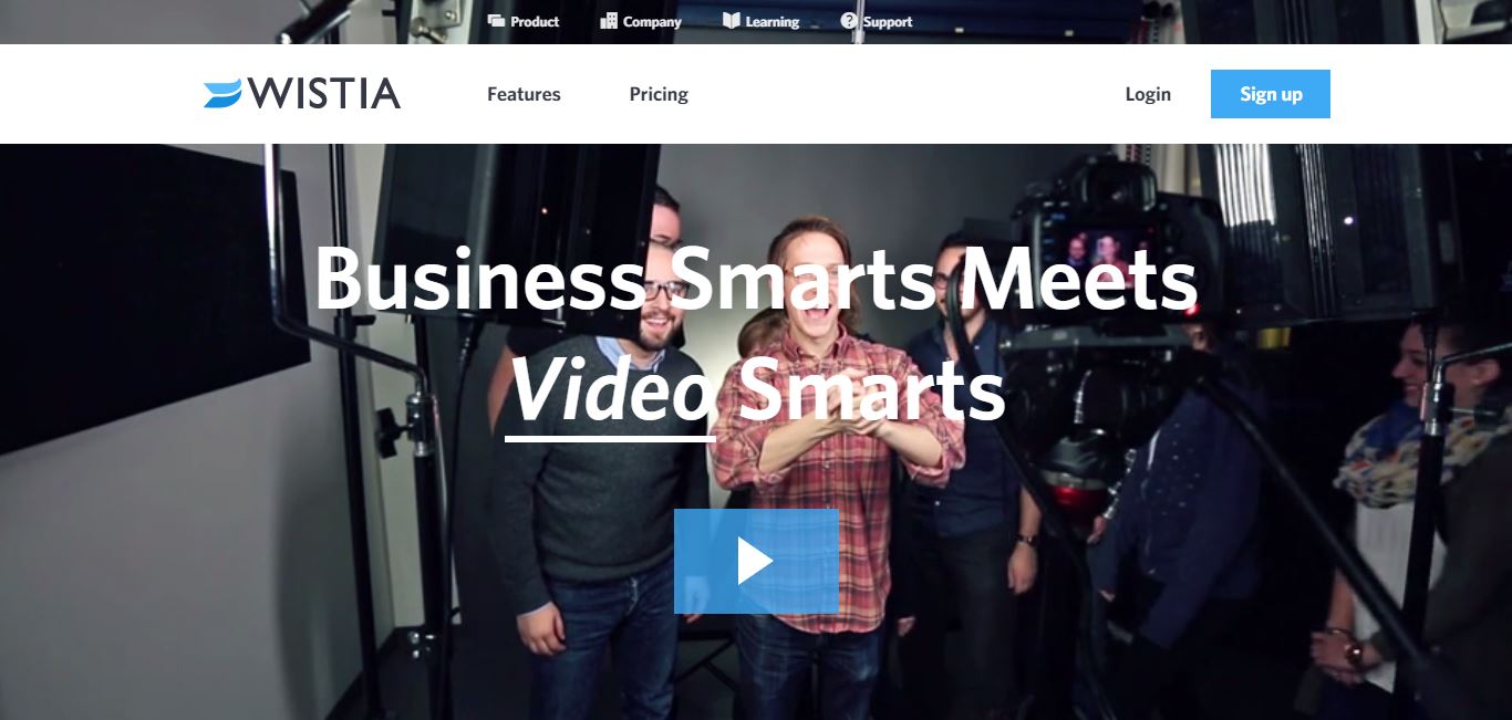
Even if you weren’t there to sign up, this strategic color choice and placement, catches your eye and in turn plants the idea of clicking through and becoming a Wistia customer.
Getting Started
Don’t let their usually small stature fool you. From their text right down to their color, shape, and placement, even the smallest tweak to your call-to-action buttons can lead to a big jump in their performance. Use these 4 tips to start testing which variations work best for your audience and please, don’t let me find any “submit” buttons lying around!
Free Assessment:
/Assets/Icon%20Library/Arrows/Grey%20Arrow%20-%20Prev.svg)
/Assets/Icon%20Library/Arrows/Grey%20Arrow%20-%20Next.svg)