/Assets/base/Close.svg)
 ]
]
/Assets/arrow-facing-left--black-01.svg)
/Assets/base/Navigation%20Icons/TAYA.svg)
/Assets/base/Navigation%20Icons/navigation%20arrow%20-%20facing%20right-01.svg)
/Assets/base/Navigation%20Icons/Sales.svg)
/Assets/base/Navigation%20Icons/Web%20design.svg)
/Assets/base/Navigation%20Icons/HubSpot.svg)
/Assets/Icon%20Library/AI%20Mastery.svg)
/Assets/Icon%20Library/Gear%20icon.svg)
/Assets/Icon%20Library/Learning%20Center%20Laptop.svg)
/Assets/Icon%20Library/Click.svg)
/Assets/Icon%20Library/Link.svg)
/Assets/navigation-global--close-symbol-black-01-1.svg)
/Assets/navigation-global--close-symbol-black-01.svg)

Sep 10, 2018
/Assets/Icon%20Library/x%20corp.svg)
/Assets/base/Learning%20Center%20Resource%20Category%20Icons/Facebook_Messenger_logo_black.svg)
/Assets/Icon%20Library/whatsapp%20logo.svg)
/Assets/Icon%20Library/Email.svg)
![21 Best Examples of Effective Mobile Website Design [+Video]](https://www.impactplus.com/hs-fs/hubfs/MarketHer%20Podcast/Blog%20images/mobile-website-examples.jpg?length=1200&name=mobile-website-examples.jpg)
Mobile websites have begun to look, work, and perform better than ever as we have progressively begun to consider various device sizes in our designs.
The restrictive nature of mobile has forced marketers, designers, and developers to consider the implications of specific functionality on smaller screen sizes.
This allows the best responsive to separate themselves and stand out as amazing examples of excellently executed mobile web design.
The 21 Best Mobile Website Design Examples
- Lyft
- Apple
- Purple
- Warby Parker
- Walt Disney
- Adobe
- Domino's
- Slack
- Stripe
- Mckinsey
- Atlassian
- Square
- Fergus
- Abercrombie & Fitch
- Booking.com
- Texas Roadhouse
- Klondike Bar
- Dove Men + Care
- Hidden Valley
- Mountain Dew
- Adidas
Rather watch? The below video covers the same content as this blog!
Research has shown that 91% of all mobile users have their mobile devices within reach 24/7. That is a constant opportunity for your business to make a positive impression on its prospects.
In order to ensure your website is making a positive impact, make sure you consider mobile functionality as you brainstorm desktop designs for it. Recognize the most important information and what elements can be removed to lighten the experience when browsing on mobile.
Some experts even advocate for a mobile first approach but warn that there are some pros and cons to the technique.
The goal is to make your pages engaging and user-friendly, without overstuffing them with too much functionality and information.
If you are looking for some ideas on how to develop an effective mobile web design, consider taking a look at a few of these companies’ mobile sites.
1. Lyft

Lyft makes great use of large typography to make its messaging bold and easy to read for those on smaller devices. The colorful, deliberate imagery and icons help naturally lead the user into the next section of the page.
The mobile menu is also uniquely organized to make it easy for users to segment themselves as riders or drivers and visit the parts of the site that most pertain to them.
2. Apple
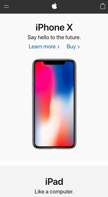
Tech giant Apple has made it their mission to create a mobile website that easily allows users to investigate more into their specific products.
The layout most of their pages with sections follow, is a simple, but organized visual pattern consisting of a header, subheader, and image.
This simplicity helps the dynamic product photos take hierarchy, roping you into their sleek design.
3. Purple
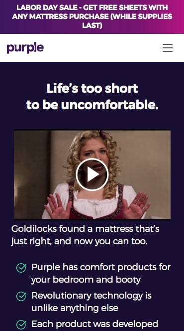
Purple’s mobile website helps drive user focus to the differentiators of their bedroom products versus traditional ones.
Their hero sections on each product page show the four key facts that you should know if you read nothing else, and if those entice you, you can continue scrolling to learn more.
Purple also weaved in custom product imagery that shows how their bedroom items help keep you comfortable (because if you don't show your product, it doesn't exist)!
The checkout process is also streamlined so users only go through a few pages to complete their purchase.
4. Warby Parker
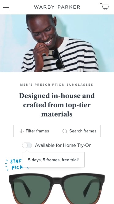
As another eCommerce site, Warby Parker does an excellent job listing their products without excessive, cluttering details.
This enables users to browse focusing on style(which we all know is most important when shopping for eyewear), but still allowing them to click on a product to see more details.
Their mobile menu also follows a similar trend, listing only three core items (Try-on, Eyeglasses, and Sunglasses) with bold imagery to show the prominence of those three menu items.
5. Walt Disney
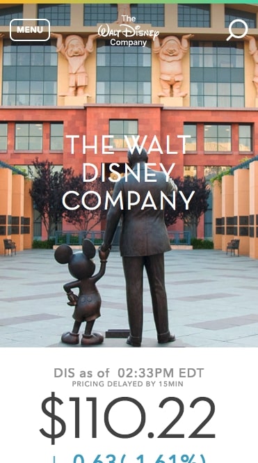
The Walt Disney Company’s mobile site focuses on organizing the more corporate/business facts of the brand, but not at the expense of a great experience.
Their mobile menu easily direct users to learn more about the company's initiatives, leading to pages filled with beautiful imagery, colorful buttons, and background colors that appropriately fit with the brand.
Throughout the mobile site, Walt Disney consistently uses a card design (which include an image, heading, and paragraph text) on anything that leads to a article. This gives the users a snippet of the content they would read if they clicked through.
6. Adobe
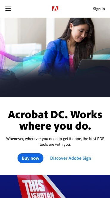
Adobe’s mobile site puts their software first so users can discover the types of solutions offered and whether or not they fit them.
This is clearly seen on the mobile menu, where Adobe lists the categories their products fall into, before becoming more granular when you click into each item.
As you click onto these pages, you can learn more about specific features or case studies that pertain to that product.
Adobe knows that it's likely you’ll want to investigate multiple pages that are categorized under that product so they made a specific mobile menu that lists those and sticks with you as you scroll.
This enables you to navigate to related pages easily, rather than getting stuck working in the main navigation that houses other products.
7. Domino’s
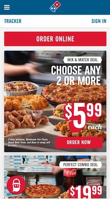
The Domino’s mobile website is all about making it super easy for you to complete your online order.
Domino’s does this by emphasizing its call-to-action buttons (especially ‘order now’), making them large and red so it's not hard for you to miss.
When placing your order, Domino’s has a clear step by step process starting with adding your items to the cart, followed by customization, and placing finally the order.
The entire process takes place in a modal so users can return to the menu by closing the popup in case you want to make any changes to your order.
They even have a mobile ordering bot (named Dom) that you can use to place your order for you.
This creates a super unique experience and had the potential to be more appealing to those who prefer to order with an assistant (one that's not human).
8. Slack
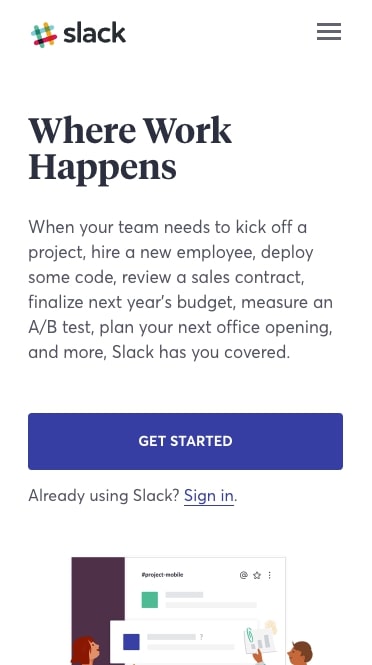
Slack’s mobile site’s main goal is to get users to sign up and download its mobile application.
This means Slack puts heavy emphasis on its download call-to-actions, by keeping them large and vibrantly colored.
When you navigate to pages detailing the purpose of the platform for specific business types, you’ll see Slack was mindful in making sure their software imagery was still very readable. Doing this helps users actually read the text within the software so they get a realistic experience and fully understand what the tool is actually capable of doing.
9. Stripe
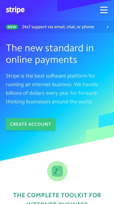
Stripe is a banking company that has software which "allows individuals and businesses to receive payments over the Internet."
For a tool that has the potential to look extremely daunting and boring, they have done an excellent job designing both their mobile and desktop site to really showcase the tool and how it can be integrated into your organization without much of a headache.
The site’s mobile menu has each of their products color coordinated and stacked neatly in a two column layout so that they fit comfortably in the viewport.
Once you click through to the respective pages, you're greeted with organized information complete with more dynamic imagery of specific components of the software size so they are easy to see.
Stripe also did an exceptional job at making sure their multitude of subtle links are still large enough so users can easily click them without needing to press multiple times.
10. McKinsey

McKinsey, being primarily a publisher site, has made sure the reading experience of their articles is top-notch for its users.
On their homepage, McKinsey has lead with what users care about the most, trending topics and a featured article.
When clicking into one of the articles, you’ll notice they’ve made the font size fairly large (18px) with a comfortable line height to ensure readability on mobile.
Once users scroll down to the bottom of the article, the page leads another so users will stay on the page longer and keep reading, rather than having to click back to the main page or leaving entirely.
11. Atlassian

At IMPACT, we're no stranger to Atlassian and know that the company has an array of products, not all of which a team may need (or even are aware exist).
So, Atlassian has constructed their mobile site to guide users to these different products where they can discover what problems they solve and the benefits they offer.
Each inner page of the product explains what the product is, who it's for, the benefits, and case studies, all in a concise manner for mobile to it’s easy to digest.
12. Square
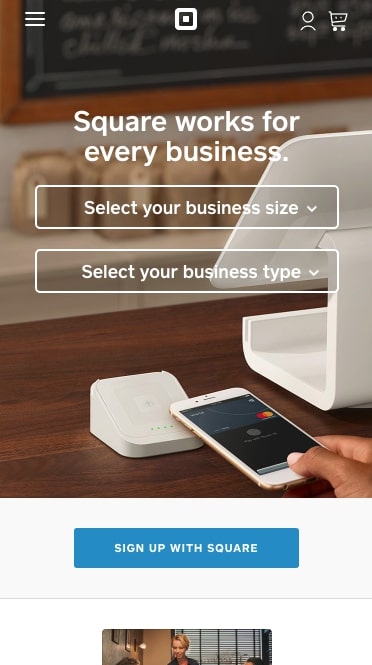
Being a very mobile product, it's only appropriate that Square have a site that’s respective to users on smaller devices.
Like other examples, Square makes sure that any images of their product or software are as large as possible on smaller screens so you can see exactly how each is used.
They also made their body font a readable 18px and keep their paragraphs short so you aren’t overwhelmed with too much text.
Square also positions a large ‘get started’ call-to-action at the bottom of some pages that sticks as users scroll so they always have the option to convert.
13. Fergus
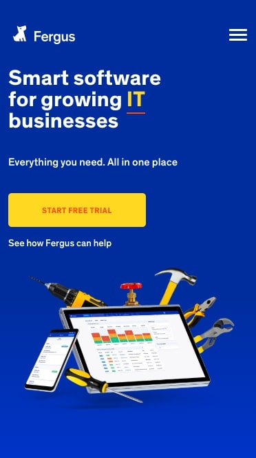
Fergus is a cloud-based job management solution that offers scheduling, contact management, job cards, and timesheets.
Their products have a substantial numbers of features and differentiators which are fully shown in their desktop menu, but in their mobile menu, they took a more consolidated approach and only have the top-level menu items listed.
This prevents overwhelming mobile users with too many menu options.
When visiting the inner pages, there are smaller sub navigations that help guide users to pages discussing more product details. Most of these pages follow a similar format of a header, subheader, and image before transitioning to the next section.
Also, on their pricing page, Fergus created a plan comparison table to help users effortlessly see the difference between all three options, rather than having to reach each one individually.
14. Abercrombie & Fitch

Abercrombie & Fitch uses a basic color palette combined with beautiful photography to draw the user's eyes to the products, rather than the elements of the site.
The simplicity of the homepage presents the user with clear options to begin shopping, which is the main purpose of the web page. The promotion/advertisement bar at the top of the page is also a great addition to encourage action and draw attention to sales.
For their mobile navigation, Abercrombie & Fitch keeps all their clothing options and categories under their mobile menu. Arrows signify whether or not there are more options under each item.
Each individual item is displayed on a clean page that allows you to easily find important details, and the big “Add to Bag” button is the most noticeable element on the page. Other important information, such as shipping details and clothing specs, are kept under accordion-style dropdowns to shorten the page and gives the user the option to access it if need be.
By keeping a monochromatic style and minimizing design elements, Abercrombie has allowed their clothing to stand out as the main attraction. After all, it's there product they want you focusing on, not the site's mobile web design.
15. Booking.com

Booking.com gets right to the point on their mobile homepage which allows the user to easily begin searching for a hotel or room in your specified area. By choosing yellow as the background color, the user's attention is immediately drawn to the form with a clear call-to-action at the bottom of the section.
The search itself is about as detailed as you would expect but in a very functional mobile format. Each hotel includes pictures, ratings, and pricing information. There's even a sorting option to further narrow down what you’re looking for.
Once you click on one of the choices, you are met with more extensive details about the location and options to change any of the information you initially searched with. To create further incentive to buy, there's a small red bubble that tells you if others are also looking at the same hotel.
The amount of information that booking.com was able to pack into theirs sites mobile web design without sacrificing its visual appeal is extremely impressive.
16. Texas Roadhouse
.jpg "Best Mobile Websites Texas Roadhouse")
Texas Roadhouse does a great job of encouraging users to find a location nearest to them to visit. Rather than using scrolling banner ads like many other sites, Texas Roadhouse opts for a single image that improves loading time and supplements their call-to-action. Their slider gives them the option to add multiple banners while keeping the page short and concise.
There isn't a large amount of excess information on the sites mobile web design, which really helps to keep the customer focused. As a restaurant, the most important information is what you serve and your
Their website also loaded the fastest out of all of the mobile sites listed here, which is extremely important if your stomach is growling and you just want to find where to grab a steak!
17. Klondike Bar

What would you do for a Klondike Bar? Would you drive around town searching for a store that sells your favorite type? If you would, more power to you, but Klondike Bar’s mobile website really helps you cut down on your search time.
Their site allows you to quickly browse their products using the variety of calls-to-action seen on the home page or using the mobile menu which lists their product categories. They even give you the option to look for stores that sell their products so you don’t need to worry about trying to guess where they’re sold.
Beyond providing store locations and nutritional information for their products, Klondike also has multiple engagement opportunities for users who just want to indulge in different content. They have a couple different unique marketing videos to view on their “Watch This!” page to facilitate this.
You may have been surprised to hear Klondike even has a mobile website, but they did a great job with designing it to make sure you don’t have to do much to get a Klondike Bar.
18. Dove Men + Care

Dove Men + Care is another mobile web design that really focuses on simplicity to improve functionality. Although there is minimal navigation on the homepage, Dove effectively uses images to increase engagement and drive people towards partiular products. Dove Men's product-focused approach is carried throughout the website via promotional videos and extras that can be found throughout the homepage and the hamburger navigation
Where Dove Men really excels is how they segment their products into specific categories with individual pages. Utilizing the homepage to promote these product pages makes it easy for users to scroll and click immediately into the products they are researching. The large blue buttons in each section also allow the call to actions to stand out and make it easy for mobile users to click.
Large buttons may not seem groundbreaking, but it allows a user to truly view a page with one hand, which is great for on-the-go mobile users.
19. Hidden Valley

When arriving to hidden valleys website, I was surprised I wasnt presented with an immedate array of hidden valley products and specials. Instead, it was recipies and blog articles that took over the top of the homepage.
The greatest aspect of the Hidden Valley mobile website that separates it from the rest is its content. Hidden Valley has highly detailed recipe and product information that gives you ideas for all different types of cuisines that incorporate its products. Essentially, Hidden Valley’s website is a tool that you can use for great dinner ideas that will still benefit the Hidden Valley brand.
Each recipe and product page includes pictures and reviews, and it almost makes you think that you are on a different website altogether. The use of Hidden Valley products and the page design holds these recipes together with the product, so it ultimately becomes an added benefit of the website.
If you find yourself in love with Hidden Valley dressings, they even have a swag store. I mean, what's not to love about salad dress? Every salad lover knows ranch dressing is a blessing.
20. Mountain Dew

Mountain Dew’s mobile web design takes a completely different approach than all of the other sites in this list, but still created an effective experience. There page is very busy, but matches the high energy feel that the Mountain Dew brand encourages. The main hero area typically advertizes a experience thats high adrenaline and meant to engage users in unique ways.
What really separates Mountain Dew from the pack is their mobile menu. Rather than sticking to the top of the screen, the hamburger bar is located at the bottom of the page which changes the content above when you click on it. This allows them push the pages closer to the top of the device viewport, rather than being bothered with a navbar immediately.
The options at the bottom of the homepage gives users options to learn about the products Mountain Dew offers while seeing the advertising campaigns they are attached to.
21. Adidas

Adidas’s mobile web design includes a variety of the elements already mentioned here, but does so in such a way that mimics their desktop website. The banner ads include engaging images that contain large buttons that link to current promotions or specific product information. Adidas has a nice balance of interesting content and simplistic design which makes their homepage very clean.
Adidas also does a nice job of extending their home page to include product categories users can filter through. Rather than using the mobile menu, you can search for a specific product category right on the home page to get you to the product you want quicker.
Like Abercrombie, the site also allows vibrant images to attract the user's eyes on their product pages and the most attention is brought to their large “Add to Bag” button to get users to purchase their products.
Takeaway
Hopefully one or more of these websites have provided you with some inspiration for how to design, or revamp, your mobile website. Just remember to keep things simple when designing your website. Include only what is necessary while giving your page a welcoming feel. A mobile website is a necessity in this day and age, so make sure yours is adding to your business rather than detracting from it.
Free: Assessment
/Assets/Icon%20Library/Arrows/Grey%20Arrow%20-%20Prev.svg)
/Assets/Icon%20Library/Arrows/Grey%20Arrow%20-%20Next.svg)